Box-shadow is being cut out, how is this fixed?
Is this something that can be done, or is it not possible?
code: https://jsfiddle.net/vnLfbamy/3/
You can stack elements on top of each other without z-index. take look at this article
Were you able to successfully do it with my code?
And it worked?
I did not test it on your code. This is an alternative to z-index property in CSS.
I don’t think it is possible to do, I will keep trying though.
How would I go about restructuring the css/html so that z-index isn’t needed on the transition?
code: https://jsfiddle.net/rspxkyoL/
What would need to be moved around in the html/css?
How would I be able to implement that?
Where 1 image fills both left and right panels.
code: https://jsfiddle.net/kqLpv21h/
Currently the image fills in both the left and right side.
I want only one image to appear, that fills in both sides.

I’m asking the obvious, but have you tried setting the background image on the container of the two panels instead?
Did doing that work for you?
How do I get the image to show?
code: https://jsfiddle.net/gf0eywbo/
Go into your brower’s dev tool inspector and look at the computed height on the image div you are adding this background to (you might have to add height: 100% to the div in order for the inspector to show you the current computed height). I think you will see why the background image isn’t showing.
As to how to get it to show? There isn’t one correct answer as there are many ways to do it. I’m not sure I understand exactly how you want to place the image though. Perhaps you could give a little more detail on what you are trying to do.
What I am trying to do:
Half an image on each side.
Meaning: Getting 1 image to appear instead of 2
How would that be done?
If I understand you correctly, you want the image to fill the entire background behind the animated circle? Then I would add the background image to an element that fills that entire area. Perhaps the curtain div? You’ll want to get rid of the background colors on the left/right panel divs.
code: https://jsfiddle.net/a764ws9q/1/
The image should be attached to the curtain, but now the transition effect is not working.
Doing this works, but it causes the image to split into two separate images.
code https://jsfiddle.net/643xLh7t/2/
I didn’t test the transition effect. You just asked how to get the background image on there so that’s all I looked at. To be honest, I didn’t click on the animated circle so I had no idea there was even supposed to be a transition effect until you mentioned it just now.
I can’t see the transition effect now so I don’t know how it is supposed to work. Put it back in place and I’ll take a look.
Here: https://jsfiddle.net/kqLpv21h/
I just added it like this:
Doing that causes the image to split into two separate images.
I want one image to show as 1 whole image, then the transition effect to split it into 2 images.
I want only one image to appear, as a full image.
Then have the transition effect split the image in half.
If I’m understanding correctly, you want a single image to split down the middle and pull apart? My guess is that you will need to put the background image on both the left/right panel divs, but only show the left 50% of the image on the left panel and the right 50% of the image on the right panel. That way when they are together they create one full image and then can be pulled apart in the transition effect.
Like this you mean: https://jsfiddle.net/gruxtycz/
Next: How do I do this?
only show the left 50% of the image on the left panel and the right 50% of the image on the right panel.
A couple of hints:
- Instead of using a percentage for background size, which is relative to the element itself, consider other units you could use which are relative to the size of the browser.
- To adjust the horizontal position of the the background image, use background-positon-x .

Advisory boards aren’t only for executives. Join the LogRocket Content Advisory Board today →

- Product Management
- Solve User-Reported Issues
- Find Issues Faster
- Optimize Conversion and Adoption
- Start Monitoring for Free
Styling with the CSS box-shadow property

Editor’s note: As of 25 October 2023, this article now features CSS box-shadow generators and information about combining the box-shadow and text-shadow CSS properties.
Nowadays, it’s not enough that a website does its job — it has to take the user on an aesthetically pleasing journey of hues, fonts, shades, and everything in between. Websites have to look and feel realistic, and shadows play a big part.
In this post, we’ll look at the box-shadow CSS property and how you can style it in three different ways: layered shadows, neon shadows, and neumorphic shadows.
What is the box-shadow property?
The box-shadow CSS property allows you to add a shadow around an element on a webpage. Shadows give us an idea of an object’s size and depth, and box-shadow brings this realism into our online experience. The property can tell us if an element like a button, navigation item, or text card is interactive. When styled properly, it can also improve the aesthetics of the webpage.
Let’s look at how a typical box-shadow in declared in CSS:
The first four values are:
- The x-offset , which represents the horizontal shadow position
- The y-offset , which represents the shadow’s position vertically
- The blur radius affects the sharpness of the shadow; higher values mean lighter shadows, and vice versa
- The fourth value defines the spread
All of these except the blur radius can be negative values. For instance, the snippet above will place box-shadow on the bottom of the element, but if you add negative values like below, the shadow will be on top:
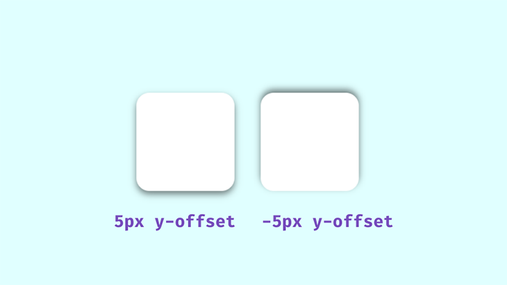
The spread value set at 0px will make the shadow the same size as the box; a positive value will increase its size and a negative value will shrink it.
Adding color to make shadows feel realistic
The next value is color. We’ll be using rgba() colors because of their alpha value. With this, we can specify an opacity, which is an important aspect to consider when styling realistic shadows. Shadows in well-lit spaces aren’t black or completely opaque — you can see the color of the area the shadow is cast on.
When styling the box-shadow property, remember that transparent shadows are the best because they look good on multicolored backgrounds. Look around and observe how shadows behave in relation to their light sources — you’ll want to keep this in mind when styling with CSS:
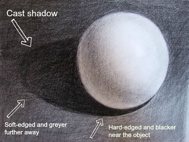
The area closest to the object has the darkest shadows, then it spreads and blurs outwards gradually. Opaque or completely black shadows would be distracting, ugly, and imply a complete blockage of light, which isn’t what we’re after.
Avoiding the drop-shadow() function
The drop-shadow() function adds a drop shadow around an image, following the shape of the entire element’s content. This means it can include any transparent areas. It differs from the box-shadow property, which applies shadows to the rectangle of the image’s box:
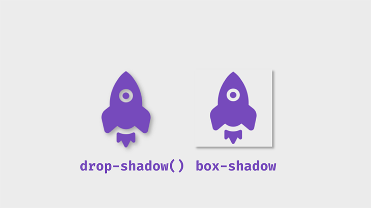
The code snippet below shows the distinction between these filters:
Getting started with box-shadow
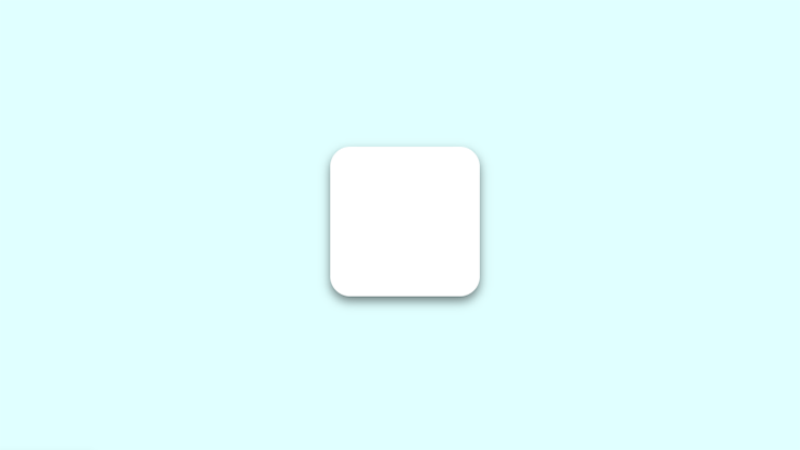
To get started with box-shadow , first, create a simple box container with HTML:
Next, add the CSS:
This will be the output:
Using box-shadow with the :hover pseudo-class and transform property
The box-shadow can also be affected by the :hover pseudo-class. You could add a shadow to a component that didn’t previously have one, or make changes to an existing shadow. In this example, the transform property modifies our shadow:
The transform property helps the illusion that the box is being lifted further off the page. In this example, the translate() function is used to resize the box.
The inset keyword can be used to put the shadow inside the frame of the box or element. The box will appear to have sunk into the page:
You can play with the values until you get what you like. This is what the final shadows will look like using these examples:
See the Pen Simple Box-shadow by Oscar-Jite ( @oscar-jite ) on CodePen .
An alternative to the translate() function is scale() . While translate() changes the shadow position along the x- and y-axes, scale() increases the size of the box along the x- and y-axes.
Let’s demonstrate this. On the second box, add the scale() value on :hover :
This will increase the size of the box by 1.1x the original size:
See the Pen Translate and scale by Oscar-Jite ( @oscar-jite ) on CodePen .
You don’t want ugly, botched, or boring shadows that look amateurish on a webpage. There are a number of ways to improve the look of box-shadow and use it nicely and effectively — all of which I’ll explain in the following sections.
Combining the box-shadow property with text-shadow
Similar to box-shadow , by specifying the shadow’s blur radius, color, and offset in both the horizontal and vertical planes, you can add shadows to text using the text-shadow property. It gives you precise control over the shadow of the text, so you can make different kinds of visual effects. Here’s a basic syntax:
While text-shadow is only applicable to text elements, it can be combined with the box-shadow property to create complex designs that not only make your text stand out but also add depth and dimension to the surrounding elements on your webpage.
You can apply box and text shadows to an element simultaneously to increase the element’s visual impact. Here’s an example of how you can combine these two CSS properties:
We added the box-shadow and text-shadow properties to the text class. The box-shadow applies a shadow effect to the card. The two shadow layers with different colors and offsets create a sense of depth and a visually pleasing neumorphic effect.
Over 200k developers use LogRocket to create better digital experiences
Then, text-shadow creates a text shadow effect by applying two shadows with different offsets and opacity values, giving the text a shadow effect:
Here’s the result:
See the Pen Combining text and box shadow by Miracle Jude ( @JudeIV ) on CodePen .
Creating layered shadows
You can stack multiple shadows on top of each other by separating their values with commas. This technique can be used to create interesting shadows that blend smoothly into the page.
Let’s demonstrate with CSS:
Notice that the spread value isn’t added — it’s not necessary in this case, but ultimately, it’s up to you to decide how your box-shadow looks.
If we set the offset and blur radius to 0px and add a spread value to one shadow, we can add a border to the box:
This border is technically a shadow because no extra space is taken up by the box in the parent element. This is what the output will look like using these two techniques:
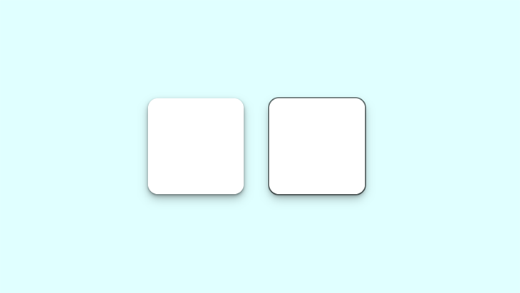
Notice the smooth subtle shadow on the left box. The box on the right shows the shadow border.
Now, let’s look at the box-shadow in a practical scenario. This property can be used on almost any element on a webpage, but the more common ones include the navbar, text cards, and images. It can also be added to input fields and buttons.
See the Pen Layered shadow Page by Oscar-Jite ( @oscar-jite ) on CodePen .
Build a simple webpage like the one shown in the demo, and try styling the box-shadow yourself!
Creating neon shadows
Real-life shadows are usually black or gray, with varying amounts of opacity. But what if shadows had colors?
In the real world, you get colored shadows by changing the color of the light source. There’s no “real” light source equivalent to change on a website, so you get this neon effect by changing the color value on box-shadow .
Let’s change the color on our first example:
This is the output:
See the Pen Neon Shadows by Oscar-Jite ( @oscar-jite ) on CodePen .
You can get a more vibrant glow by layering the shadows:
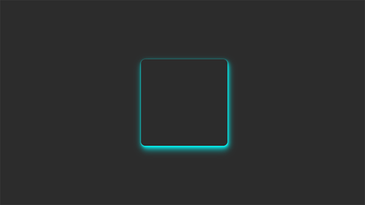
The best way to showcase colored shadows, especially neon ones, is on a dark-themed webpage. Dark themes are very popular and this shadow effect can complement it nicely if you use the right colors.
All the heavy lifting has been done in the previous examples, so let’s darken the earlier site demo and see the result:
See the Pen Neon Shadow Demo by Oscar-Jite ( @oscar-jite ) on CodePen .
It’s best to use colors that contrast well, as we’ve done in this demo. The blue box-shadow stands out well against the dark background. To make it brighter, you can increase the opacity.
Creating neumorphic shadows
This effect is unique and visually pleasing. It came from skeuomorphism , which tries to replicate objects exactly as they would appear in real life.
The first two effects we need to create deal with flat web components that seem to float above the page and cast shadows on the background. This effect makes these components look like they extrude from the page:
We can also place them on the inside of our object:

There are two box-shadows working opposite each other in the above example. The white box-shadow shows the direction of the light source and serves as a highlight. It’s similar to what we see in real life:
See the Pen Neumorphic Shadows by Oscar-Jite ( @oscar-jite ) on CodePen .
Neumorphic design mimics real-life objects. It doesn’t entirely replicate things, but it looks real enough that you could reach out and touch it. Now let’s create something cool: a push switch using a checkbox:
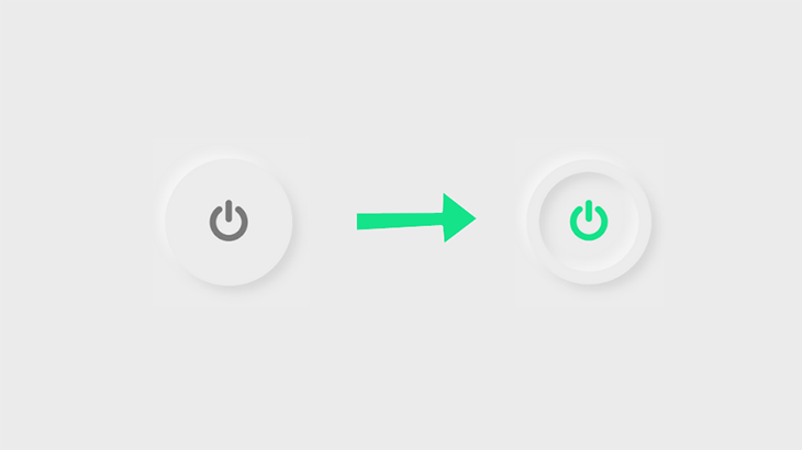
To get started, create a checkbox input:
Now, it’s time for the CSS:
Next, add the icon. I got this particular icon from Font Awesome . Link the CDN and copy the icon’s Unicode:
Set the properties for when the button is clicked. We’re adding box-shadow inside the circle, so that means creating two inset layers:
Finally, set the color of the icon after the click:
See the Pen Switch by Oscar-Jite ( @oscar-jite ) on CodePen .
CSS box-shadow generators
CSS box-shadow generators are online tools that aid with the creation and virtualization of CSS box-shadow effects. They can be useful to both beginners and experienced developers as they can help save time and effort when designing shadow effects.
There are many CSS box-shadow generators out there but here are a few popular options.
CSS Box Shadow Generator
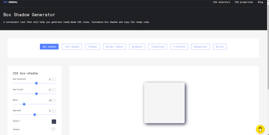
CSS Box Shadow Generator is an online CSS box-shadow generator that provides the ability to add more than one shadow, modify the shadow’s opacity, and define its spread radius. It also offers a real-time preview of the shadow effect so you can see the final result before copying the CSS code.
CSS Box Shadow Generator includes a variety of tools for generating CSS code for various elements such as box-shadow s, borders, gradients, and text-shadow s. It is easy to use even for people who are not familiar with CSS.
The generated CSS code is clean, efficient, and simple to understand, making it easy to integrate into projects. The tool is free and open source, allowing for contributions, and it is updated on a regular basis for continuous improvement.
Box Shadows
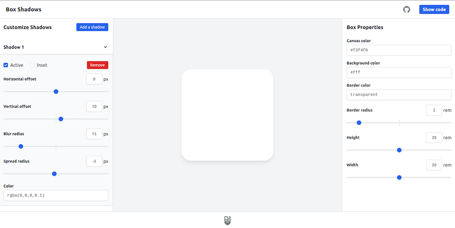
Box Shadows is a versatile tool that allows you to create complex and visually appealing box-shadow effects. It provides a wide range of features, including the ability to add multiple shadows, each with its own set of independent controls. Users can choose from a variety of shadow types, such as inset and outer, and fine-tune the offset, blur, spread, color, and opacity of the shadows.
Box Shadows ensures that the generated box shadows are compatible with a wide range of browsers and devices, providing a unified and visually appealing design across multiple platforms. It also has a live preview feature that lets developers preview and modify their shadow effects instantly.
Developers can easily create eye-catching box shadows that add depth and visual appeal to their web designs with Box Shadows’ user-friendly interface and extensive customization options. This tool makes it great for beginners and quick prototyping.
Neumorphism.io
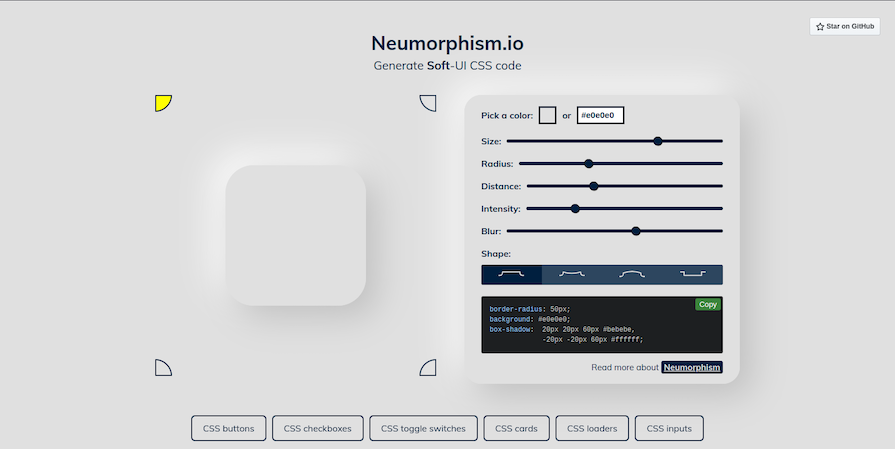
Neumorphism.io is a CSS code generator that assists in the generation of neumorphic design elements. Neumorphism is a relatively new design trend in which soft, pill-like shapes with subtle shadows are used to create a 3D effect without using any 3D elements. This can produce a sleek, modern style that is user-friendly and aesthetically pleasing.
Neumorphism.io is an easy-to-use tool for quickly generating CSS code for neumorphic buttons, cards, and other elements. You can change the size, color, depth, and intensity of your elements to create a unique look and feel. It also provides a live preview of your design, so you can see how your changes will look before you copy the CSS code.
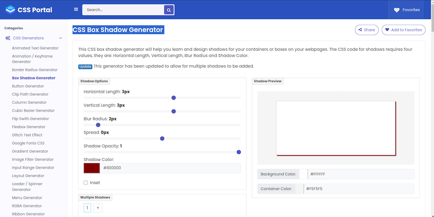
CSSPortal’ s CSS3 Box Shadow Generator is a straightforward and user-friendly tool that simplifies the creation of custom box shadows for web designs. It allows users to easily adjust parameters like shadow color, blur radius, spread distance, and box position without the need for manual coding, making it accessible to those with limited CSS knowledge.
Other online tools for designing shadows
- Adobe XD or Figma (web design tools): While not particularly dedicated to box-shadow generation, design tools such as Adobe XD or Figma include extensive web design features such as shadow effects. Designers frequently choose these tools to generate and customize not only box shadows but also other design components in a unified environment
- SmartShadow : This tool was created specifically for use with Sketch , a popular design software. It allows you to create box-shadow effects directly within Sketch and then it generates the corresponding CSS code for you
- Box Shadows for TailwindCSS : This is a free tool that was developed for the Tailwind CSS framework. It offers pre-built shadow classes for effortless box-shadow addition in Tailwind CSS projects. Additionally, it provides ready-made vanilla CSS box-shadow code that can be seamlessly integrated into your project
When deciding which online CSS box-shadow generator to use, consider your specific needs, the complexity of the design you’re working on, your CSS familiarity, and the level of customization you require.
Browser support for the CSS box-shadow property
It’s important to note that the box-shadow is not fully supported on all browsers , especially earlier versions, so it’s necessary to use the webKit extension when styling shadows:
If a browser doesn’t support shadows, they are just omitted from the webpage with no effect on the layout.
box-shadow best practices
The box-shadow property is a nice way to make your website look good, but it could easily ruin your project if it’s not used properly. Here are some tips to consider when styling shadows:
- Less is more : When layering shadows, the browser does more work. This might not be an issue on fast, modern devices, but you always have to consider users with older, slower devices or poor internet connections
- Be consistent : You can’t have your shadows looking haphazard! All your shadows should look similar because you should be using a single light source
- Use animations sparingly : A quick way to reduce performance is by animating box-shadow . Plus, this property already looks great on its own, so there’s really no need for animation. Animations can be a simple :hover to transition
- Use a shadow layering tool : If you don’t feel like writing multiple lines of code, there’s a great tool at shadows.brumm.af that can help you create layered shadows. It allows you to add as many as 10 box-shadow layers to your object, which saves time as you don’t have to enter multiple values to get the perfect shadow manually. Plus, you can get more intricate shadow values a bit more quickly:
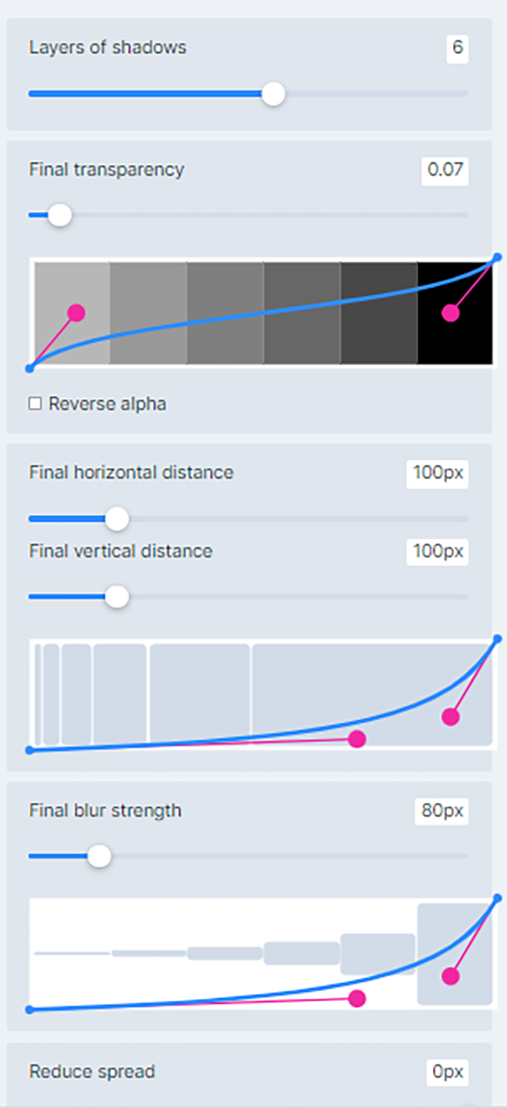
Set the properties, preview box-shadow , and copy and paste the code into your project and you’re set!
In this article, we looked at how to layer shadows and create neon shadows using the box-shadow CSS property. We also introduced a few CSS box-shadow generators that can be useful to both beginners and experienced developers by saving you time and effort when designing shadow effects.
Finally, we looked at how we can combine the box-shadow property with the text-shadow property to create well-rounded shadow effects to add depth to our webpage.
You’re well on your way to becoming a shadow expert! Practice makes perfect, so try styling some shadows yourself. See how many box-shadow layers you can add to an element. Try combining colors and see what works. Remember to test on as many devices as possible for optimal performance.
Is your frontend hogging your users' CPU?
As web frontends get increasingly complex, resource-greedy features demand more and more from the browser. If you’re interested in monitoring and tracking client-side CPU usage, memory usage, and more for all of your users in production, try LogRocket .

LogRocket is like a DVR for web and mobile apps, recording everything that happens in your web app, mobile app, or website. Instead of guessing why problems happen, you can aggregate and report on key frontend performance metrics, replay user sessions along with application state, log network requests, and automatically surface all errors.
Modernize how you debug web and mobile apps — start monitoring for free .
Share this:
- Click to share on Twitter (Opens in new window)
- Click to share on Reddit (Opens in new window)
- Click to share on LinkedIn (Opens in new window)
- Click to share on Facebook (Opens in new window)

Stop guessing about your digital experience with LogRocket
Recent posts:.

Implementing infinite scroll in Next.js with Server Actions
Infinite scrolling in Next.js no longer requires external libraries — Server Actions let us fetch initial data directly on the server.

Integrating Django templates with React for dynamic webpages
Create a dynamic demo blog site using Django and React to demonstrate Django’s server-side functionalities and React’s interactive UI.

Using aoi.js to build a bot on Discord
Explore how the aoi.js library makes it easy to create Discord bots with useful functionalities for frontend applications.

Web Components adoption guide: Overview, examples, and alternatives
Evaluate Web Components, a set of standards that allow you to create custom HTML tags for more reusable, manageable code.

One Reply to "Styling with the CSS box-shadow property"
Muito bom suas dicas, obrigado
Leave a Reply Cancel reply
Search code, repositories, users, issues, pull requests...
Provide feedback.
We read every piece of feedback, and take your input very seriously.
Saved searches
Use saved searches to filter your results more quickly.
To see all available qualifiers, see our documentation .
- Notifications
Have a question about this project? Sign up for a free GitHub account to open an issue and contact its maintainers and the community.
By clicking “Sign up for GitHub”, you agree to our terms of service and privacy statement . We’ll occasionally send you account related emails.
Already on GitHub? Sign in to your account
types: filter-function: drop-shadow() — Not actually supported well by Safari (very buggy) #17726
phoenixeliot commented Sep 7, 2022
- 👍 5 reactions
acswift commented Oct 6, 2022 • edited
Sorry, something went wrong.
Grady-Saccullo commented Oct 21, 2022
- 👍 16 reactions
e-simpson commented Jan 6, 2023 • edited
- 👍 10 reactions
robertmuehsig commented Jan 12, 2023
Jothsa commented Mar 4, 2023 • edited
- 👍 2 reactions
e-simpson commented Mar 4, 2023 • edited
Jothsa commented mar 4, 2023.
Frederick-88 commented Apr 13, 2023
- 😄 3 reactions
avivas89 commented Apr 14, 2023
Holms2009 commented May 18, 2023 • edited
- 👍 6 reactions
- 🚀 1 reaction
No branches or pull requests
Adding Shadows to SVG Icons With CSS and SVG Filters

Why would we need to apply shadows to SVG?
- Shadows are a common design feature that can help elements, like icons, stand out. They could be persistent, or applied in different states (e.g. :hover , :focus , or :active ) to indicate interaction to users.
- Shadows happen in real life, so they can be used on screens to breathe some life into your elements and add a touch of realism to a design .
Since we’re making lists, there are two primary ways we can apply shadows to an SVG:
- Using the CSS filter() property
- Using an SVG <filter>
Yes, both involve filters! And, yes, both CSS and SVG have their own types of filters. But there is some crossover between these as well. For example, a CSS filter can refer to an SVG <filter> ; that is, if we’re working with an inline SVG instead of, say, an SVG used as a background image in CSS.
What you can’t use: the CSS box-shadow property. This is commonly used for shadows, but it follows the rectangular outside edge of elements, not the edges of the SVG elements like we want. Here’s Michelle Barker with a clear explanation :

If you’re using an SVG icon font, though, there is always text-shadow . That will indeed work. But let’s focus on those first two as they’re in line with a majority of use cases.
Shadows with CSS filters
The trick to applying a shadow directly to SVG via CSS filters is the drop-shadow() function :
That will apply a shadow that starts at 3px horizontally, 5px down, with 2px of blur, and is 40% black. Here are some examples of that:
This browser support data is from Caniuse , which has more detail. A number indicates that browser supports the feature at that version and up.
Mobile / Tablet
Call an svg filter inside a css filter.
Say we have an SVG filter in the HTML:
We can use a CSS filter to call that SVG filter by ID instead of values we saw earlier:
Now that filter is taken from the HTML and referenced in the CSS, which applies it.
Using SVG filter primitives
You might be wondering how we got that SVG <filter> to work. To make a drop shadow with an SVG filter, we make use of a filter primitive . A filter primitive in SVG is an element that takes some sort of image or graphic as an input, then outputs that image or graphic it when it’s called. They sort of work like filters in a graphic editing application, but in code and can only be used inside an SVG <filter> element.
There are lots of different filter primitives in SVG. The one we’re reaching for is <feDropShadow> . I’ll let you guess what to does just by looking at the name.
So, similar to how we had something like this did this with a CSS filter:
…we can accomplish the same with the <feDropShadow> SVG filter primitive. There are three key attributes worth calling out as they help define the appearance of the drop shadow:
- dx — This shifts the position of the shadow along the x-axis.
- dy — This shifts the position of the shadow along the y-axis.
- stdDeviation — This defines the standard deviation for the drop shadow’s blur operation. There are other attributes we can use, such as the flood-color for setting the drop shadow color, and flood-opacity for setting the drop shadow’s opacity.
That example includes three <filter> elements, each with their own <feDropShadow> filter primitives.
Using SVG filters
SVG filters are very powerful. We just looked at <feDropShadow> , which is very useful of course, but there is so much more they can do (including Photoshop-like effects) and the subset of stuff we get just for shadows is extensive. Let’s look at some, like colored shadows and inset shadows.
Let’s take the SVG markup for the Twitter logo as an example :
We’re going to need a <filter> element to do these effects. This needs to be within an <svg> element in the HTML. A <filter> element is never rendered directly in the browser — it is only used as something that can be referenced via the filter attribute in SVG, or the url() function in CSS.
Here is the syntax showing an SVG filter and applying it to a source image :
The filter element is meant to hold filter primitives as children. It is a container to a series of filter operations that are combined to create a filter effects.
These filter primitive perform a single fundamental graphical operation (e.g. blurring, moving, filling, combining, or distorting) on one or more inputs. They are like building blocks where each SVG filter can be used to in conjunction with others to create an effect. <feGaussianBlur> is a popular filter primitive used to add a blur effect.
Let’s say we define the following SVG filter with <feGaussianBlur> :
When applied on an element, this filter creates a Gaussian blur that blurs the element on a 1px radius on the x-axis, but no blurring on the y-axis. Here’s the result, with and without the effect:
It is possible to use multiple primitives inside a single filter. This will create interesting effects, however, you need to make the different primitives aware of each other. Bence Szabó has a crazy cool set of patterns he created this way.
When combining multiple filter primitives, the first primitive uses the original graphic ( SourceGraphic ) as its graphic input. Any subsequent primitive uses the result of the filter effect before it as its input. And so on. But we can get some flexibility on that with using the in , in2 and result attributes on primitive elements. Steven Bradley has an excellent write-up on filter primitives that dates back to 2016, but still hold true today.
There are 17 primitives we can use today:
- <feGaussianBlur>
- <feDropShadow>
- <feMorphology>
- <feDisplacementMap>
- <feBlend>
- <feColorMatrix>
- <feConvolveMatrix>
- <feComponentTransfer>
- <feSpecularLighting>
- <feDiffuseLighting>
- <feFlood>
- <feTurbulence>
- <feImage>
- <feTile>
- <feOffset>
- <feComposite>
- <feMerge>
Notice the fe prefix on all of them. That stands for filter effect . Understanding SVG filters is challenging. An effect like an inset shadow requires a verbose syntax that is difficult to grasp without a thorough understanding of math and color theory. (Rob O’Leary’s “Getting Deep Into Shadows” is a good place to start.)
Rather than running down the rabbit hole of all that, we’re going to work with some pre-made filters. Fortunately, there are a lot of ready-to-use SVG filters around.
Inset shadows
To use filter effect on the Twitter logo, we need to declare it in our “SVG source document” with a unique ID for referencing in our <filter> tag.
There are four different primitives in there and each one performs a different function. But, taken together, they achieving an inset shadow.

Now that we’ve created this inset shadow filter, we can apply it to our SVG. We’ve already seen how to apply it via CSS. Something like:
We can also apply an SVG <filter> directly within the SVG syntax with the filter attribute. That’s like:
More examples
Here are some more shadow examples from Oleg Solomka:
Note that the basic shadows here are probably a bit more complicated than they need to be. For example, a colored shadow can still be done with <feDropShadow> like:
But that embossed effect is pretty great as a filter!
Also note that you might see SVG filters in SVG syntax like this:
On the first line there, that’s saying: this SVG shouldn’t render at all — it’s just stuff that we intend to use later. The <defs> tag says something similar: we’re just defining these things to use later. That way, we don’t have to repeat ourselves by writing things out over and again. We’ll reference the filter by ID, and the symbols as well, perhaps like:
SVG filters have wide support (even in Internet Explorer and Edge!) with very fast performance.
Wrapping things up
A final comparison:
- CSS filters are easier to use, but are much more limited. I don’t think it’s possible to add an inset shadow with the drop-shadow() function, for example.
- SVG filters are much more robust, but much more complicated as well, and require having the <filter> somewhere in the HTML.
- They both have great browser support and perform well on all modern browsers, though SVG filters have (surprisingly) the deepest browser support.
In this article, we have seen why and how to apply shadow to SVG icons with examples on each. Have you done this, but did it a different way than anything we looked at? Have you tried to do a shadow effect that you found impossible to pull off? Please share!
Why are you using rgb(0 0 0 / 0.4) instead of rbgba(0, 0, 0, .4) ?
Thx for reply.
It’s the new syntax for colors: https://www.w3.org/TR/css-color-4/#rgb-functions
Lets talk about performance. It’s unvise to use most of these usually in really life situations, and it’s extremely dangerous to overuse them. For example as I was scrolling through the article on my (high-end) phone, every time a demo appeared on my screen I started to lag while the graphics were visible.
In case you need to use these multiple times on multiple icons, it’s a no go.
I’d love to see some data or something here. I don’t doubt there are some concerns, but like… using a filter on a couple of icons on a page, that’s the one thing that’s causing a high-end phone to crawl? That’s wild. Anyone out there have deeper details here?
Thx, but what is a benefit against much worse browser support (rgb vs rgba)?
So I only noticed a slight hiccup at the heart (❤️) example (everytime I scrolled over or through it) and I’m running a midrange phone with Snapdragon 636, Android 10, viewing the page over Android Webview.
For the rest of the page though I didn’t notice any problems, then again this page is just for demonstrating different ways of using shadows and the CSS for it so I doubt recording a performance profile for this page is gonna give someone anything to infer from, also I don’t think any page could have such an insane amount of SVG icons with shadows and effects.
Although saying that I realise some profiling over old hardware might prove otherwise, but unless that data helps in increasing rendering performance for the browser, which isn’t really in front end Dev’s responsibility, it’s only to figure out the best way to go about it so that most browsers don’t have trouble with it, not work on the browser engine itself for increasing rendering performance.
Great! Thanks for this.
transitions and animations compatible?
Yes!… I think I implemented the hover effect with a little transition effect and it worked really well!
Is it possible to add shadow to a group of svg without merging them to one?
this looks like what i want for my neuromorphism project. Working on some animation to make it look like it’s “rising”, but I noticed that especially on pcs that aren’t as good as mine, css filters don’t look so smooth.
I could care less about internet explorer. It’s 2022 people.


IMAGES
VIDEO
COMMENTS
47. While using CSS3's box-shadow I am having an issue I do not usually have. The box shadow usually just bleeds over the div edges, but not on this one. box-shadow that is being cut off on the top and right hand side.. Heres the css I'm using for box-shadow: -moz-box-shadow: 0 0 5px #555; -webkit-box-shadow: 0 0 5px #555;
Home › Forums › CSS › Boxshadow being cut off in Safari. This topic is empty. Viewing 1 post (of 1 total) Author. Posts. January 19, 2018 at 8:37 am #265709. zethos. Participant. I am having issues with boxshadows being cut off in Safari, but fine in chrome. I have tried setting overflow to visible, but no luck.
The box-shadow property in CSS is for putting shadows on elements (sometimes referred to as "drop shadows", ala Photoshop/Figma). .card { box-shadow: 0 3px 10px rgb(0 0 0 / 0.2); } That syntax is: box-shadow: [horizontal offset] [vertical offset] [blur radius] [optional spread radius] [color]; The horizontal offset (required) of the shadow ...
My guess is that you will need to put the background image on both the left/right panel divs, but only show the left 50% of the image on the left panel and the right 50% of the image on the right panel. That way when they are together they create one full image and then can be pulled apart in the transition effect.
This means it can include any transparent areas. It differs from the box-shadow property, which applies shadows to the rectangle of the image's box: The code snippet below shows the distinction between these filters: box-shadow: 5px 5px 5px 0px rgba(0,0,0,0.3); filter: drop-shadow(5px 5px 5px rgba(0,0,0,0.3)); Getting started with box-shadow
But you can't use it directly on the element because the clip-path will cut it off as well. So you make a parent: ... You can't use box-shadow on that parent either, because the parent is still a rectangle and the shadow will look wrong. But you can use filter, and the shadow will follow the shape. See the Pen Shadow on Shape by Chris ...
Hello all,Are you frustrated by your attempts to add a box shadow to an element in your CSS code? In this video, we'll explore some common mistakes that can ...
Safari Bug: CSS Drop-Shadow (after element:hover) Issue. As seen in the attached image, something funny is happening in Safari after the elements—which include drop-shadow filters—have been hovered over. Again, I'm only seeing this occur in Safari. (FWIW: the second row seen in the screenshot example is just meant to demonstrate that the ...
In Safari, this shadow gets cut off at the edge of the <button> element and looks like this: . As you can see I tried -webkit-appearance: none and overflow: visible already. I've also found that this issue does not occur if I change the button to a div, but this is meant to be an interactive element so for accessibility reasons it's not a good idea.
box-shadow: 0 0 20px -150px black inset; If you put a large negative number for the spread-radius value, iOS will render the box with a vertical black bar, horizontally positioned depending on the ...
We are using "drop-shadow" as well and had a similar problem. I couldn't reproduce the above error, but we use the drop-shadow on some buttons and on iOS the shadow sometimes "stuck", even if the drop-shadow css rule was removed. Very strang - and even stranger: the transform-gpu-class fixed it. Thanks @e-simpson
Box shadow gets cutoff by parent div on safari. I have a problem with this box shadow on safari where it is cutoff by the tag & won't extend past it. Note: this problem is only on safari, all the other browsers are completely fine. Side note I have tried using position:relative with z-index and overflow:visible on all the parent elements and ...
Values. visible: content is not clipped when it proceeds outside its box.This is the default value of the property; hidden: overflowing content will be hidden.; scroll: similar to hidden except users will be able to scroll through the hidden content.; clip: content is clipped when it proceeds outside its box.This can be used with overflow-clip-margin to set the clipped area.
Safari shadow box, elephant shadow box svg, Africa shadowbox, 3D shadow box svg, africa stencil, africa laser files, safari paper cut. (18) $1.37. $3.42 (60% off)
Lion Art Lion Wall Décor Lion Frame Lion Shadow Box Lion Birthday Gift Lion Nursery Wall Art Flower Lion Toddler Room Décor Safari Décor. (79) $49.00. FREE shipping. Wildlife Safari Shadow Light Box Template SVG. Shadow Light Box Cricut Silhouette Cut File. (274) $1.38.
6. you haven't defined color here ( box-shadow: h-shadow v-shadow blur spread color inset;) <color> If not specified, the color used depends on the browser - it is usually the value of the color property, but note that Safari currently paints a transparent shadow in this case. so define color for safari.
After applying drop shadow effect, go to Filters-Filter editor dialog box.At the bottom of the dialog box there is Filter general settings tab for changing the co ordinates & dimensions. Adjust the value until you get a drop shadow following the path without any break. Image1-Drop shadow with default filter setting values
The drop shadows and the divs are one entity, so the shadows will overlap the div above or below it if div itself would had it moved over the same region. What you could try doing is setting all the divs' z-index to be equal. That might do it. You could also play with the css3 to get it to look like the shadows are blending with each other.
If I apply the shadow to the static element as svg {box-shadow: 0px 0px 0px 1px #5030FF;} it shows fine. Tried suggestions in the following threads but no luck. Ideally would like it to work with box-shadow, if the chance exists. Box-Shadow cut off in Safari; Safari cuts off box-shadow of element inside button
Check out our safari, elephant 3d shadow box selection for the very best in unique or custom, handmade pieces from our clip art & image files shops. ... Elephant Layered Paper Cut Safari Shadow Box, 3D Layered Christmas SVG Cricut Design Download PNG Transparent Printing Christmas Gift Design ... Turning off the personalized advertising setting ...
The trick to applying a shadow directly to SVG via CSS filters is the drop-shadow() function : svg { filter: drop-shadow(3px 5px 2px rgb(0 0 0 / 0.4)); } That will apply a shadow that starts at 3px horizontally, 5px down, with 2px of blur, and is 40% black. Here are some examples of that: HTML. SCSS.