Sarah Titus
15 years of serving others in the name of Christ
- browse by printable >
- hand lettering

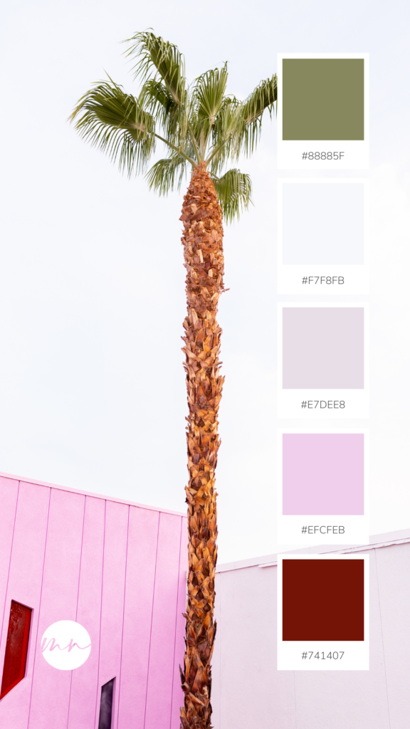
25 Best Travel Destinations Color Palettes
August 16, 2023
- Facebook 10
- Pinterest 33696
Who doesn’t like traveling?
Seriously, there’s nothing better than catching an airplane and just visiting new and exciting places around the world. I love all the things that traveling comes with. Food, nice hotels with huge pools, beautiful landscapes, and I could just go on and on.
There’s so much inspiration as well!
Do you remember a time where you just wanted to bring home a little part of your trip? I believe that all the history, people, and architecture make every single place on the planet MAGIC!
Ever since I started designing and creating tons of cool printables, I’ve been getting tons of inspiration from color palettes, but there are so many different things you can use color palettes for. Here are some examples …
Do you need to makeover a room in your house? Paint is the cheapest fix. And these palettes can help you find the color combinations for you wall, then coordinating colors for trim, curtains,your bedspread and more.
How about new pillows for your living room? Find the color closest to your current furniture color, and add in related colors for pops of bright colors to make your living room look freshly updated!
Do you want to learn to paint? These palettes are perfect. Try abstracts with swirls and designs in these colors that match, and hang them all over your house for a new look that won’t break the bank!
You can use the palettes suggestions for coordinating colors to determine your branding colors for your blog. You can use them to update the colors on your blog to give it a face-lift or to try something new. You can even use the color palettes on various graphic design websites to create eye catching designs in the brightest and newest colors. These new colors can draw people to your blog post graphics and into your blog with their fresh new feel.
You can even use the colors for scrapbooking and design new pages in the most up-to-date colors to make special events for your family. Or create wrapping paper for special days. Or greeting cards to match the paper.
The possibilities are ENDLESS!!
Here are 25 Best Travel Destinations Color Palettes for you to get ideas on how to mix and match colors for anything you need!
Wanna get your creative juices flowing even further? I’ve put together a binder with a TON of color palettes in the shop here . It’s a whopping 560 pages with inspiration from 20+ themes like seasons, holidays, abstract art, flowers, the sky, the ocean, sweet treats, and MORE!!! You’ll be buzzing with ideas! Get your color palettes binder here .
25 Best Travel Destinations Color Palettes
Planning a party, designing a printable, or just want to decorate your home?
Get tons of inspiration from these 25 Best Travel Destinations Color Palettes!
These complementary color scheme ideas are so gorgeous that will take your breath away.

- Atomic Steel Blue – #1A385A
- Seagull Blue – #769ABE
- Tomato Orange – #E46F44
- Pink Shell – #E8AA9B
- Plum Violet – #DCD5DC

- Deep Sky Blue – #0160D6
- Surf Blue – #00AAF8
- Orange Red – #F13B13
- Lawn Green – #AAB624
- Faint Gray – #F0ECE9

- Sherpa Blue – #034752
- Dark Salmon – #D47863
- Avocado Green – #64A803
- Summer Blue – #87DCF0
- Sirocco Gray – #6D7779

- Blue River – #2D79B3
- Cardinal Red – #D31E3D
- Daisy Yellow – #FCEA48
- Broccolini Green – #2A6D3A
- Light Wheat – #E7D3B0

- Murky Teal – #022831
- Blue Lagoon – #04566E
- Pastel Green – #689368
- Green Pear – #B4D330
- Blustery Blue – #D8DFE9

- Mystic Blue – #091D36
- Venice Blue – #0B4C84
- Danube Blue – #598EC2
- Blue Iris – #9BC1EE
- Gray Flash – #F0EFF5

- Green Turf – #136912
- Edamame Green – #34A426
- Faded Jade – #48817A
- Boston Blue – #3C8CA7
- Bold Denim – #1B59D0

- Wine Berry – #56202D
- Camelot Purple – #8E3A52
- Damask Orange – #D5603F
- Earth Green – #767E0F
- Frangipani Peach – #FFDEB1

- Blue Dusk – #18305C
- Cove Blue – #737DBB
- Amaranth Pink – #F083BA
- Plum Violet – #BD81BF
- Heliotrope Violet – #D4B8E9

- Elegant Blue – #031136
- Blue Bay – #434A90
- Orange Zest – #FF5903
- Watermelon Pink – #FD6B6C
- Lilac Lily – #C7A2CB

- Lotus Green – #317312
- Green Scallion – #6EBB2D
- Wafer Brown – #DED6C9
- Blue Isle – #24BAEC
- Capri Blue – #166EF3

- Dark Magic Blue – #222222
- Tamarillo Red – #891F11
- Orange Spray – #FE940A
- Lemon Pie – #FDE24D
- Empire Blue – #3A77C7

- Egyptian Blue – #043263
- Peacock Blue – #01AFD1
- Dodger Blue – #239EFE
- Malibu Blue – #7DBAFB
- Blue Daze – #DBE5FF

- Blue Dawn – #001A64
- Pink Hibiscus – #F13E51
- Light Apricot – #FDCDB6
- Pink Cupcake – #E08C9C
- Purple Hyacinth – #80558A

- Dark Cerulean Blue – #035181
- Plantation Green – #264C41
- Green Topiary – #75B459
- Cranberry Pink – #CA5C7F
- Vivid Violet – #C05AC8

- Air Force Blue – #364C75
- Monarch Red – #800B1B
- Romaine Green – #8ABC25
- Marzipan Yellow – #F8E195
- Spring Blue – #B7D1E0

- Deep Elderberry – #06031E
- Regal Purple – #38324E
- Biloba Flower – #AE9CC4
- Rose Bud – #F7A899
- Bold Orange – #FD632F

- Sangria Red – #941B13
- Terracotta Pink – #DB795E
- Swiss Gray – #DCD1CB
- Mink Lilac – #957A8D
- Purple Port – #622648

- Blackberry Purple – #57122E
- Prairie Brown – #AF6E5C
- Silver Sand – #BBBCB7
- Blue Pansy – #7BA5D5
- Woodland Green – #4E6932

- Fiesta Blue – #3CC2F5
- Twilight Gray – #C6CAC9
- Green Basil – #70AC62
- Flamenco Pink – #F65E87
- Sweetcorn Yellow – #FFDB70

- Blue Fountain – #50AAB3
- Burnt Sienna – #EE585A
- Yellow Glow – #F6D377
- Purple Foxglove – #A46A9D
- Lavender Gray – #BBBCD8

- Celadon Blue – #1B729D
- Green Caper – #B1D573
- Saffron Yellow – #EFCB59
- Dolly Pink – #FA9397
- Macadamia Brown – #D7C6AC

- Blue Nile – #0A3150
- Brick Red – #C52F21
- Golden Syrup – #E39D45
- Ash Gray – #BABCB7
- Jungle Green – #628D34

- Blue Vista – #6890CD
- Effervescent Lilac – #AFA8C9
- Olive Oil – #D9D54F
- Orange Persimmon – #FEA05A
- Arugula Green – #789F2A

- Green Spinach – #2D4C2A
- Safari Green – #5B8B1D
- Satin Gray – #B5AEA8
- Yellow Mousse – #FFDC82
- Medium Carmine – #B23931

Explore Ministries
Printables Shop Gifting Ministry Million Dollar Shop®
Calendars Daily Planner Binders Bible Studies Planner Pages Kids Activities Packs
My Story Shop Blog What We Believe Color Palettes Font Combos
Disclosure Terms of Use DMCA Policy Privacy Contact

9 Best Color Palettes For Travel Websites in 2023 (+ Examples)
By Kristie Parker
9 Travel Websites with Stellar Color Schemes
We’ve compiled a list of 9 travel agency websites that brilliantly use color to match their brand and make their content pop. We even included one from our own portfolio .
All of the examples include hex codes so you can use them as inspiration for your own website.
Pack Up & Go

Why We Like This Color Palette:
The standout orange brings a burst of energy, which fits perfectly with the brand’s spontaneous vibe. The clean white offers a fresh, open feel. The calming mint green paired with the deeper green balances things out, giving a sense of diverse landscapes and well-rounded adventures. All in all, it’s fun and adventurous, but still feels grounded – matching the brand perfectly.

The warm terracotta shade is instantly evocative of Italy’s rustic charm and sun-baked streets, pulling you into memories of quaint towns and Tuscan sunsets. The soft greys serve as a neutral backdrop, allowing that beautiful rustic color to truly shine. Then there’s the rich, earthy brown, which feels like a nod to Italy’s deep-rooted history. Combined with the clean white, it feels like a well-curated photo album – some highlights, some understated moments, but all undeniably Italian.

The primary olive green immediately connects with the essence of exploration and nature, perfectly aligning with the adventurous spirit of the brand. The softer shades of cream and muted beige evoke a sense of calm and sophistication. Paired with the deep forest green, it gives a rich, earthy feel, which speaks to Niarra’s commitment to impactful and meaningful travel. With a foundation of clean white, the palette collectively feels purposeful and fresh, mirroring the brand’s travel experiences.
Beyond the Square

The modern teal stands out, reflecting the contemporary pulse of NYC while nodding to this year’s popular color trend. Paired with a sophisticated gold, it infuses the palette with a touch of luxury, echoing the high-end experiences the city offers. The soft greys provide a calm backdrop. Together, these colors combine the urban sophistication of New York with the contemporary flair that draws travelers to the city.
Travel Local

The standout teal resonates with the idea of fresh adventures and new horizons, aligning with the brand’s emphasis on authentic experiences. The deep navy adds depth and trust, emphasizing the reliability of the local experts.
The soft, near-white hue offers a neutral background, allowing the bolder colors to pop. All together, these shades capture the essence of connecting with genuine, on-the-ground expertise while embarking on global travels.
420jamaica tours

The vibrant yellow, reminiscent of Jamaica’s sun-soaked beaches, partners well with the deep green, channeling the island’s lush landscapes and rich cannabis culture. The striking red injects energy, echoing the vibrant music scene.
Together, these colors not only capture the essence of the all-inclusive cannabis vacation tours but also subtly nod to the iconic Jamaican flag, grounding the brand in its roots. The palette perfectly balances relaxation, cultural immersion, and the unique ganja-themed experiences that 420jamaicatours promises.
This is actually one of our own designs. We created it for an amazing local travel agent. We’d love to design a visually appealing, client attracting website for you too, find out more about how to work with us .
Alpaca Your Bags

Why We Like This Palette:
The soft blush pink immediately resonates with romance, perfect for those looking to plan weddings and honeymoons. The different shades of muted blue convey intimate tropical beach intimate getaways. The clean white backdrop provides breathing space, much like the company’s approach to stress-free wedding planning.
Overall, the palette feels romantic yet clear-cut, aligning perfectly with the brand’s specialty in crafting memorable wedding and honeymoon experiences without the fuss.

The sophisticated gold hue speaks directly to luxury, giving an immediate sense of premium, bespoke travel experiences. The dark, grounding greys and blacks resonate with the brand’s depth and vast offerings, from Polar Regions to the South Pacific.
The light neutral provides a serene base, aligning with the travel agency’s commitment to responsible travel. Together, this palette perfectly balances luxury with responsibility, showcasing Jacada’s unique approach to travel.
The Concierge Group

The soft peach and blush tones scream romance and luxury, fitting for couples looking for that dreamy honeymoon getaway. The subtle aqua blue reminds us of pristine waters and tropical escapes, aligning perfectly with the luxurious overwater bungalows and beachfront stays mentioned. Altogether, the palette feels dreamy and upscale, encapsulating the promise of an unforgettable honeymoon journey.
The Impact of Color Choices on Travel Websites
After diving into these 9 travel agencies, we’ve seen how each palette, with its careful blend of neutrals and standout shades, can set the tone for a user’s experience.
Who doesn’t get honeymoon feels from Caribbean beach colors or get lost in the opulence of a luxury European vacation? Colors help get your website visitors excited for a trip before they’ve even packed their bags.
Want to see more color palette inspiration? Check out 7 Best Color Palettes for Therapy Websites in 2023 (+ Examples) , 9 Best Color Palettes for Accountant Websites , and 9 Best Color Palettes for Cleaning Service Websites.
Recent Posts
- When Will My New Website Show Up on Google? A Quick Guide
- How to Find a Color Code on a Website: Step-by-Step Guide for Non-Techies
- 9 Best Color Palettes For Accountant Websites in 2024 (+ Examples)
Privacy Overview

Discover the Best Practices for Color Scheme in Travel
Understanding the Importance of Color in Travel Branding
The psychology of color, evoking emotions and associations, enhancing brand recognition, analyzing successful travel brands' color schemes, airbnb's approach to color, the vibrancy of booking.com, expedia's colorful identity, choosing the right color palette for your travel brand, identifying your target audience, reflecting your brand's personality, considering cultural differences, tips for implementing your color scheme, consistency across platforms, balancing colors for readability, adapting to different media.
Welcome to the outrageously colorful world of travel branding! In this rib-tickling guide, we'll explore the importance of color in portraying your travel brand, examine the colorful wonders behind some successful travel brands, and learn how to select the perfect color palette for your own brand. So, buckle up and let's dive headfirst into this cornucopia of chromaticism!
Close your eyes and imagine a world without color. Boring, right? Now, open your eyes and get ready to be dazzled by the technicolor dream that is the importance of color in travel branding! Because, let's face it – color is the epitome of fun! And what's travel without fun?
Colors are no laughing matter when it comes to psychology – they have the power to conjure emotions, influence decisions, and even dabble in the dark arts of persuasion. As it turns out, those color-slinging wizards in the branding department know a thing or two about harnessing this power to create a strong, memorable brand.
Red, for instance, is known to incite passion and excitement, making it perfect for adventure travel brands. Blue, on the other hand, is associated with calmness and serenity, making it ideal for luxury travel brands. Green is linked to nature and sustainability, making it a great choice for eco-friendly travel brands. By carefully selecting the right color palette, your travel brand can evoke the desired emotions and associations in your audience.
Colors are quite the comedians, adept at stirring up a wealth of emotions with just a single hue! Emotions are what make travel experiences memorable, after all. Who could forget that hilarious bout of seasickness off the coast of Spain, or the adrenaline rush from bungee jumping in New Zealand?
For example, the color yellow is associated with happiness and optimism, making it a great choice for travel brands that focus on family-friendly vacations or romantic getaways. Orange is associated with excitement and adventure, making it a great choice for travel brands that offer outdoor activities like hiking, rafting, or rock climbing. By using the right colors in your branding, you can create a strong emotional connection with your audience and make your brand more memorable.
Ever heard of Coca-Cola, McDonald's, or Google? Of course, you have! These brands have become household names, partly due to their strategic use of color. Do you think we'd have been so smitten by Google if their logo was a repetitive grayscale spiral? Not a chance!
By selecting an unforgettable color scheme, your travel brand has the potential to join the ranks of these legendary chromatic pioneers. A strong and consistent use of color across all your branding materials, from your logo to your website to your social media profiles, can help enhance brand recognition and make your travel brand more memorable to potential customers.
In conclusion, the importance of color in travel branding cannot be overstated. By understanding the psychology of color, evoking the right emotions and associations, and enhancing brand recognition, your travel brand can create a powerful and memorable visual identity that resonates with your audience and sets you apart from the competition.
They say imitation is the sincerest form of flattery. Let's take a moment to gush over the color scheme triumphs of some well-known behemoths in the travel industry. These brands have become color-scheming maestros, so take notes, folks!
Airbnb’s heart-warming pinkish-red hue tugs at the heartstrings, evoking feelings of belonging, love, and security. And their masterstroke? Combining this rosy color with clean, crisp white to create a sense of trust and hygge. It's no wonder that Airbnb achieved global-scale success – who wouldn't want to feel like they belong in a cozy stranger's home?
And let's not forget their minimalistic color choices for their app and website, making them easy on the eyes and a breeze to navigate. Bravo, Airbnb, bravo!
Booking.com saunters onto the scene with its daring, zesty blue and yellow color scheme that screams, "Here's a travel brand who knows how to party!" It's like the life of the party who grabs you by the arm and leads you to the dance floor – endless fun and contagious energy.
Their vivacious color combination reflects the excitement of exploring new destinations, while also imbuing a sense of reliability – the perfect recipe for making you want to book that spontaneous vacation right this second.
Ah, Expedia. The brand that manages to be both buttoned-up and adventurous, all wrapped up in their distinct blue and yellow color palette. Their choice of blue instills a sense of trust and dependability – essential qualities in the travel industry – while the cheerful dashes of yellow convey a fun-seeking attitude that tempts would-be travelers to join the party.
Their clever concoction of colors caters to the needs and desires of their customers, and it's safe to say, they've truly hit the bullseye!
Now that we've swooned over the color choices of some industry giants, it's time to adorn your own travel brand in a dashing array of colors! Fear not, for the following tips will transform you into a veritable Picasso of the digital age.
First of all, who exactly are you aiming to impress with your colorful shenanigans? Millennials with their avocado toast and wanderlust dreams? Retirees seeking a luxurious cruise down memory lane? Identify your target audience, learn what makes them tick, and choose the colors that will leave them weak at the knees.
Every brand has its own personality – a dramatic flair, a hilarious sense of humor, or the uncanny ability to charm the socks off everyone they meet. What's yours? Envision your brand as a person and ask yourself, "What color suit would they wear?" Be true to your brand's persona and dress it accordingly!
Psst! Did you know that not all cultures interpret colors in the same way? A color that might prompt uproarious laughter in one country might be deeply offensive in another – and that's no laughing matter! When selecting your palette, consider your global audience and avoid falling into the trap of cultural insensitivity.
With your awe-inspiring color palette in hand, it's time to flaunt your travel brand's new look! Here are some clever tips to make sure your color choices leave a lasting impression on everyone who gazes upon them.
It might be tempting to go a little color crazy (we've all been there), but maintaining consistency across all platforms is essential for a strong brand identity. Whether it's your website, social media profiles, or marketing materials, make sure your colors are consistently applied and harmonious.
While your new color scheme might be a feast for the eyes, don't let it overshadow the essential ingredient – readability! An unreadable brand is about as enjoyable as a trip to the dentist. Strike the perfect balance between dazzling color and clear legibility, and your audience will thank you for it.
Don't forget that not all digital screens and print materials are created equal! Ensure your chosen colors translate well across various media, adjusting where necessary to maintain your brand's vibrant essence.
And there you have it, folks – a playful journey through the world of color in travel branding! Remember to stay true to your brand's personality, consider your audience, and have fun with it! Your travel brand's new color scheme will be leaving rainbow trails wherever it goes in no time.
Related Articles
The best practices for choosing a color scheme in finance.
- Understanding the Importance of Color in Finance
- The psychology of color in finance
- Color and branding in the financial industry
- Factors to Consider When...
Uncovering the Best Practices for Layout in Travel
- The Importance of a Well-Planned Travel Layout
- Enhancing the Travel Experience
- Streamlining Your Itinerary
- Reducing Stress and Overwhelm
- Key Elements of an...

7 Travel Inspired Color Palettes

Wish You Were Here
Curating my Wish You Were Here Print Collection has been such a fun experience for me. Most importantly, it brought me back outside – visiting new places and photographing scenes for fun. And, it has also re-ignited my desire to create (which is an unexpected happy by-product of this journey).
During one of those little creative bursts, I thought it would be fun to create color palettes that pull tones from some of the beautiful scenery I’ve come across so far.
Below, you’ll find 7 travel-inspired color palettes utilizing all kinds of fun bold colors for you to incorporate in your own designs.
SUMMER SANDS + COOL BLUES
This cool coastal palette is inspired by the Playa Hermosa, Costa Rica I Print. With refreshing, clean tones, this palette would be perfect for a welcoming entryway or a relaxing bedroom retreat.
Shop the print here: https://monikanormandphoto.com/products/playa-hermosa-costa-rica-i/

Kickin’ it old school: Orange and Green Color Palette
We’re bringing back the 70’s with this orange and clean greens color palette. This palette was inspired by the Kumquat Tree, Palm Springs Print, and we’re obsessed. This palette is for those who aren’t too shy to make a statement and commit to color. It would be a great fit for a bold living room or even a cheerful outdoor patio.
Shop the print here: https://monikanormandphoto.com/products/

THE ALL AMERICAN: RED AND BLUE COLOR PALETTE
We’re bringing you vibrant colors again with this one, but keeping the palette traditional! Inspired by the Downtown Dallas I Print, this palette is as timeless as a good cityscape photo. Perfect for a boy’s bedroom, or to make a statement in a traditional living room space.
Shop the print here: https://monikanormandphoto.com/products/downtown-dallas-i/

THE STAYCATION: BEACHY PEACH COLOR PALETTE
This palette is a fun one – warm peachy tan tones paired with soft greens and blues. Inspired by the Colony Palms I Print, this palette brings you poolside soothing tones perfect for your own home’s outdoor oasis or master bath.
Shop the print here: https://monikanormandphoto.com/products/the-colony-palms-i/

WARM SUMMER SUNSET: COASTAL COLOR PALETTE
Water/ocean inspired color palettes don’t always have to have cool tones – they can be warm and inviting too! This palette was inspired by the Humarock Beach, Massachusetts II Print, and it is both feminine and inviting. This palette is perfect for the beach house living room, creating a bedroom that feels like a vacation, or breathing life back into your master bath.
Shop the print here: https://monikanormandphoto.com/products/humarock-beach-massachusetts-ii/

SUNFLOWER YELLOW COLOR PALETTE
There’s no flower friendlier or brighter than a sunflower, and this palette is sure to brighten up your space. Inspired by the Sunflower Fields II Print, this palette incorporates a cool light blue, paired with inviting yellows and greens. This palette is a great out-of-your-comfort zone palette for those who typically prefer earthy, natural tones. This palette would be great again for outdoor living spaces as well as kitchen and dining areas.

Olive meet Grape: A Palm Springs Inspired Color Palette
This color palette is the last we’ll be sharing today but it’s easily the most interesting and unusual one. It’s often tough to pair green and purple in an adult, sophisticated way, but I think this palette does just that. Inspired by the Saguaro Palm Springs II Print, this palette is perfect for a sophisticated personality-packed master bedroom or a home office you actually want to work in.
Shop the print here: https://monikanormandphoto.com/products/saguaro-palm-springs-ii/
Shop the full Wish You Were Here Print Collection: https://monikanormandphoto.com/collections/print-collection/
- First Name *
- Last Name *
- What are you interested in booking? * Brand Photography Brand Videography Headshot Session Event Photography Mentorship / Coaching Other
- Email Address *
- Where are you located? *
- How did you hear about me? * Google Instagram Facebook Pinterest TikTok Referral Other
I typically reply to all inquiries within a few hours, but please allow 24 to 48 hours for a response. If you’d like to follow up, feel free to email me directly at [email protected] . Thank you!
Enjoy 2 months of free hosting with an annual WordPress plan. 30-day money-back guarantee.
26 Inspiring Website Color Schemes for Ecommerce, Landing Pages, And Personal Websites

When someone arrives for the first time on your website, color plays a significant role in what they think. Between 62-90% of consumers’ initial impression is based on color choices alone, research says .
Picking colors that match your brand — and what you want your consumers to think about your company and products — can be a powerful branding and marketing tool.
In this article, we’ll cover 25+ fantastic website color schemes for landing pages , ecommerce, and personal sites, and how you can pick your own without wasting time.
How to Pick Color Schemes For Your Website
The eyes of a non-color human adult can see over 1,000,000 distinct colors . How do you choose the right color scheme quickly and efficiently with all these options? That’s the challenge facing all web designers trying to create a color scheme or palette for their design from scratch.
With that many choices, you can’t evaluate all the shades and hues individually and pick the most suitable ones without a reference point. You need to narrow down your options. The best way to start is by finding a primary color as your starting point.
Perhaps the best way to do this is to look at the most popular choices by industry. It can help you learn something about the psychology of color and what primary colors might work well for your company or product.
Color Choices By Industry
Different companies and products choose different colors to identify their brand. But why? Color isn’t just a more efficient way to grab the attention of your prospects and consumers. It’s a way to communicate with them on an emotional, almost subconscious level.
In a sense, it’s a way to start building your brand in the mind of the consumer before using a single word or sentence of copy . No color tells the same story to the consumer, so the most popular primary brand colors depend from industry to industry.

What emotion do you want potential customers to associate with your brand, product, or service?
That’s the guiding question that should help you identify your primary color for your palette.
Blue Conveys:

In industries where consumer trust is more important than any other factor, and professionalism and reliability are key selling points, blue is often used as a primary branding color.
It doesn’t appeal to spontaneity or emotion. Instead, it initiates a calm and logical decision-making process.
Most common in the following industries:
- Communications
- Consumer Finance
- Electric Utilities
- Heavy Equipment
- Home Improvement
- Pharmaceuticals
Red Conveys:

Industries that rely on emotions and impulsive decisions (like restaurants and fast food), often use red as a primary color. Red is thought to stimulate hunger, so it’s a favorite choice among international food brands.
- Restaurants
- Food retail
- Real estate
Green Conveys:

Most people associate the color green with nature, plants, and vibrant, restorative environments. Industries that rely on a promise of better well-being or products with all-natural ingredients, often choose green.
- Food & beverage
- Department stores
Black: Confidence, Sophistication
While some companies might default to black instead of making a dedicated color choice, as it feels safe, it’s also a leading choice in industries where the consumer’s confidence or sophistication is a key factor.
- Accessories
- Internet & mobile service providers
Don’t blindly follow your taste and instincts, consider color theory and color psychology when you make your decision.
How Many Color Schemes Should be Used on a Single Website?
For a standard website color scheme, you might single out anywhere from three to seven separate colors in a single scheme or palette.
But how many different color schemes should you use on a single website?
That depends on the individual circumstances and your goals with your website. If your website is a company website or blog dedicated to a single brand, product, or company, you want to stick to a single color scheme.
On the other hand, if your website is an ecommerce store , you can use different color schemes for different product schemes to evoke different emotional reactions for different product categories.
The problem with using multiple palettes is that you will complicate things for any internal or external content creators, increasing the chance for human error and complications.
When you pick a color scheme for your website, it’s essential to avoid going overboard and spending weeks on the task. It’s an important choice, for sure, but choosing the right colors will not help you drive traffic to your website or boost conversions on your product pages by itself.
How to Get the Exact Color Schemes On a Website

To identify every color used on a website, down to the exact shade and hex code, you can use a Google Chrome extension or Firefox addon like ColorZilla .
With ColorZilla installed, you can simply hover your pointer directly over any design element on any site, logo, or image , and it will show you the exact HTML hex or RGB color codes for that pixel. If you don’t want to identify the colors used one by one, you can also use a color palette generator that will use an image, like Colormind’s image color extraction tool .
However, it’s not as perfect a solution as it might seem. You have to take a screenshot of the website and upload it and the generated palette won’t necessarily be 100% accurate to the actual shades used in the design. For example, if the website includes a gradient or a picture with colors beyond the main color scheme, the generated palette tends to be inaccurate.
So for now, the best way to identify the exact colors used in web design is still to use a color identifying plugin or extension, or taking a screenshot and doing things manually in a photo editing tool like PhotoShop.
What Website Color Scheme Are We Using at Kinsta?
Like most websites, we at Kinsta follow a basic 3-color or triadic scheme for all our content. Since we are a hosting company focused on WordPress , there’s no need for us to implement multiple palettes throughout our website .

We use a dark purple (#5333ed) as our primary color, turquoise (#2cd4d9) to juxtapose and create catching, yet balanced gradients, and a subdued grey for text (#6E7076).
But what other companies are doing?
Let’s find out!
26 Best Website Color Scheme Examples
We’ve scoured the web for great examples of color schemes and even separated the sites by category, so it will be easy for you to find inspiration from relevant websites.
Great Ecommerce Website Color Schemes
Below we’ll cover excellent ecommerce examples of color schemes that match their brand and industry.
1. Skin Care Product: Bright & Playful

Bliss ’ choice of colors is on point when it comes to its brand. The colors are bright and playful, perfectly accompanying the company’s message of body positivity and inner happiness.
2. Clothing Brand: Clear and Concise

Le Bonnet is a clothing company that focuses on clarity when it comes to the color palette of its website. A few, intense colors, along with an opaque beige background color to separate products, help elevate the simplicity of the design.
3. Apparel Store: Simplicity

Revise Concept is a clothing brand site, and instead of relying on colors in the website color palette, it uses simple colors and white space to highlight the colors and designs of the clothes themselves.
This approach can be an excellent alternative for ecommerce sites that want to let the product speak for itself, rather than creating a punchy design to tell the story.
4. Tableware: Reliability and professionalism

My Tableware is a German ecommerce site for customizable tableware and dishes.
The site uses a simple color scheme of dark blue, light brown, and grey to convey a sense of professionalism and reliability, with notes of sophistication.
5. Gum: Natural and Impulsive

Neuro is a brand of caffeine gum and mints, designed to help people focus. It uses a mix of softer colors like turquoise, light blue, and beige, to instill a sense of natural ingredients.
There’s also an appeal to emotion and impulse decisions with red and orange, excellent use of accent color.
6. Watch: Sophistication and Luxury

Prime Ambassador is a Swedish brand of timepieces, with a classy ecommerce site designed to highlight the products. The color combinations of an almost golden light brown hue on a dark grey background and wooden accents in the picture bring a sense of sophistication and luxury to the visitor.
The colors are perfect for promoting a high-end product like a bespoke watch but would feel out of place if you were selling regular consumer goods.
7. Pants: Creative & Accessible

Alday is a brand of comfort-first pants designed to fit better than the mass-produced jeans and chinos sold at lower price points.
The website is creative and playful, with vibrant color combinations that make it feel accessible to the visitor and potential customers.
8. Fruit snacks: Elegant and accentuating colors

Madies is a line of freeze-dried fruit snacks, aimed at a more fashion-conscious consumer than brandless dried fruits sold by bulk.
The black background and the yellow personification of ripe mango accentuate the simplicity of the design, leading to an elegant final product.
9. Custom Fit Denim: It’s Alive

Unspun uses bright red and orange to bring the website to life. Perfect for communicating with an audience that leads an active and vibrant lifestyle.
Personal and Travel Website Color Schemes
Below, you can find our selection of the best examples of website color schemes for personal and travel websites.
10. Creative Simplicity

Madeleine Dalla is a New York-based photographer with a keen sense for website design (and an impressive portfolio ).
By leaving color out of the equation for the rest of the design, she really highlights the vivid colors of her hand-picked featured photos from each of her highlighted projects. She uses the absence of color as much as the colors themselves.
11. Grayscale with a Splash

12. One with Nature

iFly 50 is an online magazine released by KLM to celebrate its 50th anniversary.
By highlighting the blues of the sky and water, and the green grass and forest, it makes any visitor feel at one with nature — perfect approach for any nature or scenic photographer’s website.
13. Clean & Professional

Benediktas Gylys ’s site is a masterclass in clean design. There is no clutter and that also goes for color choices.
The primary purple color highlights professionalism, and while there are only a few colors, they all serve to highlight the critical elements, the illustrations.
14. Pragmatic Colors

BucketListly uses colors pragmatically, using the yellow to highlight keywords, CTAs, and countries visited so far.
It shows how much value you can get from a single color in a design when you use it in conjunction with white space and the right concepts.
15. Elegant simplicity

Lars Franzen ’s site’s featured image uses a dark background color to bring out the color and individuality of the people in the portrait.
16. Futuristic overlay

Dot Lung ’s personal site does a great job of maximizing the simple color palette with overlays and clean background graphics. The purple in the background creates a cohesive experience from page to page to page.
17. Light and dark

Love for Iceland is a great example of how the colors in a highlighted picture can set the mood. With the bright blue of clear ice, lit by sunlight, in the top left, to the cave-like darkness at the bottom, it sets an ominous and adventurous mood for the visitor.
Landing Page Color Schemes
Below we’ve highlighted different landing pages with unique or effective color schemes.
18. Sharp contrasts

Zenly uses sharply contrasting colors to highlight the actual functionality of the live map app (btw, this how you embed Google Maps on WordPress sites ). The backdrop of space makes the globular app design stand out and makes it take on a futuristic flavor.
19. Color to highlight

Slack uses a tried-and-true landing page color scheme tactic, where colors are mostly used to highlight important calls to action and other essential elements. For a landing page, you don’t have to overcomplicate the design, and that also applies to colors.
Make sure to check out our Microsoft Teams vs Slack in-depth comparison.
20. Vibrant colors spark emotions

Spotify uses vibrant colors to spark emotions in an audience on its exceedingly simple new landing page. The colors tell more of a story than the subheadline before the CTA button. Check out our guide if you’re thinking about launching a podcast soon .
21. Color contrasts create order in the chaos

Autonomy uses colors and contrast to create order in an otherwise chaotic, animated design. The vibrant yellow cuts through and separates itself from the background and other objects.
22. Futuristic color ensemble

Bugsnag uses a varied collection of colors to impart a futuristic, high-tech feeling with its flat design. The combination of colors and shapes makes the visitor feel like they can trust that the company is at the forefront.
23. Alive with color

Connect Homes ’ landing page comes alive with bright yet mellow colors. The color palette strikes an exciting balance that conveys a modern feel.
24. Conservative colors, playful design

Plink ’s landing page is based on a relatively conservative shade of dark blue but balances it out with a playful and fun animation and design in general.
25. Natural vitality

Travelshift relies heavily on the color green to convey a sense of nature and vitality. Instead of highlighting CTAs or key content with an attention-grabbing color like red or orange, the green functions as a promise of rejuvenation instead.
26. Bright colors of hope

Swab the World uses a color scheme of bright, contrasting colors to convey a sense of hope. That’s a perfect match for the landing page of a nonprofit organization . The color clash works with the shapes to highlight the modern/futuristic approach they use to tackle the challenge.
Website Color Scheme Generators
If you don’t want to manually pick out adjacent colors, gradients, or shades for your scheme or palette, you can use online tools to help. There are a number of free color schemes or palette generators available online. We will take a closer look at some of the best options below.

Colormind is an AI-powered color generator that you can use to generate colors for websites, templates, and more instantly. The only issue is that you can’t set a primary color to extrapolate a palette from, you have to randomly generate it every time. It can also extract color palettes from any image you want.

Coolors.co is a web and mobile app that helps you generate palettes from scratch. It has shade alternatives for each color option and other advanced tools that help you make efficient decisions about your color schemes.

Instead of generating random schemes, Paletton gives you full control over your palette and which color you want to use as your base/primary color. You can choose the type of palette you want, whether adjacent colors, a triadic color scheme, or others. You can select any color from the color wheel.

ColorSpace generates color palettes based on a primary color that you input. It offers a wide variety of style options that give you more flexibility.
Color Blindness: How to Pick a Colorblind-Friendly Palette for Your Website
The last thing to consider when creating a website color scheme is how different people will see the colors.

Not everyone sees the “standard” range of colors. There are three different main types of color blindness : deuteranopia, protanopia, and tritanopia.
Red-green color blindness (deuteranopia and protanopia) is the most common form of color blindness. It affects around 1 in 12 of Northern European descent. With such a large number of the population affected by it, it’s worth considering when designing and/choosing a WordPress theme .
Blue-yellow color blindness is much rarer and affects men and women equally.
How to Pick a Colorblind-Friendly Palette for Your Website
Since the number of red-green colorblind people is much higher than any other form of color blindness, it should be your number one priority to address with your design. Because they can’t separate red, green, and purple, but rather see them as different hues of yellow and blue, you want to avoid using contrasting colors that will end up looking too similar.
- Don’t contrast green with yellow or vice versa.
- Don’t contrast yellow with red or orange.
- Don’t contrast purple with similar shades of blue.
When choosing standalone primary colors for your logo or design, you should consider whether it is still on-brand for consumers who are color blind. For example, Kinsta’s purple is still a dark blue to red-green colorblind consumers, conveying a message of reliability and trustworthiness. For us, that’s 100% on-brand, so there is no potential conflict in the mind of our prospects.
The human eye might be capable of separating millions of different shades of color, but you don’t have to comb through all your options to find a color scheme that works for your site.
By focusing on your brand and your ideal customers, you can narrow down your choices of primary colors. Once you have your choices, you can rely on online palette generators to complete your own color palette, or choose matching colors based on examples and preference.
With the right approach, creating a website color scheme that could be used as a starting point of your design process can be achieved, although hiring the right web developer/designer is oftentimes required if you’d like to get the right professional look and feel your brand needs.
Now, it’s time to choose the fonts , isn’t it?

Head of Content at Kinsta and Content Marketing Consultant for WordPress plugin developers. Connect with Matteo on Twitter .
Related Articles and Topics

Web Design Best Practices For Your Next Website Project

9 High-Converting WordPress Landing Page Plugins to Increase Sales
- Digital Marketing
- Application Development
Leave a Reply Cancel reply
By submitting this form: You agree to the processing of the submitted personal data in accordance with Kinsta's Privacy Policy , including the transfer of data to the United States.
You also agree to receive information from Kinsta related to our services, events, and promotions. You may unsubscribe at any time by following the instructions in the communications received.
25 Ways to Mix and Match Outfits Using Just 8 Travel Essentials
Capsule Travel Wardrobe , FASHION , Travel Outfits

Support TFG by using the links in our articles to shop. We receive a small commission (at no extra cost to you) so we can continue to create helpful free content. We earn from qualifying purchases made to the featured retailers. Thank you, we appreciate your support!
Many travelers choose to pack light with a carry-on size backpack and minimal travel clothes. This travel outfit style-mix shows you how to mix and match the 8 Piece Travel Essentials Packing List .
Travel Essentials Packing List: Style-Mix

25 style ideas to mix and match with just 8 pieces of women’s travel clothing!
Leggings are a great multi-purpose item to add to your travel capsule wardrobe ! You can use them for added warmth, as pants, or pajamas. A basic set of black leggings is wearable with anything! Choose a thin, microfiber type fabric and even the cheapest leggings will practically come out dry from the washing machine. Ideal!
These are the most recommended, best leggings for women who travel.

If you only pack one dress, make it a little black travel dress. You can top it with a tank or cover it up with a button-down top. Style it up for a night out or make it casual for the day. Every girl should pack at least one dress as part of her backpacking clothing!
Check out our top choices for convertible travel dresses .

Whether you choose a flirty mini like this one or a more flowy and relaxed style, a plain black skirt is a good alternative if you want to pack light and still have the option to wear a dress once in a while.
Choose a basic black skirt and pair it with a black top to make a Little Black Travel Dress!
Tip: Want to pack light, find out how packing cubes can maximize the space in your bag here !

Shorts are another travel essential if you’re traveling to warmer climates. Whether you choose to bring denim shorts, capri length pants, or dressy shorts, they’re very versatile can go days without a washing.
If you choose the shorter length like shown above, wear leggings in more conservative areas.
Dressier options like the ones shown in this Europe packing list work well for Europe.

Many girls hate convertible pants for women and would much rather travel with jeans ( these are the best ones). However, you should include a comfortable set of pants that can double as active pants in your travel wardrobe.
While some women like to wear leggings on active adventures certain styles of cargo pants can also be cute. The best thing is the fabric–it can go forever without washing or looking dirty!
These are the best travel pants for women . Find out why!
Need help creating a capsule wardrobe ?
Savvy travelers know that a capsule wardrobe is the secret to traveling carry-on only. Pack Light Stylishly is our eBook that shows you exactly how to make a functional yet stylish capsule wardrobe for travel.
Learn more about Pack Light Stylishly here !
For more tips on travel outfits, please read:
- 8 Travel Capsule Wardrobes for Any Trip
- Most Cute and Comfortable Travel Shoes
- How to Pack Carryon Every Single Time
- Free Printable Vacation Checklist
LIKED THIS POST? PIN THIS PIC TO SAVE IT!

I hope this post gives you some ideas about how to mix and match your travel outfits. Please share this with your friends on Facebook, Twitter, or Pinterest. Thanks for reading!
45 comments.

We are going on a 21 day transatlantic cruise to Rome. From there we will do Tuscany for a week and then two weeks in Croatia. I understand the capsule, but I’m struggling with how to prepare for cruise and land travel, since you usually have to have a few dress clothes/shoes for the cruise. Any suggestions? Thought about once we got off the cruise, shipping some of our closes home that we won’t need to Italy & Croatia.

Hi Sherrie, thank you for reaching out! ?
A good place to start is to take a look TFG’s signature packing lists for ideas for a capsule wardrobe and how many clothing items you can pack for your trip: https://www.travelfashiongirl.com/functional-and-fashion-packing-list/ The packing lists show you how to pack light and have the right clothes no matter the destination or the length of the journey! Then depending on your preferences you can choose more bottoms, less dresses, more tops – you have the ability to adjust the combination based on your needs.
For tips to help you adapt your packing list for your trip, check out this guide for Italy: https://www.travelfashiongirl.com/what-to-wear-in-italy-dress-like-a-local/
And for your cruise: https://www.travelfashiongirl.com/what-to-pack-for-a-transatlantic-cruise/
I would also highly recommend that you join our TFG facebook group and post any questions you have there: https://www.facebook.com/groups/travelfashiongirls/ It’s a fabulous community of helpful female travelers that love to share their awesome advice and feedback.
Hope this helps you with your packing. Have the most incredible time on your travels! ?

Where is the hat from.

Traveling to Spain and Italy for 11 days and want to travel light and only pack in a carry on. With the mix and match outfits I’m assuming you wear them several times without washing them. Is there anything to use to keep clothing item smelling fresh? I know odd question but just thought I would ask. This is going to be my first travel experience.

Hi Alee, it’s actually a great question. Yes you would rewear some clothing but you can also do laundry half way through your trip if needed. Here are a few other tips:
1) hang up your clothing after wearing it to let it air out 2) spritz a bit of febreze of needed 3) stick a fabric softener sheet inside your luggage 4) choose fabrics that don’t absorb sweat and scents 5) pack more tops and less bottoms because it’s easier to rewear bottoms without washing 6) if traveling in the summer, take dresses!
Depending on the time of year you’re traveling, you could take 3 bottoms + 7 tops and only rewear 4 of the tops or just wash them by hand after a week. Choose easy to wash fabrics.
If you’re only spending on or two nights in each city and doing laundry on the go is difficult:
– For cold weather travel, wear merino wool thermals under everything – they can be worn for days and won’t absorb scents so you’ll only need one or two pairs. Since they’re closest to you skin you won’t need to wash the rest of your clothing. – For hot weather travel, clothing is lighter so you can pack 3-4 bottoms and 11 tops and not do any laundry at all. That’s the Maximista size capsule wardrobe and should still fit into a carry-on with packing cubes.
Hope this helps 🙂

Hi Alex. Where’d you get the striped tank & white sleeveless blouse?
Hi Darlene, to be honest this post is a couple years old now so I don’t really know. I’m sorry about that!

Hi! I’m a nannie traveling to northern Michigan with their family for almost two months of the summer and I need to keep my stuff confined to 1 suitcase. Any tips? Thanks!
Hi Emma, these tips are a great place to start:
https://travelfashiongirl.com/learn-the-secret-to-packing-light-in-60-minutes/ https://www.travelfashiongirl.com/packing-cubes-video-tutorial-learn-how-to-pack-light/ https://travelfashiongirl.com/category/packing-2/packing-tips/
I’ve also posted your question on the Facebook page so stop by and keep an eye out for replies: https://www.facebook.com/TravelFashionGirl

Hi Alex- Where is that navy button up from?
Hi Jo, I think it was H&M. Thanks for reading!

Leaving for Italy the end of January for a couple weeks. Only taking one medium//large suitcase as once we get there as we will be traveling by train. I know the weather is similar to the northwestern US which is where I live. I could use help for practical dress and packing more effectively. Especially for shoes/ boots.Thanks in advance. Love your website!

Hi Shellyb – thanks for your comment! You might find this article helpful: https://travelfashiongirl.com/what-to-wear-in-italy-from-a-locals-point-of-view/ .
I’ll post your question on TFG’s Facebook page to get more feedback from other travelers: https://www.facebook.com/TravelFashionGirl
Also, you might want browse the existing questions about Italy on Facebook as you’ll great tips as well.
Thanks again for reading 🙂

I’m doing 2 months in SEA next spring and have a gazillion clothes I barely wear that are basically brand new. What’s that Pareto rule – we use 20% of the things we have 80% of the time. So I’m researching my buns off to learn how to mix and match clothing to get different outfits (I’m also terrible at matching so this is certainly a challenge!). Great article, thanks for the tips! :o)
Don’t worry – Southeast Asia is super easy to pack for. This might help: https://travelfashiongirl.com/what-to-pack-backpacking-south-east-asia-holidays/

OK I totally need help before my family accuses me of committing another atrocious OVER PACKING CRIME LMAO! We are going to Miami/Orlando for Thanksgiving week – 8 days. We will be going for a somewhat family vacation, daughter’s competitive event, enjoy a football game, Sea World, Magic Kingdom – the works – have fun, nothing crazy. What would you recommend I pack…I am really torn b/c the weather is really in between its not HOT but it’s not COLD either…any help/recommendations for outfits please!! I am very known in the family to over pack like crazy and not wear half of what I pack, not to mention shoe wise I always go overboard LOL I always want to bring my entire closet for the what ifs. Avg temp is low 50’s and highs in the mid 70’s. Mornings and nights can be chilling and the afternoons warm. It also has a tendency to rain unexpectedly in FL. And I am planning on working out so workout gear is a MUST. PLEASE HELP and help me amaze my family during this trip 😉
I hope you got this list because I had you in mind when I created it: https://travelfashiongirl.com/one-bag-travel-how-to-pack-for-a-weekend-trip/ and https://travelfashiongirl.com/thanksgiving-packing-list-10-piece-capsule-wardrobe-for-3-5-day-trip/

I have struggled with finding the right packing cubes. Do you have a recommendation for how to choose the best ones for a particular suitcase? Should I start by measuring my suitcase & then selecting cubes that fit that space?
Hi Marie, this article is going to tell you everything you want to know about packing cubes: how to use them (with video), the best ones to use, where to buy them, the best ways to pack using them, and if they’re worth it. Hope it helps!
https://www.travelfashiongirl.com/packing-cubes-video-tutorial-learn-how-to-pack-light/

Hope you enjoy your trip! But how could you survive with the lowest temp. being 50 and the highest temp. being 70?!?!
Its hard enough with 30! XD
Hi Emma, this guide will help you pack for mixed weather: https://travelfashiongirl.com/10-step-packing-guides/10-step-guide-to-packing-for-different-climates/

Hi, I will going to Texas next week for a 10 days trip. Im an islander, so I’m not comfortable with cold. The weather must be around 64 degrees. I had never experience that kind of weather before, I’m going crazy thinking about what to wear. It’s going to be a special trip, I’m going to meet up with my bf and celebrate my bday. Help me out, please!!
Hi Vanessa, thanks for your comment! I have posted your question on our Facebook page to see if we can get a wider range of feedback from you from other travelers: https://www.facebook.com/TravelFashionGirl . Thanks!

Hey alex, Where did you find the black dress pictured?

Thank you for the travel fashion inspiration! I’m a notorious over packer and hoping to be better with your help on our upcoming European vacation!!

I am traveling to Mexico city next week. I read that shorts and thight clothes are not ok. I was taking leggins as is the rainy season, but now I am having second thoughts. Help please!
Hi Lety, thanks for your comment! Mexico city is a very modern city and you’ll see many local fashionistas and hipsters. The Condesa and Roma areas in particular will leave you wishing you brought your coolest clothes from home.
You can most definitely wear leggings and skinny jeans/jeggings. I think when it says to avoid anything tight, think more along the lines of a clothing item that is overly fitted in your rear or bust area 😉
Shorts are actually ok however if they’re very short you’re rolling solo in some areas you may receive unwanted looks. Obviously shorts that are very short and revealing are never a good idea. I’d pack a pair if I were you, feel out the vibe and worse case, wear them over your leggings! The best way to wear shorts is to balance them out with a longer sleeve top 😉
Any of these looks work in Mexico City (except Escondido): https://travelfashiongirl.com/what-to-pack-for-mexico/
Hope this helps! Mexico City is an AWESOME city 😉

Oh my! I have been googling and imaging minimalist wardrobe all day. Bonzai!! I am not going to “keep”, “toss” “donate”… i am going to toss my entire closet and going on a quest for these oh so versatile pieces. Heck, in my walk in closet of over 100 items, of which I wear maybe 10… This will be so awesome!
That’s so great to hear 🙂 I’m happy this helps! It’s really helped me to let go of the hundreds of the clothing items I was hoarding in my storage.
Check out the latest packing list ensembles: https://travelfashiongirl.com/functional-and-fashion-packing-list/

Thank you so much for this, I am terrible at mixing and matching so this gives me some great ideas 🙂 Anyway that you could tell me where you found that dress? It would be perfect for my upcoming trip to europe 🙂
Hi Jane, glad you enjoyed this list 🙂 The dress has been sold out for some time but it was from crumpetengland.com. Check out modcloth.com for great dress options found in my new packing lists: https://travelfashiongirl.com/functional-and-fashion-packing-list/
Thanks for reading 🙂
thanks Alex!

Where do you find leggings that fit? The ones I’ve tried always stretch out in the crotch making me feel like I’m a duck waddling along. I never wear leggings alone but can’t imaging the waddle with a cute pair of shorts or a shorter skirt.
Hi Katara, the trick is to wear leggings with tunics so you have a bit of extra coverage in all the right places 😉 Alternatively, you can find leggings that are “legging” type material but have a more structured pant style cut that won’t result in the stretched out crotch which is the crappy part of leggings.
check out this post on Tunics 🙂 https://travelfashiongirl.com/travel-wardrobe-essentials-womens-tunics/

I have been looking all over for cute cargo pants! What brand are the ones pictured? They are very cute.
LOVE the fashion tips as well. I am hoping to do some traveling soon 🙂
These are BKE Dakota Convertible Pants. Although sold out they were on Buckle.com. Love the look of these too. Let me know if you find some your like!

Hi, My personal favorite cargo pants are the Kuhl roll-ups! Capri’s in an instant, and look nice either way. They also come in a pretty large number of colors, and roll up small enough to pack easily. I’ve also found that they tend to not wrinkle. If you like lighter weight cargoes, then I like LLBeans stretch version. They are called Vista Camp pants, and can roll up, or be pulled in at the ankle for a different look. These always go with me because they are also workable as sleep pants. The fabric is stretchy in all. Very, very light and comfortable. Best of luck to all! Connie Q directions!

Great tips! I always travel on planes in a dress with leggings. It’s at least as comfortable as tracksuit pants but much more versatile. Generally I’m traveling from a cold Melbourne winter to somewhere warm so when I get to my destination I can just take off the leggings & I’m ready to go.
http://dayjaunts.blogspot.com/
Love the idea about layering a dress over leggings for a plane ride! Beats changing outfits, just remove and you’re ready to go.
thanks for the tip 🙂

I have seriously studied how to travel with less clothes, and have taken a carry on for my annual week in Maine. But, there is now way I would wear shorts that short. I am going to Germany and Poland next summer, for 13 days and was considering taking a duffle, instead of a carry on. But, maybe I can get by with just a carry on, after all. I do take a personal item, with my netbook, travel info. like tickets and itineraries, and plastic zipper bag of toiletries, as well as a book and my MP3 player.
Hi Cassie, thanks for commenting! Ha, don’t worry all the clothing is just meant to represent an item. shorts can be longer or shorter – it’s just up to the individual. Or if you go to a colder place, maybe you pack more pants and no shorts. You just have to adjust the lists and items for your own needs 🙂
Yes it’s nice to travel Europe without wheels – I used a duffle/wheel bag when I went in 2008. Found it nice to have access to both features. A carry on for 13 days sounds doable especially because you’d probably only need travel size toiletries – they can usually last a couple of weeks. safe travels!
Thanks for reading! 🙂

love this mix. it’s true. you don’t have to pack much to look good. i’ve been traveling with a carry-on for 3+ years and I haven’t once sacrificed style.
that’s awesome! yes, it’s just about choosing the right pieces. find myself to be more creative with less options 🙂

Totally true. Too many options make simple decisions much more difficult! Packing smart is the way to go. I unfortunately, throw a bunch of things I “enjoy wearing” and just hope* things come together. Definitely going to start using this site to eliminate half of the stuff I never wear anyway while overseas! Trekking it all is such a headache.
Thanks Adriana! I think people get more creative with their outfits at home or traveling when they have less clothes – I know I do! 🙂
Submit a Comment Cancel reply
Your email address will not be published. Required fields are marked *
Save my name, email, and website in this browser for the next time I comment.
- Search Please fill out this field.
- Manage Your Subscription
- Give a Gift Subscription
- Sweepstakes
- Travel Tips
The Best Four Colors to Have in Your Travel Instagram
Having these colors in travel photos can draw the most engagement — here's why.
:max_bytes(150000):strip_icc():format(webp)/Talia-Avakian-2000-6b5d3c22daa04f72b70d290c64c2025d.jpg "color combinations for travel")
Certain colors have the ability to draw viewers in, particularly when it comes to travel photography .
To identify which of these colors are drawing the most interest, the Pantone Color Institute , influencer marketing platform Fohr , and Visit Carlsbad , teamed up to analyze the most engaged photos from 75 different influencers who had a following of 50,000 or greater, finding the four most common colors as part of their 2019 Colors of Travel Study.
The hues have been named according to the images they draw reference to and the emotions they evoke, with Visit Carlsbad creating a range of activities where visitors to the California beach stop can experience the shades.
They are: Rose Dawn (described as a soft and dusty pink), Ethereal Blue (an expansive blue hue often seen in open skies), Ocean Depths (a calming shade resembling the color of the sea and deep lagoons), and Harvest Gold (a warm yellow reminiscent of fall flowers and sunsets).
Rose Dawn was given its name thanks to its association with the dawn and early morning sunrise, when a comforting sense of peace and quiet can be felt. The color, which is also found in florals, is associated with natural elements and a natural healthy glow, tying in thoughts of wellness, according to Laurie Pressman, Vice President of Pantone Color Institute.
Ocean Depths is a teal color that fuses green and blue, showcasing hues often found in the ocean, on coastal shorelines, and in deep lagoons. The color combines attributes from both blue and green, including the feelings of calm often associated with blue and the feelings of soothing and healing attributed to green.
Ethereal Blue is reminiscent of clear blue skies, giving the feeling of endless opportunities to get outside and explore nature. The color is one we often see daily, which is why Pressman says the color also produces a sense of calm and tranquility when viewed.
Meanwhile, Harvest Gold is a shade often seen when fall arrives and golden leaves and florals abound. The color also draws reference to sandy beaches and images of spices used to create culinary delights.
"Color has always been a part of why we travel; the desire to 'see' a new place is rooted in a mental image we've already conjured." Grace Murray, Vice President at Fohr, said in a statement. "We are drawn to land and cityscapes that look drastically different to our own."
In celebration of the findings, Visit Carlsbad has created an interactive map showcasing new culinary offerings, wellness treatments, and outdoor experiences offering the new Colors of Carlsbad palette.
These include everything from spa treatments like a red algae body scrub at Ocean Crest Spa and a facial incorporating Patagonian seaweed at The Spa at Omni La Costa , to culinary offerings like golden scallops at Jeane et Jolie and cocktails and beer offerings in pink, blue, and yellow tones at locations like Jeane et Jolie , Chandler's , Ocean Pool Bar and Grill at Park Hyatt Aviara Resort and Spa , Barrel Republic , and Park 101 .
Visitors can also see these colors in the flower fields and lagoons found in Carlsbad, in addition to the beaches where water activities like jet skiing and kayaking await.
- Palette Generator
- Explore Palettes
- Image Picker
- Contrast Checker
- List of Fonts New
- Other tools
- List of colors New
- Browse Gradients
- Create a Gradient
- Make a Gradient Palette
- Color Picker
- Collage Maker
- Image Converter
- Android App
- Figma Plugin
- Chrome Extension
- Instagram Page
The super fast color palettes generator!
Create the perfect palette or get inspired by thousands of beautiful color schemes.
- Created with Sketch.
You're all set!
We updated our Terms and Privacy . Please read them and accept to continue.
- You can save up to 10 palettes
- You can have only 1 project and 1 collection
- You can save up to 5 colors to favorites
- Remove ads and popups to enter the heaven of colors
- Generate palettes with more than 5 colors automatically or with color theory rules
- Save unlimited palettes , colors and gradients, and organize them in projects and collections
- Explore more than 10 million color schemes perfect for any project
- Pro Profile , a new beautiful page to present yourself and showcase your palettes, projects and collections
- Get advanced PDF export options like shades, hues, color blindness, etc.
- Unlock additional tools like the new Palette Visualizer to check your colors on real designs
- Support me as an indie developer
- And more...

Coolors Adobe Extension
Before you cancel your subscription, please share with me what made you cancel today. Your honest feedback will help me improve a lot! Thanks.
Allow the ads
Hey, I'm Fabrizio, the guy behind this website. Please help me to keep most of the site free by allowing ads or consider subscribing to enjoy even more features. Your support truly matters.
I don't care, close popup
The Best Color Palette for Your Brand, How to Choose
- June 2, 2022
Forget 50 shades of grey. Did you know that when it comes to choosing the best color palette for your travel business and brand, there are over 10 million colors available? Holy hell.
I can’t help thinking about my bestie as she battles with her renos. Every wall in her home appears white to me, yet she’ll debate the trend factor of hundreds of shades of white paint chips lying out on her kitchen table for months before she chooses.
Will it be Benjamin Moore’s Swiss Chocolate, Dove White or Chantilly Lace? Or Sherwin Williams’s Ethereal White, Greek Villa or Marshmallow? “Dude,” I say, just pick! They are all white!”
To which she rolls me her Eyeball Whites, almost as if to say…”How are we even friends?”
My point is…if selecting a shade of white can be so debilitating, it’s easy to imagine how difficult it is to choose the best color palette for your travel brand.

Why choosing the best color palette matters
Colors, like music, can invoke strong emotions within us that often we aren’t even aware of. The benefit of choosing our color palette wisely is that subconsciously we can create feelings about our brand without ever having to say a word. Imagine the color blue. Whether you choose a deep shade of midnight or whimsical candy floss, blue denotes trust.
On the flip side, making the wrong color choice could have you on an uphill battle trying to build rapport. Have you ever encountered a brand that just felt “off” to you for no discernible reason?
And of course, once you’ve decided on the best color palette for your travel brand, you’ll want to lock it down and be consistent with it. As travel advisors, our brand may never reach the recognizability of Coca-cola red but being consistent with your brand colors leaves the impression that you will be consistent with your service.

Just how important is having the best color palette for your brand? I couldn’t tell you. But I do know that having the wrong color palette can put you at a disadvantage and who needs unnecessary extra obstacles. Us, travel professionals, already work too hard for that.
So let’s dig in and get started. How do you choose the best color palette for your brand?
Consider the type of travel you sell when choosing the best color palette
A good place to start in choosing the best color palette for your travel brand is to get some inspo from professional travel photographers specializing in the travel locations that you most sell.
If you are a specialist in selling destination weddings, you’ll want to search places like Pinterest and Instagram and start pinning and saving images. Grab some bridal magazines and look for color schemes that emerge. Start building your own library of images and you’ll begin to see common palettes emerging.

What emotions do you want to invoke?
I often recommend advisors come up with three adjectives that best describe their brand. Do you want to be thought of as serious or fun? Maybe you want to build a feeling of trust and security? Do you want to appear exclusive or will you be the travel advisor for the average Jill?
It’s helpful to come up with three core emotions and put them in your line of sight. This will act as a helpful reminder as you craft your emails or draft your social media posts.

The best color palette for your audience
Now that you’ve considered what you’d like your brand personality to be…think about your ideal client and what might be the best color palette to attract them.
Are they a “he” or “she” or somewhere in between? Mature or youthful? Affluent or thrifty? Knowing who your ideal client is and positioning all of your marketing with them in mind is the most important thing.
And once you think you’ve nailed your brand palette, why not get some feedback from your target market and see if you are on the right track before you start printing business cards and t-shirts.

Vs. The best color palette for you
I’m going to offer up a hugely unpopular opinion but given I love to live on the edge…here goes.
Yes, of course, the color preference of your ideal client matters, but if you hate the color combination that some color palette generator spits out at you, I say…use your veto rights.
Nobody will be spending as much time “in” your business as you will. If your brand color palette induces the same feelings as 8-day-old shrimp, pick again. I’m sure you’ll be able to come to an agreement with your ideal client on something.
There, I said it.

Narrowing the best color palette down to 5
How many colors should you choose for your brand color palette? This is my suggestion:
One anchor color
The anchor color is the color that sets the overall mood of your brand and from where you build the rest of your palette. This will most likely be the color for your logo and will form the basis for any branded templates you use.
My anchor color is red and it wasn’t chosen haphazardly. It wanted my brand to promote the concept of life-long learning, continual growth and guidance. I wanted my brand to be warm and inviting. So even though my favourite color is actually green, I chose the saffron red hue of the monks of Mandalay to represent Digital Travel Academy.
I know the hex code off by heart and once I landed on it…I just knew it was the right choice.
One contrasting accent color
Your contrasting color needs to really ‘pop’ against your anchor color. It’s the color you will use for your website “book” buttons, or any eye-catching accent text you’ll want people to focus on.Canva.com offers a free tool called The Color Wheel that will suggest the best option once you add in your anchor color.
One or two secondary colors
Your secondary colors should balance out your anchor color and you have some options depending on the overall feel you are trying to achieve. The safest bet is to stick with analogous colors, aka, those that hang out together on the color wheel. Using triadic or monochromatic schemes can work, but are a bit risky if you get it wrong.
I prefer to go with one very light secondary color – maybe even a very light shade of your anchor color. This might be the perfect color for the backdrop of your website instead of plain white.

One dark text color
You’ll want to select one dark color that really stands out against your palette, preferably not black. Try dark greys or midnight blues or even a deep plum depending on your other picks. This will become your primary text color, so take some time to choose wisely.
One light text color
And finally, one light text color for times when you’ll want to put text over a dark image or shade. This can be the same color as one of your secondary colors if it’s light enough.

Choosing a warm brand tone vs. a cool brand tone
The final consideration before deciding on the best color palette for your travel brand, is the warmth factor. Warm tones (reds, yellow and oranges) can give your brand the feeling of creativity, optimism and excitement vs. cool tones (blue, green and purple) that elicit emotions like serenity, harmony and health.
Remember…regardless of the colors you chose, you can always warm them up or cool them down by adding tints and shades.

Back to the many shades of grey, (or yellow)
Even though throughout this piece, I’ve offered definitions for many of the most popular colors, keep in mind that for every color, there are many, many shades. Take yellow, as an example:

That’s why I’d focus less on these broad sweeping statements that try to pigeonhole each color. Color psychology is a great starting point, but sometimes you just gotta follow your gut about what feels right.
Pro Tip – don’t forget the color blind
Yep, unless you are color blind, you’ve probably never given this a consideration, but it’s probably a good idea to run your color palette through a filter to see how it performs for clients who might be color-challenged. Use Adobe’s color accessibility checker to be on the safe side. Sometimes, just a slight shade change can prevent issues.
Trying to choose the best color palette for your brand can be challenging but also fun at the same time. Just don’t overthink it. If you follow the steps outlined above, I’m sure you will settle on the perfect combination for your travel business.
And if you like this article and want to learn more, save yourself a spot in the next session of the Travelpreneur Mastercourse. We go through all things branding from typography, imagery, language, logos and personal branding.
I’d love to see you there.
Save my spot !

Share this post...
- Marketing For Travel Agents
- No Comments

Download the 5-Step guide to attracting more quality leads

Join The Tribe
We keep your data private and share your data only with third parties that make this service possible. Review our Privacy Policy .
I Want to Learn About…

Where to Find the Best Travel Blog Ideas
Are you looking for travel blog ideas? Do you find yourself paralized by writer’s block? Read this

How to Become a Travel Agent in 2024
Love to travel and wonder how to become a travel agent? Here are the first 9 steps you should take.

7 Myths About Social Media for Travel Agents
Get clear about what works with social media for travel agents.

What It Takes To Be a Successful Travel Agent
Have you ever wondered if you have what it takes to be a successful travel agent? Find out what the top 9 personality traits are.

How to Hire the Best Assistant
Overwhelmed with tasks, spinning your wheels and not getting enough done? Could it be time to hire an assistant?

How to Use Instagram to Promote My Travel Agency
Are you struggling to figure out how to use Instagram to promote your travel agency, then this post is for you.

How to Make the Most of Your Next Travel Agent FAM Trip
So you got an invitation to join a travel agent FAM trip. Now what? Find out how to maximize your trip.

Learn How To Sell Like Socrates to Close More Bookings
Often the best sales methods come straight from the masters. Want to increase your close rate? Learn how to sell like Socrates.

Could This One Thing Be Silently Killing Your Success?
Are you struggling to meet your goals despite your best efforts? Find out what could be getting in your way.

9 Reasons Why I Kicked Mailchimp to the Curb
At some point, don’t we all say enough is enough. Are you ready to switch email service providers. Find out why I called it quits with the chimp.

How to Break Through Your Upper Limit
Learn what is keeping you from reaching your ultimate potential and how to break through the barrier.

The Secrets of Compounding Success in Your Travel Business
The secret to finding success in your travel business is surprisingly easier than you may think…

Life Lesson Stolen from Daring Greatly
Learn how working through your vulnerabilities and dealing with your shame can propel you to reach your personal best.

5 Lessons From Big Magic That Will Transform Your Business
Looking for a great book to read to inspire you to grow your travel business, Big Magic by Elizabeth Gilbert is an amazing choice. Learn why.

What You Need to Know About Starting a Travel Business
If you are thinking about starting your own travel business, here are my top 10 lessons I learned from Gary Vaynerchuk and how I applied them to my travel business.
Grow Your business
Subscribe for weekly non-sucky emails packed with tips and travel business hacks that will help you grow your business.
© Digital Travel Academy | All rights reserved 2024
- Privacy Policy
- Terms & Conditions
Privacy Overview

Psssstttt…..
Wait…did you get your free Google social media calendar link?
You will automatically be subscribed to my weekly email filled with useful sales and marketing tips to grow your travel business. But rest assured, I, Diane Molzan, solemnly swear, not to inundate your inbox with useless crap.
I’m looking forward to staying connected with you. Please keep an eye out for periodic updates and special offers.
Tell us where to send the video
- Your email is safe with us. We DO NOT spam.
- We may send you fun and infrequent updates.

How to Choose the Color Palette for Your Travel Website for Free
- Post author By Pathfndr
- Post date February 27, 2023

If you are planning to run your own travel website on the internet, then it is absolutely necessary that you use a smart color palette. A travel website built using a smart receptive design will automatically attract greater online traffic.
And since color is one of the fundamental elements of web design , the color palette that you employ for your travel website will go a long way in determining how your visitors feel and think about your online travel portal.
According to an online survey, more than half of the respondents answered that they would not go back to a site that contains below-par looks. When we are talking about ‘color palette for website’, we are essentially dealing with the manner in which website developers apply the power of colors to win over clients. The combination of colors seen on a website has a great impact on the mind of an online browser.
In fact, colors are instrumental when someone is branding their product. Under these circumstances, it becomes imperative that the people who are operating a travel agency take special note of how to manage a ‘color palette for website’.
By taking cognizance of the benefits that smart color management on a travel website can accrue for the whole travel company, anyone heading a travel agency can witness significantly improved online engagement rates.
Color Palette for your Travel Website: The Benefits
In simple terms, a color palette for a website is an amalgamation of various digital colors that web architects utilize to design websites on the internet. When you have used a superior color combination for your website, naturally it will become more legible, attractive, as well as identifiable to web browsers at any given time.
On the flip side, an inferior selection of colors will give way to a negative user experience, leading to a higher bounce rate of your travel website. In the following section of this Pathfndr travel blog, we will go through some of the benefits of utilizing a sharp ‘color palette for website’, to be applied to your travel website.
The Color Palette Enhances the Legibility of Your Travel Website
When you opt for an intelligent color choice, your travel website inadvertently becomes way better than before. To achieve the level that will get you a great many site visitors, setting up a proper color contrast between the background and the text of the website becomes ever so vital.
This is needed to reduce eye strain when your online visitors are going through the contents of your travel website. An age-old time and tested color combination is black and white. This creates the perfect balance between the text, which appears in black, and the white background, and subsequently puts the text under the radar.
Your Color Palette will Raise Brand Awareness for Your Travel website
When you put enough time and energy into deciding on the perfect color combination suitable for your travel agency website, then the results will be equally impressive. The unique color setup that you will put in place for your website will allow online browsers to remember your site for a longer period of time.
Even though it may not be the case that first-time visitors to your travel website will immediately become your clients, they would most likely get impressed by the overall get-up of your site. This will automatically raise the chances of some, if not all, coming back to your site to avail of your services at a later date.
As per several online surveys, the novelty of fluid color combination has the ability to catapult the brand recognition of your travel brand by a whopping 80 percent. So, once someone comes across your travel website, they would feel that they have to the right place.
As the owner of a travel company, your task will be to direct the marketing team to make sure all promotional activities are based on the primary colors that define your brand. This should be done to facilitate the development of associations between your travel agency and your clientele.
Most of you must be aware of the marketing scheme of global soft drink giant Coca-Cola. They have been using their iconic red color for the past many years to promote and enter new markets across the face of this planet. All their advertisements, print or electronic or elsewhere, including their official website, and allied assets, all use the same red color to drive their company targets. It has worked wonders for them since the time of their inception.
It Greatly Influences the Perception of Online Users
One of the simplest features of design that can be comprehended by a large chunk of the populace is color. When someone looks at a travel website with an appealing color combination, it straightaway stimulates their brain. These colors on their part stroke certain emotional patterns in human minds, and this is one of the ways in which products are marketed in the public domain.
More than 90 percent of respondents in an online survey have said that they give weightage to a product’s physical appearance and color more than all other features. In another survey, around 83 percent of respondents declared that color happens to be the chief source of inspiration when they are on the verge of purchasing an item.
It Highlights the Elements of Your Website
By adequately using the right colors on your travel website, you can fixate the attention of users on specific elements on your website such as testimonials boxes or discount coupons. The target should be to make the distinct features of your travel website stand out from the background.
This will enable users to spot the uniqueness of the site, and then take the time to have a good look at what your travel company has to offer them. Highlighting the CTA button by using a bright color can be an astute stance in attracting the glance of potential clients.
A consistent Color Palette Elevates User Engagement
Apart from highlighting the text on the travel website’s page, and affecting user perception positively, the correct selection of ‘color palette for website’ greatly increases user engagement . When you opt for the ideal color scheme for your site, you ensure that users spend enough time checking out all that your site has in store.
And the more time they spend on your site, the bigger chance that they go ahead and purchase a service.
Color Palette for your Travel Website: Take Your Business to the Next Level
When you are trying to fashion a captivating travel website, take the initiative to mobilize the power of the internet to find the best color scheme suitable for its design. To achieve that, you do not require to spend a lot of money.
That is because the internet provides top-notch websites that give you a wide variety of color choices for free. To help you with selecting the color scheme of your choice, we have listed the top websites that will give you a bagful of options free of cost.
Adobe Colour
With Adobe Colour, you can explore an existing set of colors and then create your personal style. This is an advanced online tool trusted by thousands of website developers worldwide. It is one of the highest-rated color palette generators and receives rave reviews on a regular basis from online ranking agencies.
Next on our list is Khroma, which serves a remarkable range of color palettes to suit your taste. Developed by noted product designer George Hastings, Khroma understands your choices in color selection with the help of machine learning, and then works out distinct and personalized color schemes for you.
Coolors is another top-rated professional tool that comes in very handy in fine-tuning the color scheme of your choice. This online generator is quick to bring out the colors that would best suit the travel website that you are engaged in. You will be able to upload an image to Coolor’s site and then extract a color scheme out of the same.
Color Tool – Material Design
A design system from the house of Google, Material Design includes several beneficial resources like a free icon pack and plenty of other free fonts. Color Tool is one segment within the larger Material Design, and it has been customized to help website developers test how a particular color palette will look as part of a user interface design.
ColourSpace
Suppose you have zeroed in on one specific color of your liking and would like to center your color palette around that, then ColourSpace is the online tool for you. Once you have entered its website, simply select the color that you prefer over others using a color wheel. After that, you have to click on the button ‘Generate’ to find the color combinations of your choice right in front of you.
Build a Professional Travel Website Using Pathfndr
Once you have finished reading this blog on ‘color palette for website’, proceed to the Pathfndr website to find more interesting blogs on travel. You can also take the time to navigate through the various features on the website, including the drag-and-drop UI builder that allows you to customize all facets of your site, including the color palette 😀
- Inspiration
130 Eye-Catching Color Combinations For Design Enthusiasts
An endless flow of color inspiration in every scheme and image.

The Designest may receive compensation from companies, products, and services featured in this publication. For more details, please refer to our Affiliate Disclosure page .
Understanding the color and knowing how to make a powerful color combination is a secret to good design. In fact, it matters as much as knowing the basics of typography and mastering the golden ratio. However, when we speak of color, theory isn’t enough, and there is always a huge emotional component in every palette.
The color can tell much more than you think, and a beautiful color combination may become as distinctive and memorable as the entire branding concept. Think of the refreshing and confident green-black-white of the Starbucks logo or Coca Cola’s white and red the makes you think of it even when seen outside the logo and merchandise. From the other side, color expresses the mood, and can fill the viewers with a rainbow of emotions once they see the well-balanced palette.

by James Eccleston

by Yaopey Yong

by Jean Fraisse
Expand Your Creative Skills With Domestika Classes
Explore thousands of creative classes in design, business, visual art and craft! Whatever skill you want to improve, Domestika has a course for it! Use the code THEDESIGNEST-10 to get an additional 10% off.
In fact, I’m sure you know yourself all the perks and powers of a good color combination. So here comes another question — how to make something totally fascinating and where to source inspiration from? The answer is simple: with the basics of color theory you can make billions of them and get something perfectly fitting you project in the end. Or you’ll have a hundred of ready-made beautiful color palettes imbued with natural, urban and floral vibes — which we’ve prepared for you. You’ll just have to transfer these color combinations to your project.
How to Make Color Combinations?
In color theory, colors are organized on a color wheel and grouped into 3 categories:
- Primary colors: the basic red, yellow and blue;
- Secondary colors: made from primary colors (orange, violet and green);
- Tertiary colors: made from primary and secondary colors (red-orange, yellow-orange, yellow-green, blue-green, blue-violet, and red-violet).

If you look at the color wheel and draw an imaginary vertical line, you’ll get warm colors from one side and cold from another. That the basics you should know before onboarding a custom color combination.
There are four types of color combinations:
- Complementary color combinations — made from colors that sit opposite each other on the color wheel.
- Triadic color combinations — made from colors placed on each vertex of an imaginary equilateral triangle (it’s a triange in which all three sides have the same length).
- Analogous color combinations — made of 2-5 colors that sit next to one another on the color wheel.
- Tetradic color combinations — made of 4 colors that are equidistant apart. There is one primary and two complementary colors, and also an additional color to highlight accents.

With this knowledge, you can try making a custom color palette and see if it works for your projects. However, an isolated understanding of what color combinations can be doesn’t always work. You may need time to gain some experience and start making color combinations that are not just technically correct but evoke necessary emotions and fit your project.
How to Use Color Combinations?
1. use the base-nuance-accent method.
When working with colors, it is important to ensure that they work well with each other. To do this, the colors must differ not only in tone, brightness, and saturation but also in the area of color spots so that the pattern does not turn into a homogeneous mass. The amount of one primary color must not be equal to the amount of another primary color. It is best when this ratio fluctuates in the proportion of 70 to 30% or even 80 to 20%.
To meet all these requirements, the method that divides the palette into base, nuance, and accent was developed:
- The base is the main color, the one that occupies the largest area of the canvas. The rest of the colors are selected based on it by the artist.
- The nuance is an additional color, usually, the one that sits next to the base color on the color wheel.
- The accent is the color with the highest contrast to the base. It is the most visible color on the canvas, albeit it has less usage than the base and the nuance ones.

2. Arrange colors by their brightness level
It is easier to transfer the colors arranged by the brightness level to the sketch. If you follow this rule, you get the accents in the following order (from the lightest to the darkest): highlights, light, light mid-tone, mid-tone, dark mid-tone, shadow, and dark accent. That’s what we’ll focus on creating our color palettes.
3. Reduce the saturation of all colors except the accent
Too saturated colors create visual noise and draw attention to themselves. To get rid of this effect and focus the viewer’s attention, you need to reduce the saturation of colors and bring them closer to the center of the color wheel.

4. No need to unquestioningly follow the established schemes: use additional colors and shades
Color schemes aren’t the solution to all the problems the designer might face. They must be used wisely, as art isn’t a technical process, it’s about feelings. Common mistake newbies make when choosing colors is to meticulously follow these schemes and don’t differentiate between guidance and their own perspective.
Usually, the picture is not made up of the color of the scheme in its pure form but is combined with the help of desaturated intermediate shades. To work with a limited number of colors you choose based on a scheme, you will need to add some shades so the picture could become complete.
Natural Color Combinations
Landscapes and the natural environment are an inexhaustible source of color inspiration. Such palettes aren’t necessarily made of 50 shades of green. You’ll feast your eyes on fanciful combinations of dusty grey and the deep blue of the mountains, cyan of the beaches, and subtle pink of the sunrises. Most pictures of nature from your collection already contain a perfectly balanced color palette, so you should just develop the skill of seeing the beauty everywhere around you.

October Rocks & Blues
The beauty of the Italian Alps in mid-autumn comes with a perfect combination of cool blue sky, gray stone, and a whole spectre of brown, yellow, and orange trees. It’s a very calm and cozy palette making you reminisce of rural locations and feel like you need a mug of hot tea to complement the relaxed and adventurous image.

Sandy Beige & Copper
The play of light, color, contrast and texture transforms Antelope Canyon scenery (which is already fantastic by itself) into a spot created by an alien civilization. But while it seems so extraterrestrial, the palette brings beautiful shades of brown, red, pink, and orange. Combined, they can create nice monochrome and pseudo-monochrome combinations for brand concepts and various design aspirations.

Earthy & Lilac
The natural views can sometimes strike with absolutely unexpected colors. When you think of the mountain landscapes, you probably expect to see the icy white palette with lots of blues, so how about that? The play of light and textures create a fascinating image where the shades of violet and pink meet warm earthy palette for multiple color combinations.

Rainbowy & Pastel
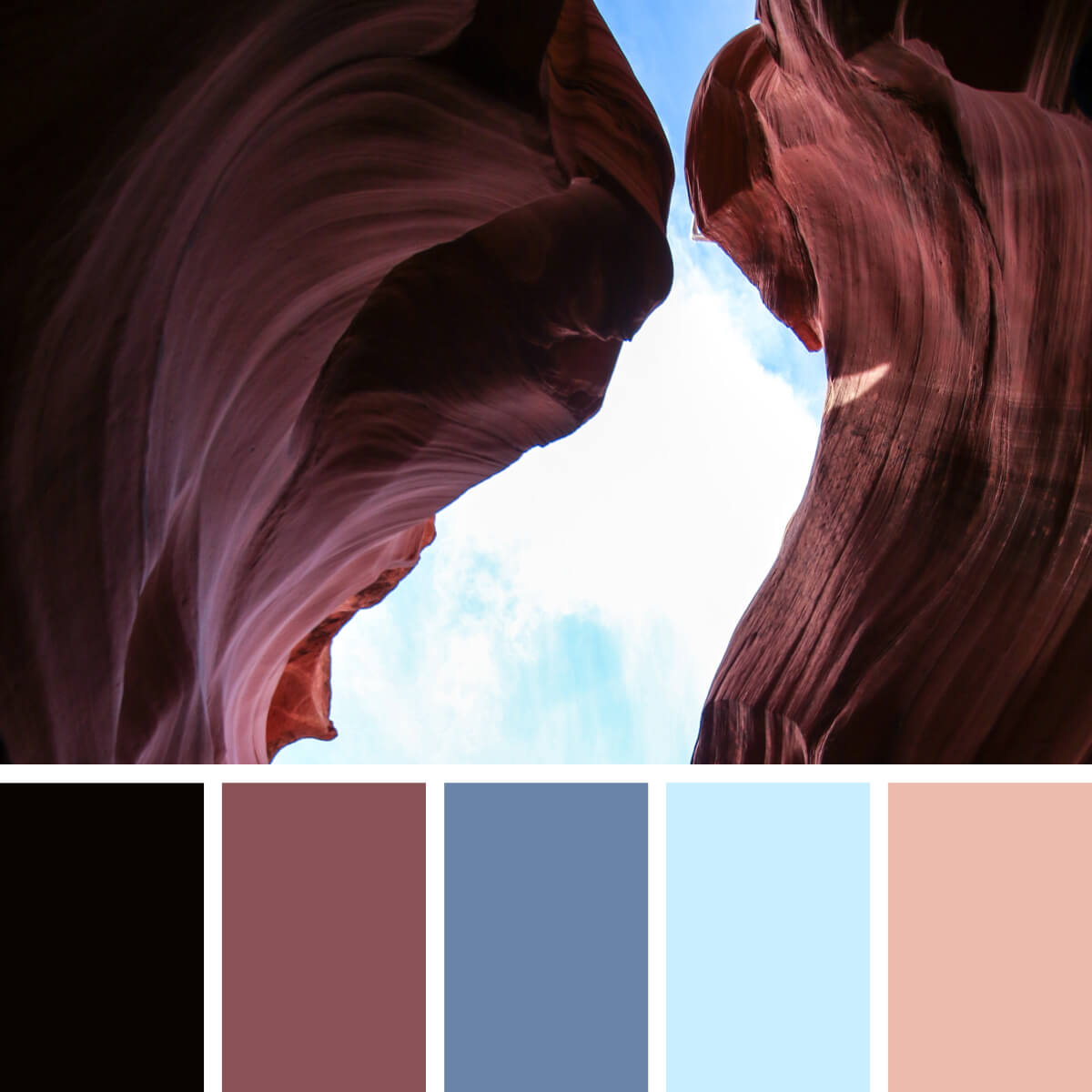
Arizona Brown & Blues

Provence Lavender & Blue
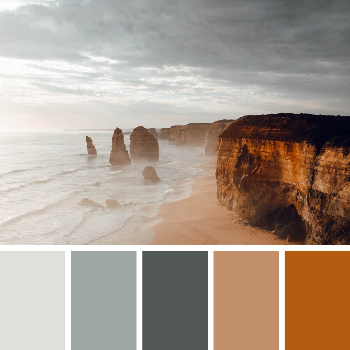
Sunny Gray & Sandy

Desert Coral & Earthy
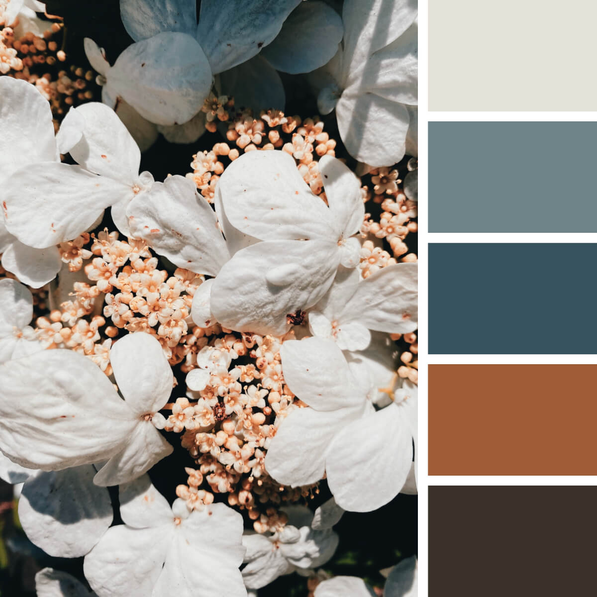
Pale Floral & Gray
Do you know this plant? It’s a Japanese snowball or Viburnum. Its inflorescence contains numerous flowerheads that start blooming consequently. So they carry you from milky white to yellowish and dark brown, and there are noble gray undertones to complement the palette and make it extremely versatile — so you can even use it for business and finance-related projects.

Gold & Turquoise

Sakura Pink & Navy

Marine & Subtle Pink

Autumn Gold & Blues

Classic Cherry & Blue

Sea Blue & Beige
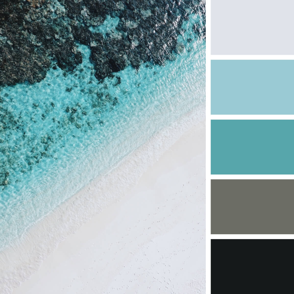
Marine & Refreshing Teal
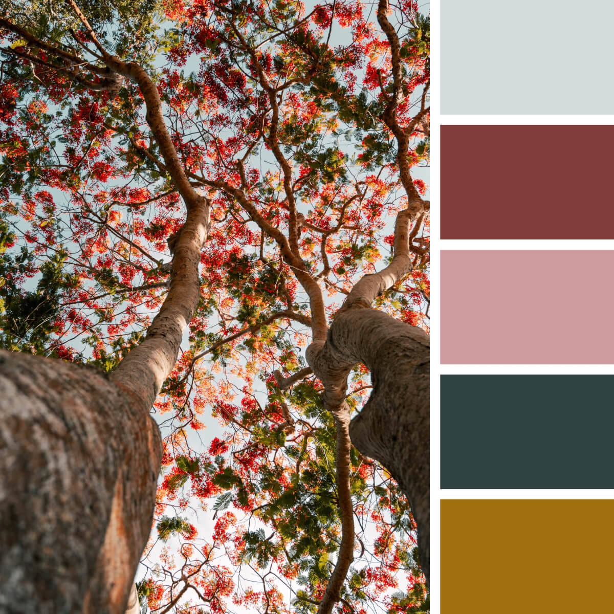
Leafy & Colorful
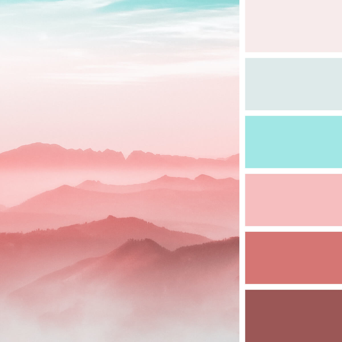
Pastel Pink & Cyan

Leafy Gold & Green

Freezing & Violet

Cool Lilac & Pink

Spring Gold & Gray

Moony & Violet
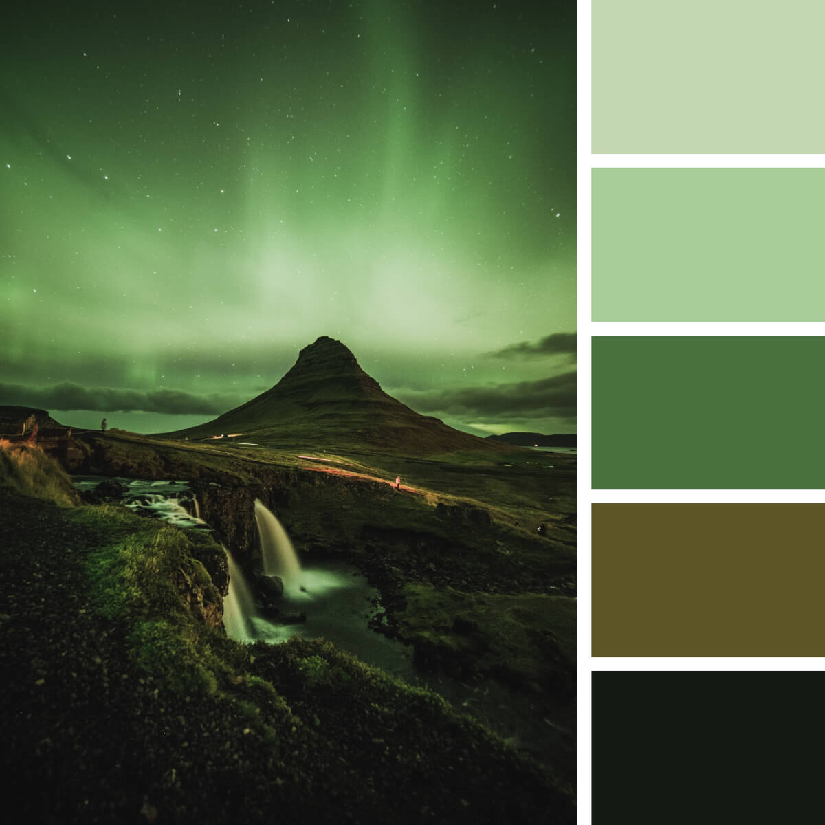
Monochrome Green & Black

Earthy Red & Rocky

Sea Blue & Teal

Jellyfish Yellow & Royal Blue

Faded Pink & Turquoise
Urban color combinations.

Royal Coral & Turquoise

Bright Orange & Blue
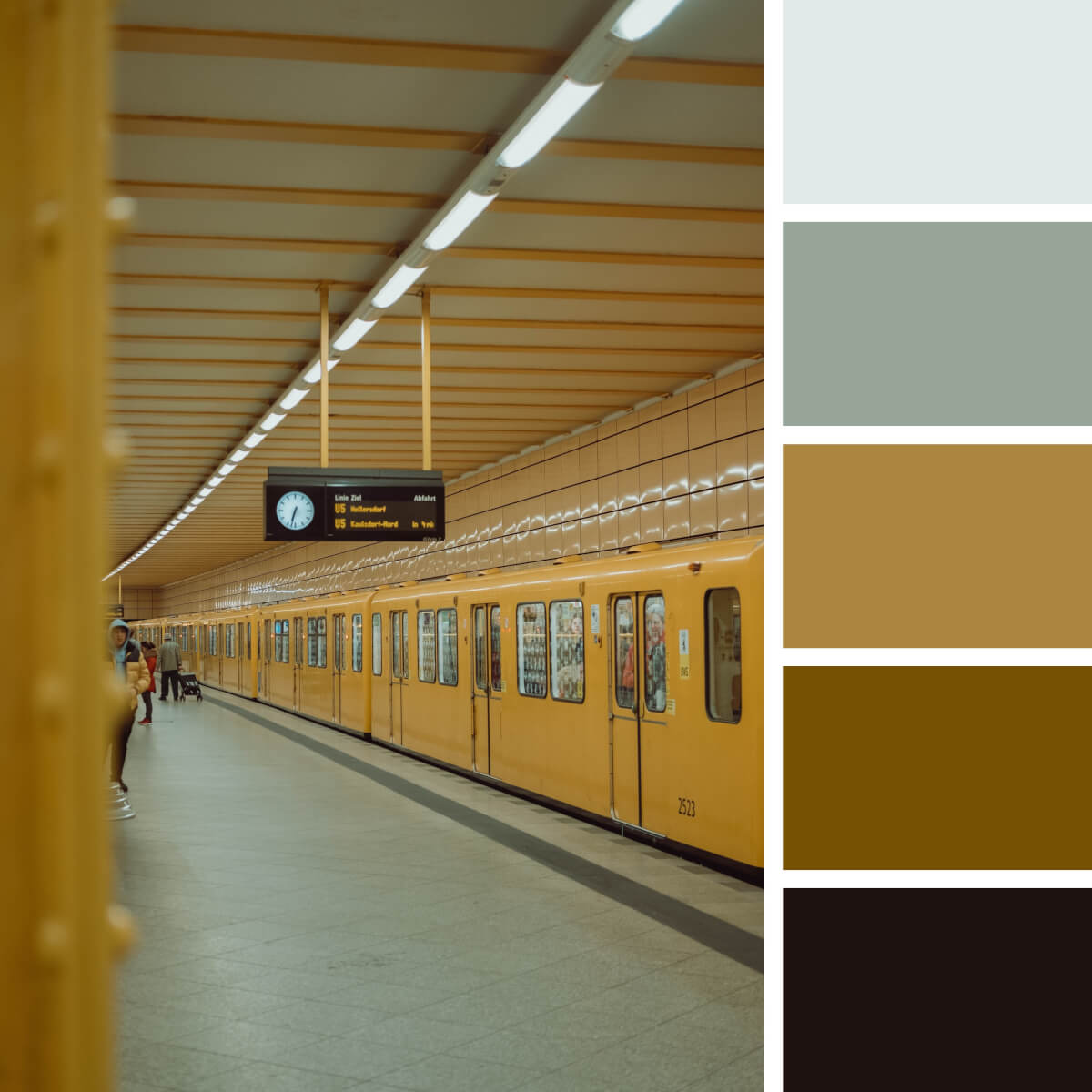
Neutral Yellow & Gray
Rise up your hand if you’re one of those who is constantly mesmerized by metro stations? Some great news for you: going underground is a great idea to source color inspiration! You can start with this warm palette enriched by the shades of grey and then travel from one spot to another, searching for another nice color combination for graphic design purposes.
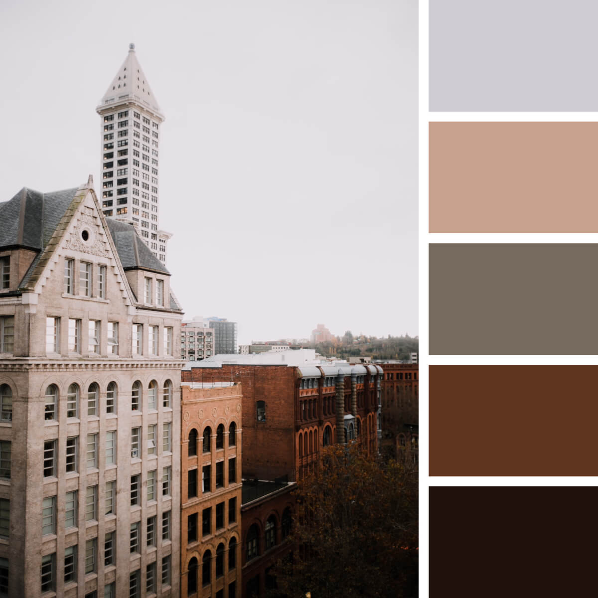
Retro Beige & Brown

Joyful Pink & Green

Megapolis Gray & Red

Majestic Gold & Burgundy
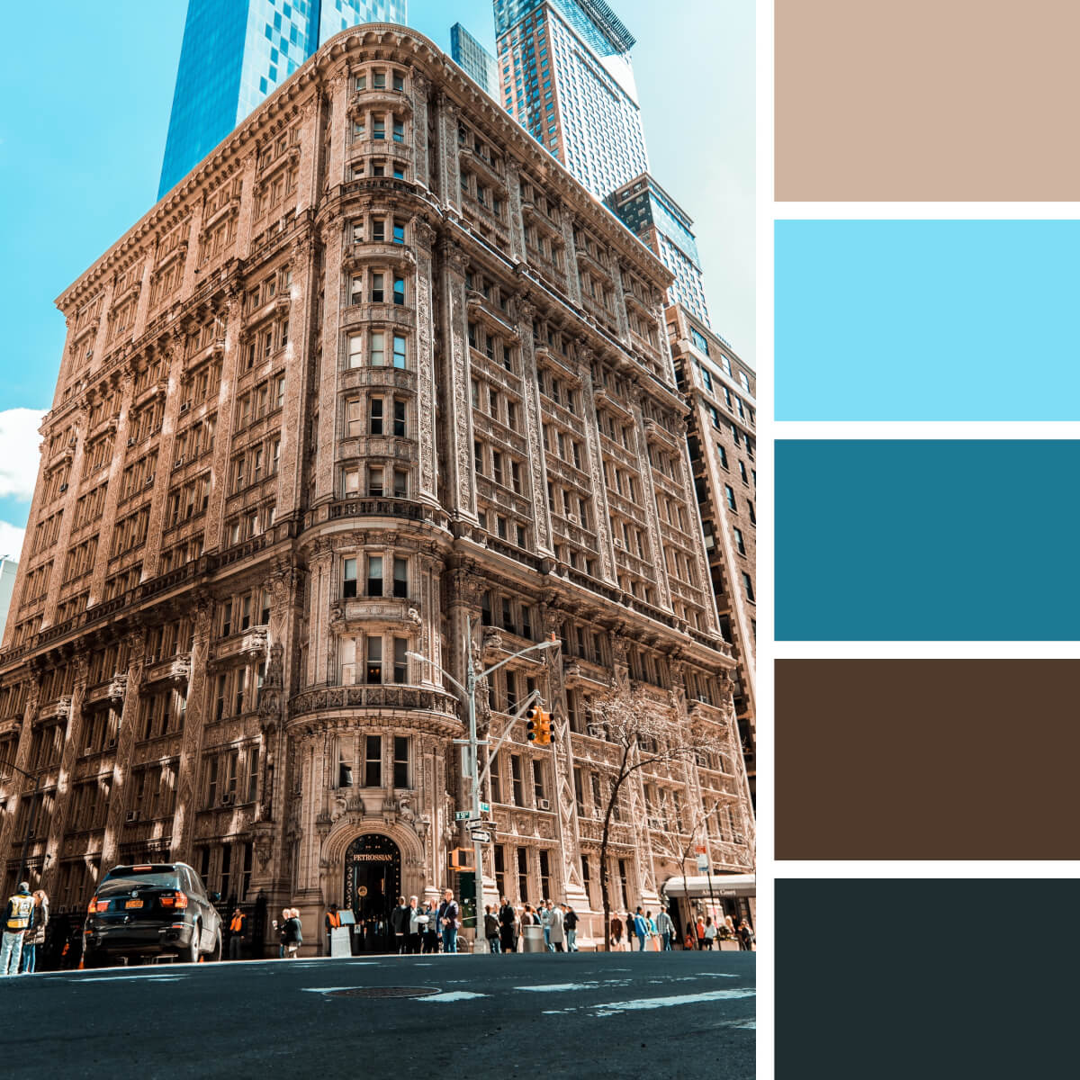
Classic Brown & Beige

Brick Red & Green

Urban Teal & Red

Gold Yellow & Gray

Pacific Orange & Ochre

Colorful Neon & Candy

Juicy Greens & Beige

Monumental Beige & Brown

Neutral Gray & Beige

Ethnic Coral & Copper
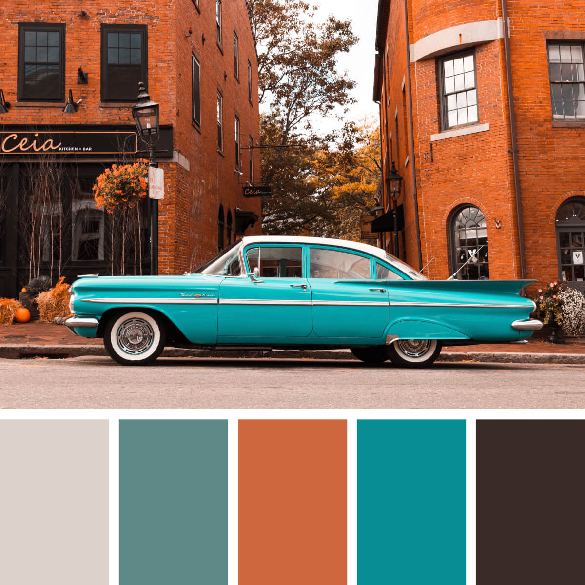
Vintage Red & Teal

Cinematic Gray & Black

Brown Concrete & Glass
Food color combinations.

Vitamin Greens & Purple
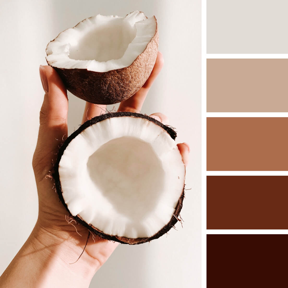
Coconut White & Brown
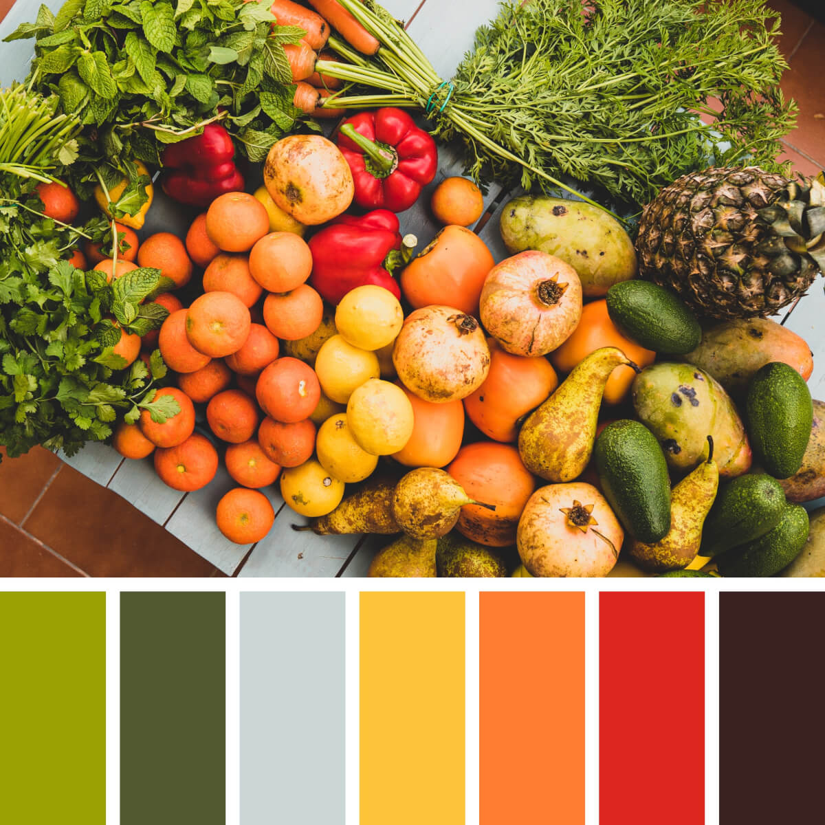
Juicy Orange & Green
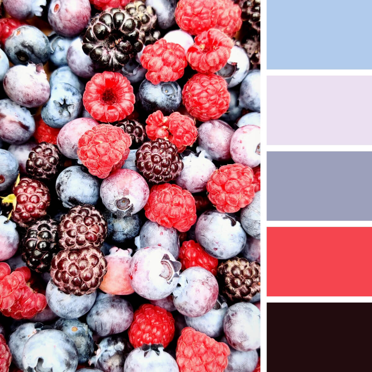
Icy Pink & Blue

Citrus Yellow & Colorful
Fruit ninja alert! Hope you don’t have citrus allergy symptoms as the image is extremely juicy and bright. Morphing the photography into a color wheel for graphic design is a piece of cake: yellow, green and red slices juggle their brightness and contrast to make an unforgettable appearance in branding, fashion photography, social media posts.
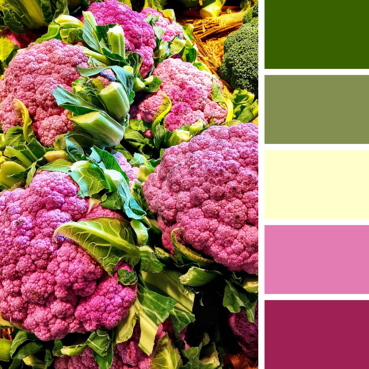
Veggie Green & Hot Pink
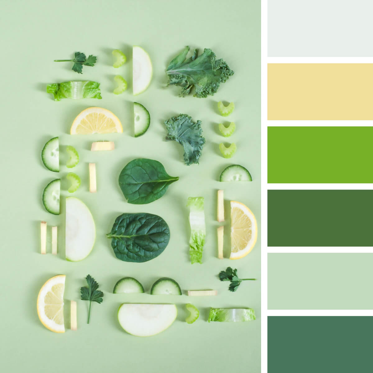
Crunchy Greens & Yellow

Pepper Green & Lemon

Noble Purple & Mustard

Refreshing Pink & Coral

Gastronomic Purple & Green

Italian Red & Yellow

Wood & Lemon Yellow

Apricot Orange & Neutral

Coffee Brown & Coral
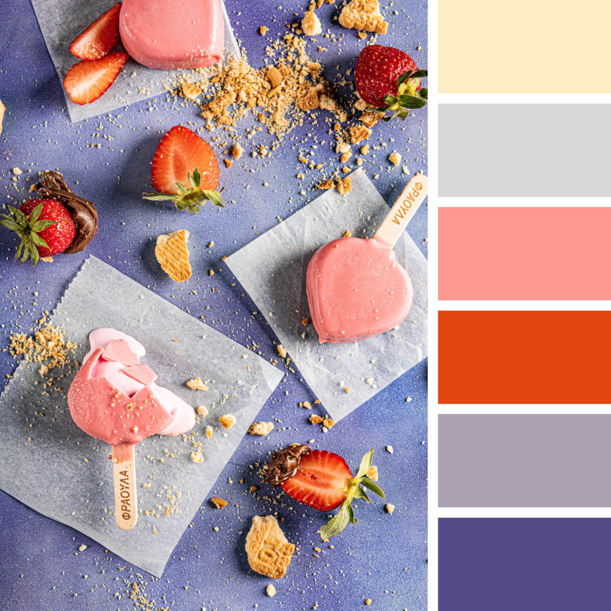
Sweet Pinks & Purples

Pastry Beige & Teal
Floral color combinations.

Floral Pink & Tender

Blooming Yellow & Blues
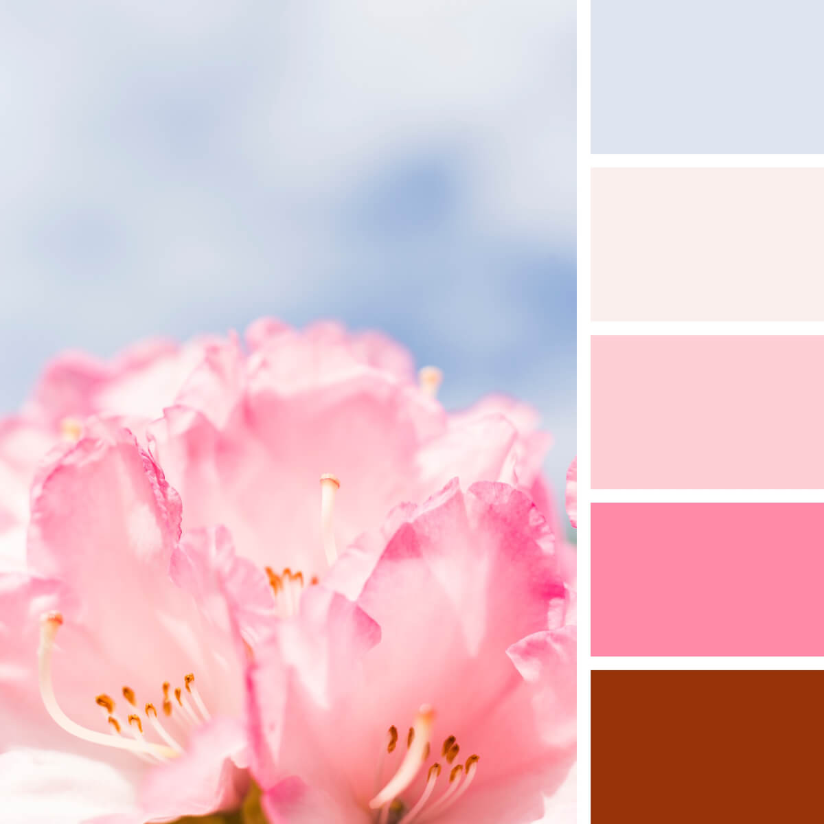
Subtle Blue & Pink
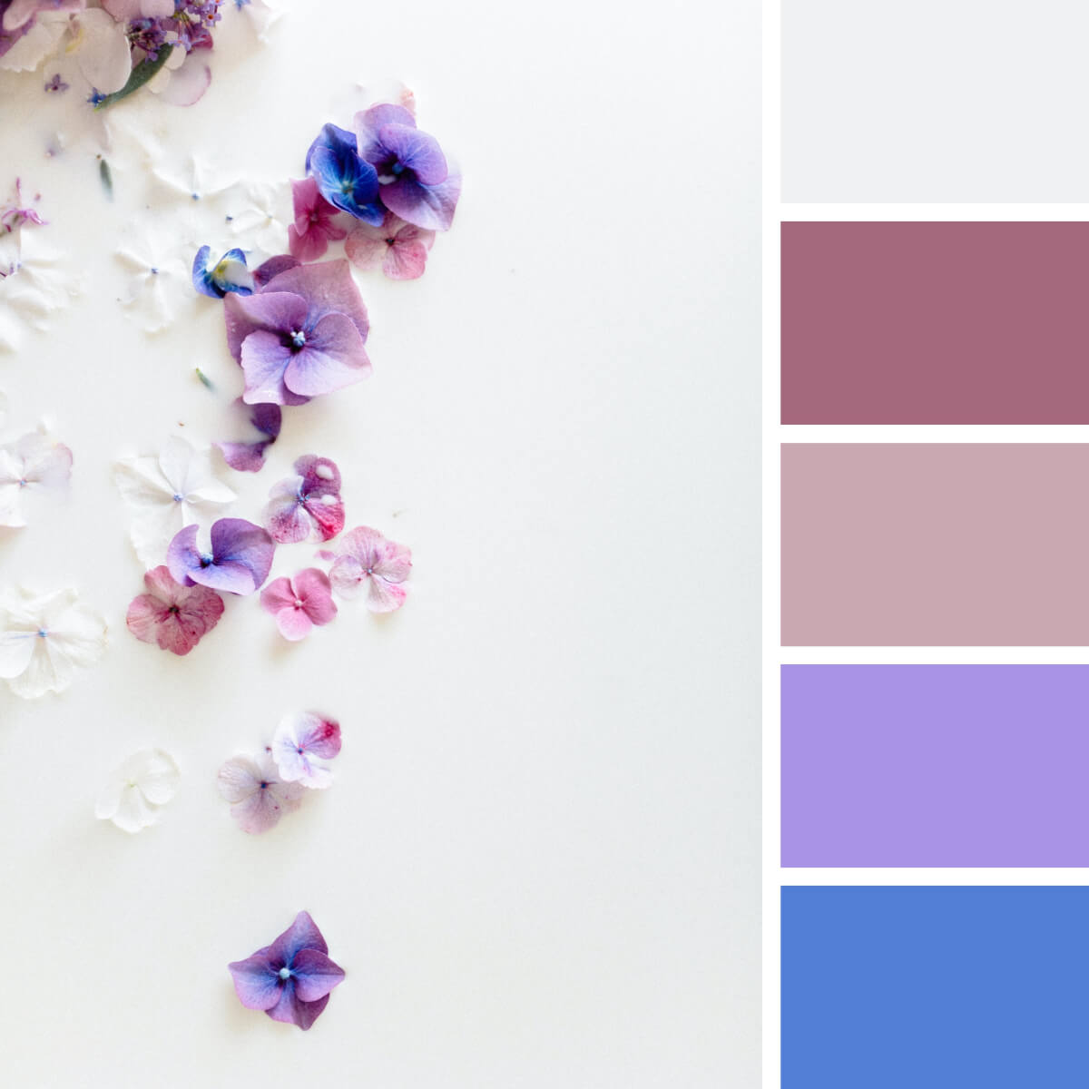
Milky White & Flowery
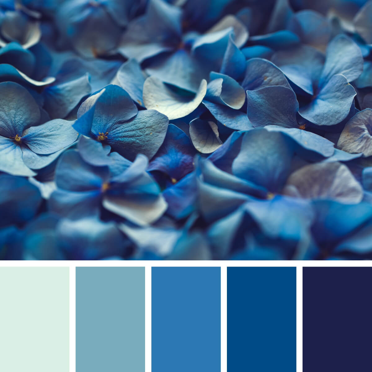
Hortensia Light & Royal Blues

Geranium Red & Yellow
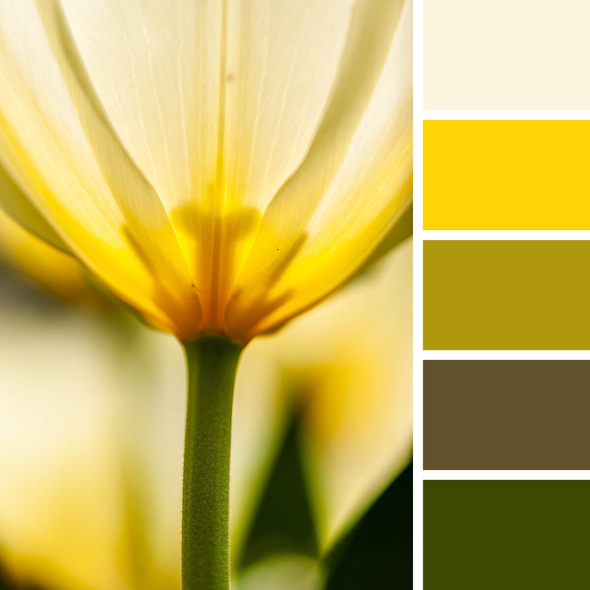
Sunny Yellow & Warm Green
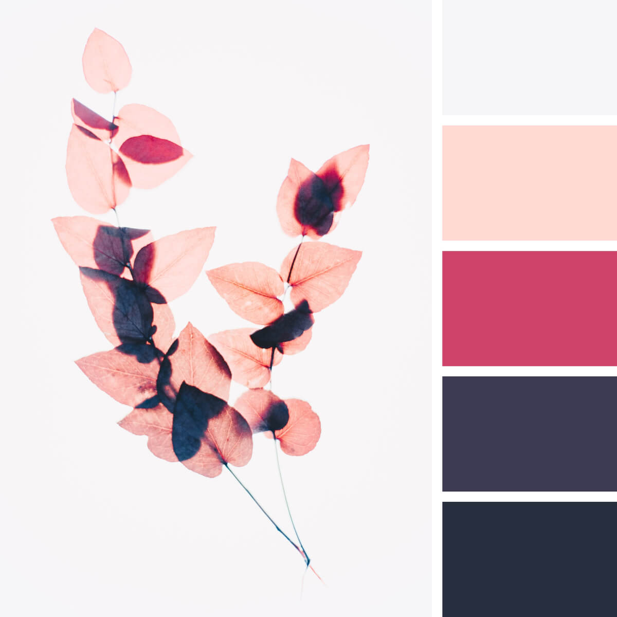
Dusty Pink & Deep Blue

White & Lilac Dahlia
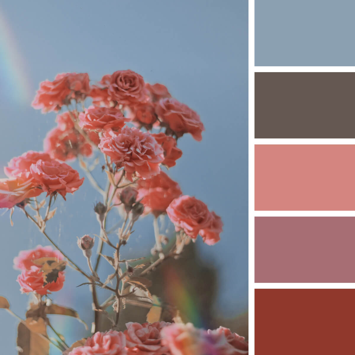
Burnt Rose & Sky Gray

Velvet Red & Burgundy
That’s another dahlia in our collection and another fascinating color combination! We’re unsure if you ever thought of matching wine red, golden green, and purple, but that’s a natural story where these three colors and shades perfectly exist together. That’s how you can go beyond expectations and pick a color combination no one expects from you.

Sophisticated Pink & Purple

Shiny Pink & Green
Compared to a lantern or a lighthouse, this lotus shines in the dark leafy environment filling it with noble beauty and floral energy. Leaves in the background look strange and fancy, making the entire composition so peculiar. Should we also mention the colors, which are another breathtaking element of this story?
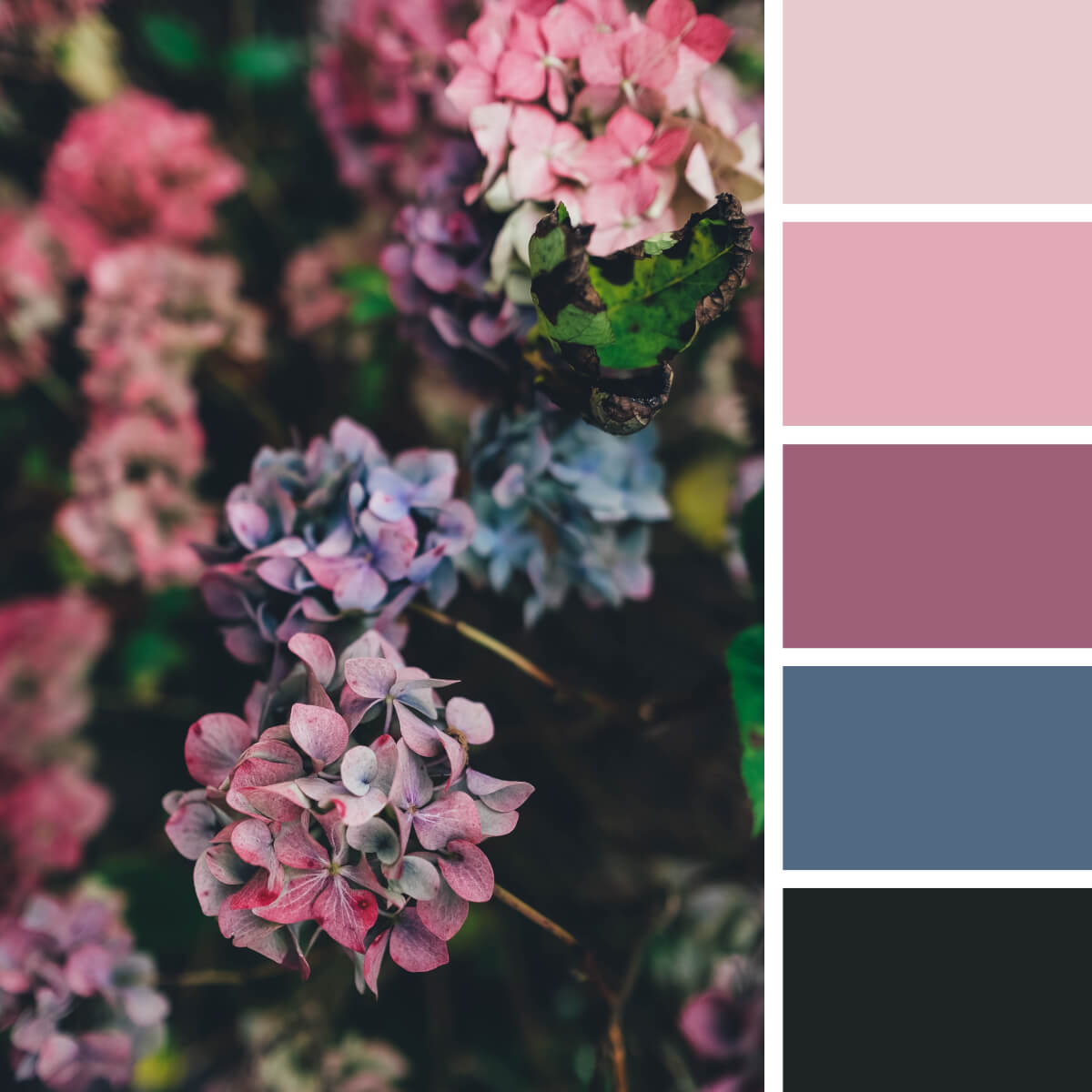
Noble Pink & Violet

Poppy Red & Orange
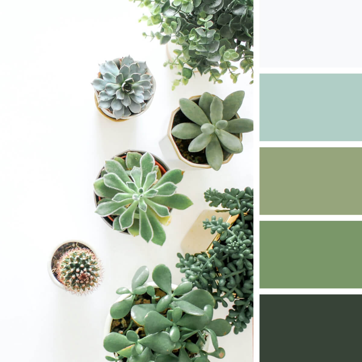
Cool Greens & Gray

Spring Pink & Peach

Iris Blue & Brown

Hortensia Pinks & Blues
Do you remember what we said about hortensia? There are absolutely any colors for it, so these pink and purple-blue branches are here to introduce you another variation. United by a basic beige, they work well together in all sorts of design projects, especially in trending web design concepts.

Winter Red & Frozen Blues
People-inspired color combinations.

Scandi Green & Gray
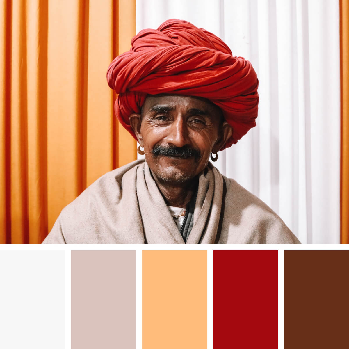
Ethnic Red & Orange
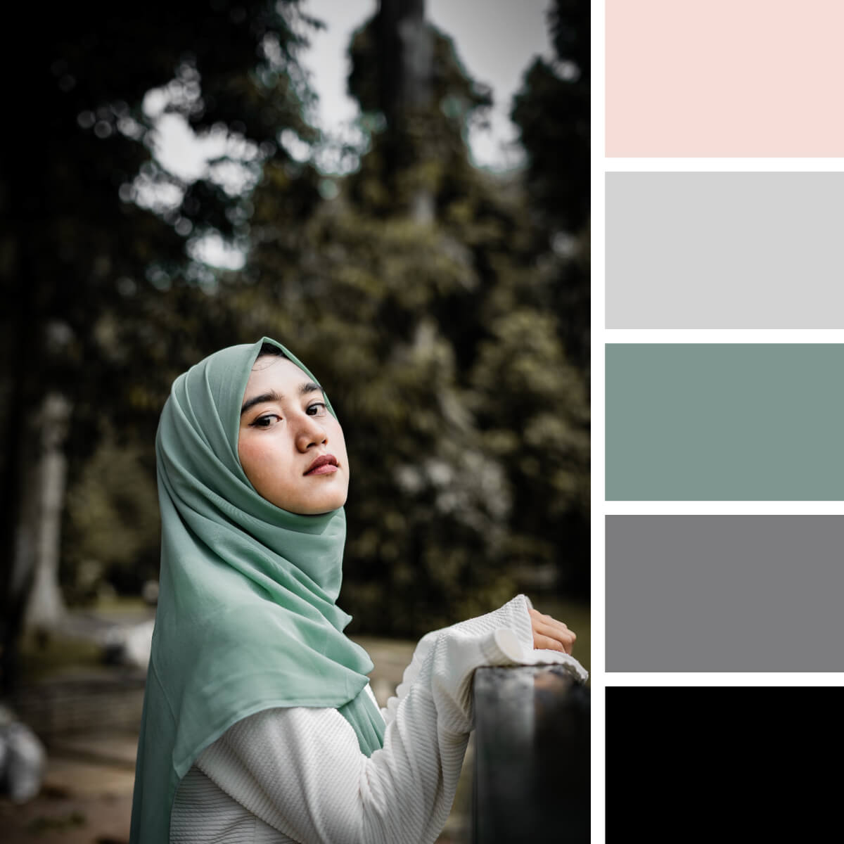
Basic Mint & Gray

Warm Red & Soft Teal
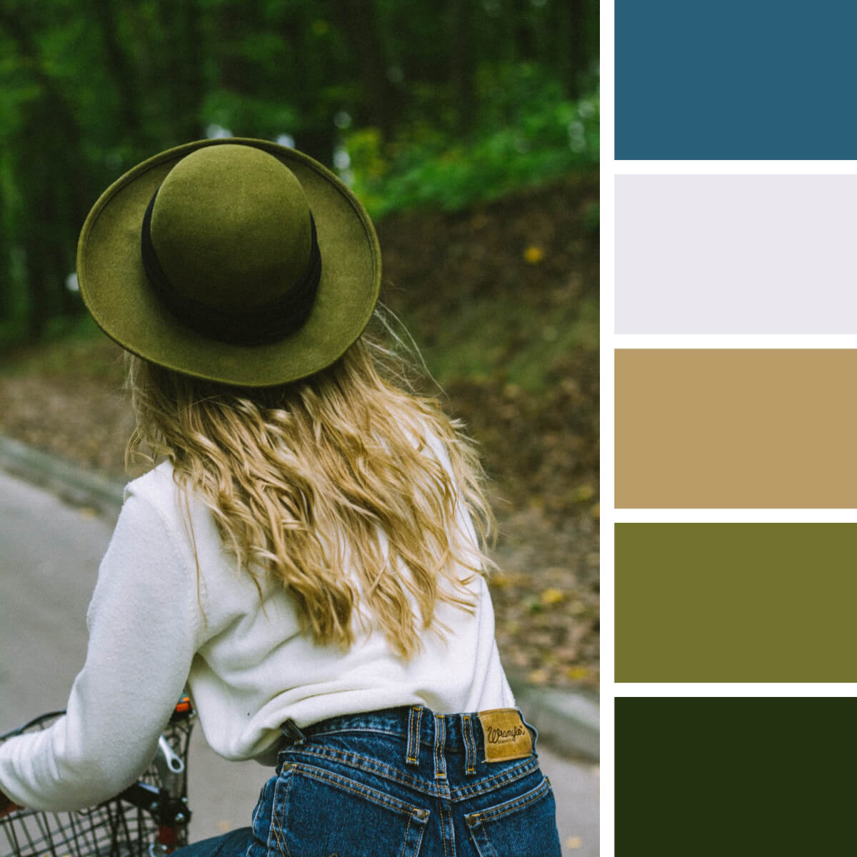
Leafy Green & Milky White

Cyan & Deep Blues

Rustic Greens & Brown

Electric Blue & Orange

Neon Teal & Violet
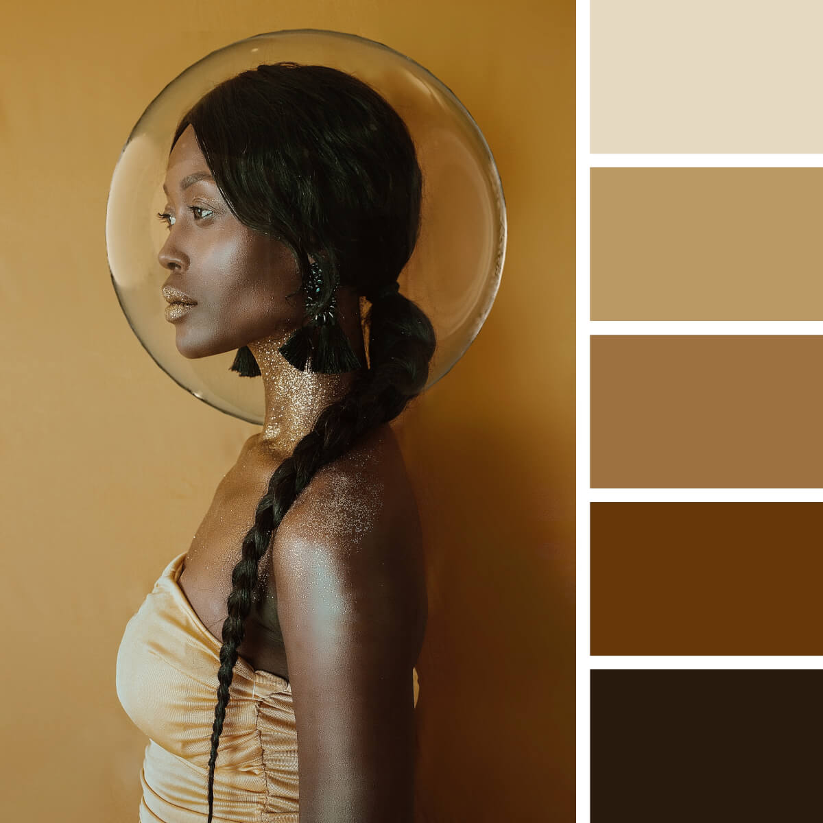
Noble Ebony & Gold
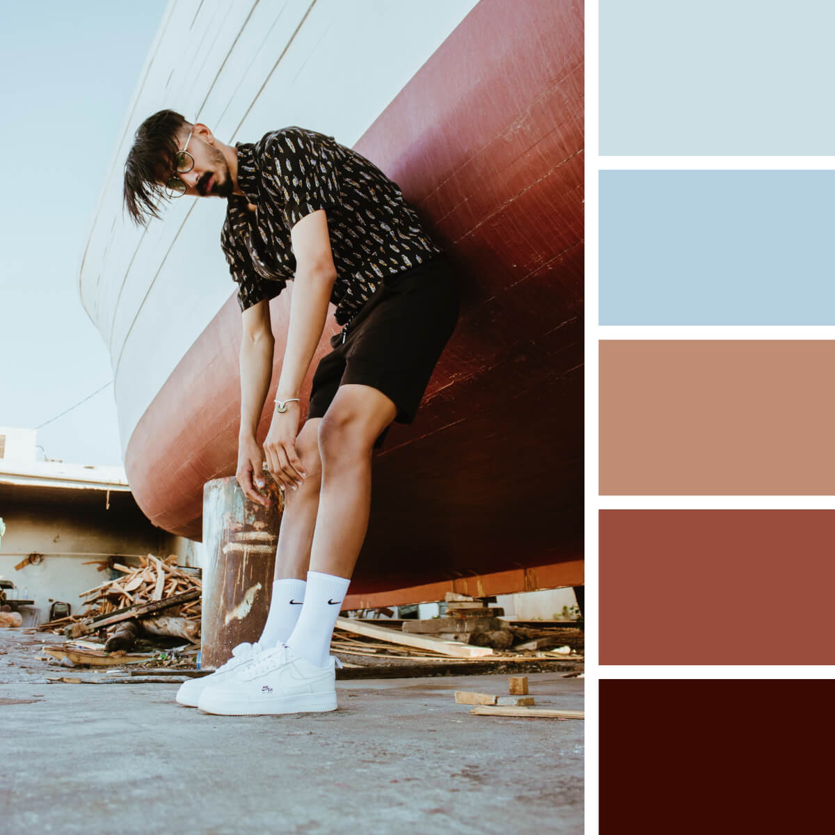
Cherry Red & Pale Blue

Playful Pink & Lilac
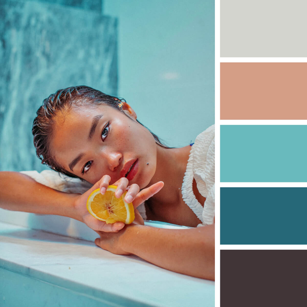
Sea Turquoise & Peach

Chinese Red & Orange
Chinese culture is lush with orange, red and pink in their omnifarious arrangements and shades. Don’t be shy to borrow the already paired combinations from cultural motifs to experience how successful this palette solution can be in your work. Even with the prepared color scheme, the initiative is all yours — experiment with saturation and contrast!
Patterns and Abstract Color Combinations

Monochrome Violet & Lilac

Pastel Mint & Gray

Basic Green, Yellow & Gray
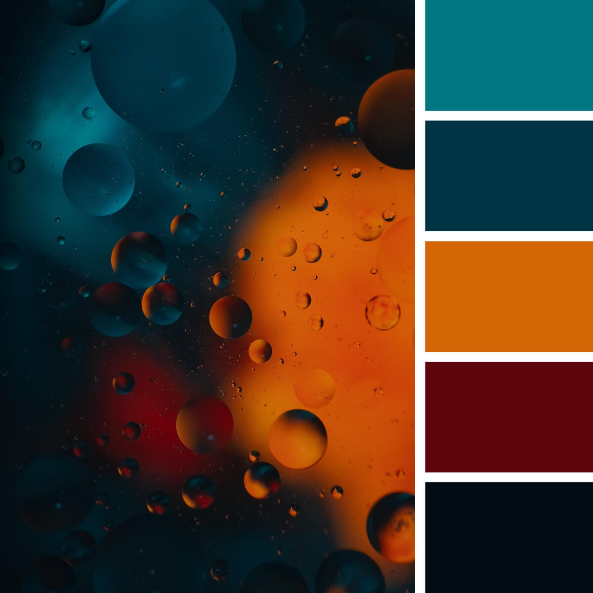
Magnetic Orange & Teal

Sandy & Milky Beige

Liquid Pink & Fuchsia

Concrete Gray & Orange

Lime Green & Gray
If you are a fan of gray-based color combos, you don’t have to stay with a classic gray-orange or gray-yellow combination. Lime green is a cool option too, and it’s a great way to add exceptional freshness and energy to any design project. So, you can design sportswear or anything else for a sports brand, create eco merchandise, and these two colors won’t let you down.

Coral Red & Sweet Peach

Moroccan Blue & Lime
We still can’t stop the flow of appreciation to the Moroccan landscapes and the color schemes we can get from them. The traditional color scheme is extremely rich and varied: it combines various shades of teal, rare greens and blues, and of course, sunny red-yellow colors. Apparently, it’s hard to surprise anyone here — however, have you ever considered some lime yellow to highlight the cool blue tile?

Grayish & Cool Greens
Is it a fanciful sea surface or a wall texture? You can set your imagination free and source inspiration from these colors and textures! It’s an eye-catching monochrome color combination where every shade of green is a great pick for modern design and interior projects. Since there is a huge trend for muted colors, now you have a very bold palette for such cases.

Contrastive Pink & Violet
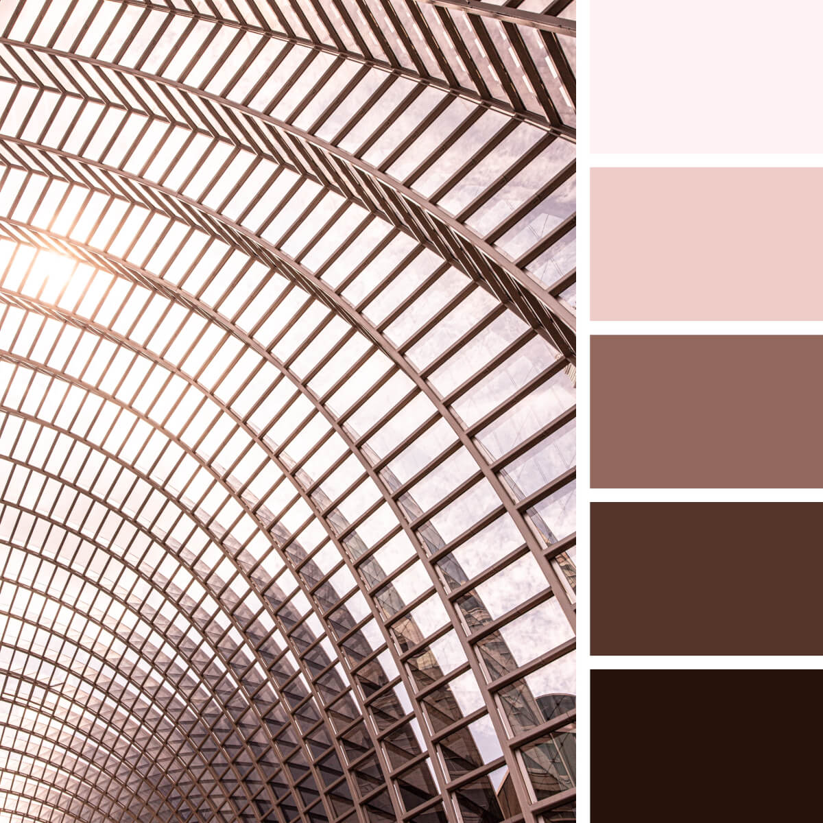
Urban Pink & Metal

Camouflage Gray & Green
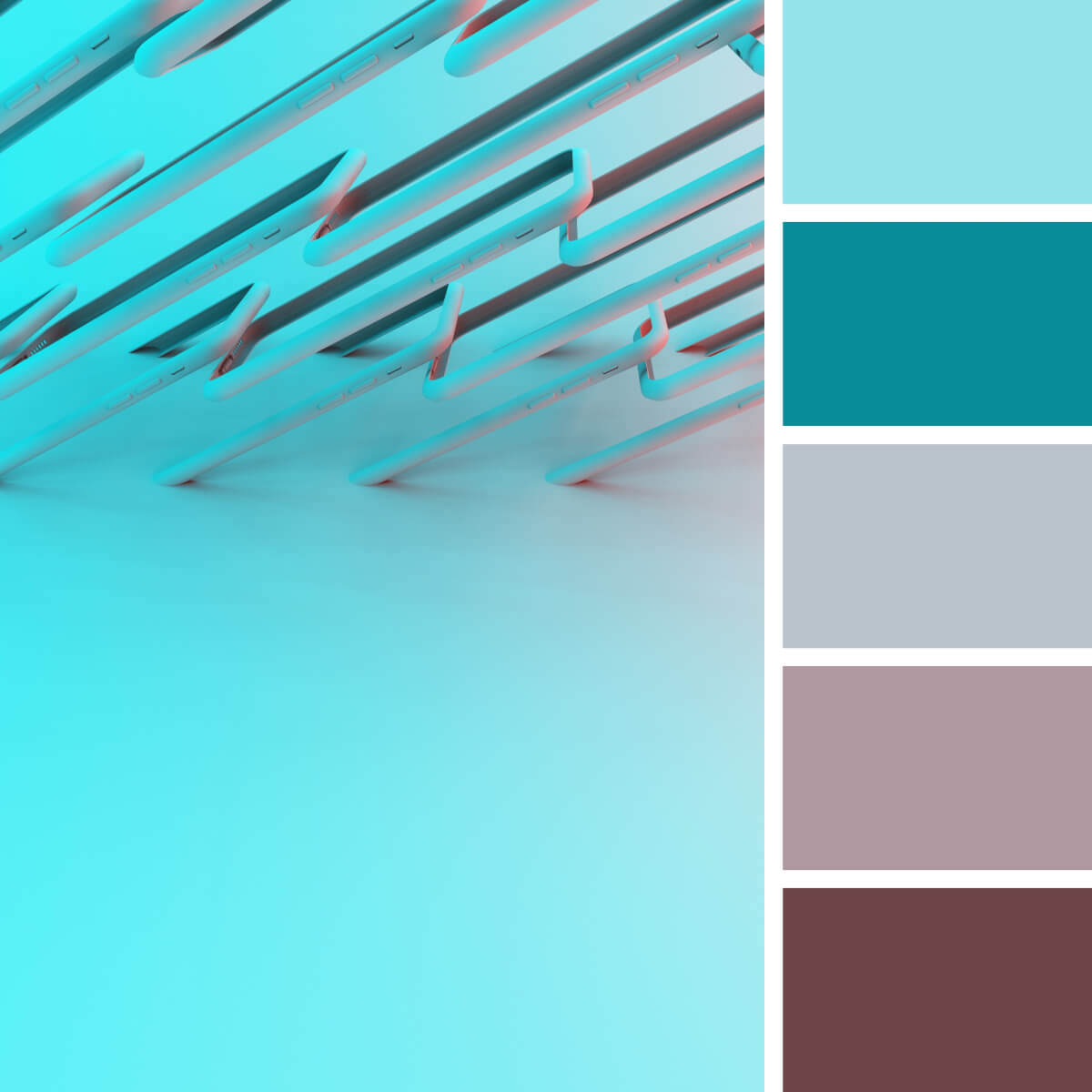
Techno Teal & Rosewood
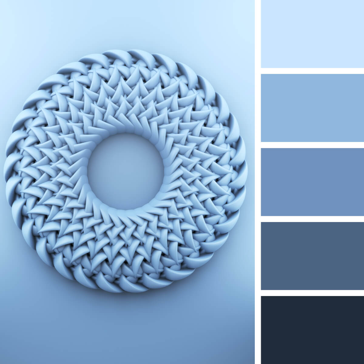
Airy & Tender Blues

Juicy Red & Orange
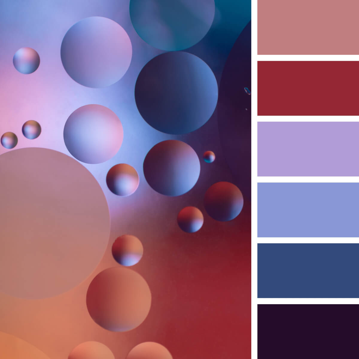
Basic Purple & Peach

Mesmerising Pink & Blues

Urban Brown & Blue
Frequently Asked Questions
11 Most Renowned Ukrainian Digital Companies and Design Studios
Best courses for modern drawing: manga, comics, 3d art and more, the designest staff.
Teamwork is something we are really good at! So sometimes we join our forces and experience to deliver even more useful, impressive content. Hope you enjoy it as much as our personal elaborations.
Related Posts
Best drawing programs & apps in 2024 for your creativity.
In 2024, art software scene is as diverse as ever. Read our guide to the top free and paid drawing...
Top Graphic Design Projects That Can Enhance Your College Portfolio
What projects should you include to ensure your portfolio stands out? Let's dive in.
50+ Best Mug Mockup Templates ⬆ Download PSD
No matter what season is outside, a mug of warming beverages will always give you a calming feeling. Your designs...
40+ Best Cap & Hat Mockup Templates
Let's play big! Use baseball hat mockups for your presentations and create scenes to please MLB fans themselves.
⬆ 70+ Best Photoshop Text Effect PSD Templates
Gain the power to reinforce your typography and make it more eloquent with a selection of pro-grade free text styles...
50+ Best Hippie Fonts: Groovy and Free-Spirited
Make design, not war! We invite you to submerge in the quaint aesthetic of the 60s and discover hippie fonts...
Popular Posts
Logo design trends 2024: outburst of typography & symbolism, 50+ best baseball fonts (free & premium), 20 digital artists you should know: famous, talented, inspiring.
- Design (80)
- Freebies (88)
- Inspiration (40)
- Toolbox (161)
- Tutorials (57)
Weekly Email Updates
We got tons of fascinating articles, videos and freebies for you every week! SUBSCRIBE
Design Blog
Welcome to The Designest — a professional design blog aimed to deliver fresh news & trends of the industry as well as the most essential courses & tutorials you must have been searching for.
- Advertise with Us
- Cookie Policy
- Privacy Policy
- Terms and Conditions
- Affiliate Disclosure
© 2023 The Designest — Professional design blog aimed to deliver fresh news & trends of the industry

26 best color combinations for your next design
Color is the most powerful tool for designers — and the most vast. Here are 26 of the best color combinations to inspire your next design in 2024.

Use Webflow's visual development platform to build completely custom, production-ready websites — or high-fidelity prototypes — without writing a line of code.

Whether you're a beginner designer or a seasoned professional, you know firsthand the incredible impact of color.
Color is perhaps the most powerful tool at your disposal as a designer because of its influential and communicative nature. It evokes emotion , influences our perception, inspires responses — conscious or subconscious — and even impacts generational appeal .
With 16.8 million colors to choose from, color combinations for your next logo design, web design, or brand identity design are just about infinite. Luckily for you, we got you covered.
First, let's look at color theory and the color wheel
To understand why certain color combinations work so well, we first have to consider color theory and the color wheel. Color theory feeds into color psychology, which digs into how our brains perceive color. The color wheel helps you visualize relationships between colors, putting color theory into practice.
Let's break it down below.
Color theory
Color theory is the art and science of using color. Research has shown that color has a psychological impact on human emotions, perceptions, and behaviors. For artists and designers, color theory unlocks color mixing and color schemes, serving as a collection of rules and guidelines that designers use to communicate with and appeal to an audience.
Pro Tip : Check out our beginner's guide on color theory or color in design guide for a deeper dive into the study.
Color wheel
Part of these rules and guidelines make up the color wheel — designed by Sir Isaac Newton in 1666. Sir Isaac intimately understood how color was defined by human perception and how it came together to create eye-catching combinations.
The color wheel is a powerful tool for visualizing the relationships between colors, thus putting color theory into practice. Sir Isaac's experiments with prisms led to his eventual discovery of the primary, secondary, and tertiary color categorizations:
- Primary colors : red, yellow, blue
- Secondary colors (created by mixing primary colors): orange, green, violet
- Tertiary colors (created by mixing both primary and secondary colors): red-orange, yellow-orange, yellow-green, blue-green, blue-violet, red-violet
Human perception defines color. Our relationship with colors, psychologically and collectively, is what gives meaning to color; that meaning creates iconic and successful branding (think red and white for Coca-Cola). By understanding the color wheel and categories, you can better create color combos that look good together.

To familiarize yourself with the color wheel, imagine a vertical line through the center of the wheel. Notice the distinction between warm colors (reds, oranges, and yellows) and cool colors (blues, greens, and violets). Warm colors embody a brightness or warmth, whereas cool colors convey a calmness or, well, cool effect.
- Complementary color combinations are the pair of colors positioned opposite to each other on the color wheel. These contrasting colors catch the eye and leave quite an impact — examples: red and green, yellow and purple, orange and blue.
- Analogous color combinations refer to any two to five colors adjacent to each other on the color wheel. These combinations create a sense of balance and harmony. Typically, one of these colors will be more dominant and sit in the foreground, while the other color will sit in the background — examples: yellow, yellow-green, and green; violet, red-violet, and red; red, red-orange, and orange; blue, blue-violet, and violet.
- Triadic color combinations select three evenly spaced colors throughout the color wheel. These combinations tend to be vibrant, creating a dynamic and harmonious visual contrast when combined. You can find your three triadic colors by creating a triangle on the color wheel — examples: red, yellow, and blue; green, orange, and blue-violet; red-orange, yellow-green, and blue-violet.
- Tetradic color combinations use four colors spaced evenly on the color wheel to form a square or rectangle — examples: Red, yellow-green, light blue, purple; magenta , green-yellow, blue-green, and indigo.
Understanding universal perceptions and color's relationship with us is essential to becoming a great artist or designer. Its communicative nuances, subtle and near-innate, are a language of its own, vibrant and elusive.
Further research the color wheel to cement your understanding of the art and science of color, and consider playing around with color palette generators .
26 beautiful color combinations that'll inspire your next design
From contrasting colors to colors that match, here are 26 of the best color combinations to inspire your next design, including classic and trending color combos.
Classic color combinations:
1. blue & pastel pink.

Combining blue and pastel pink creates a nice balance. Pink’s softer, spring-like pastel aesthetic alongside blue’s hints of sophistication creates a serene-like duality of balance and harmony. These contrasting colors evoke refined, feminine tranquility, ideal for beauty, health, and wellness brands.
Hex codes : #2F3C7E, #FBEAEB
2. Dark charcoal & bright yellow

Dark charcoal and bright yellow form a visually striking, high contrasting color combination. Paired together, these colors feel energetic and contemporary, making the ideal color palette for cutting-edge design agencies, dynamic athletic and sportswear, and urban lifestyle brands.
Hex codes : #101820, #FEE715
3. Light red & yellow

The bold and vibrant color combination of light red and yellow is the embodiment of cheer. Reimagine this classic ketchup and mustard color pairing with a modern, pastel take by changing the tints from red to coral for children’s logos and branding and youth-focused food and beverage packaging.
Hex codes : #F96167, #F9E795
4. Cherry red & off-white

Cherry red and off-white are truly versatile classics. Defined by its duality, classic and timeless, elegant and inviting, this color combination is ideal for luxury fashion and accessories brands, fine dining and hospitality industries, and romantic and bridal branding.
Hex codes : #990011, #FCF6F5
5. Baby blue & white

Another classic color combo is baby blue and white. This serene combo communicates ease and trustworthiness, invoking the feeling of looking up at the sky on a sunny morning. Baby blue and white is the perfect color combo for brand colors in the healthcare, childcare, or non-profit industries.
Hex codes : #8AAAE5, #FFFFFF
6. Dark blue & light blue

Don’t overlook different shades of color in this the light and dark blue combo. Authoritative and cultivated, this monochrome color combination inspires professionalism and trust — making it an excellent color palette for insurance agencies or financial services firms.
Hex codes : #00246B, #CADCFC
7. Sky blue & bubblegum pink

A popular classic color combination, sky blue and bubblegum pink is a playful and bright combo that communicates adolescent joy. These bright colors are ideal for parenting brands, childcare logos, children's apparel, products, and toys.
Hex codes : #89ABE3, #EA738D
8. Cherry red & bubblegum pink

Cherry red and bubblegum pink come together to form a fun analogous color combination. Paired, these colors create quite a gorgeous visual contrast, making an ideal color palette for bold and expressive beauty and lifestyle brands and products.
Hex codes : #CC313D, #F7C5CC
9. Forest green & moss green

Forest and moss green form a monochromatic color scheme, embodying the outdoors and nature sentiments ideal for eco-friendly and sustainable products or brands, outdoor apparel and gear brands, nonprofits, and cooperatives.
Hex codes : #2C5F2D, #97BC62
10. Midnight blue, royal blue, & burgundy red

Midnight blue, royal blue, and burgundy red combine to create a visually commanding color scheme. Mysterious, intriguing, bold, and luxurious, this combination evokes a passion and authority ideal for high-end fashion and jewelry, luxury cars and spirits, fine dining, boutique hotels, perfume, and cosmetics.
Hex codes : #1E2761, #408EC6, #7A2048
11. Terracotta red, light beige, & muted teal

Terracotta red, light beige, and muted teal combine to create a mesmerizing and mysterious color combination. This earthy and neutral color palette draws great appeal to the eye. This beautiful, timeless color palette is fantastic for farm-to-market brands and restaurants, home decor and interior design agencies, outdoor apparel and gear brands, and botanical wellness brands or products.
Hex codes : #B85042, #E7E8D1, #A7BEAE
Build completely custom, production-ready websites — or ultra-high-fidelity prototypes — without writing a line of code. Only with Webflow.
Trending color combinations
12. pastel olive green & salmon pink .

Earthy, vibrant, and harmonious, the combination of salmon pink and pastel olive green color evokes warmth and nostalgia often associated with nature, peace, happiness, and balance. This fresh and playful color combination is ideal for eco-friendly and sustainable brands, wellness or mindfulness products, children’s products, and toys.
Hex codes : #A1BE95, #F98866
13. Deep periwinkle & soft lilac

Dreamy and ever so whimsical, deep periwinkle and soft lilac come together to create a color combination that is both ethereal and grounded, exuding sensations of refined tranquility, gentle magic, or delicate serenity. These different shades of purple are ideal for beauty, wellness, spiritual or mindfulness brands and products.
Hex codes : #735DA5, #D3C5E5
14. Salmon pink & soft peach

Soft, subtly elegant salmon pink and soft peach are trendy colors that look good together. Inviting, with a touch of cheerfulness and sophistication, this color combination is excellent for children’s products, toys, beauty and wellness products, and even food and beverage packaging.
Hex codes : #F98866, #FFF2D7
15. Seafoam green & light blue

Seafoam green and light blue offer a refreshing, harmonious balance. These cool undertones evoke a natural airiness or serene tranquility reminiscent of the sea, sky, and nature. The calming, balanced blue and renewing green combine ideally for spa and wellness brands and travel, education, and water-based brands.
Hex codes : #C4DFE6, #66A5AD
16. Teal & light green

Like seafoam green and light blue, teal and light green come together to create a fresh, serene color combination reminiscent of lagoons or lush natural springs and pools. This harmonious color palette works for health and wellness brands as well as outdoor and nature-inspired brands.
Hex codes : #20948B, #6AB187
17. Dark green & light gray

Color trends may come and go, but this classic and refined color palette is sure to stand the test of time. Dark green and light gray create a color combination that feels utterly serene and timeless. Green’s earthy and organic tones combined with gray’s calmness and neutrality create a color palette ideal for mindfulness and wellness brands, organic products, and brands offering high-quality craftsmanship, natural materials, and understated luxury.
Hex codes : #31473A, #EDF4F2
18. Cranberry red & bubblegum

Stylish and playful, cranberry red and bubblegum combine to create an eye-catching, contemporary color palette. The bold and exciting red, matched with the almost mischievous, optimistic pink, makes the ideal color combination for more creative or expressive fashion and cosmetics brands, sportswear, beverages, or candy packaging.
Hex codes : #F52549, #FA6775
19. Deep blue, orange-red, & yellow-orange

Dynamic and playful, this deep blue, orange-red, and yellow-orange color combination is bold, vibrant, and energetic. Contrasting deep blue with warm oranges evokes a sense of movement and enthusiasm, that's great for accent colors or logo colors. This color palette is ideal for adventure and outdoor brands, adventure travel, amusement parks, and food and beverage packaging.
Hex codes : #375E97, #FB6542, #FFBB00
20. Mauve, dusty rose, & soft blue-gray

Mauve, dusty rose, and soft blue-gray go together beautifully. The combination of soft blue and dusty pinks creates a refined, feminine palette with subtle charm and maturity, ideal for wedding and event planning, beauty fashion, home decor, and the wellness industries.
Hex codes : #962E2A, #E3867D, #CEE6F2
21. Dark reddish brown, taupe, & light peachy brown

Rustic, warm, and oh-so-cozy, dark reddish brown, taupe, and light peachy brown create an earthy and inviting color combination. This timeless and sophisticated color palette is ideal for heritage and craftsmanship brands, interior design and real estate agencies, outdoor apparel and gear brands, artisanal brands, coffee shops, and bakeries.
Hex codes : #330000, #73605B, #D09683
22. Dark navy blue, bright scarlet red, & light lemon yellow

Dark blue, bright scarlet red, and light lemon yellow create a striking visual impact, evoking feelings of excitement and bold appeal. This contrasting color combination works in various styles and themes, from retro to modern — ideal for sports and fitness brands, fast food and casual dining, amusement parks, children’s products, toys, and retro-inspired ‘Americana’ designs.
Hex codes : #5031F, #CB0000, #E4EA8C
23. Teal blue, light blue, & light gray

Refreshing and modern, teal blue, light blue, and light gray combine to create a serene atmosphere reminiscent of clear skies and glacier waters. The blues of this cool and clean color combination evoke strong sentiments of trust, dependability, and stability, making it an ideal palette for hospitals, clinics, financial services, insurance, law firms, and cloud-based security brands.
Hex codes : #1995AD, #A1D6E2, #F1F1F2
24. Deep navy blue, bright red, & pale pink

Ever bold and contrasting, the playfully sophisticated combination of deep navy blue, bright red, and pale pink is striking and versatile. Navy and red create a strong visual impact, evoking a sense of movement or vitality, while the pale pink adds a touch of youthful, whimsical energy. These colors look good together, specifically for luxury brands in the automobile, fashion, or jewelry industries, sportswear, or design agencies.
Hex codes : #002C54, #C5001A, #FDF6F6
25. Dark chestnut brown, burnt sienna, & soft cream

Warm and earthy, this combination of dark chestnut brown, burnt sienna, and soft cream draws inspiration from nature, evoking a rich autumn rustic theme. The balance of colors feels welcoming, traditional, and authentic, ideal for organic and farm-to-table products, heritage and craftsmanship brands, home outdoor brands, coffee shops, and bakeries.
Hex codes : #46211A, #A43820, #F1D3B2
26. Dark charcoal, deep rust, & sky blue

Bold and contrasting, this sophisticated and modern color combination of dark charcoal, deep rust, and sky blue evokes a sense of power, comfort, and richness ideal for luxury brands in the fashion and automobile industries, as well as design agencies or architecture firms.
Hex codes : #2A3132, #763626, #90AFC5
Get started with design resources on Webflow
So there you have it; the 26 best color combinations to inspire your next design. Check out Webflow’s Color Essentials to find the right color combo to help bring new life to your creative projects, or use a color picker tool to find new color ideas. And if you're already feeling the inspiration, why not give these color combinations a go by getting started in Webflow.
Subscribe to Webflow Inspo
Get the best, coolest, and latest in design and no-code delivered to your inbox each week.
Related articles

10 elegant color palettes to inspire you
Skip the color palette generators and get color inspiration from these 10 elegant color palettes.

12 modern business color palettes to elevate your branding
From theory to application — discover the psychology of color and how to strategically leverage its emotive abilities for your business’s branding.

10 color meanings: the psychology of using different colors
Color is one of the most powerful tools in your design toolkit. Learn how to harness the power of color symbolism by exploring different color meanings.

9 unique website color schemes from popular brands
How you use your website color scheme is just as important as the color scheme itself. Here are a few lessons on how to use your color scheme effectively.

12 best color picker tools for website design
Meet a few great color picker tools that will make working with color faster and more fun.

3 tools to power your design review process
Get the green light faster and more easily with these simple but powerful deliverables.
Get started for free
Try Webflow for as long as you like with our free Starter plan. Purchase a paid Site plan to publish, host, and unlock additional features.
Transforming the design process at
- Interactions
- Localization
- Figma to Webflow Labs
- DevLink Labs
- Feature index
- Accessibility
- Webflow vs WordPress
- Webflow vs Squarespace
- Webflow vs Shopify
- Webflow vs Contentful
- Webflow vs Sitecore
- Careers We're Hiring
- Webflow Shop
- Accessibility statement
- Terms of Service
- Privacy policy
- Cookie policy
- Cookie preferences
- Freelancers
- Global alliances
- Marketplace
- Libraries Beta
- Hire an Expert
- Made in Webflow
- Become an Expert
- Become a Template Designer
- Become an Affiliate
The Capsule Suitcase
How to pack with only 3 colours.

- September 23, 2017
- Fashion Tips , Packing Lists , Packing Tips
One of the first things I think about when planning a travel capsule wardrobe is the colour scheme. Sometimes that’s dictated by the weather and the items fit for the forecasted elements but other times I have a little more freedom. The benefit of limiting the colours of a travel capsule is that you can easily match everything with everything — or just about.
Picking colours for a capsule wardrobe
This summer, I’ve been really into the colour red. Ever since the spring, where I rocked a lot of red, white, and tan , I’ve added elements of the fiery colour into my otherwise neutral palette.

On my last trip to Kansas City , I chose red, black, and white as my trio of colours. Just to be clear, I don’t consider denim as a colour, it’s a foundation! In the past, I’ve done capsules with green , orange , navy , beige , and burgundy . Up to you whether you want to chose one main colour with a few accents, complimentary colours, or a handful of neutrals.
Planning a versatile packing list
The trick to making a three-colour capsule work is to choose simple items as foundations, like denim, black pants, and a white linen blouse, and add bold-yet-versatile accents, like these cream converse sneakers, red comfortable heels, and a fun purse.
Because you’re packing fewer awesome pieces, you might start to see your capsule as boring. My motto with minimalism is if you’re wearing boring colours, make sure the clothing is impeccable and the construction is interesting. For example, mirror Ray Bans are very cool and the black Doc Marten sandals are anything but ordinary.

I chose to throw in some two-tone prints because these add interest while being easy to mix and match, as long as the colours still coordinate.

How to pack a capsule wardrobe you’ll love
If you’re going to add a piece that breaks the mold, make it count. I like to add a vintage purse or a bright hat to break up a predictable palette. Don’t be afraid to mix some odd fabrics too. For the first time ever, I wore a denim top with my workout joggers…I think it works.

What about you? Do you use colours to plan your travel capsules?
The Colour-Pairing Trend That’ll Make Packing Easier
- Alt Design , kansas city , summer

Join the conversation Cancel reply
This site uses Akismet to reduce spam. Learn how your comment data is processed .
Explore Categories
Capsule wardrobes, travel tips, gear reviews, packing tips.

About the author
Hi, my name is Andrea and I'm an entrepreneur and content creator. I'm obsessed with packing light without sacrificing an ounce of style. Follow my adventures as I share my tips for curating the perfect travel capsule wardrobe that fits in a carry-on!
Recent Posts

How I Packed for 2 Months in Asia

Packing for a 36-hour Trip in One Bag

Tips for Eco-Friendly Travel

How to Launch a Travel Blog

What to Do About Lost Luggage
Read more posts

My Favourite Buys of 2016
What items got the most wear last year? I round up my MVPs for every season of 2016 (and a few more little extras).

How to Pack for Washington DC
Find out what to pack for a trip to Washington DC in the spring.

Best Snacks to Pack for Plane Travel
Looking for the best way to satisfy your in-transit appetite? Take a look at my tips to feed your body and keep you comfortable while travelling.

5 Crease-Resistant Suits for Business Trips
See my recommendations for travel-friendly suits!
Watch my travel videos on YouTube
More videos, how to get through security as fast as possible, what to pack for a long-haul flight | my in-flight essentials, best luggage: how to pick between hardshell and softshell suitcases, how to pack formalwear | packing tips for fancy clothes and weddings, the best compression socks for travel (and why you need them), how to pack for a winter trip | cold-weather travel & layering tips, how to book cheap flights | best tips for discount airfare and affordable plane tickets, preparing your home for long-term travel | tips for travellers, snowbirds and digital nomads, shop my recommended products.
I’ve curated a list of my very favourite travel-friendly products. Take a look for recommendations and exclusive discounts.

Custom Travel-Themed Bracelets
Unbound Merino T-Shirts

Sockwell Merino Graduated Compression Socks
Everlane Catch-All Case

THINX Period Underwear

Organic Basics TENCEL™ Lounge Pack

Coop Travel/Camping Pillow

150 Denier Opaque Tights

GoTubb by Humangear Travel Containers
Organic Basics TENCEL™ Starter Pack Lite Bralette

Wool& Merino Wool Throw

Packable Down Lightweight Puffer

Infinity Bamboo Travel Pillow

The Away Everywhere Bag
SHOPPING BAG 0
Watch me on youtube, subscribe to the capsule suitcase, welcome to the capsule suitcase.
Hi, my name is Andrea and I’m an entrepreneur and content creator who loves fashion and travels a lot. Follow my adventures as I share advice for curating the perfect travel capsule wardrobe that fits in a carry-on, travelling comfortably without breaking the bank, and staying healthy along the way.
This blog contains affiliate links, which I partially use to fund this project. I never endorse products I do not genuinely like and will always disclose partnerships, gifted items, and ads.
Thanks for supporting The Capsule Suitcase! Read more about me here.
Hi, my name is Andrea and I’m an entrepreneur and content creator who loves fashion and travels a lot. Follow my adventures as I share advice for curating the perfect travel capsule wardrobe that fits in a carry-on, travelling comfortably without breaking the bank, and staying healthy along the way. Read more about me here.
Advertisement
IMAGES
VIDEO
COMMENTS
Get tons of inspiration from these 25 Best Travel Destinations Color Palettes! These complementary color scheme ideas are so gorgeous that will take your breath away. Colors: Atomic Steel Blue - #1A385A. Seagull Blue - #769ABE. Tomato Orange - #E46F44. Pink Shell - #E8AA9B.
Remove ads and popups to enter the heaven of colors; Generate palettes with more than 5 colors automatically or with color theory rules; Save unlimited palettes, colors and gradients, and organize them in projects and collections; Explore more than 10 million color schemes perfect for any project; Pro Profile, a new beautiful page to present yourself and showcase your palettes, projects and ...
26 Travel Color Palettes. Color Palettes from travel images. Browse color schemes to find color inspiration from travel color palettes and choose the perfect color combinations for your designs. Create your own color palette collections and download color palettes to Pdf, image, or Adobe swatch formats. sea, sky, cloud, tourism, coastal and ...
Why We Like This Color Palette: The primary olive green immediately connects with the essence of exploration and nature, perfectly aligning with the adventurous spirit of the brand. The softer shades of cream and muted beige evoke a sense of calm and sophistication. Paired with the deep forest green, it gives a rich, earthy feel, which speaks ...
Blue, on the other hand, is associated with calmness and serenity, making it ideal for luxury travel brands. Green is linked to nature and sustainability, making it a great choice for eco-friendly travel brands. By carefully selecting the right color palette, your travel brand can evoke the desired emotions and associations in your audience.
Browse color schemes to find color inspiration from tourism color palettes and choose the perfect color combinations for your designs. Create your own color palette collections and download color palettes to Pdf, image, or Adobe swatch formats. nature, tree, plant, sky, tourist attraction, leisure, tourism, recreation, park, landscape.
Below, you'll find 7 travel-inspired color palettes utilizing all kinds of fun bold colors for you to incorporate in your own designs. Cheers! SUMMER SANDS + COOL BLUES. This cool coastal palette is inspired by the Playa Hermosa, Costa Rica I Print. With refreshing, clean tones, this palette would be perfect for a welcoming entryway or a ...
Add some red and violet undertones, and you have a full, rich color combination that—like these chocolate cupcakes—feels a little decadent. 47. Naturally Elegant. Yellow draws attention, and this green-tinted yellow stands out beautifully in a design with the more muted green, brown, and gold shades. 48.
26 Inspiring Website Color Schemes for Ecommerce, Landing Pages, And Personal Websites. Matteo Duò , September 26, 2023. When someone arrives for the first time on your website, color plays a significant role in what they think. Between 62-90% of consumers' initial impression is based on color choices alone, research says.
Examples of Mix-and-Match Travel Outfits. The Classic Chic Outfit: Start with a black dress and add a blazer in a complementary color, such as navy or emerald green. Accessorize with neutral heels and a simple clutch. The Boho-Chic Outfit: Pair a flowy maxi dress with a denim jacket and a wide-brimmed hat.
Get inspired by color combination Classic Travel and create a design. Completely free and completely online.
Here's a short selection of 10 color combinations to use when you edit, share and download your marketing content with Visme. View more below: ... It is ideal for designs related to travel or nature. 6 Exotic Orchids. Here we have a range of blues complemented by a dark cyan and vivid orange--perfect for a colorful, vibrant design. ...
25 style ideas to mix and match with just 8 pieces of women's travel clothing! Leggings are a great multi-purpose item to add to your travel capsule wardrobe! You can use them for added warmth, as pants, or pajamas. A basic set of black leggings is wearable with anything!
A red algae body scrub celebrates Rose Dawn at Ocean Crest Spa. Courtesy of Visit Carlsbad. Ocean Depths is a teal color that fuses green and blue, showcasing hues often found in the ocean, on ...
Remove ads and popups to enter the heaven of colors; Generate palettes with more than 5 colors automatically or with color theory rules; Save unlimited palettes, colors and gradients, and organize them in projects and collections; Explore more than 10 million color schemes perfect for any project; Pro Profile, a new beautiful page to present yourself and showcase your palettes, projects and ...
Yes, of course, the color preference of your ideal client matters, but if you hate the color combination that some color palette generator spits out at you, I say…use your veto rights. Nobody will be spending as much time "in" your business as you will. If your brand color palette induces the same feelings as 8-day-old shrimp, pick again.
Start by choosing a color palette. Select three colors to work with: two neutrals and one color. Neutrals can include black, white, gray, navy, camel, or even olive green. And for the "color" of the colors, pick whatever you like! In the example below, I'm using black, white, and green for my color palette.
Color Palette for your Travel Website: The Benefits. In simple terms, a color palette for a website is an amalgamation of various digital colors that web architects utilize to design websites on the internet. When you have used a superior color combination for your website, naturally it will become more legible, attractive, as well as ...
Yellow, lime green, orange and brown. These colors are used to stimulate, encourage relaxation, energize, rejuvenate, express freedom, communicate fun, create warmth and imply common sense. -Yellow is a color that's uplifting and illuminating. It's a color that screams youthfulness, energy and optimism. This color supports a confident travel ...
Urban Brown & Blue. Blue and brown are a very popular color combination widely used by businesses. Branding design, printed products and logos — these colors always make the right effect. Apparently, this pairing of cool and warm tones is one of the best a color wheel could suggest for a clear image.
4. Cherry red & off-white. Cherry red and off-white are truly versatile classics. Defined by its duality, classic and timeless, elegant and inviting, this color combination is ideal for luxury fashion and accessories brands, fine dining and hospitality industries, and romantic and bridal branding.
One of the first things I think about when planning a travel capsule wardrobe is the colour scheme. Sometimes that's dictated by the weather and the items fit for the forecasted elements but other times I have a little more freedom. The benefit of limiting the colours of a travel capsule is that you can easily match everything with everything ...
Get Your Travel Logo Design Get a Free Quote. 03. Choice of Colors. In a logo that addresses the tourists, colors play a major role in compelling them to travel by using the company's services. Make sure that the colors are vibrant in order to express the joy and fun associated with travelling.