Safari CSS Visual Effects Guide
- Table of Contents
- Jump To…
- Download Sample Code
Using 2D and 3D Transforms
Use CSS transform properties to give webpages a rich visual appearance without needing image files. Elements can be positioned, rotated, and scaled in 2D and 3D space; perspective can also be applied, giving elements the appearance of depth.
For example, Figure 7-1 shows a simple HTML document, containing only div elements and text but rendered using CSS transform and gradient properties. It appears to be a graphics-intensive page, yet the actual content is less than 2 KB of text, and the elements animate smoothly in 3D under user control.

How does this work? HTML elements are, after all, inherently two-dimensional, or planar; they have height and width, but no thickness. By rotating planar elements into the third dimension and applying perspective, however, these elements can be combined to create apparently solid objects. For example, five div elements are combined in Figure 7-1 to form the sides and bottom of an open box; the ball inside the box is another div element with rounded borders—a radial gradient gives it the appearance of depth.
Safari uses a series of transformation matrices to determine the mapping of every pixel on the screen. You don’t need to understand matrices to use them, however. You can apply a transform either by using a matrix or by calling one of the transform functions, such as scale() or rotate() .
Transforming an element typically causes its image to be rendered in a different position on the screen, but the position and dimensions of the element on the page are not changed—the top , left , height , and width properties, for example, are not altered by transforms. It is the coordinate system in which the element is drawn that is changed. Consequently, changing transform properties does not affect the layout of a webpage. This means that transforming an element can cause it to visually overlap neighboring elements, even though their positions and dimensions on the page may not overlap.
By default, transforms are applied using the center point of an element as the origin; rotation spins an object about its center, for example, and scaling expands or contracts an element from the center point. You can change the origin by setting the -webkit-transform-origin property.
A transform can cause part of an element to be displayed in the element’s overflow area. If the value of the overflow property is scroll or auto , scroll bars appear as needed if a transform renders part of an object outside the display area.
Safari supports both 2D and 3D transforms. Both 2D and 3D transforms are W3C drafts.
See http://www.w3.org/TR/css3-2d-transforms/ and http://www.w3.org/TR/css3-3d-transforms/ for the specifications.
2D Transform Functions
To apply a 2D transform to an element, use the -webkit-transform property. The transform property can be set using predefined transform functions—translation, rotation, and scaling—or it can be set using a matrix.
2D Translation
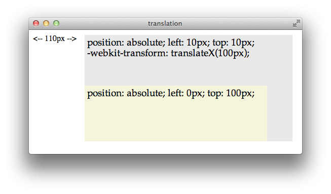
2D translation shifts the contents of an element by a horizontal or vertical offset without changing the top or left properties. The element’s position in the page layout is not changed, but the content is shifted and a shifted coordinate system applies to all descendants of the translated element.
For example, if a div element is positioned at the point 10,10 using the CSS properties top and left , and the element is then translated 100 pixels to the right, the element’s content is drawn at 110,10 . If a child of that div is positioned absolutely at the point 0,100 , the child is also shifted to the right and is drawn at the point 110,110 ; the specified position of 0,100 is shifted right by 100, and the child is drawn at 100,100 relative to the parent’s upper-left corner, which is still at 10,10 . Figure 7-2 illustrates this example.
To apply a 2D translation, set the -webkit-transform property to translateX(offset) , translateY(offset) , or both. For example:
2D Rotation
2D rotation is a rotation in the xy plane. By default, 2D rotation spins an object around its center point. To rotate an element around a different point, see Changing the Origin . Rotation is specified in degrees clockwise from the element’s orientation after any inherited rotation; rotation affects the specified element and all of its descendants. The coordinate system of any descendants is likewise rotated.
The following snippet rotates a div element 45 degrees clockwise, as shown in Figure 7-3 . The div element has a beige background and contains a paragraph of text and an image; both the text and the image inherit the div element’s rotation. A second div is positioned under the rotated div to show the original div ’s position prior to rotation.
<div style="-webkit-transform: rotate(45deg);" >

Rotation can be specified in positive or negative degrees. For example, -webkit-transform: rotate(-45deg); specifies a 45 degree rotation counterclockwise. If rotation is animated, specifying a degree of rotation greater than the current degree causes clockwise rotation; specifying a degree of rotation less than the current degree causes counter-clockwise rotation.
When animating rotation, it can be useful to specify a rotation of more than 360 degrees. For example, Listing 7-1 uses JavaScript to set a rotation of 3600deg , causing a div element to spin clockwise ten times. The text spins once on page load, and a button lets the user spin it again.
Listing 7-1 Animating 2D rotation
Notice that the CSS property -webkit-transform is addressed in JavaScript as element.style.webkitTransform . Notice also that the spin() function increments the rotation angle by 3600 each time it is called; setting the angle to 3600deg repeatedly would have no effect.
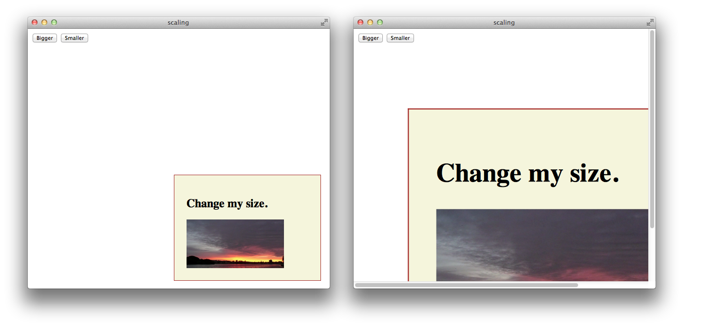
2D scaling makes an element smaller or larger in one or two dimensions. Scaling affects the whole element, including any border thickness. By default, the element is scaled up or down relative to its center, which causes all four of the element’s corners to be redrawn at new locations. The element’s top , left , height , and width properties are unchanged, however, so the layout of the page is not affected. Consequently, scaling an element up can cause it to cover other elements on the page unless you design the layout to allow room for the expansion.
Scaling modifies the coordinate system of an element’s descendants, multiplying the x and y values by the specified scaling factor. For example, if a div element contains an image positioned absolutely at 10,10 , with a height and width of 100 pixels, scaling-up the div element by a factor of two results in a 200 x 200 image, positioned at 20,20 relative to the div ’s upper-left corner, which moves up and to the left. Figure 7-4 illustrates this behavior.
Apply a scale transformation by setting the -webkit-transform property to scale(x y) , where x and y are independent scale factors for width and height, or by setting the transform property to scale(size) , where size is the scaling factor in both dimensions. For example:
style=”webkit-transform: scale(1, 2)” renders an element the same width, but twice as tall.
style=”webkit-transform: scale(2, 0.5)” renders an element twice as wide and half as tall.
style=”webkit-transform: scale(1.5)” renders an element 1.5 times larger.
Setting Multiple Transforms
Different transforms, such as rotation and scaling, are applied by setting different values to a single property: -webkit-transform . Consequently, if you apply one transform to an element and then specify another transform, the first transform is no longer applied; the new value overwrites the old one, as with any CSS property.
There are two different ways to perform multiple transforms on an element—both scaling and rotating an element, for example:
Use inheritance to apply multiple transforms: create a scaled div element, for example, add your element as a child, then rotate the child element.
Set the -webkit-transform property of the element to a space-delimited list of transform functions, such as:
-webkit-transform: scale(2) rotate(45deg);
When a list of functions is provided, the final transformation value for the element is obtained by performing a matrix concatenation of each entry in the list. (Matrix concatenation can have some side effects, such as normalizing the rotation angle modulo 360.)
Both approaches—transform inheritance and transform function lists—are valid. The following two examples illustrate two ways to apply a set of transforms to an element. Listing 7-2 sets an element’s transform property to a list of transform functions. Listing 7-3 produces the same results by applying each transform to a nested element.
Listing 7-2 Setting multiple transforms using a list
Listing 7-3 Nesting 2D transforms
Changing the Origin
By default, the origin for transforms is the center of an element’s bounding box. Most HTML and CSS entities use the upper-left corner as the default origin, but for transforms, it is usually more convenient to use the center of an element as a reference point. Consequently, elements rotate around their center by default, and scale up or down from the center out.
To change the origin for transforms of a given element, set the -webkit-transform-origin property. The new origin is specified as a distance or percentage from the element’s upper-left corner. For example, the default center origin can be expressed as -webkit-transform-origin: 50% 50%; . Changing the origin to 0% 0% or 0px 0px causes transformation to occur around the upper-left corner of the element.
The code in Listing 7-4 rotates the second box in Figure 7-5 around the top-right corner.
Listing 7-4 Rotating an element around the top-right corner

3D Transforms
The standard HTML coordinate system has two axes—the x-axis increases horizontally to the right, and the y-axis increases vertically downwards. With 3D transforms, a z-axis is added, with positive values rising out of the window toward the user and negative values falling away from the user, as Figure 7-6 illustrates.

3D transforms move an element out of the usual xy plane, where z=0—the plane of the display. A transformed element is still two dimensional, but it no longer lies in the usual plane. A transformed object may be translated along the z-axis, rotated around the x- or y-axis, or transformed using some combination of translation and rotation.
All HTML elements have a z-index. The z-index controls the rendering order when elements overlap. An element’s z-index has nothing to do with its z-axis coordinate. Transformed objects follow the standard HTML rendering rules—objects with higher z-index values are drawn on top of other objects with lower z-index values—but for elements sharing the same z-index, the areas with higher z-axis coordinate values are drawn on top.
Adding 3D Perspective
To render elements with the appearance of depth, you must specify a perspective. If you apply 3D transforms without setting the perspective, elements appear flattened. For example, if you rotate an element around its y-axis without setting the perspective, the element just appears narrower. If you rotate an element 90 degrees from the default xy plane, it is seen edge-on—the element either disappears entirely or is displayed as a line.
Adding perspective distorts the appearance of objects realistically, making nearby things appear larger and distant things look smaller. The closer the object, the greater the distortion. In order for Safari to create the illusion of depth, it’s necessary to specify a point of view, or perspective. Once Safari knows where the user’s eye is relative to an element, it knows how much distortion to apply and where.
Use the -webkit-perspective property to set the perspective for all the descendants of an element. For example:
The perspective is specified in distance from the screen. You may specify the distance in pixels, centimeters, inches, or any CSS distance unit. If no unit type is supplied, px is assumed.
Listing 7-5 sets the -webkit-perspective property using a slider.
Listing 7-5 Adding a perspective slider
Figure 7-7 shows two perspective settings from the previous example in which a child element is rotated 45 degrees around the x-axis. The elements are shown at the same rotation and position in both cases, but with different perspective settings.

You can envision perspective view as a pyramid, with the point of the pyramid centered at the user’s eye, and the base of the pyramid extending into the infinite distance. By setting the -webkit-perspective property, you specify the viewpoint’s z-coordinate—how far the point of the pyramid lies above the screen. By default, the x- and y-coordinates of the viewpoint are the center of the element to which the -webkit-perspective property belongs.
Shift the viewpoint horizontally or vertically by setting the -webkit-perspective-origin property. The default setting is -webkit-perspective-origin: 50% 50% . To set the viewpoint above the top-left corner of an element, for example, set the element’s style to -webkit-perspective-origin: 0px 0px .
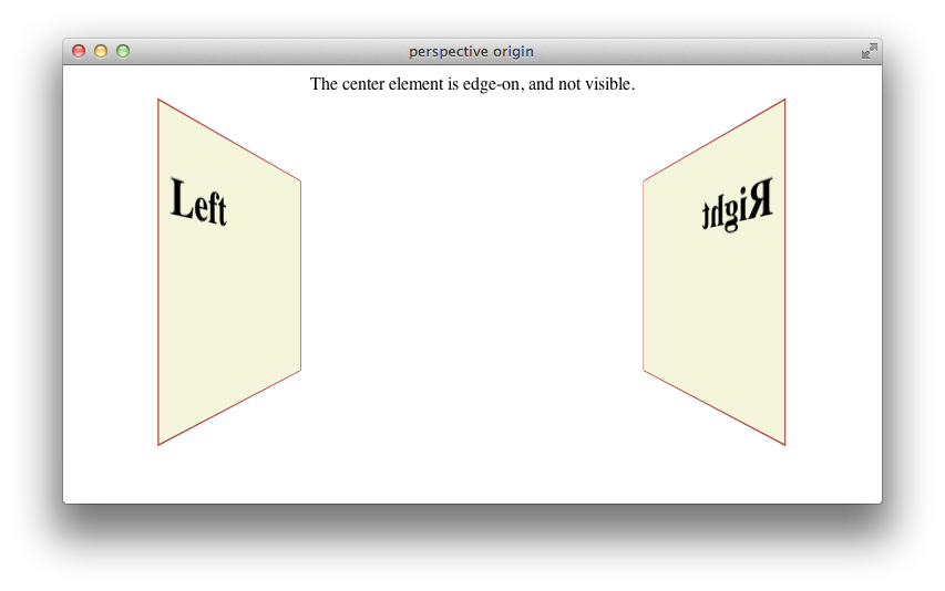
The perspective origin can affect the visibility of elements. For example, if an element is rotated 90 degrees out of the default plane, it is viewed edge-on: if the perspective origin is directly in front of the element, the element is invisible; but if the origin is off-center from the element, one side of the element can be seen. For example, Listing 7-6 creates three div elements, all rotated 90 degrees. The elements positioned on the left and right of the window are visible. When the window is sized appropriately, however, the element in the center of the window is edge-on to the viewer and cannot be seen, as Figure 7-8 illustrates.
Listing 7-6 Effects of perspective origin
Creating a 3D Space
By default, the descendants of an element are flattened into the plane of their parent. When you apply a 3D transform to an element, that element’s plane is no longer the default xy plane—the plane of the display. All descendants of the element share that element’s new plane. In order to further transform the children of an element relative to that element’s plane, you must set the -webkit-transform-style property to preserve-3d , creating a 3D space. For example:
<div id="space3d" style="-webkit-transform-style: preserve-3d;">
Setting the transform style to preserve-3d in an element makes that element into a 3D container; all the element’s immediate children can be manipulated independently in 3D, relative to the parent. Because HTML elements are flat, a transformed child also occupies a plane in 3D space. Each child can occupy a separate plane, or multiple children can share the same plane. By default, any descendants of these transformed children are flattened into their parental plane; setting the transform style to preserve-3d affects only an element’s immediate children.
3D containers can be nested. Enabling 3D transforms in one of a container element’s descendants creates a nested 3D layer; children of that descendant can be transformed in 3D, relative to their container’s plane. You need to enable 3D in a particular element only if the element’s children are to be transformed in 3D relative to that element’s plane.
Any transform applied to a 3D container is inherited by all of its descendants. By applying a rotation to the highest level 3D container, for example, you are able to rotate the view of all of the container’s contents at once.
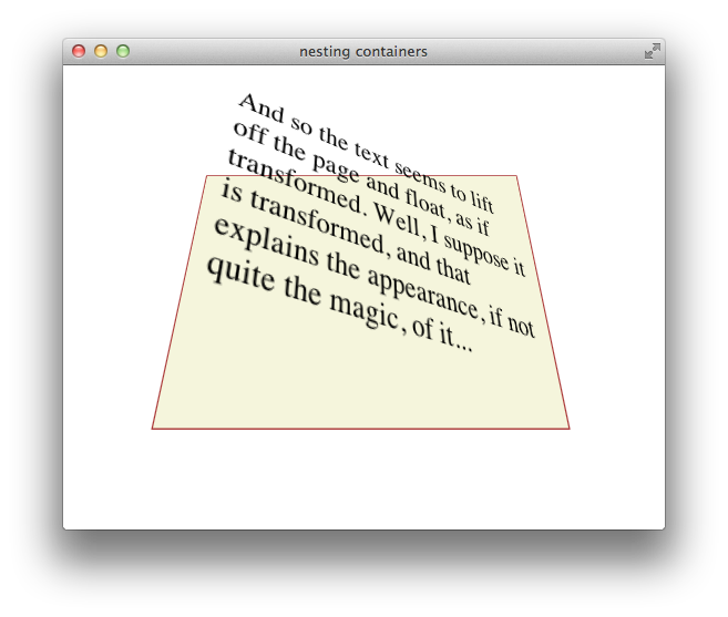
Listing 7-7 gives an example of a nested pair of 3D containers, illustrated in Figure 7-9 . The topmost container has a child div element rotated 45 degrees on its x-axis, so it appears to be tilted away from the viewer. This child div is also a 3D container, containing a paragraph of text rotated 35 degrees on its right edge away from the container, causing the text to appear to lift off the page.
Listing 7-7 Nested 3D rotations
Generally speaking, you need to create only a single 3D container—all 3D transforms can be applied relative to the default xy plane, and global transforms can be applied to the top-level container and inherited by all its descendants. Sometimes it may be convenient to manipulate a subgroup of transformed elements as a unit, however; in such a case, it makes sense to create a nested container.
To disable 3D for an element’s children dynamically, set the -webkit-transform-style property to flat . Applying a 3D transform when the transform style is set to flat does not move the element out of its parent’s plane.
3D Transform Functions
Like 2D transforms, 3D transforms are set using the -webkit-transform property. You can apply a transform to an element by specifying a transform function, a list of transform functions, or by passing in a 3D matrix. There are several functions that perform 3D transforms:
translateZ(distance) —Moves an element closer or farther away.
translate3d(x, y, z) —Moves an element in three dimensions.
rotateX(degrees) —Rotates an element around the x-axis, moving the top and bottom closer or farther away.
rotateY(degrees) —Rotates an element around the y-axis, moving the left and right sides closer or farther away.
perspective(distance) —Sets the 3D perspective for a single element.
3D Translation
3D translation moves an element closer to or farther from the viewer by changing its position on the z-axis. Use the translateZ() function to shift an element on the z-axis, or the translate3d(x, y, z) function to shift an element on two or three axes. For example:
The 3D translation functions work like their 2D counterparts, except that the z offset cannot be specified as a percentage. Z-axis units may be positive (towards the viewer) or negative (away from the viewer). Figure 7-10 shows two identical div elements with same height, width, and x and y positions, one translated on the z-axis by 100 px and the other translated by -100 px.
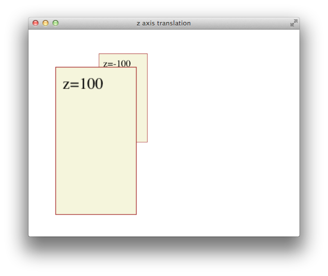
All descendants of an element inherit its z-axis translation. Note that the text in the previous illustration is translated along with its parent.
3D Rotation
You can rotate an element in 3D either around the y-axis, so that the right and left edges get nearer and farther away, or around the x-axis, so that the top and bottom edges get nearer and farther away. For example:
Rotation is around an imaginary x- or y-axis that passes through the element’s origin. By default, the origin is at the center of an object. Positive x units rotate the top edge away. Positive y units rotate the right edge away. This is illustrated in Figure 7-11 .
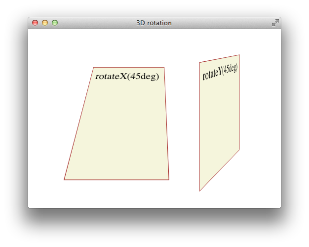
All descendants of an element inherit its 3D rotation. Note that the text in the previous illustration is rotated along with its parent.
Setting Perspective for a Single Element
To create a 3D space with a shared perspective, you need to create a 3D container that has the -webkit-perspective property set; but if you just want to render a single element with the appearance of depth, you can set the -webkit-transform property to a list of transform functions that includes the perspective(distance) function as the first transform. For example:
The foregoing snippet performs two 3D transforms on an element—rotation about the x-axis and perspective distortion, as if the user were viewing the object from 10 cm in front of the screen.
In almost all cases, it is better to create a 3D container and set the -webkit-perspective property for the container element than it is to apply the perspective() transform to an element directly. See Figure 7-7 for details.
Back Face Visibility
If an element is rotated 90 degrees or more around the x- or y-axis, the back face of the element faces the user. The back face of an element is always transparent, so the user sees a reversed image of the front face through the transparent back face, like a sign painted on a glass door and seen from behind. To prevent the mirror image of the front face from being displayed, set the -webkit-backface-visibility property to hidden . For example:
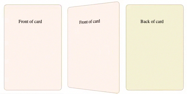
When -webkit-backface-visibility is set to hidden , an element is not displayed where its back face would be visible. One reason to do this is to create the illusion that an element has two faces, each with its own content. For example, to create the illusion of a card with different contents on the front and back face, two elements are positioned back to back in the same location. The two elements are then rotated together, progressively hiding the front element and revealing the back element. If the back face of the top element were visible, it would obscure the element beneath it instead of revealing the element beneath it as it rotates. Listing 7-8 creates the illusion of a card with content on both sides, as Figure 7-12 shows.
Listing 7-8 Hiding the back side of a card
Using Transformation Matrices
A transformation matrix is a small array of numbers (nine numbers for a 2D matrix, sixteen for a 3D matrix) used to transform another array, such as a bitmap, using linear algebra. Safari provides convenience functions for the most common matrix operations—translation, rotation, and scaling—but you can apply other transforms, such as reflection or shearing, by setting the matrix yourself.
2D Matrix Operations
For a 2D transform, set the -webkit-transform property to matrix(a,b,c,d,e,f) , where the matrix position of the parameters is in column order, as Figure 7-13 shows. The first column in the matrix is the x vector; the second column is the y vector.

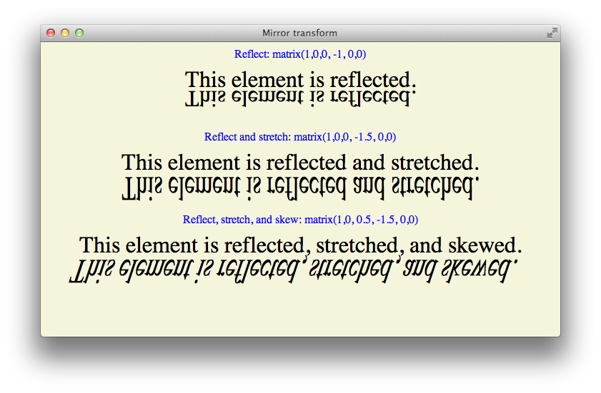
To make full use of transformation matrices, you need an understanding of linear algebra. But even without an understanding of linear algebra, you can often look up the matrix values for a particular effect. For example, here are the settings for reflection around the x- and y-axes:
Reflection around the y-axis— -webkit-transform: matrix(-1,0,0,1,0,0);
Reflection around the x-axis— -webkit-transform: matrix(1,0,0,-1,0,0);
Here are the matrix parameter settings for some common effects:
translate(x, y) = matrix(1, 0, 0, 1, x, y)
scale(x, y) = matrix(x, 0, 0, y, 0, 0)
rotate(a) = matrix(cos(a), sin(a), -sin(a), cos(a), 0, 0)
skewx(a) = matrix(1, 0, tan(a), 1, 0, 0)
skewy(a) = matrix(1, tan(a), 0, 1, 0, 0)
An example of using matrix settings to mirror, stretch, and skew elements is given in Listing 7-9 and is illustrated in Figure 7-14 .
Listing 7-9 Matrix example
3D Matrix Operations
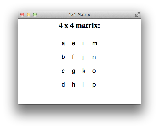
For a 3D transform, set the -webkit-transform property to matrix3d(a,b,c,d,e,f,g,h,i,j,k,l,m,n,o,p) , where the parameters are a homogeneous 4 x 4 matrix in column-major order. This means that the a , b , c , and d parameters, for example, line up as the first column in a 4 x 4 matrix, as Figure 7-15 shows. The first column is the x vector, the second column is the y vector, and the third column is the z vector.
Following are some common parameter settings for 3D transforms:
Identity matrix— matrix3d(1,0,0,0,0,1,0,0,0,0,1,0,0,0,0,1)
Translate matrix— matrix3d(1,0,0,tX,0,1,0,tY,0,0,1,tZ,0,0,0,1)
Scale matrix— matrix3d(sX,0,0,0,0,sY,0,0,0,0,sZ,0,0,0,0,1)
RotateX(a) matrix— matrix3d(1,0,0,0,0,cos(a),sin(a),0,0,sin(-a),cos(a),0,0,0,0,1)
RotateY(a) matrix— matrix3d(cos(a),0,sin(-a),0,0,1,0,0,sin(a),0,cos(a),0,0,0,0,1)
Working with Transforms in JavaScript
There are a few things to be aware of when using JavaScript to control transforms.
The CSS names for transform properties are different than the JavaScript names. When using JavaScript to set a property, delete the hyphens from the property name and capitalize the first letter of the following word. The following snippet shows how to set properties for an element with the ID “myElement” in CSS and JavaScript:
You cannot set a transform property to two consecutive states in a single JavaScript execution cycle . As with all CSS properties, transforms are not applied until the current JavaScript context finishes execution. If you need to set a property to consecutive states, break the code into separate functions and set a timeout; this allows the context to complete. For example, suppose you want to animate a rotation from 0-360 degrees repeatedly. You might do this by disabling the animation, setting the rotation to 0deg , enabling the animation, and setting the rotation to 360deg . Unless you end the JavaScript context between the two settings, the code will not work. The following snippet shows how to accomplish the task:
If you dynamically trigger transformation of an already-transformed element, the old transforms are lost. You must set the style.webkitTransform property to a list of all the transforms necessary to bring the element from its native position and orientation to the desired state. Example: Animated Rotating Box Under JavaScript Control gives an example of the necessary steps in the buttons that open and close the lid of the box.
Transforming an element in an onclick handler may move the element behind other elements so that touch or mouse events are intercepted by those other elements. One solution is to include touch and mouse handlers on any elements that the desired target element may be transformed behind.
If you set the -webkit-transform property using a list of transform functions as parameters, the functions may be combined into a matrix before being applied. Combining transform functions into a matrix normalizes rotation settings modulo 360 so that a setting of 720deg , for example, is normalized to 0deg . You can avoid this behavior by using the same set of transform functions every time you transform the element.
You can use the webkitTransform property to get an element’s transform . Use the window.getComputedStyle() method to obtain the property, as shown in the following snippet:
The webkitTransform property is a string representation of a list of transform operations. Usually this list contains a single matrix transform operation. For 3D transforms, the value is "matrix3d(...)" with the 16 values of the 4 x 4 homogeneous matrix between the parentheses. For 2D transforms, the value is a "matrix(...)" string containing the six vector values.
Example: Animated Rotating Box Under JavaScript Control
The following listing illustrates several of the points covered in Working with Transforms in JavaScript . The result is illustrated in Figure 7-16 .
Copyright © 2016 Apple Inc. All Rights Reserved. Terms of Use | Privacy Policy | Updated: 2016-10-27
Sending feedback…
We’re sorry, an error has occurred..
Please try submitting your feedback later.
Thank you for providing feedback!
Your input helps improve our developer documentation.
How helpful is this document?
How can we improve this document.
* Required information
To submit a product bug or enhancement request, please visit the Bug Reporter page.
Please read Apple's Unsolicited Idea Submission Policy before you send us your feedback.
CSS Reference
Css properties, css transform-style property.
Let the transformed child elements preserve the 3D transformations:
Definition and Usage
The transform-style property specifies how nested elements are rendered in 3D space.
Note: This property must be used together with the transform property.
To better understand the transform-style property, view a demo .
Show demo ❯
Browser Support
The numbers in the table specify the first browser version that fully supports the property.
Numbers followed by -webkit- or -moz- specify the first version that worked with a prefix.
Advertisement
Property Values
Related pages.
CSS tutorial: CSS 2D Transforms
CSS tutorial: CSS 3D Transforms
HTML DOM reference: transformStyle property

COLOR PICKER

Contact Sales
If you want to use W3Schools services as an educational institution, team or enterprise, send us an e-mail: [email protected]
Report Error
If you want to report an error, or if you want to make a suggestion, send us an e-mail: [email protected]
Top Tutorials
Top references, top examples, get certified.
transform-style

The transform-style property, when applied to an element, determines if that element’s children are positioned in 3D space, or flattened.
- Skip to main content
- Select language
- Skip to search
- transform-style
Formal syntax
This is an experimental technology Because this technology's specification has not stabilized, check the compatibility table for usage in various browsers. Also note that the syntax and behavior of an experimental technology is subject to change in future versions of browsers as the specification changes.
The transform-style CSS property determines if the children of the element are positioned in the 3D-space or are flattened in the plane of the element.
If flattened, the children will not exist on their own in the 3D-space.
As this property is not inherited, it must be set for all non-leaf descendants of the element.
Specifications
Browser compatibility.
[1] In addition to the unprefixed support, Gecko 44.0 (Firefox 44.0 / Thunderbird 44.0 / SeaMonkey 2.41) added support for a -webkit prefixed version of the property for web compatibility reasons behind the preference layout.css.prefixes.webkit , defaulting to false . Since Gecko 49.0 (Firefox 49.0 / Thunderbird 49.0 / SeaMonkey 2.46) the preference defaults to true .
- Using CSS Transforms
Document Tags and Contributors
- CSS Property
- CSS Transforms
- Experimental
- CSS Reference
- Using CSS transforms
- backface-visibility
- 0 becomes larger; each 3D-element with z<0 becomes smaller. The strength of the effect is determined by the value of this property."> perspective
- perspective-origin
- transform-box
- transform-origin
- CSS data type denotes a function used to modify an element's appearance. A transform can usually be expressed by matrices, with the result determined by using matrix multiplication on each point."> <transform-function>
3D Transforms
Jul 16, 2009
by Simon Fraser
WebKit on Mac OS X now has support for CSS 3D transforms , which allow you to position elements on the page in three-dimensional space using CSS. This is a natural extension of 2D transforms, which we described in an earlier blog post . 3D transforms have been supported on iPhone since 2.0, and now we’re please to announce that we have currently added support for Leopard and later.
If you want to jump right in and see a demo, make sure you’re running recent WebKit nightly build on Leopard or later, and load this example:
Poster Circle
Here’s a screenshot for those not running a recent-enough WebKit (if you are, hover over it for a treat!):
Like many of the examples you’ll see here, this one combines CSS transforms with CSS transitions and animations to great effect.
3D transforms are applied via the same -webkit-transform property as 2D transforms. For example, here’s how to rotate an element about the Y (vertical) axis:
There are several new transform functions available for use in the -webkit-transform property:
We’ve also extended one other CSS transform property, and implemented the four other 3D-related properties described in the spec:
-webkit-transform-origin now accepts three values, allowing you to specify a z offset for the transform origin.
-webkit-perspective is used to give an illusion of depth; it determines how things change size based on their z-offset from the z=0 plane. You can think of it as though you’re looking at the page from a distance p away. Objects on the z=0 plane appear in their normal size. Something at a z offset of p /2 (halfway between the viewer and the z=0 plane) will look twice as big, and something at a z offset of – p will look half as big. Thus, large values give a little foreshortening effect, and small values lots of foreshortening. Values between 500px and 1000px give a reasonable-looking result for most content.
The default origin for the perspective effect is the center of the element’s border box, but you can control this with -webkit-perspective-origin .
Here’s an example that shows how perspective works:
Perspective
The interesting thing about -webkit-perspective is that it does not affect the element directly. Instead, it affects the appearance of the 3D transforms on the transformed descendants of that element; you can think of it as adding a transform that gets multiplied into the descendant transforms. This allows those descendants to all share the same perspective as they move around.
We’ve described how you can assign 3D transforms to elements and make them look three-dimensional with some perspective. However, so far, all the effects are really just painting effects. Those transformed children are still rendering into the plane of their parent; in other words, they are flattened .
When you start to build hierarchies of objects with 3D transforms, flattening is not what you want. You want parents and children to live in a shared three-dimensional space, and to all share the same perspective which propagates up from some container. This is where -webkit-transform-style comes in.
-webkit-transform-style has two values:
- flat : This is the default value, and gives the behavior described above; transformed children are flattened into the plane of their parent (think of the 3D transform as simply a painting effect).
- preserve-3d : This value states that the element to which it is assigned does not flatten its children into it; instead, those children live in a shared 3D space with the element.
Here’s an example that shows transform-style in action:
Transform Style
A common pattern, therefore, is to have content that looks like this:
Here both ‘leaf’ and ‘box’ share the same 3D space, so both appear with the perspective specified on the container. ‘box’ can also be rotated with a transition or animation, and ‘leaf’ will move around as ‘box’ moves, in perspective.
One thing you may have noticed in these demos is that it’s quite common to have a 3D transform that flips an element around so that you can see its reverse side. In some cases you don’t want the element to appear at all in this situation (say, for example, you want to position two elements back-to-back, so you need to hide the one that’s facing away from the viewer). This is the reason for the last 3d-related property, -webkit-backface-visibility . Its two values— visible (the default), and hidden —specify whether the element is visible or not when that element is transformed such that its back face is towards the viewer.
Here’s a final example that shows backface-visibility in action, along with more 3D goodness, animations and transitions:
Morphing Power Cubes

For more information, see the CSS working drafts on 2D transforms , 3D transforms , transitions and animations . There is also documentation in the Safari Reference Library .
We hope you have a blast with these new features, and share your creations with us. If you find bugs, please report them at bugs.webkit.org .
CSS transform-style
The CSS transform-style property is used to determine whether child elements (of a 3D element) should be 3D or flat.
If the value is preserve-3d , the children of the element will be positioned in the 3D-space (i.e. they will appear as 3D). If the value is flat , the children will appear flat (i.e. they won't appear as 3D).
Possible Values
Explanation of these values:
In addition, all CSS properties also accept the following CSS-wide keyword values as the sole component of their property value:
Basic Property Information
In HTML , a transformable element is either:
- a block-level or atomic inline-level element
- or whose CSS display property computes to table-row , table-row-group , table-header-group , table-footer-group , table-cell , or table-caption
In SVG, a transformable element is an element which has the attributes transform , patternTransform or gradientTransform .
Example Code
Working example within an html document, css specifications.
- The transform-style property is defined in CSS Transforms Module Level 1 (W3C Working Draft, 26 November 2013).
Browser Support
The following table provided by Caniuse.com shows the level of browser support for this feature.
Vendor Prefixes
For maximum browser compatibility many web developers add browser-specific properties by using extensions such as -webkit- for Safari, Google Chrome, and Opera (newer versions), -ms- for Internet Explorer, -moz- for Firefox, -o- for older versions of Opera etc. As with any CSS property, if a browser doesn't support a proprietary extension, it will simply ignore it.
This practice is not recommended by the W3C, however in many cases, the only way you can test a property is to include the CSS extension that is compatible with your browser.
The major browser manufacturers generally strive to adhere to the W3C specifications, and when they support a non-prefixed property, they typically remove the prefixed version. Also, W3C advises vendors to remove their prefixes for properties that reach Candidate Recommendation status.
Many developers use Autoprefixer , which is a postprocessor for CSS. Autoprefixer automatically adds vendor prefixes to your CSS so that you don't need to. It also removes old, unnecessary prefixes from your CSS.
You can also use Autoprefixer with preprocessors such as Less and Sass .
- transform-origin
- perspective
- perspective-origin
- backface-visibility
- CSS3 Properties
- CSS properties
- Español – América Latina
- Português – Brasil
- Tiếng Việt
- Chrome for Developers
Performant Parallaxing

Love it or hate it, parallaxing is here to stay. When used judiciously, it can add depth and subtlety to a web app. The problem, however, is that implementing parallaxing in a performant way can be challenging. In this article, we’ll discuss a solution that is both performant and, just as importantly, works cross-browser.

- Don’t use scroll events or background-position to create parallax animations.
- Use CSS 3D transforms to create a more accurate parallax effect.
- For Mobile Safari use position: sticky to ensure that the parallax effect gets propagated.
If you want the drop-in solution, head over to the UI Element Samples GitHub repo and grab the Parallax helper JS ! You can see a live demo of the parallax scroller in the GitHub repo.
Problem parallaxers
To begin with, let’s take a look at two common ways of achieving a parallax effect, and in particular, why they are unsuitable for our purposes.
Bad: using scroll events
The key requirement of parallaxing is that it should be scroll-coupled; for every single change in the page’s scroll position, the parallaxing element's position should update. While that sounds simple, an important mechanism of modern browsers is their ability to work asynchronously. This applies, in our particular case, to scroll events. In most browsers scroll events are delivered as "best-effort" and are not guaranteed to be delivered on every frame of the scroll animation!
This important piece of information tells us why we need to avoid a JavaScript-based solution that moves elements based on scroll events: JavaScript doesn’t guarantee that parallaxing will keep in step with the page’s scroll position . In older versions of Mobile Safari, scroll events were actually delivered at the end of the scroll, which made it impossible to make a JavaScript-based scroll effect. More recent versions do deliver scroll events during the animation, but, similarly to Chrome, on a "best-effort" basis. If the main thread is busy with any other work, scroll events will not get delivered immediately, meaning the parallax effect will be lost.
Bad: updating background-position
Another situation we’d like to avoid is painting on every frame. Many solutions attempt to change background-position to provide the parallax look, which causes the browser to repaint the affected parts of the page on scroll, and that can be costly enough to significantly jank the animation.
If we want to deliver on the promise of parallax motion, we want something that can be applied as an accelerated property (which today means sticking to transforms and opacity), and which doesn’t rely on scroll events.
Both Scott Kellum and Keith Clark have done significant work in the area of using CSS 3D to achieve parallax motion, and the technique they use is effectively this:
- Set up a containing element to scroll with overflow-y: scroll (and probably overflow-x: hidden ).
- To that same element apply a perspective value, and a perspective-origin set to top left , or 0 0 .
- To the children of that element apply a translation in Z, and scale them back up to provide parallax motion without affecting their size on screen.
The CSS for this approach looks like so:
Which assumes a snippet of HTML like this:
Adjusting scale for perspective
Pushing the child element back will cause it to get smaller proportional to the perspective value. You can calculate how much it will need to be scaled up with this equation: (perspective - distance) / perspective . Since we most likely want the parallaxing element to parallax but appear at the size we authored it, it would need to be scaled up in this way, rather than being left as is.
In the case of the above code, perspective is 1px , and the parallax-child 's Z distance is -2px . This means that the element will need to be scaled up by 3x , which you can see is the value plugged into the code: scale(3) .
For any content that doesn’t have a translateZ value applied, you can substitute a value of zero. This means the scale is (perspective - 0) / perspective , which nets out at a value of 1, which means that it’s been scaled neither up or down. Quite handy, really.
How this approach works
It’s important to be clear why this works, since we’re going to use that knowledge shortly. Scrolling is effectively a transform, which is why it can be accelerated; it mostly involves shifting layers around with the GPU. In a typical scroll, which is one without any notion of perspective, scrolling happens in a 1:1 manner when comparing the scrolling element and its children. If you scroll an element down by 300px , then its children are transformed up by the same amount: 300px .
However, applying a perspective value to the scrolling element messes around with this process; it changes the matrices that underpin the scroll transform. Now a scroll of 300px may only move the children by 150px, depending on the perspective and translateZ values you chose. If an element has a translateZ value of 0, it will be scrolled at 1:1 (as it used to), but a child pushed in Z away from the perspective origin will be scrolled at a different rate! Net result: parallax motion. And, very importantly, this is handled as part of the browser’s internal scroll machinery automatically, meaning there’s no need to listen to scroll events or change background-position .
A fly in the ointment: Mobile Safari
There are caveats to every effect, and one important one for transforms is about the preservation of 3D effects to child elements. If there are elements in the hierarchy between the element with a perspective and its parallaxing children, the 3D perspective is "flattened", meaning the effect is lost.
In the above HTML, the .parallax-container is new, and it will effectively flatten the perspective value and we lose the parallax effect. The solution, in most cases, is fairly straightforward: you add transform-style: preserve-3d to the element, causing it to propagate any 3D effects (like our perspective value) that have been applied further up the tree.
In the case of Mobile Safari, however, things are a little more convoluted. Applying overflow-y: scroll to the container element technically works, but at the cost of being able to fling the scrolling element. The solution is to add -webkit-overflow-scrolling: touch , but it will also flatten the perspective and we won’t get any parallaxing.
From a progressive enhancement point-of-view, this probably isn’t too much of an issue. If we can’t parallax in every situation, our app will still work, but it would be nice to figure out a workaround.
position: sticky to the rescue!
There is, in fact, some help in the form of position: sticky , which exists to allow elements to "stick" to the top of the viewport or a given parent element during scroll. The spec, like most of them, is fairly hefty, but it contains a helpful little gem within:
This may not appear to mean a great deal at first glance, but a key point in that sentence is when it refers to how, exactly, the stickiness of an element is calculated: "the offset is computed with reference to the nearest ancestor with a scrolling box" . In other words, the distance to move the sticky element (in order for it to appear attached to another element or the viewport) is calculated before any other transforms are applied, not after . This means that, very much like the scrolling example earlier, if the offset was calculated at 300px, there’s a new opportunity to use perspectives (or any other transform) to manipulate that 300px offset value before it’s applied to any sticky elements.
By applying position: -webkit-sticky to the parallaxing element, we can effectively "reverse" the flattening effect of -webkit-overflow-scrolling: touch . This ensures that the parallaxing element references the nearest ancestor with a scrolling box, which in this case is .container . Then, similarly to before, the .parallax-container applies a perspective value, which changes the calculated scroll offset and creates a parallax effect.
This restores the parallax effect for Mobile Safari, which is excellent news all round!
Sticky positioning caveats
There is a difference here, however: position: sticky does alter the parallax mechanics. Sticky positioning tries to, well, stick the element to the scrolling container, whereas a non-sticky version doesn’t. This means that the parallax with sticky ends up being the inverse of the one without:
- With position: sticky , the nearer the element is to z=0 the less it moves.
- Without position: sticky , the nearer the element is to z=0 the more it moves.
If that all seems a bit abstract, take a look at this demo by Robert Flack, which demonstrates how elements behave differently with and without sticky positioning. To see the difference, you need Chrome Canary (which is version 56 at the time of writing) or Safari.

A demo by Robert Flack showing how position: sticky affects parallax scrolling.
Assorted bugs and workarounds
As with anything, though, there are still lumps and bumps that need to be smoothed over:
- Sticky support is inconsistent. Support is still being implemented in Chrome, Edge lacks support entirely, and Firefox has painting bugs when sticky is combined with perspective transforms . In such cases, it’s worth adding a little code to only add position: sticky (the -webkit- prefixed version) when it’s needed, which is for Mobile Safari only.
- The effect doesn’t "just work" in Edge. Edge tries to handle scrolling at the OS level, which is generally a good thing, but in this case it prevents it from detecting the perspective changes during scroll. To fix this, you can add a fixed position element, as this seems to switch Edge over to a non-OS scrolling method , and ensures that it accounts for perspective changes.
- "The page’s content just got huge!" Many browsers account for the scale when deciding how big the page’s content is, but sadly Chrome and Safari don’t account for perspective . So if there’s - say - a scale of 3x applied to an element, you may well see scroll bars and the like, even if the element is at 1x after the perspective has been applied. It is possible to work around this issue by scaling elements from the bottom right corner (with transform-origin: bottom right ), which works because it will cause oversized elements to grow into the "negative region" (typically the top left) of the scrollable area; scrollable regions never let you see or scroll to content in the negative region.
Parallaxing is a fun effect when used thoughtfully. As you can see, it’s possible to implement it in a way that is performant, scroll-coupled, and cross-browser. Since it requires a little bit of mathematical wriggling, and a small amount of boilerplate to get the desired effect, we have wrapped up a small helper library and sample, which you can find in our UI Element Samples GitHub repo .
Have a play, and let us know how you get on.
Except as otherwise noted, the content of this page is licensed under the Creative Commons Attribution 4.0 License , and code samples are licensed under the Apache 2.0 License . For details, see the Google Developers Site Policies . Java is a registered trademark of Oracle and/or its affiliates.
Last updated 2016-12-02 UTC.
- CSS Tutorial
- CSS Exercises
- CSS Interview Questions
- CSS Selectors
- CSS Properties
- CSS Functions
- CSS Examples
- CSS Cheat Sheet
- CSS Templates
- CSS Frameworks
- CSS Formatter
How to transform child elements preserve the 3D transformations ?
- How to apply multiple transform property to an element using CSS ?
- How to manage the div visibility during 3d transform?
- What is the purpose of the transform Property in CSS ?
- D3.js transform.translate() Function
- HTML | DOM Style transformOrigin Property
- How to transform background image using CSS3 ?
- How to set a 3D element's base placement in CSS ?
- HTML | DOM Style transformStyle Property
- How to set the perspective from where an element is viewed in CSS ?
- HTML canvas setTransform() Method
- HTML | DOM Style transform Property
- D3.js transform.invert() Function
- Computer Graphics - 3D Rotation Transformations
- Computer Graphics - 3D Composite Transformation
- Computer Graphics - 3D Translation Transformation
- Computer Graphics - 3D Scaling Transformation
- Composite Transformation in 2-D graphics
- 2D Transformation in Computer Graphics | Set 1 (Scaling of Objects)
- Creating animations using Transformations in OpenGL
- Top 10 Projects For Beginners To Practice HTML and CSS Skills
- How to insert spaces/tabs in text using HTML and CSS
- HTML Calculator
- Types of CSS (Cascading Style Sheet)
- How To Create a Fixed Footer ?
- How to select all child elements recursively using CSS?
- CSS :not(:last-child):after Selector
- How to float three div side by side using CSS?
- How to set space between the flexbox ?
- Resize image proportionally with CSS
In this article, we will learn how to transform child elements to preserve the 3D transformation.
The CSS transform-style property is used to transform child elements to preserve the 3D transformations. The transform-style property is used to specify that the children of an element are positioned in 3D space or flattened with respect to the plane of the element. The preserve-3d property value on an element, one can preserve the 3D transformations of its child element.
Syntax:
Property values:
- preserve-3d: This value enables the child elements to preserve their 3D position.
Example 1: Here is the basic example of our above method.

transform-style:preserve 3d
Example 2: In this example, we are using the CSS transform style property.

flat and preserve 3d properties
Please Login to comment...
Similar reads.

- CSS-Properties
- CSS-Questions
- Web Technologies

Improve your Coding Skills with Practice
What kind of Experience do you want to share?
- a. Send us an email
- b. Anonymous form
- Buyer's Guide
- Upcoming Products
- Tips / Contact Us
- Podcast Instagram Facebook Twitter Mastodon YouTube Notifications RSS Newsletter
Apple Releases Safari Technology Preview 193 With Bug Fixes and Performance Improvements
Apple today released a new update for Safari Technology Preview , the experimental browser Apple first introduced in March 2016. Apple designed the Safari Technology Preview to test features that may be introduced into future release versions of Safari.

The current Safari Technology Preview release is compatible with machines running macOS Ventura and macOS Sonoma , the latest version of macOS that Apple released in September 2023.
The Safari Technology Preview update is available through the Software Update mechanism in System Preferences or System Settings to anyone who has downloaded the browser . Full release notes for the update are available on the Safari Technology Preview website .
Apple's aim with Safari Technology Preview is to gather feedback from developers and users on its browser development process. Safari Technology Preview can run side-by-side with the existing Safari browser and while designed for developers, it does not require a developer account to download.
Get weekly top MacRumors stories in your inbox.
Top Rated Comments
I'm always curious about these Safari Tech Preview posts. Are they just a quick way to add another headline? I suspect so, as I don't see many people trusting these builds as their daily driver. I've tried that in the past, but it never stuck.
Popular Stories

Apple Announces 'Let Loose' Event on May 7 Amid Rumors of New iPads

Apple Cuts Vision Pro Shipments as Demand Falls 'Sharply Beyond Expectations'

Apple Finally Plans to Release a Calculator App for iPad Later This Year

iOS 17.5 Will Add These New Features to Your iPhone

Apple Releases Open Source AI Models That Run On-Device

Apple Reportedly Stops Production of FineWoven Accessories
Next article.

Our comprehensive guide highlighting every major new addition in iOS 17, plus how-tos that walk you through using the new features.

App Store changes for the EU, new emoji, Podcasts transcripts, and more.

Get the most out your iPhone 15 with our complete guide to all the new features.
A deep dive into new features in macOS Sonoma, big and small.

Revamped models with OLED displays, M3 chip, and redesigned Magic Keyboard accessory.

Updated 10.9-inch model and new 12.9-inch model, M2 chip expected.

Apple's annual Worldwide Developers Conference will kick off with a keynote on June 10.

Expected to see new AI-focused features and more. Preview coming at WWDC in June with public release in September.
Other Stories

10 hours ago by Joe Rossignol

2 days ago by Tim Hardwick

Mega Mall Khimki

Most Recent: Reviews ordered by most recent publish date in descending order.
Detailed Reviews: Reviews ordered by recency and descriptiveness of user-identified themes such as wait time, length of visit, general tips, and location information.

Also popular with travelers

Mega Mall Khimki - All You Need to Know BEFORE You Go (2024)
IMAGES
VIDEO
COMMENTS
Please someone suggest me various scenarios where preserve-3d might not work or can there be come other problem. ... When I look at your first example (code_on_jsfiddle) in Safari it works fine, but in Chrome, as mentioned above, the background-image is visible all the time, but the rotation is working. I'm using Chrome 20..1132.57 and Safari ...
It's good in android and chrome, but It is seem not work in Safari. I already use autoprefixer and add -webkit-. Why no effect? position: relative; height: 100vh; overflow: scroll; overflow-scrolling: touch; -webkit-overflow-scrolling: touch; transform-style: preserve-3d;
Safari supports both 2D and 3D transforms. Both 2D and 3D transforms are W3C drafts. ... Setting the transform style to preserve-3d in an element makes that element into a 3D container; all the element's immediate children can be manipulated independently in 3D, relative to the parent. Because HTML elements are flat, a transformed child also ...
Transform style demonstration. In this example we have a 3D cube created using transforms. The parent container of the cube faces has transform-style: preserve-3d set on it by default, so it is transformed in the 3D space and you can see it as intended. We also provide a checkbox allowing you to toggle between this, and transform-style: flat.
Definition and Usage. The transform-style property specifies how nested elements are rendered in 3D space. Note: This property must be used together with the transform property. To better understand the transform-style property, view a demo. Show demo .
body { margin: 0; /* this overrides the default margin - which is crucial if your background isn't white/blank/undefined */ box-sizing: border-box; /* ensures that the border is within the container's limits rather than outside */ background-color: black; /* the hex code for dark gray, the equivalent of rgb(48,48,48) or hsl(0deg 0% calc( 100% / 16 *3)), and a shorthard for #333333 )*/ display ...
Again, this is because we apply 3D transforms on the cube as we animate it and it has 3D transformed children, so we want our cube to have a value of preserve-3d for transform-style. But setting mix-blend-mode: overlay on our cube forces the used value of transform-style to flat, so the cube faces get flattened into the plane of their parent.
The transform-style property, when applied to an element, determines if that element's children are positioned in 3D space, or flattened. .parent { transform-style: preserve -3d; } It accepts one of two values: flat (the default) and preserve-3d. To demonstrate the difference between the two values, click the toggle button in the CodePen below:
Also note that the syntax and behavior of an experimental technology is subject to change in future versions of browsers as the specification changes. The transform-style CSS property determines if the children of the element are positioned in the 3D-space or are flattened in the plane of the element. If flattened, the children will not exist ...
WebKit on Mac OS X now has support for CSS 3D transforms, which allow you to position elements on the page in three-dimensional space using CSS.This is a natural extension of 2D transforms, which we described in an earlier blog post. 3D transforms have been supported on iPhone since 2.0, and now we're please to announce that we have currently added support for Leopard and later.
CSS transform-style. The CSS transform-style property is used to determine whether child elements (of a 3D element) should be 3D or flat. If the value is preserve-3d, the children of the element will be positioned in the 3D-space (i.e. they will appear as 3D). If the value is flat, the children will appear flat (i.e. they won't appear as 3D).
The solution, in most cases, is fairly straightforward: you add transform-style: preserve-3d to the element, causing it to propagate any 3D effects (like our perspective value) that have been applied further up the tree..parallax-container { transform-style: preserve-3d; } In the case of Mobile Safari, however, things are a little more convoluted.
The preserve-3d property value on an element, one can preserve the 3D transformations of its child element. Syntax: transform-style: preserve-3d. Property values: preserve-3d: This value enables the child elements to preserve their 3D position. Example 1: Here is the basic example of our above method. HTML.
Apple designed the Safari Technology Preview to test features that may be introduced into future release versions of Safari. Safari Technology Preview 193 includes fixes and updates ...
The -webkit-transform-3d Boolean CSS media feature is a WebKit extension whose value is true if vendor-prefixed CSS 3D transform s are supported. Note: While this media feature is currently supported by most browsers. If possible, use an @supports feature query instead.
Skip to main content. Review. Trips Alerts Sign in
A World War II memorial made of over-sized replicas of an anti-tank device invented by Mikhail Gorikker and widely used by the Russians to stop German tanks during that war. A line of those Ezhi has been actually placed in that area in 1941 to stop German tanks in the outskirts of Moscow/ The name of the inventor is mot mentioned anywhere. Read ...
MEGA CARD says it all! Get it today while shopping at new MEGA center in Khimki near Moscow, recently widely advertised at major world travel destinations, and the need "to hit the ball" in order to dance with the prime queen or "run to the base on time" is no longer needed. Destiny is already in your hands!
I met same issue. I have one <iframe> tag with inside element style "-webkit-transform: translate3d(0,0,0)" to force 3d acceleration. It turns out that outside frame with higher z-index is always hidden by the inside iframe element. Just visual hidden, I can "click" on the invisible outside element. This only happens in Mobile Safari. -
I want to be able to hide TEXT1, TEXT2, TEXT3 etc. when hovering with the mouse over either the image or text. I have managed to do this in chrome by adding transform-style: preserve-3d; The link i am sharing with you works in chrome but not in firefox. Working Code Link (works in Chrome but not in Firefox)