Exploring object-fit
On web documents, a common problem concerns the display of different sized images (or videos) in the same place. Perhaps you are writing a dynamic gallery app that accepts user submissions. You can’t guarantee that everyone will upload images of exactly the same aspect ratio, so what do you do?
Letting the aspect ratio distort to fit the containing replaced element nearly always looks horrible. And doing some kind of dynamic cropping or resizing on the fly each time might be more work than you have the capability to implement. (For instance, maybe you’re working on a CMS and don’t have permission to edit anything except the page content.)
The CSS Image Values and Replaced Content module provides properties called object-fit — which solves such problems, and object-position — which sets the horizontal and vertical position of the content inside the element.
These elements have decent support across modern browsers (with the exception of IE). In this article we’ll look at a few examples of how they can be used.
Note: object-fit works with SVG content, but the same effect can also be achieved by setting the preserveAspectRatio="" attribute in the SVG itself.
How do object-fit and object-position work?
You can successfully apply object-fit to any replaced element, for example:
The five possible values of object-fit are as follows:
- contain : The content (e.g. the image) will be resized so that it is fully displayed with intrinsic aspect ratio preserved, but still fits inside the dimensions set for the element.
- fill : The content will expand to exactly fill the dimensions set for the element, even if this does break its aspect ratio.
- cover : Preserves the aspect ratio of the content, but alters the width and height so that the content completely covers the element. The smaller of the two is made to fit the element exactly, and the larger overflows the element and is cropped.
- none : Completely ignores any height or weight set on the element, and just uses the replaced element content’s intrinsic dimensions.
- scale-down : The content is sized as if none or contain were specified, whichever would result in a smaller replaced element size.
object-position works in exactly the same way as background-position does for background images; for example:
Percentages work, but they’re actually resolved against the excess available space — the difference between the element’s width & the replaced content’s final rendered width. So object-position: 50% 50% (the default value) will always exactly center the replaced element. Furthermore, object-position: 0% 0% always means align with top-left corner , object-position: 100% 100% *always* means align with bottom-right corner , etc.
The keywords top , center , right , etc. are really just handy aliases for 0%, 50%, 100%, etc.
Note: You can see some object position examples in our basic example page.
The effects of the different object-fit values
The following code examples show the effects of the different object-fit values.
Letterboxing images with object-fit: contain
Sometimes referred to as letter-boxing, there are times when you will want to preserve the aspect ratio of the images on a page, but get them to fit inside the same area. For example, you might have a content management system that allows you to upload products on an e-commerce site or images for an image gallery, with lots of different content authors. They may upload images in roughly the right size, but the dimensions are not always exact, and you want to fit each image into the same amount of space.
Having images with the aspect ratio shifted usually looks horrible, so you can letterbox them instead with object-fit: contain ( object-fit: contain example ):
Cropping images with object-fit:cover
A different solution is to maintain aspect ratio, but crop each image to the same size so it completely envelops the <img> element, with any overflow being hidden. This can be done easily with object-fit:cover ( object-fit: cover example ):
Overriding a video’s aspect ratio with object-fit: fill
Going in the opposite direction, it is also possible to take a video and force it to change aspect ratio. Maybe some of your content editor’s videos have a broken aspect ratio, and you want to fix them all on the fly, in one easy fell swoop?
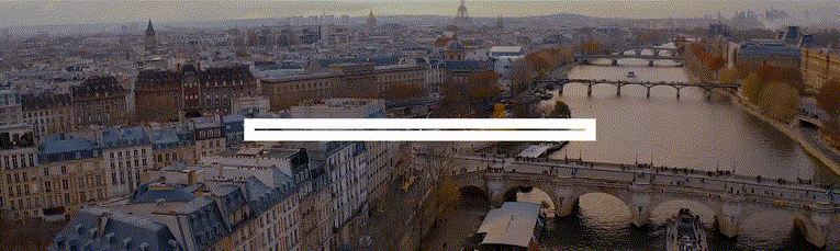
Take the following video image:

It would look terrible: the video would appear letter-boxed, since the <video> element always tries to maintain the source file’s intrinsic aspect ratio. We could fix this by applying object-fit: fill ( object-fit: fill example ):
This overrides the video’s intrinsic aspect ratio, forcing it to completely fill the <video> element so it displays correctly.
Interesting transition effects
Combining object-fit and object-position with CSS transitions can lead to some pretty interesting effects for image or video galleries. For example:
Only a small part of the image is shown, and the element grows to reveal more of the image when it is focused/hovered ( object-fit: none example ).
This is because by setting object-fit: none on the <img> , we cause the content to completely ignore any width and height set earlier, and spill out of the sides of the element. We then use overflow: hidden to crop anything that spills out. A transition is then used to smoothly increase the size of the <img> element when it’s hovered/focused, which reveals more of the image.
Gallery example
To show a slightly more applied usage of object-fit , we have created a gallery example :

The 16 images are loaded via XHR , and inserted into the images as ObjectURLs .
Each image in turn is given an onclick handler so that when clicked the images appear full size, filling the screen (the main image, initially set to display: none; in the CSS is given a class of blowup , which makes it display and fill the whole screen; the main image’s src is then set to the same object URL as the thumb that was clicked).
Clicking a full size image makes it disappear again.
All the sizing is done with percentages so that the grid remains in proportion whatever the screen size.
Note: the thumbnails have all been given tabindex="0" to make them focusable by tabbing (you can make anything appear in the page’s tab order by setting on tabindex="0" on it), and the onclick handler that makes the full size images appear has been doubled up with an onfocus handler to provide basic keyboard accessibility:
The clever parts come with the usage of object-fit :
- The thumbnails: These have object-fit: cover set on them so that all image thumbs will appear at the same size, at the proper aspect ratio, but cropped different amounts. This looks pretty decent, and creates a nice effect when you resize the window.
- The main image: This has object-fit: contain and object-position: center set on it, so that it will appear in full, at the correct aspect ratio and as big as it can be.
Chris Mills is a senior tech writer at Mozilla, where he writes docs and demos about open web apps, HTML/CSS/JavaScript, A11y, WebAssembly, and more. He loves tinkering around with web technologies, and gives occasional tech talks at conferences and universities. He used to work for Opera and W3C, and enjoys playing heavy metal drums and drinking good beer. He lives near Manchester, UK, with his good lady and three beautiful children.
More articles by Chris Mills…
Discover great resources for web development
Sign up for the Mozilla Developer Newsletter:
Thanks! Please check your inbox to confirm your subscription.
If you haven’t previously confirmed a subscription to a Mozilla-related newsletter you may have to do so. Please check your inbox or your spam filter for an email from us.
15 comments
Are there any proper polyfills for this? I’ve needed this for a very long time. Had to make due with this piece of junk for too many years http://thinsoldier.github.io/externals/centerimage/example.html
I did a cursory googling and found this: https://github.com/anselmh/object-fit Tested it out locally and it seems to work well on Firefox release. Hope that helps!
I’ve added in the MDN documentation: https://developer.mozilla.org/en-US/docs/Web/CSS/object-fit#See_also ;-)
this is AMAZING! Thanks MDN!
Polyfill: https://github.com/anselmh/object-fit
I believe a similar article was written several years ago by Chris Mills. And it’s taken until 2015 to see acceptable browser support! IE’s lack of support doesn’t surprise me. Unfortunately, canisue states Safari doesn’t support object-position. I’ve tried/been using JS plugin work-arounds that have never been satisfactory, especially where responsive sizing is a given. Finally, some sigh of relief…
Yup, we are going in the right direction finally. And you are right, my dev.opera.com article is rather old now ;-)
Hey there. I’m the author of the polyfill and while it does its job and polyfills it, the performance can be hoffible if applied to too many elements (on non-webkit browsers). This is due to the fact I need to parse the whole CSS and Gecko and Trident both suck massively at it. Therefore I recommend to test it out wisely before applying it to many elements. If used wisely it does a great job though and I hope it helps to polyfill the technique on older and non-supporting browsers.
Hello Chris, hello everybody… probably a very common question and the answer may help many out there, including me {I’m back along the road for falling in love with Design again}… how to add some effect and some scroll between the pictures without the need to go back to the thumbnails? I’ll look for a proper solution myself of course, because I’m that stubborn, but a little help won’t ruin my pride and rather make me grateful… Cheers!
Hi David, It sounds like you’re asking how to modify the demo to let you switch between photos without zooming out, yes? I’d expect you could just set up some other button (or listen for a keypress like leftarrow/rightarrow) and effectively combine cmills’ two “onclick” functions (to hide the currently-shown image & blow up the next image).
Right on – thanks Daniel for the replies! Yes, it would be simple to add a couple of onscreen buttons or keyboard event handlers to move the blown up photo left or right, to scroll between them. Have a look at the source code and how I’ve implemented the onclick handlers. You could attach a similar handler to a element to create a button that moves the blown up image, or use a body.onpress event handler to use keyboard controls.
Actually the implementation in Gecko (and Blink/WebKit) and the current spec do not allow overflowing for object-fit:cover. It was just the Presto implementation and old spec ( https://dev.opera.com/articles/css3-object-fit-object-position/ ).
Right — nothing *actually* overflows the bounds of its replaced element — it’s cropped. I think Chris knows that — the “object-fit:cover” section of the article is titled “Cropping images with object-fit:cover”, and Chris says “with any overflow being hidden” in that section. (But maybe you’re talking earlier section that goes over the various “object-fit” values at a very high level? If so, I agree that it might be clearer to replace “and the larger overflows the element” in that section with “and the larger overflows the element *and is cropped*.)
Thanks for the comment Simon. ;-) I’ll update the article to clarify this, as Daniel suggests.
Thx. There’s still some stuff about setting overflow: hidden; though. :-)
Comments are closed for this article.

The object-fit property defines how an element responds to the height and width of its content box. It’s intended for images, videos and other embeddable media formats in conjunction with the object-position property. Used by itself, object-fit lets us crop an inline image by giving us fine-grained control over how it squishes and stretches inside its box.
object-fit can be set with one of these five values:
- fill : this is the default value which stretches the image to fit the content box, regardless of its aspect-ratio.
- contain : increases or decreases the size of the image to fill the box whilst preserving its aspect-ratio.
- cover : the image will fill the height and width of its box, once again maintaining its aspect ratio but often cropping the image in the process.
- none : image will ignore the height and width of the parent and retain its original size.
- scale-down : the image will compare the difference between none and contain in order to find the smallest concrete object size.
This is how we might set that property:

Because the second image has an aspect ratio that is different than the original image on the left it will stretch outside the realm of its content box, cropping the top and bottom parts of the image.
It’s worth noting that by default the image is centered within its content box but this can be altered with the object-position property.
The demo below shows five examples detailing how we might want an image to squish into a content box which is sometimes smaller or larger than its original width (resize the browser for a better idea of how this might work):
See the Pen object-fit by Robin Rendle ( @robinrendle ) on CodePen .
If the content of the image does not fill the content box for whatever reason then the unfilled space will show the element’s background, in this instance a light grey background.
Related properties
- object-position
Other resources
- object-fit on W3C
- object-fit on MDN
- object-fit polyfill
Browser support
It’s worth noting that iOS 8-9.3 and Safari 7-9.1 the object-fit property but not object-position .
This browser support data is from Caniuse , which has more detail. A number indicates that browser supports the feature at that version and up.
Mobile / Tablet
The polyfill is a lie! Portal references aside, at the time of writing the polyfill does not currently work in IE which is a real shame for me as I will have to write some JS to continue using this beautiful css prop.
Same here. The whole point of the polyfill is to make IE/Edge be nice. I have poked the IE/Edge dev forum ( https://dev.modern.ie/platform/status// ). We as a community should let MS know what features we really want. It is now ‘Under Consideration’.
There are a few perfectly-working polyfills: * for images: https://github.com/bfred-it/object-fit-images * for videos: https://github.com/jonathantneal/fitie
Just in case someone needs a IE9, IE10, Edge hack solution, I have a workaround, that produces not actually a cropping, but a IMHO acceptable fallback for IE9+: …
… … // IE9 HACK :root figure { height:200px; overflow:hidden; }
Maybe I’m missing something…I don’t see the benefit of this property? Fluid images will fill a parent container and retain their aspect ratio. They can be aligned horizontally with the “text-align” property and vertically with “vertical-align”. The only exception would be if, one wanted the image to be cropped by its parent (object-fit: cover).
The reason I’m looking to use it is exactly what you said. I’m replacing some stuff that used css background images with responsive images, and I need to use object-fit:cover on them. Maybe someone will propose srcset for background images in the css spec instead though. =)
Consider a blog post featured image. If you use background-image as the only way the image is displayed due to design constraints, that image will not display as metadata when the article is shared on Social Media, or in google searches.
You can get the layout benefits of background-image with images without sacrificing the data that you need outside of your side to display your post properly.
Thank you for trick
object fit css not working ie browser.any alternative solution please give soon.
There’s an IE hack three comments up that looks legit. I still haven’t hopped on the “IE’s okay, now!” train, so I don’t know if it really IS legit, but it does seem worth giving a shot.
Great post :) I Love object fit! It made my life easy when styling a website to fit into the design I got. Native LG & Samsung browsers doesn’t support object-fit as well. The polyfill workes great for them.
I’m really digging using object-fit instead of inlining background-images, so I spent an hour or two coming up with a working jQuery polyfill for IE Edge and other non-supporting browsers. Feel free to check it out (and contribute if you see any issues!)
https://github.com/constancecchen/object-fit-polyfill
Alternatively, you can also check out Primož Cigler’s solution, which sets the image as a background-image on the parent container. https://medium.com/@primozcigler/neat-trick-for-css-object-fit-fallback-on-edge-and-other-browsers-afbc53bbb2c3#.sqaa2ssg4
Constance, your polyfill is fantastic. Thank you very much. The others I tried would not work for my situation.
Thank you so much for this (object-fit: contain). Worked like a dream controlling my featured image sizes in cpts.
FYI https://jsfiddle.net/trixta/x2p17f31/ this demo work on ie11 ;)
https://github.com/aFarkas/lazysizes and supports object-position too!
Can we apply object-fit on background images? I’ve been trying for 3 days to scale the bg image down but it shows completely different sections of the image on mobile and laptop
@Abdul I think what you’re looking for will be addressed by the CSS properties background-size ( https://css-tricks.com/almanac/properties/b/background-size/ ) and background-position ( https://css-tricks.com/almanac/properties/b/background-position/ ).
With ‘contain’, how to find out the resulting scaled image size? The image will be constrained in different ways depending on the orientation of both the screen and the image, so it’s not trivial to figure it out; since the browser has already done the work, are there not properties on the img element that are the scaled dimensions?
A reminder on the accessibility implications of choosing between an img element and a CSS background: If the image is purely decorative, then go for a CSS background. Otherwise, an img is more suitable.
Leave a Reply Cancel reply
Your email address will not be published. Required fields are marked *
Save my name, email, and website in this browser for the next time I comment.
Copy and paste this code: micuno *
Leave this field empty
How to change how a video should be fit inside a container
This question is asked by developers who want to alter how a video should be sized inside the video's frame. By default, a video player respects the aspect ratio the video.
- For example, due to size of the container/frame, black pillars appear on the sides of the container. Instead, you want your video to cover these black pillars, even though this
- Cuts out content outside the box.
- Or deforms the content, and causing misalignment with the aspect-ratio.
Code example
The snippets below help you understand how you could attempt to implement this use case.
The CSS object-fit property serves this use-case.
Alternatively, if you cannot use CSS for some reason, you could try to achieve the same through JavaScript.
Legacy Android SDK (4.12.x)
For SDK version 3.6.1 and above, you can use the API described at Player#setAspectRatio(AspectRatio) to set the AspectRatio values.
The snippet below demonstrates how you could use this API:
If you are using one of minApi21 , androidTV or fireTV SDK with version below 3.6.1, the Web SDK code above should be included in your Android (TV) project .
The article at How to add CSS or JavaScript files to an Android/iOS project explains how you can add CSS and JavaScript files to your project. The sample project at How to insert a button demonstrates this.
iOS (tvOS) SDK
You can use the API described at THEOplayerFullscreen to set the video gravity values.
- iOS (tvOS) SDK

How to Use CSS object-fit and object-position
Share this article

What object-fit Is For
How object-fit works, fitting an image into a container with object-fit, using object-fit without a container, using object-fit in responsive layouts, setting the position of images with object-position, frequently asked questions (faqs) about css object-fit and object-position properties.
There are lots of options for sizing and positioning background images with the CSS background-size and background-position properties. The object-fit and object-position properties allow us to do similar things with embedded images (as well as other replaced elements like videos). In this article, we’ll dig into how to use object-fit to fit images into a specific amount of space, and how to use object-position to get the positioning within that space just right.
object-fit: cover
Object-fit: contain, object-fit: none, object-fit: scale-down, object-fit: fill.
Sometimes an image is too big for the space we want it to fit into. In the past, we would either have to crop the image in an image editor, or resize the image by setting width and/or height constraints (an imperfect option), or perform some kind of complicated clipping, or perhaps resort to using a background image instead (which is a pity if the image isn’t just for decoration).
The object-fit property does for images what background-size does for background images: it provides options for how an image is displayed within a designated area, hiding some of it if necessary. This designated area might have a fixed width and height, or it may be a more responsive space such as a grid area that grows, shrinks and flexes depending on the size of the browser’s viewport.
Every HTML element has its own “content box”, which represents the space it occupies. By default, the content box of an image matches the image’s natural dimensions.
When we apply a different width and/or height to an image, we’re really changing the dimensions of the content box. If the dimensions of the content box change, the image will still fill the content box. So if we have a 300px by 300px image and set its dimensions to 300px by 200px , the image will appear distorted.
The object-fit property gives us options for how the image is displayed within that resized content box. Instead of it appearing distorted, we can hide part of the image, or force the image to only partially fill its content box so that it’s fully visible and not distorted.
To illustrate in detail how the object-fit property works, we’ll place an image inside a div that’s centered using Grid layout . The div has a brown background, and a dotted border provided by the ::before pseudo-element that will help us understand what’s happening with the image.
See the Pen object-fit: setup by SitePoint ( @SitePoint ) on CodePen .
For our image demos, we’ll use the following image (of Oia on Santorini, Greece). Its natural dimensions are 400px by 600px .

Our image is much larger than our div, and if we place the image inside the div, it will spill out, as shown below.
See the Pen object-fit: setup2 by SitePoint ( @SitePoint ) on CodePen .
Our goal is to prevent the image from bursting out of its container like this, but also to have it fit comfortably within it, and object-fit will help us do that.
If we were working with a background image, we could set something like background-size: cover and the background image would be constrained to the area of the container . But as we’ve seen, for object-fit to do anything useful, we first need to define a height and width on the image’s content box that’s different from its natural size. In the examples below, we’ll constrain the width and height of the image to 100% , so that its content box matches the size of the container div:
Here’s what that looks like.
See the Pen object-fit: setup3 by SitePoint ( @SitePoint ) on CodePen .
The image and its content box now fit snugly within the container, but the image is badly distorted. This is where the magic of object-fit comes to our rescue, so let’s see what it has to offer.
The object-fit property offers five main keyword values for determining how our image will be displayed within its container. Two of those keywords — cover and contain — perform the same role as their background-size cousins .
The cover value forces the image to completely cover the area of the container, showing as much of the image as possible without distorting it:
See the Pen object-fit: cover by SitePoint ( @SitePoint ) on CodePen .
Because the image is quite tall, we see its full width but not its full height, as illustrated in the image below.

The cover value is probably the most useful of those on offer, being the go-to option in most circumstances.
It’s worth noting here the positioning of the image. Unlike background-position , which defaults to 0 0 (positioning the background image from the top left of the container), the default object-position is 50% 50% , which centers the image in its content box. When we look at the object-position property later, we’ll learn how to specify which part of the image is visible.
The contain value forces the image to fit entirely within its content box but without distortion. The image retains its natural aspect ratio, and therefore doesn’t fill its container:
See the Pen object-fit: contain by SitePoint ( @SitePoint ) on CodePen .
It might seem like we would get the same result above by just setting height: 100% on the image and nothing else. But not quite, as that would leave the image positioned to the left rather than in the center, which is the default with object-fit . In combination with object-position , object-fit provides more options for how the image is positioned within the container.
The none property allows the image to maintain its natural, original dimensions. Only as much of it as can fit in the resized content box is visible.
See the Pen object-fit: none by SitePoint ( @SitePoint ) on CodePen .
Unlike with object-fit: cover , our image isn’t forced to be completely visible along at least one axis. The original image is wider and taller than the content box, so it spills out in both directions, as illustrated below.

Note, again, that the center of the image aligns with the center of the content box by default.
Also note that object-fit: none doesn’t mean object-fit is doing “nothing”. As we can see, it’s doing a lot compared with no object-fit setting at all. (See what happens in the Pen above if you remove object-fit: none as a reminder.)
The scale-down property either does the same as none or contain . It chooses whichever will result in the image appearing smaller .
See the Pen object-fit: scale-down by SitePoint ( @SitePoint ) on CodePen .
Obviously, in our current example, contain is what it will choose, because our container is smaller than the image. If our container were larger than the image, none would prevail, and the image would stay at its natural size rather than fill the container in one direction, as you can see in this CodePen demo .
If we change the object-fit value to fill in our demo, it’s as if object-fit isn’t set at all. That’s because, by default, the image fills its content box no matter what dimensions are set.
See the Pen object-fit: fill by SitePoint ( @SitePoint ) on CodePen .
Because the fill property is likely to distort an image, it’s probably not the best one to turn to in most cases.
In the examples above, we’ve been using object-fit to size an image within a div container, but the principles we’ve seen in practice work just as well without that container. What’s important is the size of the image’s content box and how the image is displayed within that box.
For example, we could apply the following CSS to the image, without any surrounding div:
The result is shown in the CodePen demo below.
See the Pen object-fit: no container by SitePoint ( @SitePoint ) on CodePen .
Try changing the values on the object-fit property in the Pen above to cover , fill , scale-down and none to see how each behaves. The results are the same as if the image were set to width and height of 100% and contained within a div set to 300px by 300px .
The object-fit property is probably most useful in situations where the dimensions of the image’s designated area respond to the size of the browser viewport. The following demo assigns our image to a specific, flexible grid area:
See the Pen object-fit in a responsive area by SitePoint ( @SitePoint ) on CodePen .
As the viewport and grid areas expand and contract, the cover value ensures that the image always fits nicely into its grid area, changing how much of the image is visible so that it’s never distorted. (Check out the demo in full page view to get the best sense of this.)
To learn more about grid areas, check out our beginner’s guide to CSS Grid .
Just as background-position is used to set the positioning of a background image within its container, the object-position property is used to control the positioning of an image element within its own content box.
As we’ve seen, object-position defaults to 50% 50% , which means that the center of the image aligns with the center of its content box. We can change that with a range of keyword values ( top , bottom , left , right , center ), or by using length values (such as px , em , or % ), or by using combinations of both.
Let’s say we now want to position our image from the bottom right. We could use the keywords right bottom , or percentage values 100% 100% :
See the Pen object-position 1: keywords by SitePoint ( @SitePoint ) on CodePen .
The image below illustrates the positioning of our image now.

You can play around with the positioning keywords in the Pen above to see how they work, along with the object-fit keywords, but the results should be easy to predict.
We can also offset the image from its container with units such as pixels or ems. For example:
See the Pen object-position 2: units by SitePoint ( @SitePoint ) on CodePen .
We could do a similar offset from the bottom right by combining units and keywords, like so:
See the Pen object-position 3: units and keywords by SitePoint ( @SitePoint ) on CodePen .
We’ve seen already that we can position our image in its content box with percentages. As with the background-position property , using percentages with object-position can get a bit confusing. An object-position of 50% 50% means that the center of the image aligns with the center of its content box on both horizontal and vertical axes.
If we set the object-position to 20% 40% , it means that a vertical line 20% from the left of the image coincides with a vertical line 20% from the left of the content box, and a horizontal line 40% from the top of the image coincides a horizontal line 40% from the top of the content box, as illustrated below.

We can see this in practice in the CodePen demo below.
See the Pen object-position 4: percentages by SitePoint ( @SitePoint ) on CodePen .
The object-fit property is designed to work with any kind of replaced elements , such as images, videos, iframes and embeds. Quite how useful it is to fit elements like videos into a defined area (where some of the element might be hidden) is perhaps a matter for debate, but no doubt there are viable use cases. A better option might be to set the width of an iframe to width: 100% of the available space and then use the aspect-ratio property to preserve its proportions.
It’s more common to have a specific amount of space in which an image needs to fit, so object-fit is very useful for allowing the image to fit into that space without being distorted (even if some of it has to be hidden).
To learn more about object-fit and object-position , check out the MDN pages for these properties:
- object-position
Finally, as noted above, it’s worth comparing the object-fit and object-position properties with the background-size and background-position properties, which have a lot of similarities. Check out How to Use CSS background-size and background-position to get up to speed with them.
What is the difference between object-fit and object-position in CSS?
The object-fit and object-position properties in CSS are used to control the content of replaced elements, such as images or videos. The object-fit property defines how an element responds to the height and width of its content box. It’s similar to background-size in CSS but works with replaced elements. It has five values: fill, contain, cover, none, and scale-down. On the other hand, the object-position property determines the position of the replaced element within its box. It’s similar to background-position but for replaced elements. It takes two values representing the x and y coordinates, which set the position of the element.
How can I use the object-fit property to resize an image?
The object-fit property can be used to control how an image should be resized to fit its container. Here’s an example: img { object-fit: cover; } In this example, the image will be resized to cover the entire width and height of its container, while maintaining its aspect ratio. The image will be clipped if its aspect ratio does not match the aspect ratio of its container.
Can I use object-position with background images?
No, the object-position property cannot be used with background images. It only works with replaced elements, such as img, video, or embed. For background images, you can use the background-position property instead.
How does the ‘contain’ value of object-fit work?
The ‘contain’ value of the object-fit property resizes the content to fit within the content box, while maintaining its aspect ratio. The entire content will be visible, but there may be some space left in the content box if its aspect ratio doesn’t match the content’s aspect ratio.
What does the ‘none’ value of object-fit do?
The ‘none’ value of the object-fit property means the content will ignore the height and width of the content box. It will retain its original dimensions, which may result in the content being clipped if it’s larger than the content box.
How can I center an image using object-position?
You can center an image within its content box using the object-position property. Here’s an example: img { object-position: 50% 50%; } In this example, the image will be positioned at the center of its content box.
Can I use percentage values with object-position?
Yes, you can use percentage values with the object-position property. The values represent the position of the content relative to the content box. For example, ‘0% 0%’ positions the content at the top left of the content box, while ‘100% 100%’ positions it at the bottom right.
What happens if I don’t specify an object-position value?
If you don’t specify an object-position value, the default value is ‘50% 50%’, which centers the content within its content box.
Can I use object-fit and object-position together?
Yes, you can use the object-fit and object-position properties together to control both the size and position of the content. Here’s an example: img { object-fit: cover; object-position: 50% 50%; } In this example, the image will be resized to cover its content box and centered within it.
Are the object-fit and object-position properties supported in all browsers?
The object-fit and object-position properties are widely supported in all modern browsers, including Chrome, Firefox, Safari, and Edge. However, they are not supported in Internet Explorer.
Ralph is a production manager at SitePoint and a freelance copyeditor, web designer and teacher at Page Affairs .

- Skip to main content
- Skip to search
- Skip to select language
- Sign up for free
- Português (do Brasil)
The object-fit CSS property sets how the content of a replaced element , such as an <img> or <video> , should be resized to fit its container.
You can alter the alignment of the replaced element's content object within the element's box using the object-position property.
The object-fit property is specified as a single keyword chosen from the list of values below.
The replaced content is scaled to maintain its aspect ratio while fitting within the element's content box. The entire object is made to fill the box, while preserving its aspect ratio, so the object will be "letterboxed" if its aspect ratio does not match the aspect ratio of the box.
The replaced content is sized to maintain its aspect ratio while filling the element's entire content box. If the object's aspect ratio does not match the aspect ratio of its box, then the object will be clipped to fit.
The replaced content is sized to fill the element's content box. The entire object will completely fill the box. If the object's aspect ratio does not match the aspect ratio of its box, then the object will be stretched to fit.
The replaced content is not resized.
The content is sized as if none or contain were specified, whichever would result in a smaller concrete object size.
Formal definition
Formal syntax, setting object-fit for an image, specifications, browser compatibility.
BCD tables only load in the browser with JavaScript enabled. Enable JavaScript to view data.
- Other image-related CSS properties: object-position , image-orientation , image-rendering , image-resolution .
- background-size
CSS3 object-fit/object-position
Method of specifying how an object (image or video) should fit inside its box. object-fit options include "contain" (fit according to aspect ratio), "fill" (stretches object to fill) and "cover" (overflows box but maintains ratio), where object-position allows the object to be repositioned like background-image does.
- 4 - 31 : Not supported
- 32 - 123 : Supported
- 124 : Supported
- 125 - 127 : Supported
- 12 - 15 : Not supported
- 16 - 18 : Partial support
- 79 - 123 : Supported
- 3.1 - 7 : Not supported
- 7.1 - 9.1 : Partial support
- 10 - 17.3 : Supported
- 17.4 : Supported
- 17.5 - TP : Supported
- 2 - 35 : Not supported
- 36 - 124 : Supported
- 125 : Supported
- 126 - 128 : Supported
- 9 - 10.5 : Not supported
- 10.6 - 12.1 : Supported
- 15 - 18 : Not supported
- 19 - 108 : Supported
- 109 : Supported
- 5.5 - 10 : Not supported
- 11 : Not supported
Chrome for Android
Safari on ios.
- 3.2 - 7.1 : Not supported
- 8 - 9.3 : Partial support
- 17.5 : Supported
Samsung Internet
- 4 - 23 : Supported
- 24 : Supported
- all : Supported
Opera Mobile
- 10 : Not supported
- 11 - 12.1 : Supported
- 80 : Supported
UC Browser for Android
- 15.5 : Supported
Android Browser
- 2.1 - 4.4 : Not supported
- 4.4.3 : Supported
Firefox for Android
- 14.9 : Supported
Baidu Browser
- 13.52 : Supported
KaiOS Browser
- 2.5 : Supported
- 3 : Supported
Anselm Hannemann --> Web Developer & Consultant
Fix image resizing with object-fit.
As a webdeveloper you probably know how image/media behavior sucks regarding responsive webdesign. Some quick CSS fixes solve your issues usually:
But there is more than that. You may want to set an foreground image to fill its wrapping element, containing its intrinsic aspect-ratio and also want it to be repositioned always to center. Or, if you ever wanted to resize an iframe responsively in its initial aspect-ratio you might got into real trouble. Of course there are fixes for that kind of problem, too, but they all in all one can say:
Media resizing behavior is outta control!
Let's fix that
Yes, we're going to fix this now. There's a webstandard for it, it's the CSS property called object-fit . With that you'll set an media-element's size like you've been able to set for background images via background-size for a long time now. object-fit can have the following values:
But browser support is as following:
Fix the browser support
As the browser support is not that good I wanted to have a interim solution. If you wanna depend on jQuery there also is a polyfill. The problem is, this polyfill isn't that performant as it calculates the image sizing live at runtime. When I started to write a vanilla JavaScript polyfill I realized the very same problem. While the solution I chose kind of worked, it didn't please me. Fortunately, when I asked Christian Schaefer for a code review, he came up with a much smarter idea.
Christian rewrote the whole code to work with CSS classes that are applied via JavaScript depending on the current 'situation' / 'state' of the image in a container. Additionally we wrap an x-tag around the image element to be able to apply a CSS-only style solution. This way there's no need to constantly calculate sizes of the image to drastically improve the performance of the polyfill.
Well, enough said—check out the object-fit Polyfill on GitHub. It's also available via bower and npm . Simply enter the following into your command line:
And this will get you the polyfill as a component. By the way, there is no need for Modernizr. We have a neat and very small feature-test baked right into the polyfill.
Thanks to Christian for his great support and contributions!
IOS17+ safari video size rendering compatibility issue
Then, the html changed as follows,
From the mac developer tools, the width of the video is 1400px, but it render like the size is same as before in iOS17+(iOS17.1 and iOS17.3.1).
the actual results are looks like
I tried the same operators in iOS 14.6 and 16.4 and it worked as expected, this problem likes only exists in iOS17+.
Please help me to resolve this problom. Thanks.
Navigation Menu
Search code, repositories, users, issues, pull requests..., provide feedback.
We read every piece of feedback, and take your input very seriously.
Saved searches
Use saved searches to filter your results more quickly.
To see all available qualifiers, see our documentation .
- Notifications
Polyfill for object-fit and object-position CSS properties on video elements. Works with IE9-11, Edge, Safari <10.
TricomB2B/object-fit-videos
Folders and files, repository files navigation, object-fit-videos.
An open-source polyfill for CSS object-fit and object-position on videos. Supports IE9-11, Edge, and Safari <10 (and more?). Does nothing on browsers that support these properties.
Installation
Include the polyfill in your markup
Add a special font-family CSS property for targeting IE/Edge or Safari
object-position can be used similarly. Note that object-position only supports keyword positioning at this time. That's top , bottom , left , right , and center
Make the JavaScript call to initialize the videos with the special CSS property
You can make the call before the closing </body> tag or whenever the DOM is ready. The polyfill will do the rest.
Polyfilling Specific Elements
You can also pass elements to the objectFitVideos() function to only polyfill specific videos. A couple examples:
So on and so forth.
Contributions
Feel free to open Pull Requests, bug reports, feature requests.
Special thanks to these folks to who have contributed code:
msorensson oncode richtr
Copyright (c) 2016 TricomB2B
Permission is hereby granted, free of charge, to any person obtaining a copy of this software and associated documentation files (the "Software"), to deal in the Software without restriction, including without limitation the rights to use, copy, modify, merge, publish, distribute, sublicense, and/or sell copies of the Software, and to permit persons to whom the Software is furnished to do so, subject to the following conditions:
The above copyright notice and this permission notice shall be included in all copies or substantial portions of the Software.
THE SOFTWARE IS PROVIDED "AS IS", WITHOUT WARRANTY OF ANY KIND, EXPRESS OR IMPLIED, INCLUDING BUT NOT LIMITED TO THE WARRANTIES OF MERCHANTABILITY, FITNESS FOR A PARTICULAR PURPOSE AND NONINFRINGEMENT. IN NO EVENT SHALL THE AUTHORS OR COPYRIGHT HOLDERS BE LIABLE FOR ANY CLAIM, DAMAGES OR OTHER LIABILITY, WHETHER IN AN ACTION OF CONTRACT, TORT OR OTHERWISE, ARISING FROM, OUT OF OR IN CONNECTION WITH THE SOFTWARE OR THE USE OR OTHER DEALINGS IN THE SOFTWARE.
Contributors 2
- JavaScript 100.0%
Object-fit : cover does not work?
I want to fill up the whole parent div with the image in it. I tried to use object-fit:cover but it does not work…

Remove the width of the .card selector, is that what you want?
I want to create this kind of effect. no matter how big or small the parent div is, the image is always displayed in the middle, cover up the whole div.
I think that the source image I choose is too big for object fit…
It looks like you must give a height to the image, otherwise it will expand and you won’t have that effect.
thank you! that worked. I think I will keep this in mind next time I use object fit.
Thank you! Registered to Freecodecamp just to give you +1 x)
IMAGES
VIDEO
COMMENTS
height: 100%; object-fit: cover; } I noticed that upon loading the page in Safari, the video initially displays at a smaller scale within the div, before jumping to its intended scale and position. I attached a GIF below to show this behavior: object: fit bug safari. The same code works perfectly well in Chrome and Firefox.
On all normal browsers (Chrome/Firefox) the video loads nicely. But on Safari 15.5 (desktop and mobile) you can see a flicker for a while. The first frame of the video can't adjust to the size. Video component looks like this: and CSS of parent component looks like this: height: 100%; position: relative; & video {. object-fit: cover;
However on safari object-fit fill does not stretch the video. Object-fit cover works fine, but fill doesn't. This video is set to autoplay. I have another hidden video element that plays a video on loop and shares the same space as the above mentioned video and is shown when the above mentioned video finishes playing.
With the iOS version 15.5 the CCS object-fit attribute does not work initially on Safari with videos anymore. When we inspect the DOM and uncheck the attribute, to recheck it, it works. But, of course that's not a proper workaround. Adding "important" does not work as well. If you reset the height: The result is flickering.
the video loads in its original size, and then object fit cover is applied perhaps a second or so after, which makes it look like the video is loading in two parts, and has a big jump I just don't know how to get around it.. any ideas!!
The CSS Image Values and Replaced Content module provides properties called object-fit — which solves such problems, and object-position — which sets the horizontal and vertical position of the content inside the element. These elements have decent support across modern browsers (with the exception of IE).
object-fit can be set with one of these five values: fill: this is the default value which stretches the image to fit the content box, regardless of its aspect-ratio. contain: increases or decreases the size of the image to fill the box whilst preserving its aspect-ratio. cover: the image will fill the height and width of its box, once again ...
The CSS object-fit property serves this use-case. .theoplayer-skin video {. object-fit: contain; /* default */. /* object-fit: cover; // content outside of the container, hence some content might be missing from the container */. /* object-fit: fill; // all content inside of the container, but the content might be deformed to be fitted inside ...
Let's say we now want to position our image from the bottom right. We could use the keywords right bottom, or percentage values 100% 100%: img { width: 100%; height: 100%; object-fit: cover ...
contain. The replaced content is scaled to maintain its aspect ratio while fitting within the element's content box. The entire object is made to fill the box, while preserving its aspect ratio, so the object will be "letterboxed" if its aspect ratio does not match the aspect ratio of the box.. cover
CSS3 object-fit/object-position. - CR. Method of specifying how an object (image or video) should fit inside its box. object-fit options include "contain" (fit according to aspect ratio), "fill" (stretches object to fill) and "cover" (overflows box but maintains ratio), where object-position allows the object to be repositioned like background ...
Yes, we're going to fix this now. There's a webstandard for it, it's the CSS property called object-fit. With that you'll set an media-element's size like you've been able to set for background images via background-size for a long time now. object-fit can have the following values: img {. /* Fills image into the parent element so it's fully ...
This video correctly shows with the "fill" property in all the browsers except for safari on iOS, which, as the webpage is loaded, for just a fraction of a second, shows the video with the right property (fill) and after that instant, it forces it to "object-fit: contain".
From the mac developer tools, the width of the video is 1400px, but it render like the size is same as before in iOS17+ (iOS17.1 and iOS17.3.1). The expected results looks like. the actual results are looks like. I tried the same operators in iOS 14.6 and 16.4 and it worked as expected, this problem likes only exists in iOS17+.
Polyfill for object-fit and object-position CSS properties on video elements. Works with IE9-11, Edge, Safari <10. - TricomB2B/object-fit-videos
Maintaining video's aspect-ratio (which is very important). Basically, the object-fit: cover does the job fine here. And in Safari works perfectly, the video upscale/downscale inside his container maintaining aspect-ratio. In Chrome that happens too, but there's no respect for the height of the container. The element surpasses the height of his ...
object-fit: cover; ... I think that the source image I choose is too big for object fit…. It looks like you must give a height to the image, otherwise it will expand and you won't have that effect. object-fit: cover; width:100%; height: 200px; thank you! that worked. I think I will keep this in mind next time I use object fit.
video{ object-fit: cover; /*to cover all the box*/ } Fill. video{ object-fit: fill; /*to add black content at top and bottom*/ object-position: 0 -14px; /* to center our image*/ } Note that the video controls are over our image, so our image is not completly showed. If you are using object-fit cover, edit your image on a visual app as photoshop ...