Guided Tour Design Pattern
- Flagging & Reporting
- Morphing Controls
Alternate titles : User Guided Tutorial, Just-in-time Tooltips.

Problem summary
The user wants to learn about new or unfamiliar interface features.
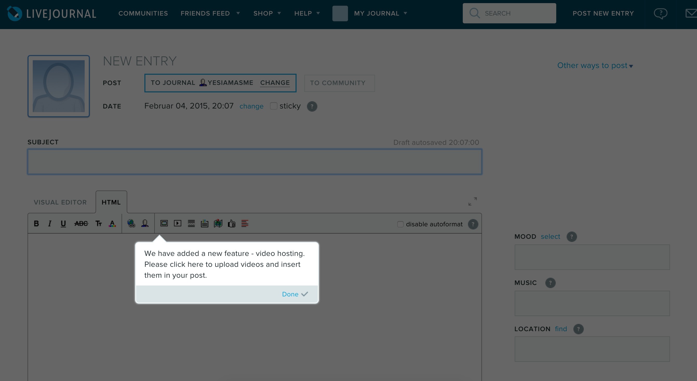
▲ As you are about to update your blog post, just-in-time guidance is triggered to alert about a new feature
- Use when you want to help users along getting accustomed to your user interface.
- Use when you want to notify your users of new or unfamiliar features
- Use when your user interface is not self-explanatory
This card is part of the UI Patterns printed card deck
A collection of 60 User Interface design patterns, presented in a manner easily referenced and used as a brainstorming tool.
More examples
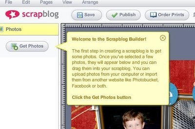
“Just-in-time” guidance is triggered as the user explores.
Allow users to learn at their own pace using tooltips, overlays, models, and alerts hinting optimal use of an interface within the context of everyday use. Connect hints with clear completion states. Too many and too plain hints lead to frustration. Don’t overdo it and be sure to allow escape.
Create a series of individual hints that progressively appear during the first-time use of a product or interface. Hints can be anything from tooltips, overlays, to modal alerts.
Some users appreciate the help and others don’t. Be sure to always allow escape; to dismiss your guided tour.
Product-guided vs User-guided.
Decide whether you want to let the tour be product guided or user-guided. In a product-guided tour, hints are automatically progressed in linear succession, while hints in a user-guided tour are triggered as the user reaches appropriate points in their experience. For user-guided tours, hints may appear in different orders for different users.
1 Patterns for new user experiences by Krystal Higgins
More examples of the Guided Tour pattern See all 26 example screenshots
User interface design patterns.
- Password Strength Meter
- Structured Format
- Keyboard Shortcuts
- Rule Builder
- Inplace Editor
- Drag and drop
- Expandable Input
- Fill in the Blanks
- Input Feedback
- Calendar Picker
- Good Defaults
- Input Prompt
- Forgiving Format
- Completeness meter
- Inline Help Box
- Rate Content
- Vote To Promote
- Pay To Promote
- Navigation Tabs
- Module Tabs
- Breadcrumbs
- Notifications
- Shortcut Dropdown
- Vertical Dropdown Menu
- Accordion Menu
- Horizontal Dropdown Menu
- Adaptable View
- Article List
- Progressive Disclosure
- Continuous Scrolling
- Categorization
- Event Calendar
- Pull to refresh
- Table Filter
- Sort By Column
- Alternating Row Colors
- Frequently Asked Questions (FAQ)
- Autocomplete
- Search Filters
- Collectible Achievements
- Testimonials
- Leaderboard
- Activity Stream
- Friend list Mini
- Auto-sharing Mini
- Invite friends
- Product page
- Shopping Cart
- Pricing table
- Tip A Friend
- Playthrough
- Guided Tour
- Inline Hints
- Walkthrough
- Blank Slate
- Lazy Registration
- Account Registration
Persuasive Design Patterns
- Status-Quo Bias
- Optimism Bias
- IKEA effect
- Decoy Effect
- Loss Aversion
- Endowment Effect
- Sunk Cost Effect
- Negativity bias
- Illusion of control
- Set Completion
- Present Bias
- Delay discounting
- Need for closure
- Value attribution
- Priming Effect
- Peak-end rule
- Cashless Effect
- Inaction Inertia Effect
- Choice Closure
- Temptation Bundling
- Limited choice
- Limited duration
- Appropriate challenge
- Storytelling
- Intentional gaps
- Periodic Events
- Investment Loops
- Hedonic Adaptation
- Self-Monitoring
- Variable rewards
- Fixed rewards
- Goal-Gradient Effect
- Unlock features
- Achievements
- Appointment Dynamic
- Prolonged play
- Isolation Effect
- Zeigarnik Effect
- Picture Superiority Effect
- Recognition over Recall
- Serial Positioning Effect
- Pattern recognition
- Conceptual metaphor
- Feedback loops
- Fresh Start Effect
- Authority Bias
- Retaliation
- Role playing
- Self-Expression
- Reciprocation
- Social proof
- Commitment & Consistency
- Cognitive Dissonance
- Positive mimicry
- Nostalgia Effect
- Halo Effect
- Competition
- Noble Edge Effect
Advisory boards aren’t only for executives. Join the LogRocket Content Advisory Board today →

- Product Management
- Solve User-Reported Issues
- Find Issues Faster
- Optimize Conversion and Adoption
- Start Monitoring for Free
Complete guide to building product tours on your React apps

Introduction
Ever heard of tours in product UI?

Product tours are self-explaining tips UI for the website user to break down complex UX and make it easily useable.
Product tours play a vital role in B2B product UI. It helps save customer support time related to repeated ‘how-to-use’ questions about the UX.
What problems do product tours solve?
Product tours help with onboarding users to new and complex UX and helps to get users familiar with UI functionalities. They’re also useful for showcasing new updates on product UI, and they can save time for the customer success team.
Slack, Trello, Asana, and Invision are some of the big products that use product tours for different UX needs.
The indirect alternative to product tours including FAQs about product functionalities, product video demos and tours, and on-demand tips UI.
However, video tours or FAQs don’t have the same level of impact as inline product tours.
The majority of users don’t look for tutorials outside the UI.
On the other hand, on-demand tips UI are similar to product tours and can have a similar impact.
In this post, you’ll learn how to build a simple product tour for your React application. Before building, it you’ll first need to learn about existing React libraries.
Existing React libraries for product tours
Even though product tours are used by lot of companies, there aren’t many React-based tour UIs. Some of the libraries are React Tour and React Joyride.
Over 200k developers use LogRocket to create better digital experiences
React Tour library
React Tour has around 1.4k stars on Github and is moderately active.
It has very nice UI if you need a simple product tour without much customization. If this is the case, React Tour UI will be good enough.
You can view the demo for React Tour here .
How it works
With React Tour, you pass the classname selector and content for each step to the component.
It will render the tour UI based on a button click, or after mounting the component. It’s simple for static pages and UI:
However, if you need to customize for a custom behavior, then it won’t work very well. The component is very rigid, and styles aren’t exposed well enough to make it reusable.
One drawback is that if you don’t use styled-components in your project, then you won’t have any luck using the component. There is no other way — the library has a hard dependency for styled components.
Additionally, if a classname selector is not present in the current screen, then React Tour just displays the non-matched content in the center of the screen. There is no way to hide it.
The only way to overwrite such behavior is to trigger the next steps through our own logic, but that defeats the purpose of the component.
It’s almost as complex as writing your own component for product tours.
More great articles from LogRocket:
- Don't miss a moment with The Replay , a curated newsletter from LogRocket
- Learn how LogRocket's Galileo cuts through the noise to proactively resolve issues in your app
- Use React's useEffect to optimize your application's performance
- Switch between multiple versions of Node
- Discover how to use the React children prop with TypeScript
- Explore creating a custom mouse cursor with CSS
- Advisory boards aren’t just for executives. Join LogRocket’s Content Advisory Board. You’ll help inform the type of content we create and get access to exclusive meetups, social accreditation, and swag.
React Tour really shines when you don’t want to customize a lot, and when you want basic tour functionality with beautiful UI and UX.
It also works well for static content or dynamic content where the selector labels always exist on the UI.
React Joyride library
The next famous React product tour library is React Joyride . It has 3k stars on Github and is also actively developed.
The UI isn’t as elegant as React Tours, but the API is less rigid. It allows for some level of customization.
Of course, it has its own limitations.
The docs aren’t good enough if you need custom solution on top of basic React tour functionality. The props API also isn’t very intuitive or simple.
The only difference is that it has solutions for most use cases in product tours. They expose all the events and actions to the end user, so you can capture those actions and do whatever customization you want.
Building a simple product tour in a React app
First, let’s build a simple React tour without any custom functionality.
We’ll use react-dashboard by creative tim as our base application.
This loads the product tour on top of it.
This is what the dashboard UI looks like:
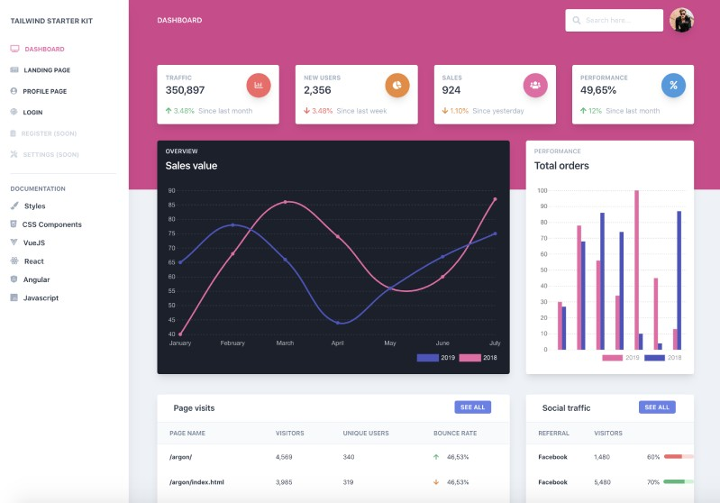
We’ll do a product tour on this UI. You can see the final product tours UI here .
Let’s create the simple product tour component:
Load this tour component anywhere on the page to load the blinking beacon UI. If you click that beacon, it will open the tour. The next button will let you navigate til the end of the tour.
Joyride components take a lot of props. The most important ones are steps props. It accepts an array of objects with target selector elements and content.
Continuous props are used for showing the next button on each step.
You can see the demo for this simple tour component here .
Now let’s add more features and make our product tour more customized. Simple features are:
Skip option on each step
- Change locale text labels
- Hide / show buttons (next, skip, back buttons)
Custom styles like button colors and text alignment
Then we’ll add the custom feature like:
- Auto start the tour
- Start the tour by manual triggers (i.e., through link or button click)
- Hide blinking beacon
- Auto start tour once and only show tour on manual triggers next time
Most of the basic functionalities can be achieved through the props provided by Joyride docs .
Adding showSkipButton to true will do the trick. Skip link will skip the remaining step on the tour.
How to change text labels for buttons and links
Let’s change the last button text as end tour and skip button text to close tour .
How to hide Back, Next and Skip buttons
- For the Skip button, use *showSkipButton* props
- For the Back button, use hideBackButton
- For the Next button, use continuous props
Unlike other props, continuous props work differently. They either show the Next button or show a Close button, depending on the boolean value passed to the props.
You can see how inconsistent the props API naming are. It isn’t very easy to find lot of hidden features unless you read the complete docs for Joyride couple of times 😅
Styles are exposed as an object. So if you pass a style object to the component, the component will merge it with their default styles.
A caveat to this way of styling is that it only supports a handful of the object styles, which are already defined on the component.
It won’t allow you to customize everything on an element level. Also, the classnames used in the rendered elements are not very easy to customize.
However, the library exposes props to use your own elements instead of the default elements.
Some of the components are:
- Beacon component ( beaconComponent prop)
- tooltip component ( tooltipComponent prop)
Controlled product tour
So far, you’ve learned how to use the Joyride library to create a basic product tour and customize it using props.
You’ve also seen some of the limitations to styling the component.
Until now, the tour has been controlled in the library. You just pass the steps and tweak some props.
It’s possible to control the tour and trigger goto a particular step directly through button click, but it requires some coding.
We’ll see how to do it by achieving a few of the features.
The Joyride component exposes some of the actions and events through callback. You need to capture the callback and, based on the function, you can customize your functionality.
It’s simple to make the component controlled by passing a prop stepIndex .
stepIndex is the index number and starts from 0. Once you pass the values, the Next and Back button clicks need to be handled by you.
Let’s get to it. First, we will define the steps:
Here’s the initial state to make the component controlled:
To auto start the tour, you need to pass disableBeacon: true in the first step. This will just disable the beacon. But you need to trigger start by changing the state run: true :
The actions that are important to make the functionality are Close button click, Skip button click, Next, and Back button click.
Let’s implement the reducer function:
Now we’ll listen to the events and dispatch proper state changes to manage the tour:
Here’s a quick overview of how each action, event, and state update works:
If the Close button, Skip button, or End Tour button are clicked, then STOP the tour. Meanwhile, if the Next or Back button are clicked, then check whether the target element is present in the page.
If the target element is present, then go to that step. If it’s not present, find the next step target and iterate.
Joyride expose EVENTS, STATUS, and ACTION labels. You can use those to listen to the callback event without hardcoding it.
Let’s also auto start the tour when the page loads:
You can even trigger the start of tour using button click:
Right now, we have it set up so that the tour will be shown every time you refresh the page.
If you only want to show the tour once and then trigger it only through manual click, you can do so using localStorage .
You can find the working example code here and the demo here .
Steps for building a custom product tour in React
We’ve achieved the product tour using the Joyride library.
But what if we need to create our own?
Let’s walk through building a tour component.
The biggest challenges to building tour components include finding the target element and showing a popover component, as well as ensuring the popover component calculates the available window space and automatically displays by the target element.
It can also be difficult to ensure the tour component is reusable and that styles are easily extended.
To build a custom tour component in React, it’s easiest to isolate the functionality and component UI with these React Hooks:
- useTour – a custom Hook to build your own UI on top of functionality
- Tour – a dumb UI component that consumes useTour to load the tour portal UI
This mock code shows how useTour works:
I hope this article helped you learn the tricks of creating product tour components in your React application. Let me know your experience on tour UX in the comments 🤗
Get set up with LogRocket's modern React error tracking in minutes:
- Visit https://logrocket.com/signup/ to get an app ID
Install LogRocket via npm or script tag. LogRocket.init() must be called client-side, not server-side
Share this:
- Click to share on Twitter (Opens in new window)
- Click to share on Reddit (Opens in new window)
- Click to share on LinkedIn (Opens in new window)
- Click to share on Facebook (Opens in new window)

Stop guessing about your digital experience with LogRocket
Recent posts:.
Using AWS Lambda and CloudFront to optimize image handling
Leverage services like AWS Lambda, CloudFront, and S3 to handle images more effectively, optimizing performance and providing a better UX.

Building web-based terminal components with Termino.js
Explore Termino.js, an open source library for integrating web-based terminals into applications, in this introduction article.

How to build a custom GPT: Step-by-step tutorial
Let’s see why and how to build custom GPTs — personalized versions of ChatGPT that act as custom chatbots to serve a specific purpose.

Jest adoption guide: Overview, examples, and alternatives
Jest is feature-rich testing framework that comes with several in-built features that make it powerful and easy to use.

Leave a Reply Cancel reply
Existing customer? Sign in
Product Tours 101: Guidelines, Inspirations, and Tools for 2023
Build engaging product tours using these six simple guidelines and find inspiration in the best real-life examples.
Product tours are an essential tool for a product manager in guiding users towards their "aha" moment or showcasing high-value features that are being underused.
By offering contextual guidance while your users interact with your product, you help them recognize your product value quickly and take the right action to get their job done.
Creating product tours is both art and science . It requires design and styling, copywriting mastery, as well as data analysis, testing, and iteration until a tour perfectly meets your user needs.
So how exactly do you create product tours that are effective at customer onboarding? Read on, we'll explain key guidelines in detail, and showcase some of the best examples of product tours out there.
Here is a quick summary video to tell you what this guide will be about:
Product tours are also known as product walkthroughs, in-app guides, onboarding tours, or product tutorials. Either way, they are a powerful tool for user engagement and product adoption.
What makes a tour successful? To be effective, a tour should be short and non-intrusive, timely and relevant, contextual and informative.
Each tour will have its purpose , whether it’s to onboard new users, walk existing users through a major interface redesign, or showcase new features.
There’s no one-size-fits-all, but keep in mind that our Benchmark Report shows that three-step tours are the most effective , with a completion rate of 72%.
Some of the key guidelines on how to create successful product tours include breaking one long tour into several shorter ones, using clear and concise copy, offering self-serve support, and continuous iteration. We go into details for each guideline below 👇
And, we dissect six best-performing product tour examples for your inspiration.
What are product tours? #
Product tours are interactive guides that give s a walkthrough of the product's key features. Their primary goal is to turn new users into active users and drive product adoption, ultimately achieving product-led growth.
On a technical level, product tours are composed of in-app messages that form the onboarding process. They are experiences layered over the product itself and provides an interactive guide while the user is navigating the app.
What are not product tours? #
Before we go further into what makes a great product tour, let's talk about what isn't a product tour because there can be some confusion.
Product tours are tools of customer engagement. In other words, they interact with the end-user to boost feature adoption. They are also experiences contained within the product itself.
This means that anything else than the above isn't exactly a product tour. Let's go over two particular examples.
Employee onboarding #
Employee onboarding is the process of integrating new employees into the workplace and helping them adjust to the company's internal processes. It involves activities such as orientation sessions, and training programs.
While there are similarities between employee and product tours, such as the need for clear and structured guidance, they are very different. Product tours focus on user onboarding, which is introducing new users to a product or service, ensuring that they can navigate and utilize it efficiently.
Employee onboarding, on the other hand, is designed to help new hires become productive members of the organization and align with the company's goals and objectives.
Product demos #
Product demos are interactive presentations that showcase a product's features to potential customers, aiming to persuade them to make a purchase.
Think of it as a difference between a movie and a video game. A product demo is a movie, because you're simply watching what is occuring, while a product tour is a video game, because you're actively involved in what's happening on the screen.
Remember, true interactive product tours consist of in-app guidance used to onboard users and drive feature adoption.
6 essential guidelines for a successful product tour #
So now that we've covered what a product tour is, let's talk about what it takes to create successful product tours that convert new users and help existing users deepen their product knowledge.
Each tour you create will have its purpose – to onboard new users, walk existing users through a major redesign, showcase a new feature, guide customers through a product plan upgrade, or something else that is relevant to your product.
Let's look into the most important principles and guidelines that will help you build engaging tours.
1. Don't lecture 🤐 #
When someone signs up for your product, they are excited to play with it and are often not prepared for long introductory tutorials. Showing a comprehensive tour as soon as they land inside your product for the first time will often be met with resistance – users will immediately seek to close/dismiss it.
In fact, keeping things short has a lot of benefits. We analyzed 58 million Tours made with Chameleon – started within a period of 12 months – and found that top-performing product tours have a clear message with 25 words per step . That's the same length as a Tweet, so each step needs to be concise and instantly understandable. Otherwise, a tour could easily become overwhelming.
Why is this important?
Users typically want to get a "lay of the land" with your product before they are ready for guidance. That's why you need to gradually reveal your tours and offer just the right information at the right time.
Once users understand the basics of your product and how it helps them solve their problems, there will be plenty of time to introduce more advanced functionalities.
Key takeaways:
Ask whether users are interested in a tour as the first step. Offer a “Snooze” button to enable users to come back at their own convenience.
Remember that tours are part of your product marketing, so ensure that the messaging and design are compelling, engaging, and aligned with your brand
Use a less-invasive step design (e.g. don't cover the whole screen), or you could risk annoying users. You can go with slide-outs and modals, or enable users to start a tour by triggering a certain element on the page (e.g. icon or a hotspot).
2. Break up the user journey💔 #
People learn by doing , so giving users a chance to implement your guidance is critical. Long tours increase anxiety because users worry they have to ingest a lot of information before they can use it. And this is also backed up by psychology.
Miller's Law states that the average person can keep up to around seven items in their working memory. This means that the fewer items your users have to retain, the more successful they will be in learning new information. This is why you should build your Tours in as few steps as possible.
Findings from our 2022 Benchmark Report show that three-step tours are the most effective with a completion rate of 72% , three-step tours are the most effective, hands down. Add one step and the completion rate drops to 45%, while seven-step tours have a completion rate of only 16%.
In other words, people like shorter tours.
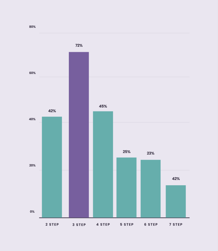
With timely, relevant, and contextual tours, you will navigate users step by step through each action they need to take. This way, you avoid overwhelming them with too much information to comprehend at once. Here is our CEO Pulkit explaining more in detail why this is so important:
Don't try to teach everything. Pick a single user action as the goal, and create a 3-step tour to convince a user to take that action.
Create many smaller tours rather than a single long tour. With Chameleon, you can also prioritize and sequence your Tours.
Copy is your #1 lever, make it clear, concise, and benefit-focused. Use copy to encourage users, make them feel comfortable, and put off any doubts they may have.
3. Provide value 💡 #
Users should feel thankful after seeing your tour. It should not be annoying or draining in any way for them to complete the tour, so don't ask them to undertake lots of work to get value.
Instead, surprise and delight them with additional information that they would not have otherwise gleaned from your interface.
If users don't find your tours valuable, they will exit and be less open to further teaching in the future – so it's vital that you don't reduce your credibility by building irrelevant tours.
On the other hand, our benchmark data shows that users are 4.5x more likely to complete a second tour if they complete the first instead of dismissing it.
Review your tour: Did you enjoy going through it? Ask your teammates, too. And, don't forget to ask your users directly for their feedback.
You can use Customer Effort Score surveys (more specific and actionable than NPS) to measure user satisfaction with key features or UX/UI elements.
Assess how well your tours are performing – make sure you have connected your product analytics tool to see a bigger picture. For this, if you're using Chameleon, leverage deep integrations with Mixpanel, Heap, Amplitude, and other tools to easily see performance data.
4. Embrace self-discovery 🔦 #
Although it's natural to want to pull your users through all of the hoops you want them to jump through, using product tours to do this will fail. You simply cannot force a user to use your product, and highlighting everything you want them to do is a bad way to encourage engagement.
For instance, our research shows that enabling users to take a tour at their own pace by providing a “Snooze” button will increase the chance of more users taking the tour and, eventually, completing it. Our 2023 Benchmark Report found that when given the option to snooze, one in five users will come back to the Tour to finish it, which is much better than them skipping it altogether.
Or consider onboarding checklists. These self-serve widgets allow users to go through the onboarding process at their own pace, and increasingly it is becoming a preferred method of onboarding in contrast to linear product tours.
Don't take our word for it. That's what the users say. Our 2023 Benchmark Report revealed that Tours started from Launchers had a 61.65% completion rate , which is almost double the average.
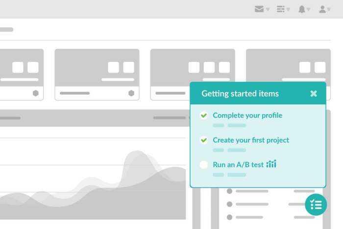
The BJ Fogg Behavior Model explains that people take action when they are motivated, they have the ability, and they are triggered, so you need a combination of these three elements to keep your users engaged. Focus on motivating users to take the action and offer self-serve support to enable users to learn at their own pace.
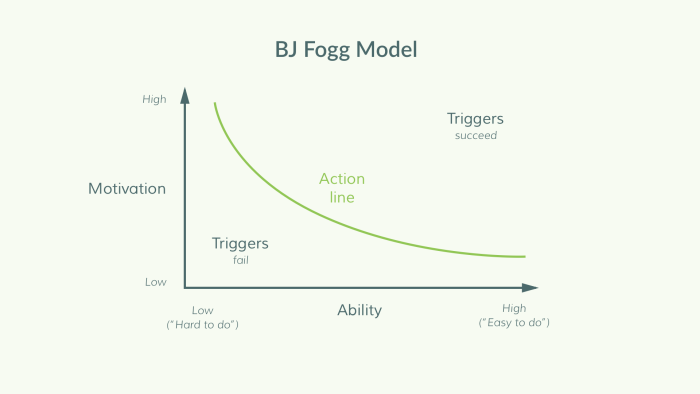
Keep behavioral principles in mind when creating a tour, and make sure your users have the motivation, ability, and the right prompt to take action.
Focus your copy on explaining why a user should take certain actions; what value will they gain from doing so.
Use tours to highlight the most fundamental aspects of your product. For other ancillary features, use single-step tours as signposts.
5. Don't set it and forget it 😴 #
Traditionally, user onboarding was a set-and-forget project – teams would spend weeks overhauling the onboarding flow, then shift focus away, and repeat after 12 months. This is an inefficient and ineffective way to use product tours. Instead, collect feedback constantly on your product tours and iterate based on user feedback to continuously improve them.
For instance, a simple in-app survey like this one from Paypal below can go a long way in gathering constant feedback:
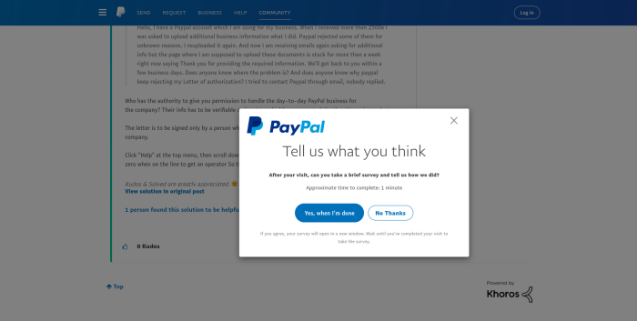
To keep up with ever-evolving user needs, apply Agile principles to the tour creation. Once you've built your tour, focus on collecting user feedback, analyzing the performance data, and iterate on until you're satisfied with the outcome.
Be outcome-driven, not output-driven. Focus on a key quantitative goal and continue to focus on improving your product tour until you get there.
Set a conversion goal, beyond the completion of the tour. For example, you can use Chameleon for this, as it lets you track goals (such as clicks) without writing any code.
Provide clear accountability to someone on your team to own product tours and be responsible for regular updates.
6. Timing and context are key #
Lastly, when it comes to delivering a great product tour, it's important to give users value exactly when and where they need it. For instance, if you have a tour that tells the user about a new feature, it should only launch when that feature is present on the page.
Our data from the 2023 Benchmark Report suggests that Tours positioned relative to on-page triggers have a completion rate of 69.56% which is well over the average, meaning that Tours that are contextually related to what is on-page are much more well-received.
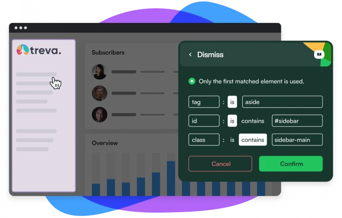
Or better yet, have your Tours trigger only when there is user interest. Such as when users hover over certain icons to find out more or click on an element. Below are some examples of this.
Another way to do this is to target different user segments to see what context is best for optimal engagement. Not all product tours have to be shown to everyone. Show the right ones to the right users.
If your Tour pops out when it isn't wanted or it isn't related to what is being served, it'll only cause a negative experience for the user.
On the other hand, if your Tour actually helps the user along and educates them, that adds constructively to the experience, which means they're more likely to find value in your product.
Be mindful of the context that your tour is being launched under. Is it related to the experience? Is it something the user will find useful? The answer should be nothing but yes.
Think about when you're serving the Tour. Is it actually wanted? Or is it just a nuisance? Your Tours should be gentle nudges, not an intrusion. Try to trigger your Tours when there is a sign of user interest, such as a hover or a click over the element.
6 excellent product tour examples for your inspiration #
We gathered some excellent real-life examples to show you how SaaS companies are using product tours effectively. Let's dive in.
Psst... If you want to see more examples, browse our Inspiration Gallery .
Example #1: Heap #
Heap is a product analytics platform, and the first-time setup is more complex than something you simply use like Dropbox or Gmail. It's B2B software that needs to be configured for your product, so it comes as an 'empty bucket' that the user has to invest in.
Source: Heap
To reduce friction and help users make it through the rocky first mile, Heap built its product tour to coach the user through tasks that make its product's specific capabilities clear: set events, segment users, track conversions, and build reports.
Its tour has two interlinked parts – a user onboarding checklist and hotspots that trigger tooltips, showing the user how to complete each checklist task.
The tooltip copy helps clarify feature-specific language by offering examples that are rooted in a Heap user's everyday work.
The checklist gives users context on their setup progress and acts as a powerful motivator. Ticking checklist tasks sends small bursts of dopamine to the brain and makes your users feel good. 😄
Example #2: Typeform #
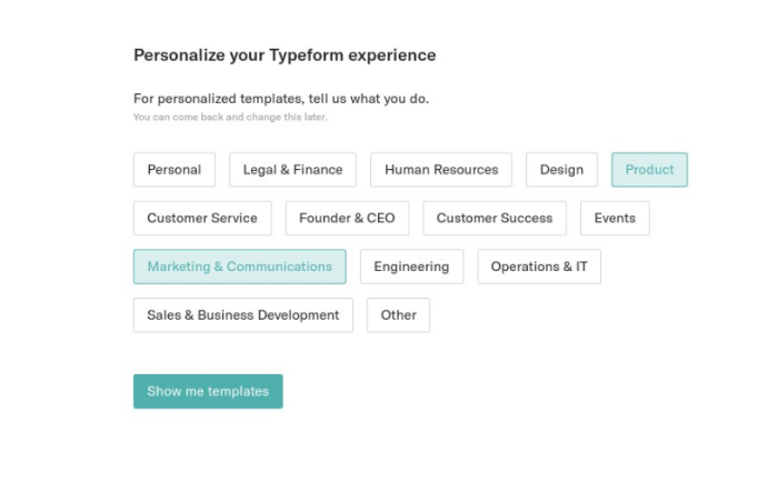
Source: Typeform
As an online forms software, Typeform is a Swiss army knife that can be used for lead generation, event registration, IT incident reports, fun office quizzes, and more. Because it's so open-ended, Typeform's onboarding tour depends on the user’s job to be done and whether they want to start from scratch or use a template.
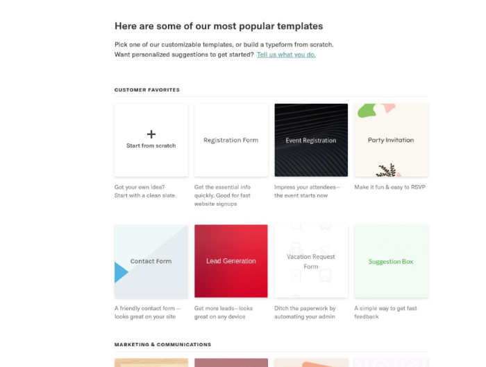
The templates offered are a masterclass in Typeform best practices. They use advanced features like logic jumps and custom branding to cement the product's possibilities in the user's head and coach the user to make successful forms.
For Typeform, the pre-made forms themselves act as the product tours – sequential, educational, and driven by tangible examples. This is a great way to drive users to the “aha!” moment quickly.
Example #3: Slack #
We are familiar with the explosive growth Slack has had, and a big component of it was how easy, friendly, and fun it was to set up at the beginning.
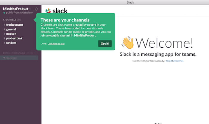
Source: Slack
Slack uses bright tooltips and personable copy in its now-legendary product tour . The series of tooltips highlight public channels and direct messages to help the user understand the differences, benefits, and product terminology.
As well as clearly communicating brand personality with a laid-back tone, the product tour gets you chatting with a bot straight away to instantly teach you the core mechanics.
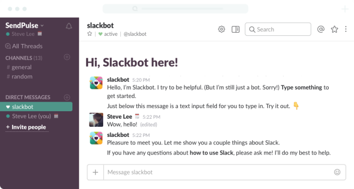
Want to create a similar tour for your product? Check out the video below to see how to re-create Slack's user onboarding experience with Chameleon 😎
Chameleon Recipes: Recreating Slack's User Onboarding
Example #4: Dropbox Paper #
Dropbox Paper understands that its users want to create collaborative documents that are easy to share and fun to use. So, its product tour is built into a gorgeous example document – Getting Started with Dropbox Paper.
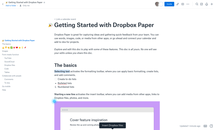
Source: Dropbox Paper
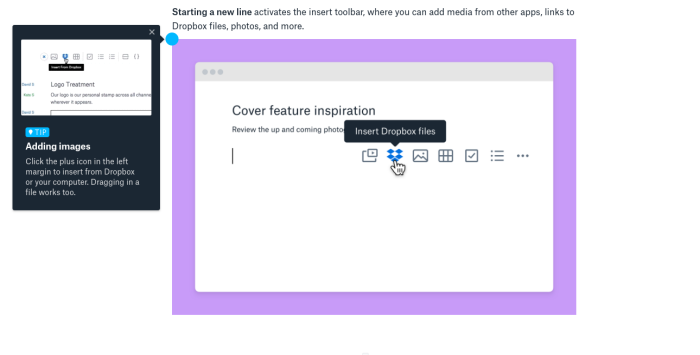
The document is packed with hotspots that show rich video tooltips explaining the core features of Paper: changing formatting, adding files, and – of course – inserting emoji.
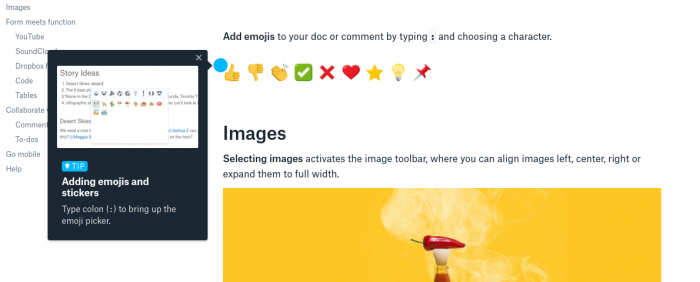
In a fun product aimed at creatives instead of enterprise executives, it makes a lot of sense to sell the benefits of emoji so early; Dropbox shows the feature off even before it explains how to format code or embed files 🤓
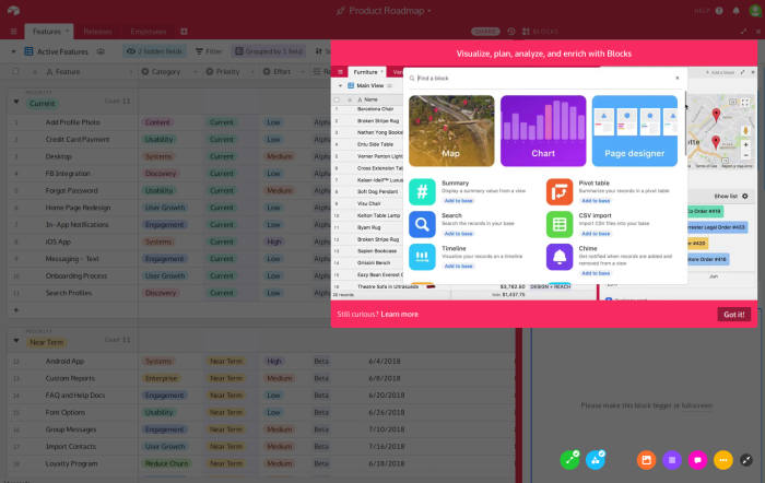
Example #5: Airtable #
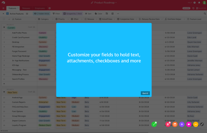
It looks delightfully like it was built by Fisher-Price, but Airtable is a very complex product that condenses the power of an SQL database into something as simple as Google Sheets.
Source: Airtable
To simplify that inherent complexity, Airtable's product tour shows snippets of high-level information and practical gifs on a self-serve basis .
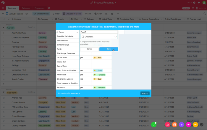
The multicolored row of icons in the bottom right each represents one part of the tour and highlights a specific feature with its core benefit and a call-to-action.
Example #6: Pipefy #
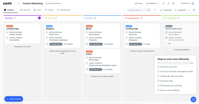
With Chameleon Launchers, Pipefy created a self-serve onboarding checklist, which can be toggled on and off. It also added a progress bar to keep people on track wherever they are in the onboarding process.
What you should look for in a good product tour software #
Now that you know how to build great product tours, you might be thinking about getting a product tour tool or in order to create interactive walkthroughs.
There are many options out there and you may be unsure of which is the best product tour software for you. So we want to leave you with essential features that you should have when you get one.
No-code editor #
First and foremost, your tool should be code free, so that you could do everything without relying on your engineering team. What makes a product tour software a great solution is that it saves resources, and a big part of that comes from not having to take development support.
Therefore, the tool of your choice should require zero coding knowledge to create an effective interactive product tour.
Fully customizable styling #
Nothing derails the user journey like an experience that looks way off your brand style. From simple things like fonts, colors, and button shapes to custom CSS, you should be able to tailor every single in-product experience to look 100% on-brand .
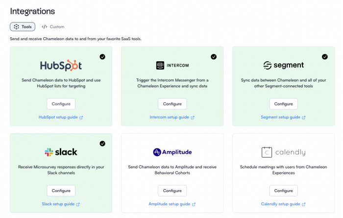
Deep integrations #
Your team likely uses a stack of tools for various purposes, whether it's a CRM or an advanced analytics tool. Therefore, for the best results, your product tour software should be able to integrate deeply with a broad range of other SaaS products.
Now you might be thinking, why don't you just get an all-in-one tool rather than a focused and extensive product tour software? This is true, there are few like this, such as Intercom Product Tours, which is a product tour add on to its core offering of customer communication.
The problem with jack-of-all-trades tools is that they're always missing something compared to the next best product tour software alternative, and they also may not accommodate your specific needs from a product tour tool. There is merit to integrating the best tools together to create a stack that is optimally customized to your goals.
Native A/B testing #
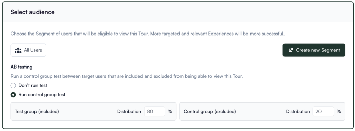
We talked about why it's important to take feedback and iterate your tours to improve. For that, it's best to experiment and test different versions of your product walkthroughs to know what really works.
Thus, you should be able to set up native A/B testing right from your product tour solution.
Contextual targeting #
A product walkthrough that gives the same experience to every user is not as effective as a hyper-targeted one. Because user behavior may diverge depending on various attributes such as profiles, as well as key actions taken during the user journey.
You can create a much more user friendly product tour by tailoring tours according to different context. For that, you need product tour features that allow you to target and adapt.
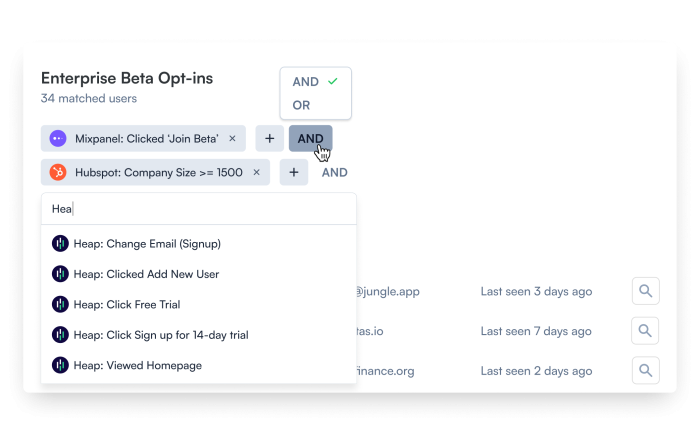
For instance, with Chameleon you can create custom audiences and configure environments, as well as decide how certain Tours will trigger.
Thorough Help Documentation #
Even if support is top-notch, they can't be there for you 24/7. In fact, the best kind of support is one that solves the problem before you ever have to get in touch with the support team. That's where the help documentation shines.
Great help documentation improves user onboarding, reduces the learning curve, provides consistent and accurate information, enables self-service support, and ensures scalability and accessibility. Overall, it enhances user satisfaction and promotes effective utilization of the tool.
So watch for how effective and thorough the tool's help docs are.
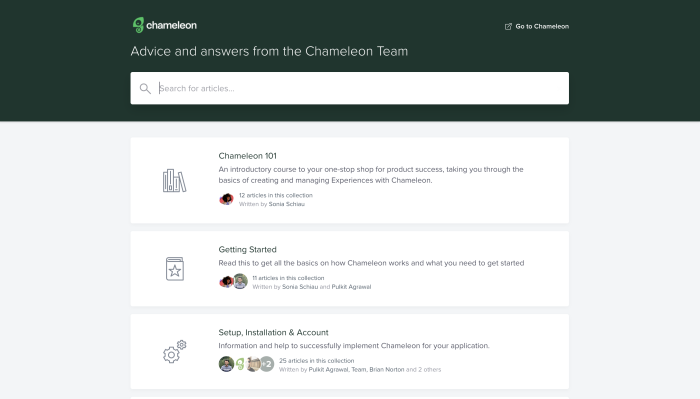
Chameleon's help center provides answers for all kinds of issues and troubles.
Technical reliability #
Last, but not least, technical reliability is a must-have. If your product adoption software is slowing your product down overall, or it's making your product less usable, that defeats the purpose.
So make sure to look out for how technically robust the tool is. Try out all sorts of functionalities in various contexts. If your product has a specific requirement, make sure that the requirement is smoothly fulfilled with the tool. These include but are not limited to:
Mobile support
Single Page Application support
iFrame support
Shadow DOM support
100% uptime
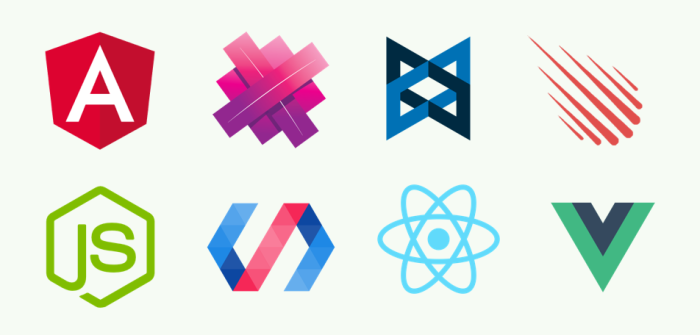
If your app is built on one of these frameworks, make sure it's supported by your tool of choice.
5 Product Tour Builders You Should Check Out #
Now that we've talked about everything that has to do with product tours, and what you should look for in product tour software, we'll leave you with a simple list of recommendations
1. Chameleon: The best-in-class product adoption platform #
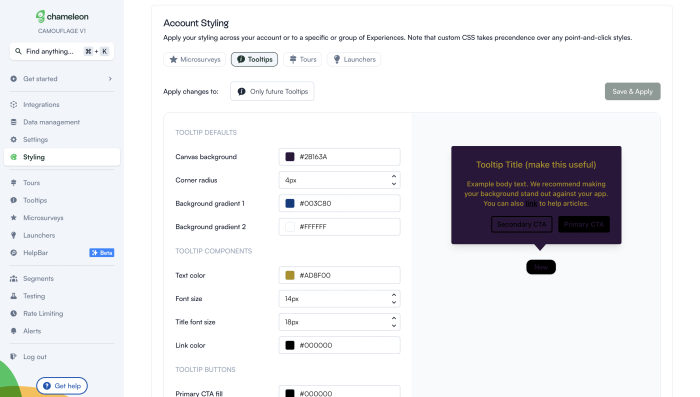
We pinky promise that we say this with no bias. Chameleon is currently the product adoption platform with the deepest configuration and customization options.
From the way you can style your experiences to match your brand, as well as set granular targeting options, Chameleon is what you need if you're looking to create sophisticated product tours.
Pricing starts at $279 a month for up to 2,000 MAUs.
👉 Explore an interactive demo and see how easy it is to build a product Tour with Chameleon, without any code.
2. Appcues: If you need iOS and Android mobile product tours #
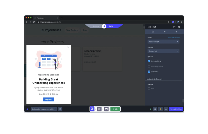
If you want to create product tours for mobile apps, then Appcues is your answer. Appcues is one of the most popular tools in the product adoption space, but what really sets it apart is native mobile onboarding for iOS and Android applications.
Pricing starts at $249 a month for up to 2,500 MAUs and cost is adjusted depending on how many users you'll be tracking as well as what more features you need.
3. Pendo: For those looking for product tours and onboarding in one #
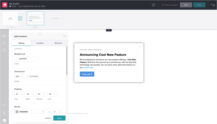
If you're looking for analytics tools in addition to product tours, then Pendo is what you might be looking for. Pendo is a bit of a jack of all trades. Every product tour software comes with some kind of analytics dashboard, but Pendo's analytics solution is more advanced than your typical product tour builder.
So if you want to have both analytics and product tours in one solution instead of paying for two. This is an option. If you have an existing analytics tool, Pendo might be an overkill.
4. UserGuiding: The budget option that is simple and straightforward #
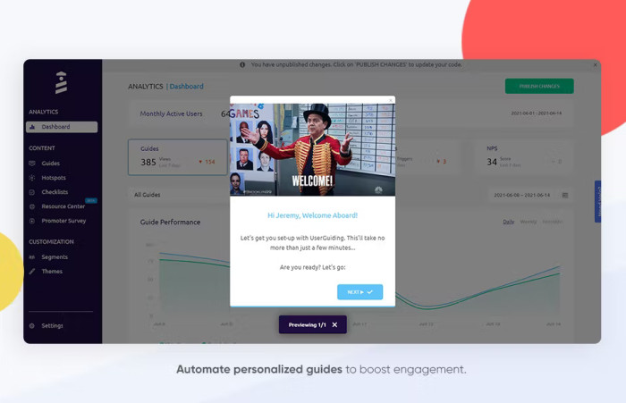
If the price tag of the above tools scares you a bit, then there is a cheaper option: UserGuiding. at $89 a month for up to 2,500 MAUs, it essentially has all the basic product tour features you would need to build something with.
Of course, as you get deeper into building more sophisticated product tours, you might want to invest in something better, but if you're budget-conscious, UserGuiding is where you can start.
5. IntroJS: An open-source library for DIY product teams #
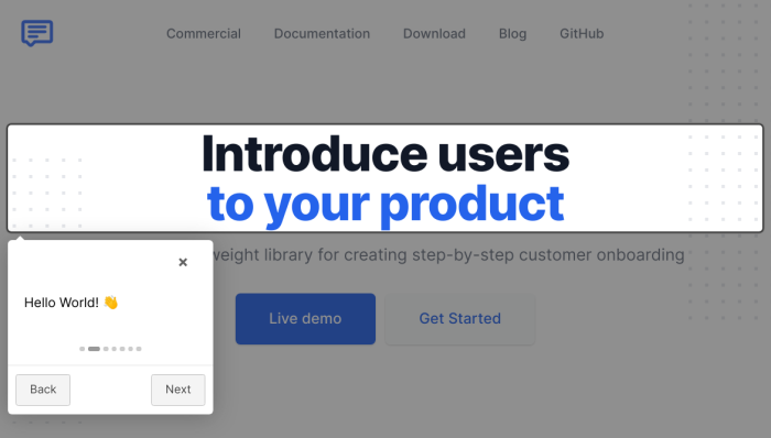
IntroJS is not exactly a builder. It is a lightweight JavaScript library for creating interactive product tours and user onboarding. For teams with dev resource to spare, IntroJS can be a reasonable option, especially because it involves almost no cost at a one time fee of $9.99 for a commercial license.
Plus, it seems to have more support and frequent updates than other open source JavaScript libraries, which makes sense considering big brands like Amzon and SAP use the library.
Engage more users and drive customer success with masterful product tours #
Take away these core guidelines and key principles, create guided tours, and start testing and iterating until perfect. It's time for you to apply these lessons to your own product tour.
Before you know it, you'll be building effective product tours that can drive lots of happiness (and learning!) for your users , as well as increased user engagement for your product.
We're always happy to help – if you'd like to speak with one of our product specialists to learn what product tours you should be building based on your goals, let's talk! You can book a demo below, or start using Chameleon for free to explore by yourself and get a sense of what your next product will look like.
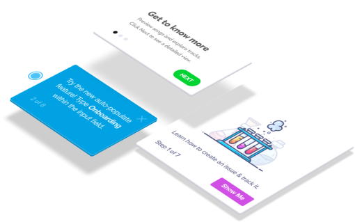
Build in-app guides to retain users
Chameleon makes it easy for product teams to create product tours, tooltips, onboarding checklists, and in-app surveys without code.
You might also be interested in...
User Onboarding Metrics, KPIs, and Benchmarks: A Comprehensive Guide
User onboarding still isn't good enough, but here's how it's changing, 10 key saas product metrics to track (+ best practices for measuring).
Boost product adoption and reduce churn
Get started free in our sandbox or book a personalized call with our product experts
Thinkific Plus
Essential product tour best practices for engaging user experiences, share this article.
Discover the top product tour best practices to enhance user engagement and provide a seamless onboarding experience. Learn from real-world examples and expert tips.
Skip Ahead:
All you need to know about product tours
What is a product tour, key elements of an effective product tour, step-by-step guide to creating a product tour.
- Checklist for product tour design
Real-world examples of successful product tours
Measuring the success of your product tour, common mistakes to avoid.
You know your product has the potential to transform the way people learn online. But the key to unlocking this potential lies in how you introduce it to your users. That’s where product tours come in — they’re not just a feature, they are your first interaction with the user, setting the tone for their entire experience.
The success of your customers hinges on how well they can navigate and engage with your product from the get-go. This article is crafted to guide you through the nuances of creating product tours that are informative, engaging, and tailored to your audience’s needs.
By the end of this read, you’ll have a clear understanding of best practices to craft product tours that resonate with your audience. Our goal is to equip you with the knowledge and confidence to create experiences that educate and empower your users, fostering a connection with your product from the first click.
A product tour is your first chance to communicate with your users. It’s an interactive guide that introduces your digital product’s key features and functionalities. The purpose? To make users feel comfortable and confident as they navigate your platform. Think of it as a friendly, knowledgeable guide that walks new users through your digital landscape, helping them understand how to get the most out of your product from the start.
Product tours are critical in user onboarding and throughout the user journey. They’re the bridge connecting users to your product’s value proposition. A well-crafted tour not only showcases the features but also aligns them with the user’s needs and goals, ensuring they understand the immediate benefits of your platform. This understanding transforms a first-time user into a long-term, engaged learner.
Why they should be used
Users frequently face a learning curve in the digital world, especially with sophisticated software. Product tours are instrumental in smoothing this journey, perfectly balancing instructional support with user autonomy. Here are key reasons why product tours are essential:
- Streamlining user experience: A thoughtfully designed product tour simplifies the learning curve, particularly for complex enterprise SaaS products. It focuses on teaching users about the key features most relevant to their roles, making the learning process more intuitive and less daunting.
- Driving meaningful action: Beyond just showcasing features, product tours guide users to take action. This approach of ‘learning by doing’ ensures knowledge retention and helps users master your product more quickly. It’s about moving from passive observation to active participation.
- Enhancing user engagement: Well-executed product tours reduce friction in the onboarding process. A smooth initial experience with your product increases the likelihood of continued engagement, helping users recognize and appreciate your tool’s value. This is pivotal in boosting user retention rates.
- Expedited onboarding: Product tours accelerate the learning process. By guiding users through essential features and functions, they enable quicker proficiency and reduce the time it takes for users to derive value from your product.
- Reduced support requests: By providing a clear and comprehensive introduction to your product, these tours can significantly decrease the volume of support inquiries. Users are more likely to understand how to use your product effectively, encountering fewer issues requiring support.
- Fostering the ‘Aha’ moment: The ultimate goal of user onboarding is to lead users to the ‘aha moment’ — the point where they recognize the value of your product. A well-crafted product tour can hasten this realization, propelling users toward full product adoption .
They are not product demos
Product demos are like interactive presentations aimed at potential customers. They showcase a product’s features and benefits to persuade the audience toward a purchase. However, unlike product tours, demos are typically passive experiences where the audience observes rather than interacts.
If a product demo is a movie, a product tour is more like a video game. In a movie (demo), you’re an observer of what’s happening, while in a video game (product tour), you’re actively engaged and involved in the experience.
Product tours are defined by their interactive, in-app nature. They’re tools for onboarding users to a product, helping them understand and adopt its features effectively. This sets them apart from other forms of customer engagement and educational tools.
Crafting a product tour that resonates with your users involves several critical elements. Here’s an expanded look at what makes a product tour not just functional but impactful:
Personalization and contextual engagement
- Segmented approach: Tailor your product tours to different user roles, offering a personalized experience that speaks directly to each user’s unique needs and objectives.
- Action-triggered tours: Initiate tours based on specific user actions, ensuring that tutorials are contextually relevant and appear at just the right moment.
- Match UI patterns with use cases: Choose UI patterns best suited for each part of your tour. For example, use pop-up modals for welcome messages and tooltips for quick feature explanations.
- Design consistency: Ensure a seamless experience by maintaining consistency in design across all elements of your product tour.
- Conciseness and relevance: Keep your product tours brief and focused, quickly demonstrating your product’s value without overwhelming users with lengthy steps.
- Focus on the ‘why’: Go beyond instructions to explain the value behind each action, fostering deeper user engagement and adoption.
- Continuous updates: Regularly review and update your product tours based on user interaction data, optimizing the onboarding experience.
- Skip option: Allow users the flexibility to skip the tour, catering to those who prefer a more hands-on approach or are already familiar with your product.
Engagement techniques
- Interactive elements: Use features like clickable areas, animations, or quizzes to keep users engaged and promote active learning.
- Pacing: Find the right balance in the pace of your tour to maintain user interest while allowing sufficient time for information absorption.
Clarity and simplicity
- Clear and concise content: Provide straightforward, jargon-free information. Each step should clearly contribute to the user’s journey and understanding.
- Purpose-driven steps: Ensure every part of the tour serves a meaningful purpose in the broader context of user education and engagement.
Creating an engaging and effective product tour is a structured process. Let’s walk through the essential steps:
Planning your product tour
Effective planning is the foundation of a successful product tour. Here’s how to approach this phase with precision and purpose:
- Define objectives: Start with a clear vision of your goal. Are you aiming to increase feature adoption, enhance user engagement, or reduce onboarding time? Your objectives will guide every aspect of your tour.
- Identify key features: Determine the critical features and functionalities that need to be highlighted. Understand how these align with your users’ needs and contribute to the overall value of your product.
- Map the user journey: Visualize the user’s path during the tour. Consider the logical flow of information — how one step leads to another- to ensure a coherent narrative that gradually builds users’ understanding and skills.
- Sequence and structure: Decide on the order in which to present information. The sequence should feel natural and intuitive, guiding users from basic features to more complex functionalities.
- End goal visualization: Remember the ultimate goal of enabling users to effectively understand and utilize your product. Every element of the tour should contribute towards this end.
Designing for different user segments
When crafting your product tour, recognize each user’s uniqueness. Design a tour that adapts to various user segments, acknowledging their differing experience levels, interests, and usage patterns. This tailored approach is not just about inclusion but effectively connecting with every user.
- Segmentation by needs and interests: Understand that users have diverse needs and preferences. A survey reveals that 67% of customers favor self-exploration over extensive interactions with representatives. This preference highlights the importance of delivering a product tour that aligns with individual user preferences.
- Customized content for each segment: Avoid overwhelming users with generic or irrelevant information. Customize your tour by dividing your audience into distinct segments and then tailor the content to suit each group. This might involve creating different versions of your tour or using adaptive content that evolves based on user actions and feedback.
- Engagement through relevance: By providing a product tour experience specific to their needs and interests, you’re more likely to see higher levels of engagement. Tailored tours make new customers or prospects feel seen and understood, leading to better outcomes in terms of their learning, engagement, and overall satisfaction with your product.
- Continuous adaptation: Remember that user needs can evolve. Review user feedback and engagement data regularly to refine your customer segmentation strategies. This ongoing adaptation ensures that your product tour remains relevant and effective for all user segments over time.
The key to designing for different user segments while avoiding learning barriers is balancing personalization and inclusivity. By acknowledging the unique journey of each user, you create a product tour that resonates more deeply, fostering a sense of belonging and understanding. This approach enhances the user experience and reinforces your product’s perception as user-centric and adaptable to diverse needs.
Choose the right UI pattern
Selecting the most effective UI pattern for your product tour involves understanding the options available and their unique strengths. Here’s a breakdown of different UI patterns and how they can be utilized:
- Pop-ups: These can range from simple splash screen graphics to modal windows requiring user action. Pop-ups quickly engage users and explain the value of your application. They are effective for immediate engagement and conveying key information at the start of a product tour.
- Interactive walkthroughs: These provide step-by-step instructions for key workflows within your application. Users learn about processes as they actively engage with the product tour. Interactive walkthroughs are particularly useful for complex applications, simplifying training and enhancing user understanding during initial onboarding or feature rollouts.
- Hotspots (Beacons): Small icons or alerts, hotspots draw attention to specific application elements. They’re great for delivering information about feature updates or workflow changes. Hotspots enable a self-serve onboarding process, allowing users to interact with training material at their own pace.
- Tooltips: Tooltips offer a quick overview of a feature or UI element’s function. They are less intrusive than guided product walkthroughs and are excellent for providing concise, crucial information without prompting users to take action.
- Explainer videos: Integrating explainer videos with pop-up modal windows can create engaging welcome messages for new users. A video overview of key features upon first login can significantly increase the likelihood of users engaging with and understanding your product.
- Task lists: Reflecting the concept of sustained acceleration, task lists help maintain momentum and enthusiasm throughout the user’s interaction with the product. They effectively guide users through actions or learning objectives, keeping them engaged and on track.
- Progress bars: These visually indicate a user’s progress through the product tour. By showing how many steps are in the tour and how much progress has been made, progress bars offer a sense of control and achievement. They are crucial for managing user expectations and motivation throughout the tour.
When combining these UI patterns, the goal remains consistent: to engage users interactively at all stages of technology adoption. Well-designed product tours cater to a wide range of users, from tech-savvy to slower adopters, without overwhelming or frustrating them.
Crafting engaging content
The content of your product tour is where you connect with users. Make it count by focusing on these key aspects:
- Clarity and brevity: Use clear, concise language that’s easy to understand. Avoid jargon and overly technical terms that might confuse new users.
- Visual aids: Enhance your text with relevant visuals. Videos can provide an overview, screenshots can highlight key features, and infographics can simplify complex concepts.
- Interactivity: Incorporate elements like clickable areas, animations, or quizzes. This not only maintains user interest but also encourages active learning.
- Relevance: Tailor the content to reflect the users’ context and needs. Show how your product solves their specific problems or enhances their work or lifestyle.
- Supportive tone: Adopt a friendly and encouraging tone, mirroring a knowledgeable guide or mentor. This helps in building trust and makes the learning process more enjoyable.
- Consistent brand voice: Ensure the content reflects your brand’s voice and personality. Consistency in tone and style across all your communications reinforces your brand identity.
Checklist for Product Tour Design
- Define Objectives: Clearly articulate your goal with your product tour.
- Identify Key Features: Select the essential features and functionalities to highlight.
- Understand Your Audience: Gather data on your user segments to tailor the tour.
- Map the User Journey: Plan the tour flow from start to finish.
- Create Engaging Content: Develop clear, concise, and visually appealing content.
- Incorporate Interactivity: Use elements like quizzes or clickable areas to engage users.
- Test and Iterate: Pilot the tour with a small group of users and refine it based on feedback.
- Monitor Engagement: Use analytics to track how users interact with your tour.
- Optimize for Different Devices: Ensure the tour works seamlessly across all platforms.
- Update Regularly: Keep the tour current with any changes in your product.
Following this step-by-step guide and checklist will help you create a product tour that introduces users to your product and engages and educates them , setting the stage for a successful and long-lasting relationship with your platform.
Learning from successful examples can provide invaluable insights into creating effective product tours. Let’s explore some case studies:
Case studies and analysis
Slack’s product tour is notable for its unique blend of collaboration highlights and interactive personalization. The tour, guided by Slackbot, a friendly chatbot, asks users about their preferences and tailors the experience accordingly. This conversational approach makes the tour more engaging and helps users quickly grasp the collaborative nature of the platform and how it can enhance their work processes.

Asana greets new users with a guided setup to create their first project – a crucial step that showcases the tool’s utility. Users receive personalized app guidance post-tour, leading to their ‘aha’ moment. Asana enhances its onboarding process with contextually relevant tooltips, ensuring users feel supported throughout their journey.

Evernote’s tour helps users kickstart their experience by guiding them to create their first note and then progressing to more advanced features. The tour includes an onboarding checklist, allowing users to complete tasks and experience a sense of achievement as they explore the tool’s functionalities.

Canva begins its tour with a quick, 2-minute onboarding video, followed by a hands-on experience where users are prompted to create a design using templates. The journey concludes with a demonstration of sharing or downloading their creation, seamlessly integrating learning with doing.

Dropbox focuses on core functionalities, providing clear, step-by-step guidance through each feature. The tour includes practical exercises, allowing users to try out features — enhancing retention and building user confidence in navigating the platform.

What makes them stand out
These examples excel due to their strategic fusion of clarity, engagement, and personalization. They use a mix of conversational interfaces, interactive elements, and visual guides to maintain user interest. Each tour is tailored to the user’s needs and interests, facilitating a deeper understanding of the product and fostering a positive initial experience.
To ensure your product tour achieves its objectives to transform your user’s journey, you’ll need to measure its effectiveness accurately.
Key metrics to track
- Completion rate: This directly indicates how engaging and appropriately paced your tour is. High completion rates suggest that your tour is resonating well with users.
- User feedback: Direct insights from users are invaluable. They provide a qualitative measure of what’s working and areas needing improvement.
- Engagement metrics: Observing which parts of the tour users spend the most time on and which features they interact with can reveal a lot about their preferences and pain points.
- Conversion rate: Ultimately, the effectiveness of your product tour is also measured by the actions users take afterward, like signing up or making a purchase.
Tools and techniques for analysis
Here are some tools and techniques, along with insights into their unique capabilities, to help you analyze and refine your product tours:
Analytics tools
- Google Analytics/Mixpanel: These platforms offer comprehensive insights into user interactions with your tour. They provide valuable data on user behavior, tour engagement, and conversion rates, enabling you to see what’s working and what’s not.
- Pendo: Known for its deep product usage insights, Pendo helps you understand how customers interact with your product. This information is invaluable in identifying the most needed aspects of your product tours, though Pendo may have limitations in self-help content creation compared to other tools.
A/B testing
A/B testing is essential for fine-tuning your product tour. By comparing different versions, you can understand which elements resonate best with your audience.
- Whatfix : While primarily an interactive guide creation tool with an easy-to-use editor, Whatfix can be a valuable asset in setting up A/B tests, especially since it doesn’t require extensive coding knowledge.
- Appcues : This tool, focusing on product-led growth, integrates seamlessly with your product to make UI patterns appear native. However, its analytics features might not be as comprehensive as some of its competitors.
User feedback tools
- User Surveys: Conducting surveys is a direct way to gather qualitative feedback. This feedback is crucial for understanding the user’s perspective on your product tour.
- WalkMe : Though robust in features, WalkMe might require IT assistance to create content. It can be an excellent tool for gathering user feedback, especially in more complex product environments.
Heatmaps and user behavior analysis
- Hotjar : Creating heatmaps, Hotjar provides visual insights into where and how users interact with your tour, revealing user behavior patterns that might not be obvious through traditional analytics.
- Userlane : This tool is particularly suited to small and medium-sized businesses. While it may not offer the depth of customization larger enterprises might need, it’s effective for straightforward product tour analysis.
- Storylane : Ideal for engaging website visitors, Storylane allows you to create automated, code-free demos that can enhance your product’s experience. It’s a tool that facilitates engagement and product-led growth by enabling you to clone your environment quickly and provide an optimal product experience.
Each of these tools and techniques offers unique benefits. The key is choosing those that align best with your specific needs and goals, ensuring that your product tour educates, engages, and converts.
Selecting the right product tour software
When choosing a product tour tool, consider these essential features:
- No-code editor: A tool that doesn’t require coding allows you to create tours without relying on your engineering team, saving time and resources.
- Fully customizable styling: Your product tour should reflect your brand style. Look for options that offer customization in fonts, colors, button shapes, and custom CSS customization.
- Deep integrations: The best product tour software should seamlessly integrate with your existing tools, be it a CRM or analytics platform.
- Native A/B testing: Inbuilt A/B testing capabilities are vital for refining your tours based on user responses and behavior.
- Contextual targeting: Hyper-targeted tours, adapted according to user behavior and profiles, provide a more personalized and effective user experience.
- Comprehensive help documentation: Ensure the tool comes with thorough help documentation, critical for user onboarding and self-service support.
- Technical reliability: The tool should be robust and support various functionalities, such as mobile and single-page applications while ensuring it doesn’t hinder your product’s performance.
Remember, the right tool should align with your goals, balancing comprehensive features and user-friendly functionality.
Creating an effective product tour is a journey marked by learning and adaptation. However, certain common pitfalls can hinder this process. At Thinkific Plus, we believe in guiding you away from these mistakes, ensuring your product tours are as effective and user-friendly as possible.
Avoiding information overload
Packaging your product tour with as much information as possible is tempting, but this often leads to user overwhelm. The key is to focus on clarity and brevity:
- Focus on essentials: Highlight your product’s most crucial features. Determine what your users need to know first to get started.
- Simplicity is key: Use clear, straightforward language. Technical jargon can be off-putting unless your audience specifically requires it.
- Digestible content: Break down information into smaller, easily digestible segments. This approach helps users absorb and retain information more effectively.
The objective is to inform your users, not to flood them with information. A well-structured tour guides users through your product effortlessly, enhancing their understanding and engagement.
Embracing user feedback
Ignoring user feedback is like sailing without a compass. User insights are crucial for the continuous improvement of your product tour:
- Active feedback collection: Use surveys, direct communication, and user testing to gather feedback. This should be an ongoing process, not a one-time event.
- Adapt and improve: Analyze feedback to understand user needs and pain points, and be prepared to make changes based on what you learn.
- Evolving with your users: Your product tour should evolve alongside your product and users. Regular updates based on user feedback ensure it stays relevant and effective.
We believe in the power of listening to and learning from users. Their insights are the key to refining your product tour and making it an integral and evolving part of the user experience.
What are the key components of an effective product tour?
The key components include clarity and simplicity of content, engaging and interactive elements, personalization to cater to different user segments, and consistent alignment with user needs and goals.
How can I measure the success of my product tour?
Measure success through metrics like completion rates, user feedback, engagement metrics, and conversion rates. Utilize tools like analytics software, A/B testing, user surveys, and heatmaps for comprehensive analysis.
What are some common pitfalls in designing product tours?
Common pitfalls include overloading users with information, neglecting the importance of user feedback, lack of personalization, and failing to keep the content updated and relevant.
Conclusion
As we conclude our exploration of creating impactful product tours, the essential takeaways are clarity, engagement, and personalization. It’s about striking the right balance — providing enough guidance to be insightful, yet not so much that it becomes overwhelming. Continuously adapt and refine your approach based on customer feedback, ensuring your tours remain relevant and resonate with your audience.
Download our free Product Tour Planning Guide
If you’re ready to take the next step and get personalized guidance to streamline your Product Tours with online learning, get pricing details, and a live demo of Thinkific Plus, don’t hesitate to reach out to our experts.
Request a call with a member of our Thinkific Plus solutions team today, and let us help you unlock the full potential of your online learning journey.
<- Inline Form To Request A Call
Stephanie is a content marketing expert with a passion for connecting the dots of strategy and content. She has worked with industry leaders including HubSpot, Oracle, Travel + Leisure, and Forbes.
- SaaS Onboarding Process, Checklist, and Best Practices
- How to Reduce Churn (5 Strategies & Tips for Net Growth)
- Launch Your Online Course In 90 Days: Tips From A Launch Specialist
- The Ultimate Guide to Customer Success
- What Is Customer Lifetime Value (CLV) and Why Does It Matter?
Related Articles
Training invitation templates: tips and examples.
Learn to create compelling training invitation templates and access customizable templates to make your training invitations stand out.
The Top 6 Must-use Thinkific Apps (Or Tools) To Level Up Your Online Academy
Learn the top 6 Thinkific Apps recommended by Customer Success Manager Gareth Alexander that you can use to level up your online academy.
Why Customer Segmentation Matters (And How To Do It Right)
Learn about what customer segmentation is, how it can help you achieve your business goals, and how to get started.
Try Thinkific for yourself!
Accomplish your course creation and student success goals faster with thinkific..
Download this guide and start building your online program!
It is on its way to your inbox
- Blessing Krofegha
- Aug 6, 2020
A Practical Guide To Product Tours In React Apps
- 13 min read
- UI , Apps , React
- Share on Twitter , LinkedIn
About The Author
Blessing Krofegha is a Software Engineer Based in Lagos Nigeria, with a burning desire to contribute to making the web awesome for all, by writing and building … More about Blessing ↬
Email Newsletter
Weekly tips on front-end & UX . Trusted by 200,000+ folks.
As stated on Appcues :
“Product tours — sometimes called product walkthroughs — introduce users to a new product and help them find their bearings.”
Usually, when it needs to showcase a new feature or complex UI functionality in a web app, the customer-success team would send a campaign email to all of its users. While this is a great way to create such awareness, some users might not have the opportunity to see the added feature; hence, the purpose of the email would be defeated.
A better way to increase user awareness of a particular feature in a web app is by integrating concise, self-explanatory UI tips, called product tours.
Product tours guide users to “a-ha” moments , or showcase high-value features that are being underused. Product tours can be powerful tools to introduce users to a new product and to help them find their bearings. They can draw attention to product launches, promo offers, and product sales.
But when done wrong, product tours can end up feeling like a backseat driver. And no one likes a backseat driver, do they?
In this tutorial, you’ll learn about what a product tour is and the types of product-tour packages in the React ecosystem, along with their pros and cons.
If you’re building customer-facing products using React, then you might be keen to implement this in your React application. By the end, we’ll have built a product tour for a simple shopping-cart UI using React Joyride .
We won’t go through React and JavaScript’s syntax basics, but you don’t have to be an expert in either of these languages to follow along.
Product Tour Guidelines
Product tours are a tricky aspect of web apps, requiring some user-experience expertise to drive results. I’d recommend going through Appcues’ tips for product tours. The following are a few guidelines to consider.
Never Lecture
Putting a lot of tours on a web page is tempting. But users are usually not keen on long introductory tutorials. They become anxious when they have to ingest a lot of information before being able to use a feature in the app.
Break It Down
Don’t teach everything. Focus on a single feature, and create a tour of two to three steps to showcase that feature. Show many small tours, rather than a single long tour. Prioritize their sequence.
Do you enjoy taking your own tour? How about your teammates? Present the tour in such a way that users will understand. Showcase value, rather than stories.
Now that we know the value of product tours and seen some guidelines for building them, let’s cover some React libraries for product tours and learn how to use them.
There are only a few React-based libraries for implementing tours. Two of the most popular are React Tour and React Joyride .
React Tour has around 1,600 stars on GitHub and is being actively developed. The best use case for React Tour is a simple product tour in which little customization is required. A demo is available.
How It Works
With React Tour, you pass the className selector and content for each step to the component. The library will render the tour’s user interface based on a button click, or after you’ve mounted the component. It’s simple for static pages and UIs:
- React Tour is best for tours that need little customization.
- It works well for static content and for dynamic content whose selector labels always exist in the UI.
- Fans of styled-components might find it interesting because it has a hard dependency on styled-components.
- If your project has no dependency on styled-components, then you might not find it easy to implement.
- Your creativity will be limited because it doesn’t support customization.
React Joyride
The other main product-tour library is React Joyride , which has about 3,100 stars on GitHub and is also actively maintained.
We pass the className as a target and the content. The state stores the tour. The Joyride component uses steps as props.
- Integrating React Joyride in a web app is less rigid than with React Tour, and it has no hard dependency on other libraries.
- Events and actions are made available, which fosters customization.
- It’s frequently improved.
- The UI isn’t as elegant as React Tour’s.
Why React Joyride?
Product tours, especially for really big web apps, require customization , and that sets React Joyride apart from React Tour. The example project we’ll make demands some creativity and customization — hence, we’ll go with React Joyride.
Building A Simple Product Tour
First, we’ll build a simple React tour using the props available to us in React Joyride. Next, we’ll use the useReducer hook to automate the tour’s processes.
Clone the “ standard-tour ” branch in the GitHub repository, or use the web page of your choice, as long as you’re able to follow along.
Install the packages by running npm install .
To start the app, run npm run start .
We’ll be covering the following steps:
- define the tour’s steps;
- enable a skip option in each step;
- change text labels on buttons and links;
- customize styles like button colors and text alignment.
Then, we’ll add some custom features:
- autostart the tour;
- start the tour manually (i.e. with a link or button click);
- hide the blinking beacon.
The props in React Joyride enable us to perform some basic functionality.
For this tutorial, we’ll build a product tour of the UI shown below:
Define The Tour’s Steps
To begin with, ensure that you’re targeting the particular classNames that will hold the content of the tour on the page — that is, according to whether you’ll be using your UI instead of the shopping-cart UI.
In the component folder, create a Tour.js file, and paste the following code into it. Also, ensure that the target classNames exist in your style sheet. Throughout this article, we’ll tweak the Tour.js component to suit the task at hand.
What we’ve done is simply define our tour’s steps by targeting the classNames that will form the bedrock of our content (the text). The content property is where we define the text that we want to see when the tour starts.
Enable Skip Option in Each Step
A skip option is important in cases where a user isn’t interested in a particular tour. We can add this feature by setting the showSkipButton prop to true , which will skip the remaining steps. Also, the continuous prop comes in handy when we need to show the Next button in each step.
Change Text Labels On Buttons And Links
To change the text labels on either buttons or links, we’ll use the locale prop. The locale prop has two objects, last and skip . We specified our last tour as the End tour , while skip is the Close tour .
Customize Styles, Like Button Colors And Text Alignment
The default color of buttons is red, and text alignment is always set right. Let’s apply some custom styles to change button colors and align text properly.
We see in our code that the styles prop is an object. It has other objects with unique values, including:
- tooltipContainer Its key is textAlign , and its value is left .
- buttonNext Its key is backgroundColor , and its value is green .
- buttonBack Its key is marginRight , and its value is 10px .
- locale Its keys are last and skip , and its values are End Tour and Close Tour , respectively.
The library exposes some props to use on our elements in place of the default elements, some of which are:
- beaconComponent
- tooltipComponent
We’ve seen how to create a product tour and how to customize it using the various props of Joyride.
The problem with props, however, is that, as your web app scales and you need more tours, you don’t just want to add steps and pass props to them. You want to be able to automate the process by ensuring that the process of managing tours is controlled by functions, and not merely props . Therefore, we’ll use useReducer to revamp the process of building tours.
In this segment, we are going to take control of the tour by using actions and events , made available by the library through a callback function.
To make this process feel less daunting, we’ll break this down into steps, enabling us to build the tour in chunks.
The complete source code is available, but I’d advise you to follow this guide, to understand how it works. All of our steps will be done in the Tour.js file in the components folder.
Define the Steps
In this first step, we define our steps by targeting the appropriate classNames and setting our content (text).
Define the Initial State
In this step, we define some important states , including:
- Set the run field to false , to ensure that the tour doesn’t start automatically.
- Set the continuous prop to true , because we want to show the button.
- stepIndex is the index number, which is set to 0 .
- The steps field is set to the TOUR_STEPS that we declared in step 1.
- The key field makes the tour re-render when the tour is restarted.
Manage The State With Reducer
In this step, using a switch statement when case is START , we return the state and set the run field to true . Also, when case is RESET , we return the state and set stepIndex to 0 . Next, when case is STOP , we set the run field to false , which will stop the tour. Lastly, when case is RESET , we restart the tour and create a new tour.
According to the events ( start , stop , and reset ), we’ve dispatched the proper state to manage the tour.
Listen to the Callback Changes and Dispatch State Changes
Using the exposed EVENTS , ACTIONS , and STATUS labels offered by React Joyride, we listen to the click events and then perform some conditional operations.
In this step, when the close or skip button is clicked, we close the tour. Otherwise, if the next or back button is clicked, we check whether the target element is active on the page. If the target element is active, then we go to that step. Otherwise, we find the next-step target and iterate.
Autostart the Tour With useEffect
In this step, the tour is auto-started when the page loads or when the component is mounted, using the useEffect hook.
Trigger The Start Button
The function in this last step starts the tour when the start button is clicked, just in case the user wishes to view the tour again. Right now, our app is set up so that the tour will be shown every time the user refreshes the page.
Here’s the final code for the tour functionality in Tour.js :
We’ve seen how to build a product tour in a web UI with React. We’ve also covered some guidelines for making product tours effective.
Now, you can experiment with the React Joyride library and come up with something awesome in your next web app. I would love to hear your views in the comments section below.
- Documentation , React Joyride
- “ Seven Exceptional Product Tours, and the Best Practices They Teach Us ”, Morgan Brown, Telepathy
- “ The Ultimate Guide to Product Tours and Walkthroughs ”, Margaret Kelsey, Appcues
Smashing Newsletter
Tips on front-end & UX, delivered weekly in your inbox. Just the things you can actually use.
Front-End & UX Workshops, Online
With practical takeaways, live sessions, video recordings and a friendly Q&A.
TypeScript in 50 Lessons
Everything TypeScript, with code walkthroughs and examples. And other printed books.
How To Create A Product Tour for Customers in 2024

Think of your amazing product as an elaborate feast – without a guided tour, your customers may not fully understand the complex flavors it brings to the table.
That's where a product tour comes in, serving as a virtual tour guide that introduces new users to your app and helps them get comfortable with your UI.
It's the key to long-term engagement, product activation, product adoption, and user retention.
So, if you want to keep your customers coming back for more, let's dig into what a product tour is, how to create one, and why it's essential for your business in 2024.
What is a Product Tour?
A product tour is a guided walkthrough of your product given to new users when they sign up. It is the quickest way to successfully onboard customers and ensure they get value out of your product at the earliest.
Through a product tour, you can showcase:
- How your product works
- Its benefits
- Hidden features
- How to use it
In other words, effective product tours are like a concise and clear roadmap that helps users quickly understand your product's flow and value by taking them on a step-by-step journey through its features.

What is a Guided Product Tour or Walkthrough?
Imagine having a personal tour guide that helps you unlock the full potential of a SaaS product with ease.
That's exactly what a product tour or interactive walkthrough offers.
Interactive guides showcase:
Think of effective product tours as a concise and clear roadmap that helps users quickly understand your product's flow and value by taking them on a step-by-step journey through its features.
5 Reasons Why You Need to Invest in a Guided Product Tour
Let's dive into the reasons why interactive walkthroughs are a game-changer for your business:
Adopt a Product-Led Strategy
In today's competitive market, prospects have countless alternatives at their fingertips.
That's why it's time to let your product take the lead, backed by strategic sales efforts.
Here’s where you can leverage product tours to drive your product-led growth marketing strategy – allowing prospects to experience the value of your product and provide personalized guidance!
The best course of action is to let prospects explore and adopt your product independently, reducing their Time to Value through product demos. The longer it takes for them to see the value, the more likely they are to look elsewhere.
Improve Product Adoption and Upsell
How do you ensure user adoption ? Say goodbye to boring emails and elevate user experience with interactive product demos instead! You can use guided product demos to take your users through new features, introduce them to unexplored areas of your product for feature adoption, and optimize the onboarding process. Do this and see user satisfaction levels go through the roof!
You can also upsell premium additional features with compelling tours that showcase their value. Onboarding process tours can drive cross-selling opportunities and entice users to upgrade for more benefits.
Ensure Customer Success
A guided product tour is the key to optimizing your customers’ user journey, ensuring they get the most out of your product.
Say goodbye to the hassle of googling "how to" guides and fumbling through software alone.
With a step-by-step product tour, they'll effortlessly learn how to maximize their product experience and save time.
Big win for customer success teams!
Good onboarding experiences also help to guide users to their "aha" moment with ease. Show them how your product can transform their work or life and build lasting relationships with customer loyalty.
Adding an interactive product tour on your website can captivate prospects and prolong their stay on your site, which can significantly boost your SEO.
This is because a longer dwell time can indicate to Google that your company is an authority on the topic and potentially result in a higher page ranking.
Improve Employee Onboarding Experience
Having a guided product tour as part of your employee onboarding experience is a great way to familiarise your new hires with your product. This saves the bandwidth of the customer success team, engineering team, and even the product team!
Get. Set. Go launch that Onboarding Tour 🚀

How to Create a Guided Product Tour on Storylane?
The fastest and easiest way to create an amazing product tour is with no-code interactive product tour software like Storylane . Here’s how it works:
Step 1: Capture Your Product’s Screens
To ensure that your demo is effective and beneficial, it's important to highlight the features of your product. To do this, start by using Storylane's Chrome Extension to capture screenshots of your software's screens.

For an interactive product tour that gives customers a sort of Sandbox experience, you’ll have to choose the Chrome Extension's ‘Record HTML’ option – this also gives you advanced capture options to make sure you’re covering all bases!
Step 2: Open the Storylane Editor and Add Guided Steps
Once you finish capturing the screens, you’ll be directed to the Storylane Editor.
Here, you can choose from a variety of widgets like tooltips and modals to create a flow for your product tour. These will form the steps of your product tour.

Step 3: Customize Your Steps
Each widget that’s added as a step can be customized to match your requirements. You can use product tour tools to make stylistic changes like the background color, the beacon color, add a backdrop, change size and alignment, etc. You can also make more advanced changes like:
- Adding close ‘x’ buttons
- Previous/next buttons
- Numbering steps
- Adding lead forms
- Enabling auto play of demos and more!

Step 4: Add Advanced Flows and Personalization
To make your tour more interactive and show more complex product features, you can create advanced flows like creating a product tour to keep users engaged and avoid drop-offs.

- Personalize for your tour structure: You can edit screens to change the content inside – such as editing text, adding graphs, embedding images, blurring sensitive data, deleting elements and more.

- Personalize at scale for your client’s needs: You can use advanced features to personalize text, day/time, image and video tokens to suit your customer’s specific needs
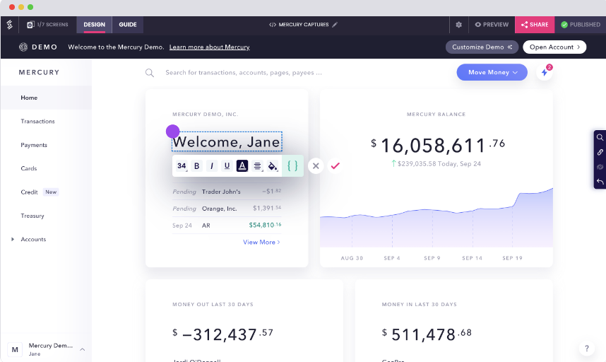
Step 5: Publish and Analyze
While you are building your demo story, you will notice that the status is "Draft". Once it’s ready, you can publish it by clicking on the ‘publish and share’ button in the editor. This will publish your demo story and provide you with different options for sharing – you can share it publicly or opt for secure sharing through passcodes/expiry dates.
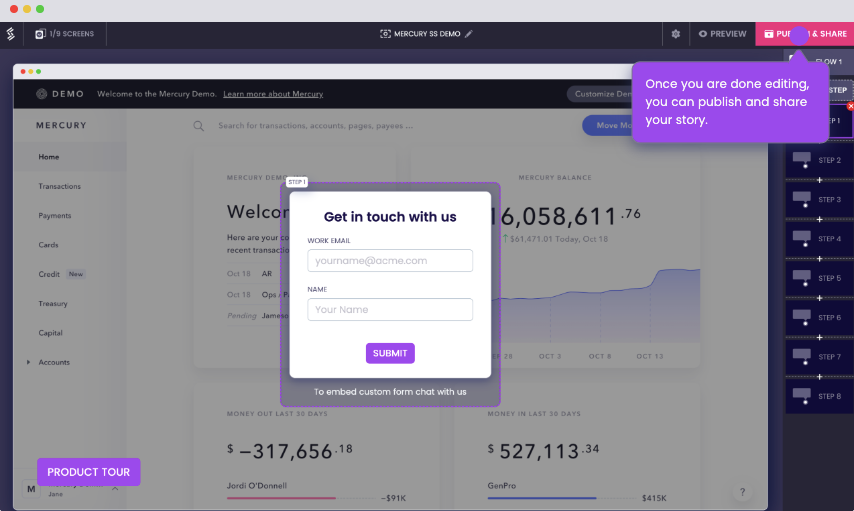
Once you share your interactive guided product tour in the desired channel, it’s time to wait for a while and dig into the analytics ! With a product tour software like Storylane, the analytics feature often is the most valuable one too as it can help you uncover real time helpful insights.
You can check overall impressions and engagement, story analytics, and even session analytics! These advanced analytics will equip you with valuable insights to optimize your product tours in the long run.
Here's an interactive demo that showcases the entire flow:
Also check out: Best Product tour software for SaaS
10 Best Tips to Create Effective Product Tours That Convert
To create a compelling guided product tour, you need to weave together essential elements. Here are 10 actionable tips to guide you in creating an effective product tour:
- Use a Storytelling Approach
The key to a successful product tour is storytelling. By narrating a compelling story that showcases how your software can be used, you can keep users engaged and help them understand the benefits of each feature.
Have fun and create a product walkthrough that delights your users – if they enjoy the app experience, they're likely to stick around and gain value from the product. It's not just a "nice-to-have"; it’s essential for user retention and satisfaction.
- Lead with Value
When creating a product tour, it's crucial to provide contextual guidance by showing users upfront how your product can enhance their lives. Make sure the value proposition is clear from the very beginning of their journey.
Ask yourself at every step: Does this help users understand the value of my product or feature?
Avoid overwhelming them with explanations of every little feature, as this can frustrate and annoy them.
You can always introduce additional features later on.
Instead, focus on highlighting the necessary features that will help them experience your product's core value and lead them to their "aha" moment.
- Make the Navigation Simple
Don't leave your potential customers in the dark with confusing navigation options. If your product tour is complicated, prospects may leave without exploring further.
Your product demos should be user-friendly, allowing them to move seamlessly between sections and understand your product with ease.
Show users exactly how to use your product, where to click, and what each action affects.
- Keep the Messaging Crisp
To avoid overwhelming or annoying users with an extensive product tour, focus only on the features that are relevant and important to them.
Start with the most critical features first, so that users can understand how they work without getting confused by other things. Keep it simple and straightforward for a smooth and engaging product tour experience!
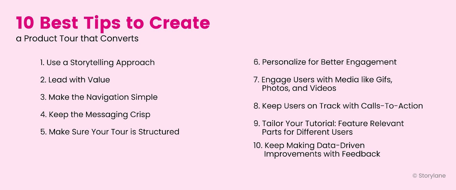
- Make Sure Your Tour is Structured
If prospects ask themselves, "Why is this feature showing up when I click something else?" during your product tour, it's a sign that your tour may be disorganized and confusing.
To prevent users from getting distracted or lost, create a clear structure for your complex product tour that allows for smooth and intuitive navigation.
This is especially important if you're a product manager showcasing multiple tools or features within the same walkthrough.
Make sure your users know where they're going and how they're getting there, so they can fully understand and engage with your product.
- Personalize for Better Engagement
Personalization is a powerful tool to create a sense of belonging and connection with your users.
By personalizing your product tour, you can focus on what's important, as the personalization has already been taken care of. Show your potential customers that you value their individuality and provide a personalized experience to drive engagement.
And with product tour tools like Storylane , you can effortlessly personalize text, images, and even video!
- Engage Users with Media like GIFs, Photos, and Videos
Don't let your product tour be boring and forgettable.
Spice it up with engaging media to capture your users' attention – like an intro video of yourself welcoming users to the tour or a funny GIF to put a smile on their faces.
A more interesting and enjoyable product tour will leave users wanting to click through, resulting in higher engagement and better conversion rates.
- Keep Users on Track with Calls-To-Action
A clear and prominent CTA can guide users and keep them engaged throughout extensive product tours, driving them toward taking a key action.
Depending on your product tour's purpose, the CTA can encourage users to try a new feature, add a new integration, or do anything else that’s your desired action.
Keep the CTAs prominent to guide users along the desired path, take meaningful actions, and drive customer engagement and conversions.
- Tailor Your Tutorial: Feature Relevant Parts for Different Users
Not all active users have the same needs or interests when going through your product tour.
Instead of bombarding them with irrelevant information, quickly customize your tutorial by dividing user segments and featuring only the parts that matter to each segment.
With Storylane , this can be easily done to make your product walkthrough more engaging and conversion-friendly.
By providing a tailored product tour experience, you can better meet the specific needs and interests of your new customers or prospects, resulting in higher engagement and better results.
- Keep Making Data-Driven Improvements with Feedback
A successful product tour should improve customer success.
After the tour, you should monitor user behavior from advanced analytics and collect user feedback to:
- Identify pain points
- Areas of confusion
- Locate drop-off points in your product tour
With this information, you can make necessary adjustments, refine your messaging, and optimize the user experience.
4 Examples of Great SaaS Product Tours
Let’s look at some SaaS product tour examples that have nailed it in getting customers to love their products!
Grammarly is one of the product tour examples that leverages interactive elements such as hotspots and beacons to transform its onboarding process into an engaging experience that promotes meaningful learning and action.
Hotspots and beacons are strategically placed to draw users' attention to important features and guide them through the learning process.
This approach is particularly effective as Grammarly's actual product functionality operates in a similar manner, using hotspot-like elements to highlight grammar errors.
Plus, Grammarly considers returning active users or those already familiar with the tool by providing the option to skip the tour, avoiding repetitive onboarding for those who don't need it.

Slack’s product tour highlights the collaborative features of the platform – showcasing how active users can communicate and collaborate with their team members. This helps users grasp the value of the product and how it can enhance their work processes.
Another unique aspect is its interactive and personalized approach, led by a chatbot named Slackbot. Through a conversational style, Slackbot engages users by asking about their interests and preferences and then customizes the tour accordingly. This creates a more engaging and interactive experience compared to a traditional one-way presentation, paving the way for better product adoption.

Upon registering for an account and logging in, new users are guided to create their initial project by Asana. The creation of a new project is a pivotal action that highlights the value of Asana's features to new users.
And for those who complete Asana's engaging product tour, they can look forward to receiving personalized app guidance tailored to their unique needs, leading them to their "aha" moment of discovery and success!
Asana's user-friendly approach includes contextually relevant tooltips that provide helpful guidance during the onboarding process, ensuring that new users are supported every step of the way.
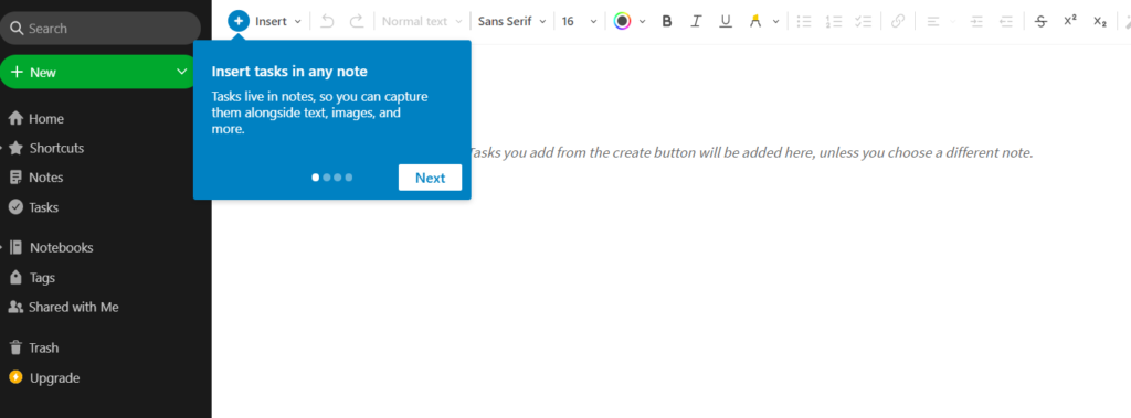
Evernote is a versatile note-taking tool designed for both business and personal use. This product tour example shows how Evernote's product tour is designed to help users get started by showing them how to create their first note. It then provides a series of feature walkthroughs that cover more advanced use cases related to organization and note editing. Additionally, the product tour includes an onboarding checklist that allows users to complete individual tasks, fostering a sense of accomplishment and progress as they explore the tool's capabilities.
Q1. What is a product walkthrough?
A product walkthrough is a guided demonstration or tutorial that showcases the features, functionalities, and benefits of a product to a user or customer. It typically involves step-by-step instructions and visuals to help the user understand how to use the product effectively. Product walkthroughs are commonly used in software applications, websites, and other digital products but can also be used for physical products or services. The goal of a product walkthrough is to familiarize users with the product, highlight its key features, and provide a positive onboarding experience to promote product adoption and customer satisfaction.
Q2. What is an interactive product tour?
An interactive product tour is a dynamic and immersive way to showcase the features, functionalities, and benefits of a product to users or customers. It usually involves a guided, interactive experience that allows users to actively engage with the product and explore its various aspects.
An interactive product tour may include elements such as interactive elements like tooltips, modals, pop-ups, step-by-step guidance, visuals and multimedia, and customization.
Q3. How to do a product walkthrough?
To make a product walkthrough, first identify the key features and functionalities of your product that you want to showcase. Then, you can use a product tour software like Storylane to create a step-by-step guide or interactive experience that highlights those features, provides clear instructions or prompts, incorporates visuals or multimedia, and allows users to actively engage with the product to explore and understand its value proposition effectively.
Q4. Why use a product tour?
Product tours are beneficial because they provide an engaging and informative onboarding experience for users, helping them quickly understand the value and functionality of a product. They can improve product adoption, customer retention, and satisfaction by guiding users through key features, functionalities, and benefits, and helping them become proficient users, thus maximizing the potential of the product.

What’s a Rich Text element?
The rich text element allows you to create and format headings, paragraphs, blockquotes, images, and video all in one place instead of having to add and format them individually. Just double-click and easily create content.

"Previously, there was scope for error and we’ve gone from a process that could be time consuming and painful to a process that’s super quick."

—CHRIS LANCASTER, SUPPLY CHAIN PROJECT

Similar Posts
Outbound Sales Strategy: How to Revive It in 2024
Miller Heiman Sales Process: Is It for You?
Consultative Selling Approach for 2024 [+ Free Template]
Product Tour Examples to Drive Product-led Growth
Are you in the process of implementing in-app onboarding and looking for successful product tour examples for inspiration?
You’ve landed at the right place.
We’ll cover what a product tour is, and how they fit into the onboarding process, then get straight into some examples, and finally explore the best product tour software tool for the job.
Let’s do it!
- A product tour demonstrates to your customers exactly how to use your product’s features. They can take many forms – but optimizing for interaction and engagement is typically the best practice.
- Why use them? Firstly, product tours are a fantastic way to keep your users engaged. Secondly, they’re one of your most effective levers to reduce time to value . Finally, they have a proven link to boosting the activation rate.
- Different SaaS organizations have different methods of building product tours and driving toward customer success.
- Userpilot builds personalized tours , utilizing various UI patterns to knit together a cohesive experience. After a survey and welcome screen, a modal is launched setting users off on the right track. Salesforce also leverages modals as part of its tours.
- Kommunicate uses interactive walkthroughs to give step-by-step instructions to its users.
- Sked Social opt for a slightly different variety of interactive walkthrough: rather than a standard tour of product features, they’ve built checklists . The step-by-step approach helps drag users toward activation.
- Asana uses contextual tooltips to craft a ruthlessly relevant onboarding tour.
- Typeform introduces various elements of gamification to their tour to drive up engagement and help customers achieve their goals.
- Tolstoy is a platform aimed at boosting digital adoption by leveraging video in customer onboarding. They use video within their own product tour, personalizing the experience with engaging, in-app video messaging.
- Jira opts for a more classic product tour approach. After catching users’ attention with an eye-catching slideout, they launch into a comprehensive walkthrough of the product’s capabilities.
- Loom utilizes in-app video tutorials to provide contextual guidance and educates users on how to use the product.
- Grammarly gives users a choice of whether they’d like to undergo a tour or not. If a user opts for an interactive tour , they essentially have a whole demo environment to play around it (with some key guidelines to follow).
- How do you create an effective product tour within your own application? Ideally, you want a powerful no-code editor – Userpilot is a fantastic option.
- With Userpilot , you can build custom product tours with various UI patterns , gather user feedback directly by launching in-app microsurveys, and track user behavior with powerful analytics capabilities .
What is a product tour?
A product tour demonstrates to your customers exactly how to use your product’s features and guides them toward activation (the realization of value).
Importantly, product tours should be interactive . Interactive product tours will engage your users while dull, sequential, and irrelevant tours will drive them away.
Why use product tours in your user onboarding process?
User onboarding is an ongoing, evolving process. So where do product tours fit in, and how do they help? Let’s dive into the detail.
Engage users with the product’s key features
First and foremost, product tours are a fantastic way to keep your users engaged without boring them.
You need to make sure you’re mapping tours closely to your customers’ specific jobs to be done . Get that right, and you have a great opportunity to demonstrate exactly how your features will help them solve their problems and pain points .
Reduce time to value
If you walk users through relevant parts of your product, you’ll make onboarding far simpler and smoother. You’re giving users a foundation of knowledge that will help them thrive.
Importantly, the better users understand your product, the faster the time to value . The alternative is leaving them to discover everything on their own and that risks friction.
Done right, product tours can become a pivotal part of any user onboarding process .
Increase activation rate
If there’s a metric you should care about as a product manager, it’s activation . It’ll help you understand whether customers are getting value from your product. Without that, your revenue will eventually dry up – and you’ll be out of business.
Effective and well-designed product tours can help drastically improve your activation rate by reducing friction throughout user onboarding.
They’ll also help boost engagement with your key features (which ultimately will result in a higher activation rate amongst new customers).
Successful product tour examples to get you inspired
Now we’re going to explore some examples; looking into the individual product tours for different SaaS companies and drawing out some handy tactics and tips.
Userpilot’s personalized product tour for new users
Userpilot introduces new users to their product with a welcome survey. They want to encourage users to provide valuable information that can be used to personalize the experience.
Not all product tours personalize onboarding with users’ jobs to be done but most of the good ones do.

So, onto the next stage of the user journey.
Once they’ve finished the survey, they’re greeted with the screen below. It’s an empty state that helps customers to figure out their next step.

Once they land on their website, a modal – with an engaging onboarding video – will pop up and start guiding users on the journey to creating their first flow.

Salesforce uses pop-ups to engage new users quickly
Let’s explore an implementation from Salesforce.
Salesforce is a cloud-based software company that provides businesses with tools that help them find more prospects, close more deals, and provide a higher level of service to their customers.
You can see how they’ve built interactive walkthroughs which utilize modals .
Of course, you’ll have many UI patterns to choose from but modals will pop up and draw your users’ attention toward key messages.
It’s simple to recreate this kind of product tour using different modals (whether that’s during initial onboarding or at any other stage).
Kommunicate uses a product walkthrough to provide step-by-step instructions
Kommunicate is a customer support automation platform that enables users to build their own AI chatbots without any coding.
When onboarding its users, Kommunicate deploys interactive walkthroughs that guide users on how to customize their chat widget. Step-by-step instructions are given in simple copy to onboard users smoothly.
Sked Social uses an onboarding checklist to drive activation
Sked Social is a social media project management tool for Instagram. They’ve opted for a slightly different variety of interactive walkthroughs: rather than a standard tour of product features, they’ve built a checklist .
So what’s the use case?
By providing users with a specific list of tasks that drive them toward activation, you essentially shorten the learning curve and drive feature adoption. A checklist can help anyone – a new user or experienced customer – experience value faster.

Asana uses contextual tooltips to kickstart interactive product tours
Asana is a project management tool that can help you organize work, focus on what’s important, and prioritize effectively in one place for smooth collaboration.
After signing up for an account (and once a user logs in), new users are prompted to create their first project.
At this stage, Asana uses contextually relevant tooltips to help the user onboard . As we’ve discussed, tooltips are great for boosting overall product adoption.

Typeform adds gamification elements to its product tour
Typeform is a tool that helps you build, launch, and analyze surveys.
Their product tour modal features a fun illustration and quirky copy that grabs user attention and sets the tone.
It’s a great example of how small gamification elements can transform a basic product tour. This modal can help ease a customer into a journey that helps them understand what might otherwise be a complex product.
Gamification is a concept that’s been taking the SaaS world by storm – particularly onboarding gamification – for good reasons.

Tolstoy lets users choose their own product tour at their own pace
Tolstoy is a platform aimed at boosting digital adoption by leveraging video in customer onboarding. Videos are proven to drive engagement, boost knowledge retention, and increase conversion.
They practice what they preach by showing video tutorials in their interactive guides . Human faces help to add an element of personalization, and their product tour demonstrates exactly what a user can expect.

Jira uses a new feature design walk-through
Jira is one of the best tools out there when it comes to product management . It enables issue tracking, ticket creation, story mapping, and a suite of other agile project management tools.
They use a slideout to capture the user’s attention – this product tour isn’t aimed at showing off a specific feature, though.
The slideout then starts with a short presentation guiding users around the entire product.

Loom uses video tutorials to educate and guide users
Loom is a platform enabling asynchronous video messaging. It’s extremely helpful for sharing short, punchy videos within your product teams.
In their product tour, they utilize in-app video tutorials to provide contextual guidance and educate users on how to use the product.

Grammarly uses a product demo to provide an interactive experience
Grammarly is a text editing SaaS tool that helps improve communication; clarity, brevity, spelling, and punctuation.
The key element of any good product tour is making sure they are interactive . Grammarly nails that: when a user first logs in, they’re quickly prompted with an engaging modal. It gives users the chance to start a quick tour or skip the experience entirely.
One product demo mistake is not giving users autonomy, so the element of choice in this example is a definite plus.

But rather than a static tour, they have a whole environment to play around in. The demo environment is supported by hotspots and beacons, designed to capture the user’s attention and iteratively build up their knowledge as they go.
Create product tours code-free with Userpilot
We’ve explored several interesting product tour examples, but let’s get to the crux of it – none of it’s possible without the right tool for the job.
Userpilot is a powerful product adoption platform that enables you to quickly build personalized, flexible, and contextually relevant in-app experiences targeted to different user segments – all without writing a line of code.
Let’s get into how it can help you!
Product tour UI patterns
A product tour will obviously differ from one SaaS to the next. One of Userpilot’s key features is the huge range of different UI patterns at your disposal. Pick the right option for your use case:
- Modals to capture and draw attention
- Tooltips to contextually reveal information
- Checklists to drive user actions forward
- And many more…
Don’t become over-reliant on one particular pattern. You need to analyze the situation and choose the right combination to create a truly effective product tour.

Collect user feedback to improve your product tours
“Feedback is the breakfast of champions.”
All feedback – especially the feedback you don’t want to hear – is extremely valuable. You need to make sure you’re dialed into the key themes emerging from your users. It’s the only way to make sure you make the right product decisions.
With Userpilot, you can create a huge variety of microsurveys to collect customer feedback. Make sure you trigger them contextually to collect actionable feedback . You can also embed videos and long forms in the surveys created with Userpilot.

Measure product tour’s effectiveness with analytics
The famous business strategist Peter Drucker said that “What gets measured, gets managed.”
Utilize Userpilot’s analytics capabilities to make sure you are keeping on top of your users’ behavior. For example, you can tag pages (and various UI elements on those pages), then monitor customer interactions over time.
The better the quality (and the range) of customer data you gather, the better your chances of making effective product decisions.
We’ve covered a lot of ground!
Hopefully, you should now feel well-equipped to tackle product tours in your own SaaS. You’ll be clear about what a product tour is, why they’re important for product managers, how they’re implemented in other SaaS companies and the right tools for the job.
So if you want to get started today, get a Userpilot Demo – and see how you can craft interactive product tours, effectively onboard users, and achieve your product goals.
Leave a comment Cancel reply
Save my name, email, and website in this browser for the next time I comment.
Get The Insights!
The fastest way to learn about Product Growth,Management & Trends.
The coolest way to learn about Product Growth, Management & Trends. Delivered fresh to your inbox, weekly.
The fastest way to learn about Product Growth, Management & Trends.
You might also be interested in ...
Examples of good onboarding surveys [+30 questions], 9 best onboarding platforms for saas companies.
Aazar Ali Shad
Aha Moment: The Ultimate Guide for Product Managers (+Examples)
Saffa Faisal
Best Examples & Practices of Guided Tours & Tutorials in Mobile Apps
- Bartek Dziegiel
What is a guided tour in a mobile app?
Guided tours and tutorials are potent tools to help find themselves in the new app. It allows users to navigate complex interfaces, grasp core functionalities, and ultimately derive maximum value from their interactions with a product.
Guided tours are sometimes also called walkthroughs or product tours . Designers can use guided tours of all types of digital products.
They serve as virtual mentors, accompanying users on their journey through digital experiences. Tutorials can use many different types of guidance, such as
- providing step-by-step guidance and explanations,
- interactive demonstrations,
- contextual tips.
Dedicated UI elements provide the instructions. These features shorten the learning curve. Moreover, they empower users to quickly become proficient in using new platforms.
What are the types of guided tours?
There are two main approaches to guide users through a digital product.
One of them is static onboarding screens. Those screens appear when users open the app for the first time. They often appear as a slide show – a quick presentation teaching the users how to use the app’s primary functions.
The other is a contextual instructions approach in the form of tooltips and coach marks. They provide information relevant to the current layout of the app or website.
This article will discuss best practices from the most popular apps. We will take product tour examples from widely used and successfull apps.
Best examples of guided product tours
№1: take advantage of animated instructions like notion.
Onboarding screens appear right after opening the application for the very first time. They are a great way to welcome new users and show them the apps’ value proposition. For example, Slack, a widely used communication and collaboration platform, takes this approach. App walkthrough informs users, what the app does and what it is for.

Alternatively, it is an opportunity to demonstrate the app’s main features. The Notion, productivity and note-taking web application, presents its functions through screens with animations. A short animation showing a screen of the application demonstrates how users can organize their notes.

This method is handy when it describes actions that can be taken outside of the platform (like in the “Settings” of the device or actions done in a browser). For example, Evernote, a note-taking and task-management application, uses animation to explain how to save web content.
№2: Use tooltips to present relevant information like Otter
Many modern applications use contextual instruction to demonstrate their functions. Pieces of information nudge users into exploring various features of the app. Tooltips are located near the button that serves the function the tooltip describes.
For example Otter, a transcription software, guides users through the application and demonstrates how to use it using tooltips hovering over certain UI elements. Small arrows at one side of the tooltips draw the user’s attention to specific details. In some cases, Otter uses visual emphasis (like a darker background combined with a contrasting UI element) to further bring users’ attention to the element it describes.

№3: Use page indicator and navigation for multi-step instructions like Meetup
A guided tour takes the user through different screens of the app. Tutorials can be done via tooltips describing certain interface elements one after the other.
For its instructions, divided into separated stages, Evernote uses tooltips containing step indicators and buttons that lead from one step to another. They provide navigation through instructions and allow users to take an actual guided tour through the app.
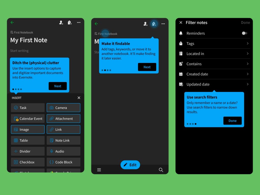
Meetup, a social media platform for hosting and organizing in-person and virtual activities, takes navigation through tutorials even further by allowing users to go back to the previous instruction.
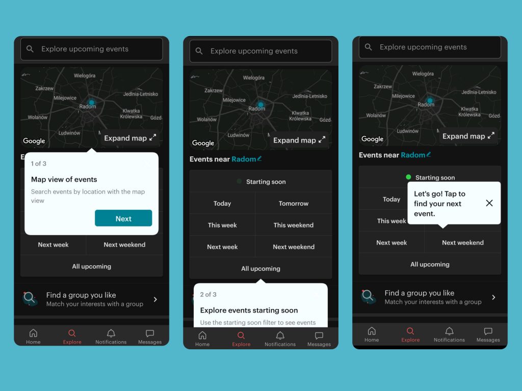
№4: Make instruction dismissable through skip and close button like Slack
Onboarding instructions appear when a user opens the app for the first time. However, not every person is a first-time user – some of them have previous experience with this interface and do not need this information.
Consequently, it is an excellent strategy to let users to skip or dismiss the tutorials. Lengthy, unskippable introductions can be frustrating for the users.
For example, welcome onboarding screens of Slack are easily skippable through the “Skip” button located at the top right corner. Users can just as easily dismiss the tooltips by using the close icon. Similarly, Otter’s tooltips always include close buttons that let users brush off instructions they are not interested in.
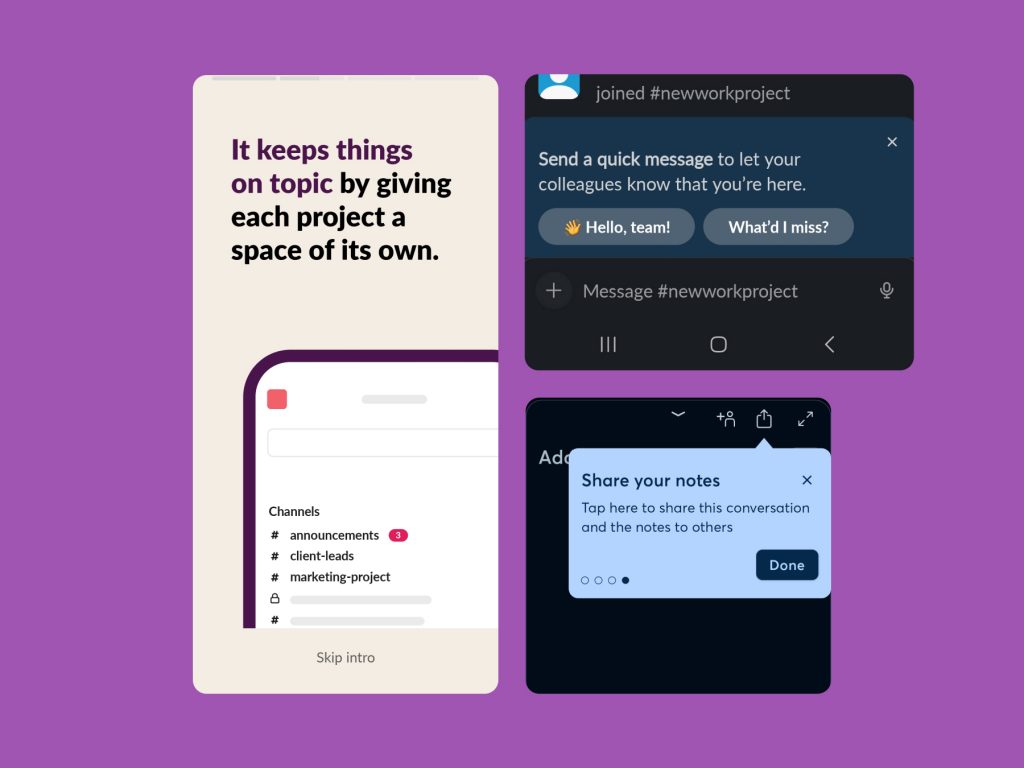
№5: Let the user access instructions again like Evernote
However, allowing users to access instructions again could be beneficial.
Most apps allow users to go through their guided tutorial only once and never again. If users prematurely skip initial instructions, they are left to explore the app on their own.
Providing the option to access instructions multiple times can help to avoid that scenario. Moreover, thanks to that approach, users can reinforce their understanding of the app. They can retake a tour to clarify doubts and refresh their memory on specific tasks or features.
Take an example from Evernote and its approach to guided tours and tutorials. After opening the app for the first time, users’ attention is brought to the “Get Started” widget, which contains six tutorials explaining how to use the app’s different functions.
Users can tour the app, guided by helpful tooltips, as often as they like. Then, the user can remove the widget by customizing the app’s home screen. Through the same function, they can bring the widget back and reaccess the tutorials if some interface elements are unclear.
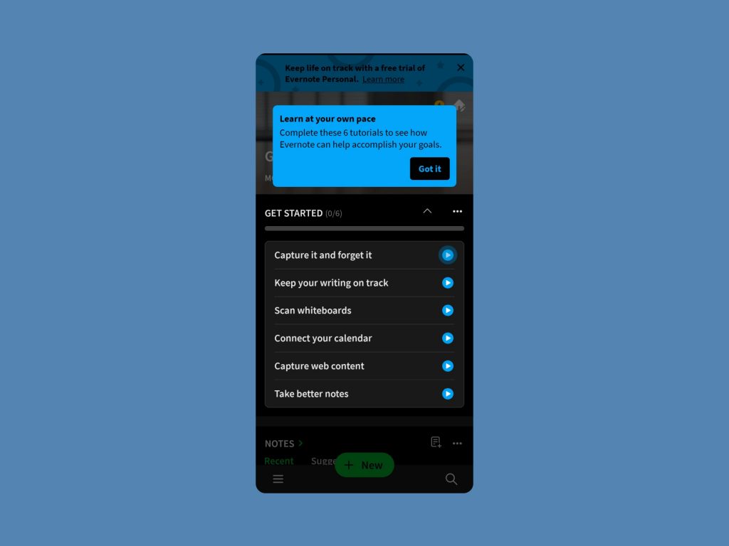
Why are Guided Tours and tutorials important?
If you are currently working on guided tour or tutorial flow yourself Talebook is a helpful resource to simplify your task.
This article was based on research conducted at Talebook. Here you can access the report based on that research. It was made using Talebook.io, an online research repository.
Furthermore, you can access the link to explore tutorial flow wireframes that are conveniently available for download. Wireframes are fully customizable and offered free of charge, so go on and start designing your user onboarding process today!
Talebook UI Kit – Onboarding Wireframes
Quality product content. In your inbox. Every week.
Onboarding ux: ultimate guide to designing for user experience.

Skip to section:
Most people would be reluctant to explore a new city or country without some sort of guide. If you’ve traveled to a place like New York or Rome, you know tourists fall into 2 groups: big, double-decker-tour-bus people, or Google/Apple Maps, find-my-own-way types. Regardless of your preference, we can all agree traveling is a far less pleasant experience without a handy frame of reference.
New users signing up for your product are the same. They also need help navigating your website or app through in-app tutorials or guide posts. The absence of such guidance can be the difference between users continuing their journey or quitting before arriving at their destination. So, offer these tips the right way during user onboarding—or risk derailing your users’ journey before it even gets started.
What is user onboarding?
User onboarding is the process of helping new users learn and understand your product or service with the hopes of turning them into long-term customers and advocates. It will convince new users that your product is easy to use and can help them achieve their goals. When done well , it shortens a user’s time to value. We refer to this moment of value as a user’s wow or aha moment —like, “ Wow, this is awesome!” Or “ Aha! Now I get it! ”
Onboarding tools will help you build user onboarding UI/UX experiences into your product or incorporate common UI patterns that overlay or augment your app’s true UI with annotations. These annotations guide users to their aha moment faster than if they were simply dropped into your app after signing up. And by getting your new users to that aha moment faster, you are more likely to retain these new users beyond their first session.
Good user onboarding experiences boost user retention rates, minimize early churn, reduce support tickets, and lead to higher free-trial-to-paid conversion rates.
Tl;dr: User onboarding is essential (yes, even for products with otherwise great UX ).
What is user onboarding UX?
User onboarding UX is the in-app experience of new users when they sign up to test or use your product. It’s the way the product setup instructions and UI element signals make users feel when they begin using your product.
Many users will come to your app with little knowledge of your app and how to use it. It’s your responsibility to ensure that they can easily discover the features they need to justify using your app and that they enjoy the in-app learning process.
User onboarding UX methodologies
We’re big fans of user onboarding UX—so much so that we analyze every onboarding experience we come across. Over the last few years, we’ve analyzed over 500 onboarding UX methodologies and categorized them into 8 onboarding UX patterns to use as inspiration.
1. Welcome messages
Welcome messages are any greeting that first-time users see when they log into an app for the first time, and these messages usually contain words like “Hello” or “Welcome.” The message often includes an opportunity for action—like a CTA to begin a brief product tour or walkthrough. Welcome messages help users feel more, well, welcome to your app and can help set expectations and tone.
.jpg)
When to use welcome messages
About 9 in 10 new user onboarding sequences begin with a welcome message. Welcome new users when they first log in to your app and give them direction on the next steps to take in their product journey.
Tips for welcome message design
Welcome messages are often contained within a modal window —a large UI element that visually separates the user onboarding experience from the application’s interface itself. These messages often have a layer of transparency behind them to give users a peek into the main app. This design helps users keep an eye on their end goal and may motivate them to complete your user onboarding experience to start using your app.

Alternatively, some welcome message modals take over a user’s entire screen, blocking visibility into your app and focusing a user entirely on the message and user onboarding experience in front of them. We refer to this pattern as a full-screen takeover. This pattern is highly disruptive and is best used sparingly or saved for when there are required inputs that a user must fulfill before using your product.

Here’s a good deep dive into in-app welcome messages .
User onboarding toolkit: Welcome messages
You can build welcome messages with Appcues’ modal windows or with one of these open-source alternatives:
- Sweet Alert
- animatedModal.js
- This list of open-source modal plugins
ALWAYS BE ONBOARDING
Create an amazing first impression in minutes, not sprints.
- Use Appcues no-code builder to change text, images, buttons—it's *all* in your control
- Pick your pattern, we've got tooltips, modals, and more!
- Create seamless in-app experiences
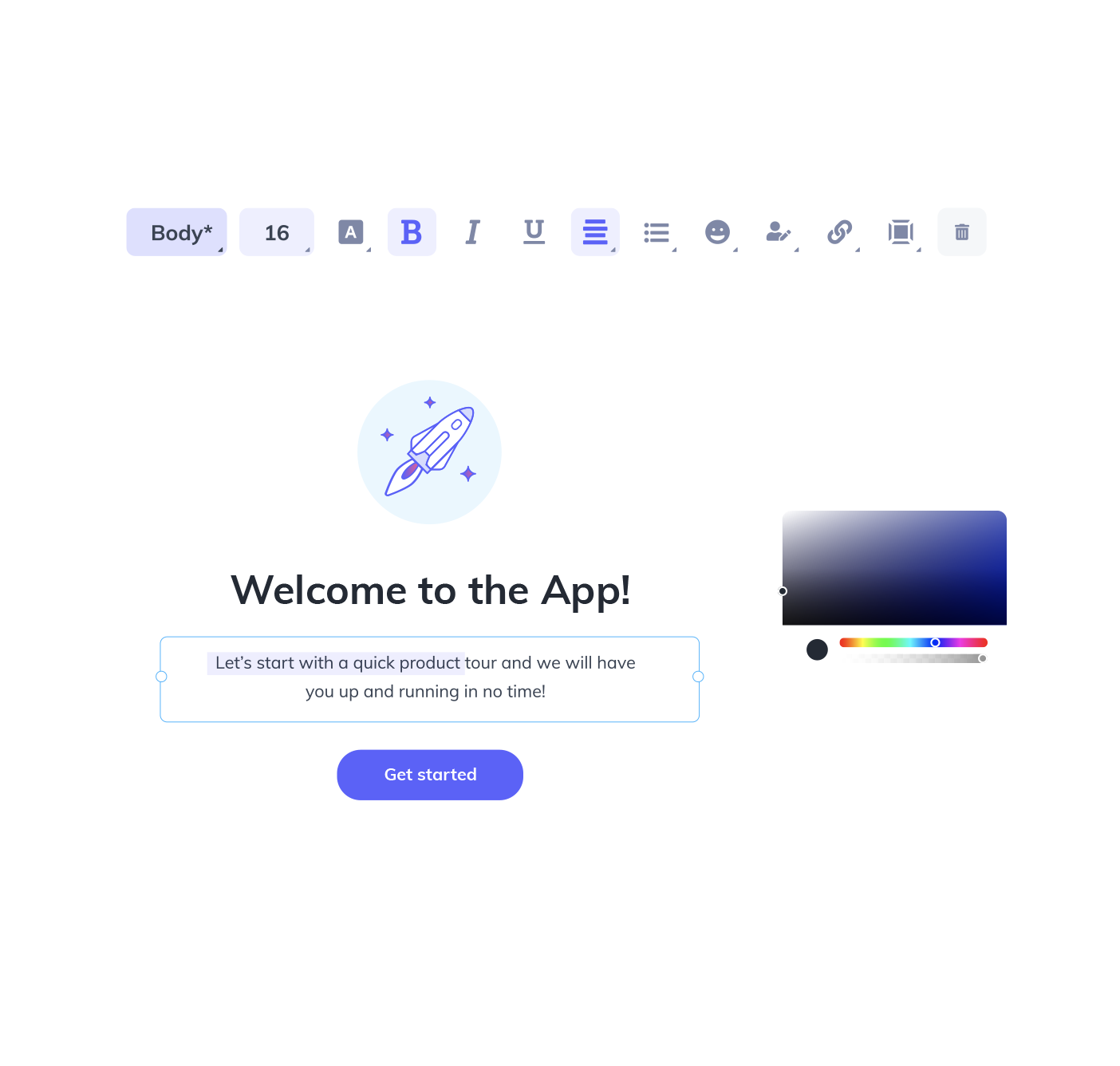
2. Product tours
Product tours are in-app guides that walk new users through your app to familiarize them with your UI. These guides show new users key workflows or processes that make your product valuable and are useful for driving full product adoption. Product tours can take the form of various UI patterns and often include videos to show users your product in action.

When to use product tours
Use product tours when you want users to take specific action or complete certain processes in your app. The process can be simple or complicated—what’s difficult to the user might be simple for you, so always err on the side of creating a product walkthrough.
Tips for product tour design
Product tours often come in the form of tooltips . Tooltips are boxes with pointers that call out and contextualize certain elements within a product. A few tips to optimize your product tour’s user onboarding UX:
- Be selective. The best product tours typically consist of 3–5 tooltips. Any more steps than that can start to feel like a hassle for new users.
- Make your first tooltip open on page load.
- Keep the copy short. Think 140 characters or less—like Twitter back in the day.
- Focus your copy on value rather than how-to. This will keep users motivated.
- Design your tooltips to look native to your product’s brand, but make sure they have enough contrast with the main interface to get noticed.
- Make sure you have access to easy-to-read analytics on your product tour. You should be able to ascertain how far users make it in the tour and how this affects their ultimate success with your product.
User onboarding toolkit: Product tours
You can build product tours with Appcues’ tooltips or with one of these open-source alternatives:
- This list of open-source tooltip plugins
3. Progress bars
Progress bars are visual representations of a new user’s progress toward completing tasks in your app. They’re common with processes like downloads, installations, and file transfers. Progress bars say, “ Hey, you’re on your way! Just a little more effort, and you’ll get there.”
When to use progress bars
Use progress bars (or similar progress indicators, like dots, dashes, and fractions) to motivate new users to complete their onboarding. You should also use progress bars to show how long a task featured in a product walkthrough will take to encourage completion.
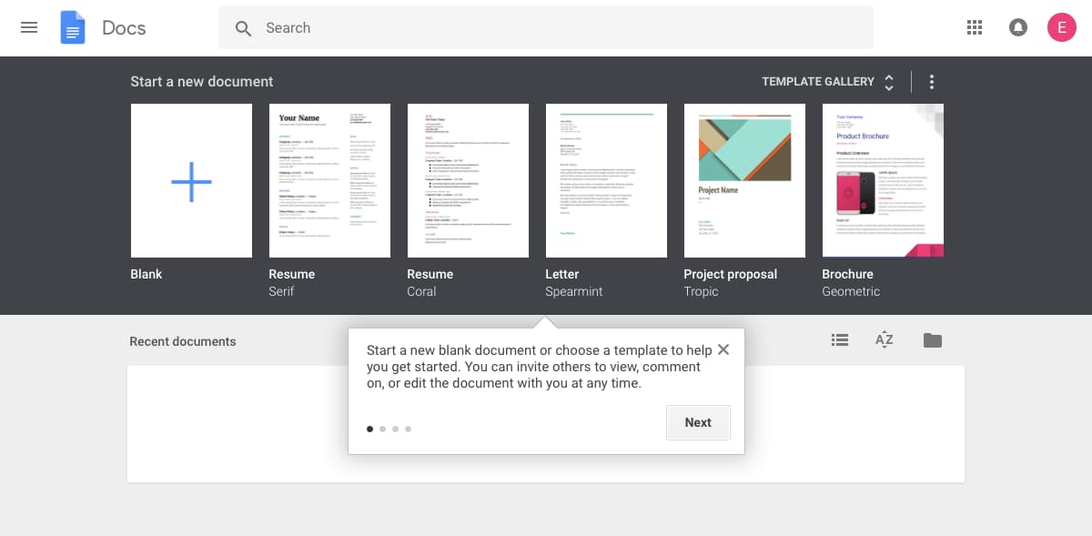
Tips for progress bar design
Progress bars are most effective at motivating users when they show a substantial percentage of the bar filled out. Starting with a partially completed progress bar helps a user feel like they’ve already accomplished something instead of starting from scratch. This sense of progress increases a person’s desire to complete the task at hand.

User onboarding toolkit: Progress bars
You can add progress bars to your app onboarding with Appcues’ modal windows or build your own with one of these open-source alternatives:
- Animated progress bar
- Progressbar.js
4. Checklists
A checklist is a visual depiction of tasks that informs people how many tasks they have and haven’t completed. Like progress bars, they play into powerful psychological principles, motivating new users to finish—and even enjoy— the crucial setup tasks required to get up and running within your product. Users will see a checkmark next to completed tasks while uncompleted ones are left unticked.
When to use checklists
Checklists are used for complex tasks and multi-step processes during user onboarding. They also combine well with a progress bar to turbocharge motivation.

Tips for checklist design
Checklists work best when they live alongside your product as a present reminder of the tasks that still need to be completed.
For more checklist design inspiration, check out 5 other examples of best-in-class checklists .
User onboarding toolkit: Checklists
Yup, we offer checklists too! You can add progress bars to your user onboarding with Appcues’ Checklists or build your own with one of these open-source alternatives:
- Create a to-do list with CSS & JavaScript
- Checklist with JS
- CSS & jQuery To-Do Checklist
5. Hotspots
Hotspots are small dots that prompt people to focus on specific elements or features of your app’s UI. A cross between notification badges and tooltips, hotspots are a great alternative to tooltips since they can appear passively without a user’s active interaction with your product.
When to use hotspots
Hotspots are subtle and discreet. They’re best for calling out non-essential features without interrupting user workflow. They’re also useful for giving some contextual help to entice new users to activate certain elements or features in your app.
Tips for hotspot design
Beautify your hotspots with unique pulsating animations to catch the user’s eye. Adjust the intensity of your animation so that users can easily digest relevant information. You don’t want users to miss the point of the hotspot.
User onboarding toolkit: Hotspots
You can build hotspots with Appcues or create your own with one of these open-source alternatives:
- Pulsating Dot
- Pulsating Hotspot UI element
- CSS3 Pulsating Dot
6. Tooltips
Tooltips are in-app messages that pop up when someone hovers over, stops at, or clicks a specific element on your website or mobile app. Tooltips work best on elements like text links, buttons, and icons. They disappear when the user leaves the element.
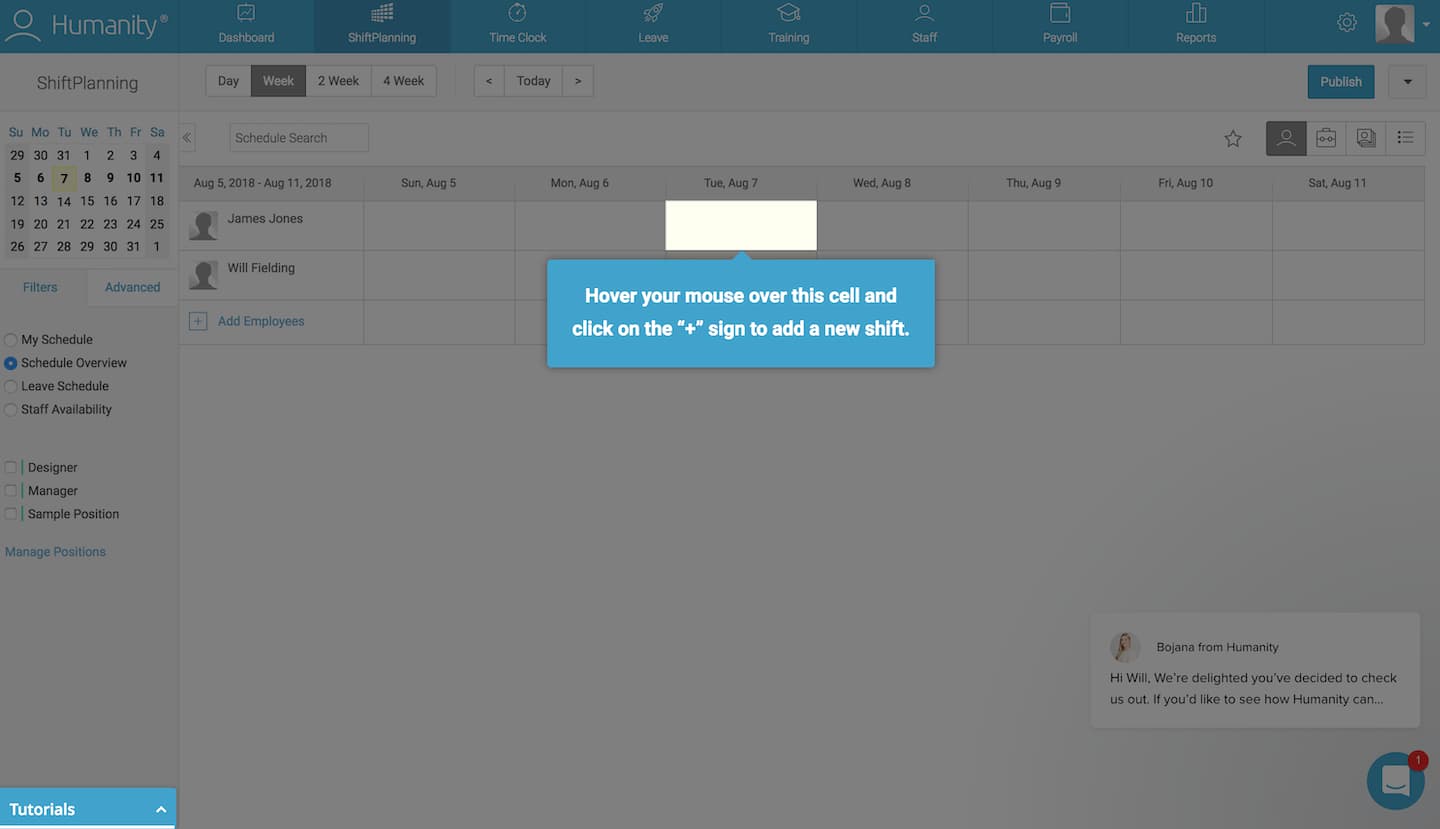
When to use tooltips
Use tooltips when you want to isolate elements like form fields or buttons to guide a user through account setup. Once a user completes a step, they’re referred to the next one, and so on.
Tips for tooltip design
Highlight a given element in your app and darken the space around it to help users to follow a particular set of instructions and path through your product. However, you should be careful not to overdo tooltips—they can come off the wrong way to more independent-minded users.

Don’t place tooltips on information that is essential to the success of a new user’s task. Tooltips disappear, and users would need to memorize the information to complete the task.
User onboarding toolkit: Tooltips
You can build action-driven tooltips with Appcues’ tooltips or with one of these open-source alternatives:
7. Deferred account creation
Deferred account creation allows new users to experience the value of your product before asking them to sign up. New users can see the value of your product without the commitment of adding their email, creating a password, or inputting other details. Delaying account creation will help you avoid signups from users who aren’t a good match with your product.
When to use deferred account creation
Defer account creation when you want to ensure that new users have a certain level of commitment to your product before signing up. Some products delay account creation until after the initial landing page, while others go as far as delaying account creation entirely until after a user has reached their aha moment. This process is called gradual engagement .
Tips for deferred account creation design
Move new users through your app slowly, helping them experience the value firsthand before requiring that they sign up for an account. You can also defer account creation by decreasing the number of form fields to fill out and the amount of personal information you require of users. This can be as simple as asking users to sign up with only their email address at first—it increases conversion rates on your signup page by lowering the barrier of entry.
The UI for delayed account creation needs to be hyper-focused once you actually get to the registration step. If a user doesn’t realize they need to save their account, you may lose them if they bounce—or perhaps even worse, they may lose their progress and feel so frustrated that they churn.
User onboarding toolkit: Deferred account creation
There isn’t any single UI pattern for deferred account creation. Depending on how you plan to communicate the need for registration, you may want to use tooltips to draw attention to a signup CTA or a modal window at an appropriate moment in the user journey. You can build either pattern with Appcues or the following open-source alternatives:
- Open-source tooltip plugins
- Open-source modal plugins
8. Persona-based user onboarding
Persona-based user onboarding means designing new users’ onboarding experience based on their role or desired outcome while using your app. This user onboarding UX design prompts users to self-segment by selecting their own course of action, with each option leading to different first experiences. Segmenting can happen without the user knowing it—by using data collected on signup—or through a choose-your-own-adventure option.

When to use persona-based user onboarding
Use persona-based user onboarding during or after the signup process if your app has multiple products or offers serving different target audiences. It gives users personalized and relevant first experiences with higher engagement and lower time-to-value rates.

Tips for persona-based user onboarding design
Personalized user onboarding often starts with an option after a user has filled out a signup form. The option may be a clear choice for the user based on their desired outcome, or it may be to select their job role.
It’s important not to overwhelm the user with too many choices. From what we’ve seen, 2–5 options seem to be the magic number.
User onboarding toolkit: Persona-based user onboarding
You can create persona-based user onboarding with Appcues or by hard-coding the logic and data loops with an open-source alternative.
There are hundreds of fantastic user onboarding examples for every UX/UI pattern we’ve listed. Head over to ReallyGoodUX for some of the best examples for mobile and web—whether you’re actively building your user onboarding flow and need inspiration, or you’re just trying to stay on top of the trends.
Best practices when creating onboarding experiences
Thoughtful onboarding experiences are the difference between converting free users to paying customers and experiencing drop-offs after signup. To help you avoid or combat these, here are the best tips for creating onboarding experiences .
Know your customers
Each customer is different, but they signed up for your product because they believed it could benefit them. Use your user onboarding experience to validate their belief about your product.
Look at your existing customers who have been around for more than 90 days. Find behavioral patterns and compare them with customers who didn’t stick around. Tools like Amplitude or Mixpanel allow you to segment customers into behavioral cohorts where you can analyze what’s driving user retention or possibly causing churn. A cohort like “users who bought a product add-on” can help you understand where your users need more guidance. Giving these users the necessary instructions can convince them that paying for your product or buying a higher plan is worthwhile.
Collect direct user feedback through conversations, emails, and in-app surveys if you don’t have enough data to use a product analytic tool. Look for patterns in their responses and apply anything you learn to improve your onboarding experience. Your product and customer behavior will change over time, so stay on top of any changes by actively collecting user feedback.
Write helpful UX copy
UX copy will be your users’ guide throughout their interactions with your product. Use these tips to help you write effective UX copy:
- Use clear verbs. Don’t tell users “ Reserve your file ” when you mean “ Save your file ” or just “ Save .” The latter is clearer.
- Use consistent terms. Don’t say “ Meeting ID ” in one part of your UI and “ Meeting Code ” in another—it’s confusing.
- Use active voice. Choose “ Your file is ready ” over “ Your file has been downloaded ” every time. Passive voice is wordy and creates complex sentence structures.
- Avoid technical jargon. Say “ Your account is locked ” instead of “ Error code 584 .” It’s frustrating when customers have to perform a Google search to figure out the meaning of your error codes.
- Use platform-consistent language. Ensure your copy makes sense on all the platforms users can access your product. It wouldn’t make sense to tell a desktop user to “ Swipe up ” to find the right menu. Most desktops do not have touch functionality.
Check out this article for a more in-depth look at how to write exceptional UX copy .
Perform tests and run experiments
Tests and experiments will give you data to make better decisions instead of relying on gut feelings. Sometimes your instincts are based on conscious or unconscious biases that blur the line between a good idea and a terrible one. Testing will help you ensure you’re making changes the user actually needs—not what you think they need.
Run tests and experiments to confirm or disprove any assumptions you have about creating onboarding experiences for your customers. If you think your free trial users are not converting to paid users because of a certain feature, test it. Withhold the feature from some users and leave it for others. Analyze your results and apply the insights you gain by removing or adding new features and running more tests.
A product analytic tool like Amplitude allows you to perform A/B tests that will enable you to improve your onboarding UI and onboarding patterns. Don’t stop at testing sticky app features that improve the user onboarding experience. Test your user onboarding UI and UX copy too. You’ll get a lot of data points to help you further optimize your user onboarding.
Building user onboarding UX/UI experiences
Each common UI pattern can be built with either open-source or SaaS solutions, and both have their advantages.Here’s how they compare:
Open-source tools
- Built and maintained by developers
- Style is customizable with hard-coded CSS
- Content is hard-coded into the product
- Require deploy
- No analytics attached
- One UI pattern per plugin
SaaS solutions
- Installed by the developer; maintained by anyone
- Content and style are created through “what you see is what you get” (WYSIWYG) editor
- No deploy necessary
- Come with analytics
- Multiple UI patterns per solution
Give your non-technical team the keys to engaging new users with a SaaS solution. Think about it: Who’s more familiar with the user journey and writing compelling copy—your marketers and CSMs or your engineers? However, if you’re bootstrapping and have an abundance of dev time, open-source solutions may make sense.
Read: 8 examples of effective SaaS onboarding experiences (plus tips)
What is user onboarding on a website?
User onboarding on a website is how the website helps you understand its product: what you can do with it, how to use it, and how using certain features benefits you. It involves product tours, flows to explain certain features, and in-app messages to encourage learning and app usage progress.
How do you improve the onboarding process with UX?
You can improve an onboarding process with UX in the following ways:
- Understand your customers: Users have a pleasant onboarding experience when you understand their needs and implement them in your onboarding process.
- Use a product like Appcues to experiment with several onboarding UI patterns: Experiments will help you nail your customers’ preferred patterns and improve their engagement during onboarding.
- Write effective UX/UI copy: Clear copy enables users to understand what they need to do to get the best out of your product.
- Test and run experiments: A/B testing helps you figure out what’s wrong or right with your onboarding experience and how you can improve it.
How do you design an onboarding experience?
Design an onboarding experience in the following steps:
- Write your welcome message: This is your chance to make a good first impression on new users. A compelling welcome message will boost user excitement about using your product.
- Decide on an activation event: Choose the first aha moment you want new users to experience when they begin using your product. A well-chosen one will increase your chances of turning them into loyal, paying customers.
- Build backward from activation: Understand what education users need to activate and then include only that in your onboarding flow to keep it lean and mean.
- Use effective UX/UI patterns: Don’t be overwhelmed by the variety of choices at your disposal. Think of what you want your users to accomplish with your product and choose an appropriate pattern .
- Personalize and optimize: Users will use your products in different ways and for different purposes. Allow users to choose their preferred use case and serve them onboarding experiences consistent with their needs.
What are some good user onboarding examples?
A couple of user onboarding examples for inspiration:
- Asana : Uses simple prompts and practical guides to boost team adoption
- Loom : Creates a specific flow for commercial users
- Speeko : Personalizes user experience with needs-based onboarding
- Webflow : Uses a familiar UI pattern to guide users
- Deputy : Gives users different ways to access onboarding materials
You can find other onboarding examples on ReallyGoodUX .
Always be onboarding
Companies are constantly launching multiple feature updates, and existing users need updated training to keep up. So, don’t stop onboarding after new users are acquainted with your product—make it a vital part of their ongoing product experience.
If you focus on giving users the best experience possible on your app, you’re already halfway to making excellent first impressions with your onboarding flow. The other part would involve creating onboarding patterns that fit with your users, their journey, and their desired outcome with your product. That’s how you’ll retain users, grow revenue, and, who knows, probably create an app people can’t live without .

Intuitive and customisable tours for user onboarding
TourGuide is a Javascript library written for creating user tours and on-boarding steps for your apps.
TourGuide JS has a range of promise driven methods and callbacks to provide an enjoyable developer experience.
Framework agnostic
Written entirely in vanilla JS with TypeScript and usable in virtually any framework. Choose from CDN or NPM installation.
Typescript support
Type definitions help automatically detect available options in your IDE as well as ensure a type safe package for your projects.
1 Dependency
Tour positioning is supported by Floating-ui. It's required modules are pre-bundled into the TourGuide JS library.
Customizable
Define an array of options to create the perfect onboarding experience for your visitors, you can even use custom HTML in your tour content.
Open source
TourGuide JS is in early stages of development and contribution is welcome. Open license for both commercial and personal use.
CDN installation is available for simpler integration or testing purposes
For projects with build processes, NPM is recommended
Get started
Installation.
Creating a tour only takes a few steps, once initialized you can interact with the TourGuideClient object.
Include in your project
Declare steps (data attribute method)
Initialization
Customization
With a variety of options you can tweak the tour to suit your needs.
Read the documentation to understand how to use events, declare steps and customize the tour behaviours futher.
Your browser does not seem to support JavaScript. As a result, your viewing experience will be diminished, and you have been placed in read-only mode .
Please download a browser that supports JavaScript, or enable it if it's disabled (i.e. NoScript).
Discover and share your #QtStories
Upcoming forum update april 22nd, congratulations to our qt 2023 champions.
Forum Maintenance: Feb 6th, 8am - 14pm (UTC+2)
Nominate our 2022 Qt Champions!
Solved switch off "take a ui tour" window appearing at start of qt creator. how.
- Oldest to Newest
- Newest to Oldest
- Reply as topic
Hello all! I've been updating Qt Creator an got this:

It's appearing every time when Qt Started. I've tried everything: -- Disable "Do not ask again" -- Pressing "Take UI Tour" and see this tour
The question is - How to kill this window appearing at time of Qt Creator start?

Hi @bogong ,
I first did the mistake to uncheck the checkbox. Once I noticed it has to be checked, it disappeared forever.
Does that help you?
Qt has to stay free or it will die.
@aha_1980 I've tried everything. It's appearing every time ... Reinstalling right now ...
@bogong said in Switch off "Take a UI Tour" window appearing at start of Qt Creator. How? :
Worth reporting as a bug, then.
Do any other Qt Creator settings fail to get saved for you? Perhaps location where QtC saves settings is read-only on your machine?
@bogong where's you QtCreator installed? It may be a permission thing, if you have it for example in Program File (on windows) and the setting to show the popup is stored in a local file. Than the write attempt will fail without elevated rights.
Be aware of the Qt Code of Conduct, when posting : https://forum.qt.io/topic/113070/qt-code-of-conduct
Qt Needs YOUR vote: https://bugreports.qt.io/browse/QTQAINFRA-4121
Q: What's that? A: It's blue light. Q: What does it do? A: It turns blue.
Just totally deleted previous Qt and reinstalled from scratch. It's working. I don't know what was it ... But now it's working, mean do not appearing anymore. It's became habitual that is something wrong with Qt Creator on Mac OS. At least 5 times for last half of year. But it is what it is ...
I have the same problem . please where to switch it off in setting ? or change a file in system ?
@ehblan said in Switch off "Take a UI Tour" window appearing at start of Qt Creator. How? :
I have the same problem . please where to switch it off in setting ? or change a file in system ? hi : after setting the sessions restore . the TakeTour dialog disappear . file > sessions > manage > select the " restore last session on startup " . done .
it works on my Mac .
Help --> About Modules --> Core --> Welcome.
@tsvigo2 That disables the whole Welcome Mode, which is overshooting the target.
The whole "Take a UI Tour" feature has been reworked, the question is non-modal now and can be answered with "No".
So why would you want to disable the Welcome Mode screen?

- First post Last post Go to my next post


Virtual Tour
Experience University of Idaho with a virtual tour. Explore now
- Discover a Career
- Find a Major
- Experience U of I Life
More Resources
- Admitted Students
- International Students
Take Action
- Find Financial Aid
- View Deadlines
- Find Your Rep

Helping to ensure U of I is a safe and engaging place for students to learn and be successful. Read about Title IX.
Get Involved
- Clubs & Volunteer Opportunities
- Recreation and Wellbeing
- Student Government
- Student Sustainability Cooperative
- Academic Assistance
- Safety & Security
- Career Services
- Health & Wellness Services
- Register for Classes
- Dates & Deadlines
- Financial Aid
- Sustainable Solutions
- U of I Library

- Upcoming Events
Review the events calendar.
Stay Connected
- Vandal Family Newsletter
- Here We Have Idaho Magazine
- Living on Campus
- Campus Safety
- About Moscow

The largest Vandal Family reunion of the year. Check dates.
Benefits and Services
- Vandal Voyagers Program
- Vandal License Plate
- Submit Class Notes
- Make a Gift
- View Events
- Alumni Chapters
- University Magazine
- Alumni Newsletter

U of I's web-based retention and advising tool provides an efficient way to guide and support students on their road to graduation. Login to VandalStar.
Common Tools
- Administrative Procedures Manual (APM)
- Class Schedule
- OIT Tech Support
- Academic Dates & Deadlines
- U of I Retirees Association
- Faculty Senate
- Staff Council
University of Idaho News
University Communications and Marketing
Fax: 208-885-5841
Email: [email protected]
Web: Communications and Marketing
NASA, U of I Capitalize on Solar Eclipse to Improve Weather Tracking
April 04, 2024.
MOSCOW, Idaho — The last total eclipse to cross the U.S. until 2044 will occur Monday, April 8, and a team of University of Idaho engineering students is using the event to help NASA gather data needed to improve global weather forecast models and climate change mitigation processes.
For the past year, U of I engineering students have been training teams nationwide as the lead university in the Nationwide Eclipse Ballooning Project (NEBP).
Teams use weather balloons to gather data on atmospheric disturbances produced during eclipse events, including gravity waves that represent a transfer of energy through the atmosphere. For decades, scientists have been tracking gravity waves because of their influence on weather patterns and forecast accuracy.
NEBP teams will be stationed along the path of totality from Texas to Maine, engaging in launches to gather data on these disturbances.
The U of I team is traveling to North Springfield, Pennsylvania, to launch weather balloons Sunday and Monday, April 7-8, and gather data during a 30-hour launch session held during the total solar eclipse.
“Knowing this is the last visible eclipse in the U.S. for the next 20 years, the teams we’ve trained nationwide are crucial to gathering the datasets we need,” said Matthew Bernards, U of I College of Engineering associate professor and co-project lead. “The data will continue to improve long-term weather forecasting capability. Better prediction methods have global impact on agriculture, aviation and the economy.”
Students traveling include graduate student Konstantine Geranios of Spokane, Washington; and undergraduate students Caeley Hodges of McCall; Logan Kearney of Moscow; Ashley Keeley of Mukilteo, Washington; Cole Long of Boise; Chase Long of Boise; Shashwot Niraula of Nepal; and Will Schaal of Coeur d’Alene.
Media Contact:
Matthew Bernards Associate Professor, U of I College of Engineering Director, NASA Idaho Space Grant Consortium 573-355-2564 [email protected]
Alexiss Turner Marketing and Communications Manager U of I College of Engineering 208-885-7511 [email protected]
About the University of Idaho
The University of Idaho, home of the Vandals, is Idaho’s land-grant, national research university. From its residential campus in Moscow, U of I serves the state of Idaho through educational centers in Boise, Coeur d’Alene and Idaho Falls, nine research and Extension centers, plus Extension offices in 42 counties. Home to nearly 11,000 students statewide, U of I is a leader in student-centered learning and excels at interdisciplinary research, service to businesses and communities, and in advancing diversity, citizenship and global outreach. U of I competes in the Big Sky and Western Athletic conferences. Learn more at uidaho.edu .

IMAGES
VIDEO
COMMENTS
The best product tours usually involve 3-5 steps. It takes the average lead 3-5 days to schedule a sales demo, and most sales demos last 30 minutes to an hour. More time waiting = more interest lost for your prospect. Product tours should decrease time-to-value—so keep them brief and punchy.
In a product-guided tour, hints are automatically progressed in linear succession, while hints in a user-guided tour are triggered as the user reaches appropriate points in their experience. For user-guided tours, hints may appear in different orders for different users. Sources. 1 Patterns for new user experiences by Krystal Higgins.
To build a custom tour component in React, it's easiest to isolate the functionality and component UI with these React Hooks: useTour - a custom Hook to build your own UI on top of functionality. Tour - a dumb UI component that consumes useTour to load the tour portal UI. This mock code shows how useTour works: /*.
5- Trello. Not all product tours happen during the initial onboarding and Trello's new interface tour is a great example. Trello introduces their new navigation bar in 4 simple steps and asks whether the user would like to switch to the new version at the end. A short and concise interaction with the user for sure.
Product tours (or product walkthroughs) introduce new users to apps by giving them the lay of the land. You can think of them like interactive tutorials—they help users get comfy with your UI while guiding them to the core processes that bring value to your product. Great product tours set users up for long-term engagement and increase the ...
Blog. Product Tours 101: Guidelines, Inspirations, and Tools for 2023. Product tours are an essential tool for a product manager in guiding users towards their "aha" moment or showcasing high-value features that are being underused. By offering contextual guidance while your users interact with your product, you help them recognize your product ...
Action-triggered tours: Initiate tours based on specific user actions, ensuring that tutorials are contextually relevant and appear at just the right moment. Match UI patterns with use cases: Choose UI patterns best suited for each part of your tour. For example, use pop-up modals for welcome messages and tooltips for quick feature explanations.
React Tour. React Tour has around 1,600 stars on GitHub and is being actively developed. The best use case for React Tour is a simple product tour in which little customization is required. A demo is available.. How It Works. With React Tour, you pass the className selector and content for each step to the component. The library will render the tour's user interface based on a button click ...
3. Choose the best UI pattern for the job. The most well-intended product tours can fall flat because they use the wrong UI pattern. A less invasive slideout or a series of well-placed hotspots may be more effective than an attention-grabbing modal window, especially if your users are trying to perform an important task.. If you are going to monopolize users' attention, be quick about it.
Step 2: Open the Storylane Editor and Add Guided Steps. Once you finish capturing the screens, you'll be directed to the Storylane Editor. Here, you can choose from a variety of widgets like tooltips and modals to create a flow for your product tour. These will form the steps of your product tour.
Product tour UI patterns. A product tour will obviously differ from one SaaS to the next. One of Userpilot's key features is the huge range of different UI patterns at your disposal. Pick the right option for your use case: Modals to capture and draw attention; Tooltips to contextually reveal information; Checklists to drive user actions forward
A modern guided tour combines different UI patterns like pop-ups, interactive walkthroughs, beacons, tooltips, and explainer videos to allow new users to learn in the flow of work .These patterns offer more contextual guidance that creates a stronger first impression with new users. That strong first impression improves product adoption rates ...
So, in some cases, a long product tour full of action-driven tooltips and various UI patterns might work quite well. But in other cases, the potential users might not want to be guided a lot. So make sure you take your audience into consideration. You cannot be 100% objective about your product but at least you can take these into consideration:
There are two steps to deciding which UI patterns to use for your product tour: learning the different UI patterns available to you and understanding their unique strengths. 1. Pop-ups. Quickly engage users and explain the value of your application with pop-up elements in your product tour.
Dedicated UI elements provide the instructions. These features shorten the learning curve. Moreover, they empower users to quickly become proficient in using new platforms. ... We will take product tour examples from widely used and successfull apps. Best examples of guided product tours №1: Take advantage of animated instructions like Notion.
Tours should be short, clear and convey a specific goal. The ideal complexity of a tour should not exceed 12-15 steps. ... If a task is the desired goal for a step, e.g. clicking a button in the UI, don't use redundant navigation buttons. Header with image (optional) Support the message by visualizing the action. Allow the user to exit the tour.
1- Evernote. Evernote is a note-taking app that is available on your mobile devices, your browser, and desktop. You can easily create to-do lists, take notes, and establish calendars. Let's go over their user onboarding process and how they use a guided tour to explain the functions of their product.
Product tours can take the form of various UI patterns and often include videos to show users your product in action. Typeform uses tooltips to walk new users through its product. When to use product tours. Use product tours when you want users to take specific action or complete certain processes in your app. The process can be simple or ...
UI design patterns and product users generated through UX can be a great way to imprint your message on the minds of your users. Whether it's a software, website, or even an app, it helps the users to know that you care. It comes in handy when you have to create a simple tour for a complex or comparatively difficult to use product.
Tour positioning is supported by Floating-ui. It's required modules are pre-bundled into the TourGuide JS library. ... Creating a tour is simple and takes only a few steps to get started. Add the [data-tg-tour] attribute to elements that you want to include in your tour. This attribute should contain the relevant text for the tour guide step.
Take A Tour. Inspirational designs, illustrations, and graphic elements from the world's best designers. Want more inspiration? Browse our search results ... Lazarev. Team. 379. 82.1k. Divan Raj Pro.
-- Pressing "Take UI Tour" and see this tour. The question is - How to kill this window appearing at time of Qt Creator start? 1 Reply Last reply Reply Quote 0. aha_1980 Lifetime Qt Champion @bogong last edited by . Hi @bogong, I first did the mistake to uncheck the checkbox. Once I noticed it has to be checked, it disappeared forever.
Explore thousands of high-quality take a tour images on Dribbble. Your resource to get inspired, discover and connect with designers worldwide. ... Masud ~ UI/UX Designer. Like. 25 794 View City Tour App. City Tour App Like. Applover Full-Stack Digital Agency Team. Like. 12
MOSCOW, Idaho — The last total eclipse to cross the U.S. until 2044 will occur Monday, April 8, and a team of University of Idaho engineering students is using the event to help NASA gather data needed to improve global weather forecast models and climate change mitigation processes. For the past year, U of I engineering students have been training teams nationwide as the lead university in ...